Tutorial – How to create a top 10 countdown in ArcGIS Online
In this tutorial, you'll create an app showcasing one of SDG's goals, Goal5 - Achieve gender equality and empower all women and girls, represented in the top 10 countries by the percentage of women in national parliaments.
More specifically, you'll learn to use ArcGIS Online to create a web map, use images as icons, add graphs to pop-ups, customise a basemap and set up an Instant App.
You can follow along and adapt this tutorial to your projects; this particular Instant App – Countdown template - is ideal for keeping track of an indicator, comparing locations and showing temporal trends.
Let's get started!
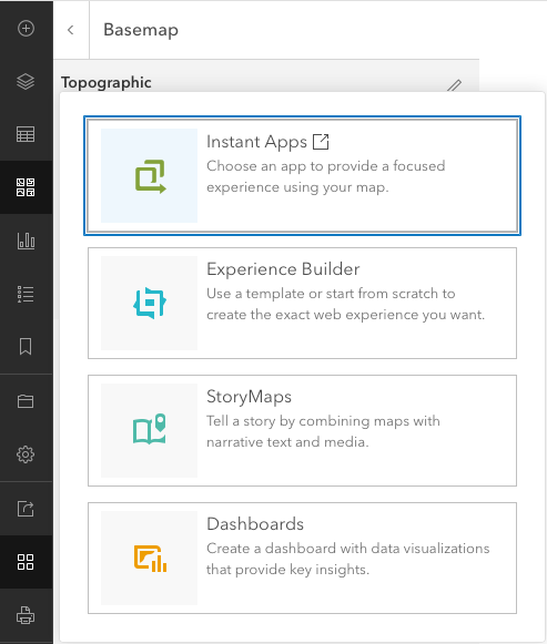
1 Choose the tool
Choose → Prepare → Create → Share
Esri has recently introduced a range of apps called Instant Apps, available in different use-case specific templates (sixteen, at the time of writing) that are easy to customise.
One of those templates is Countdown. This template enables you to create an interactive countdown experience based on an attribute. Then, as you tour that top-n countdown, you see the features on the map, along with other information on each location.
This app is available to you for free with any of the following ArcGIS accounts:
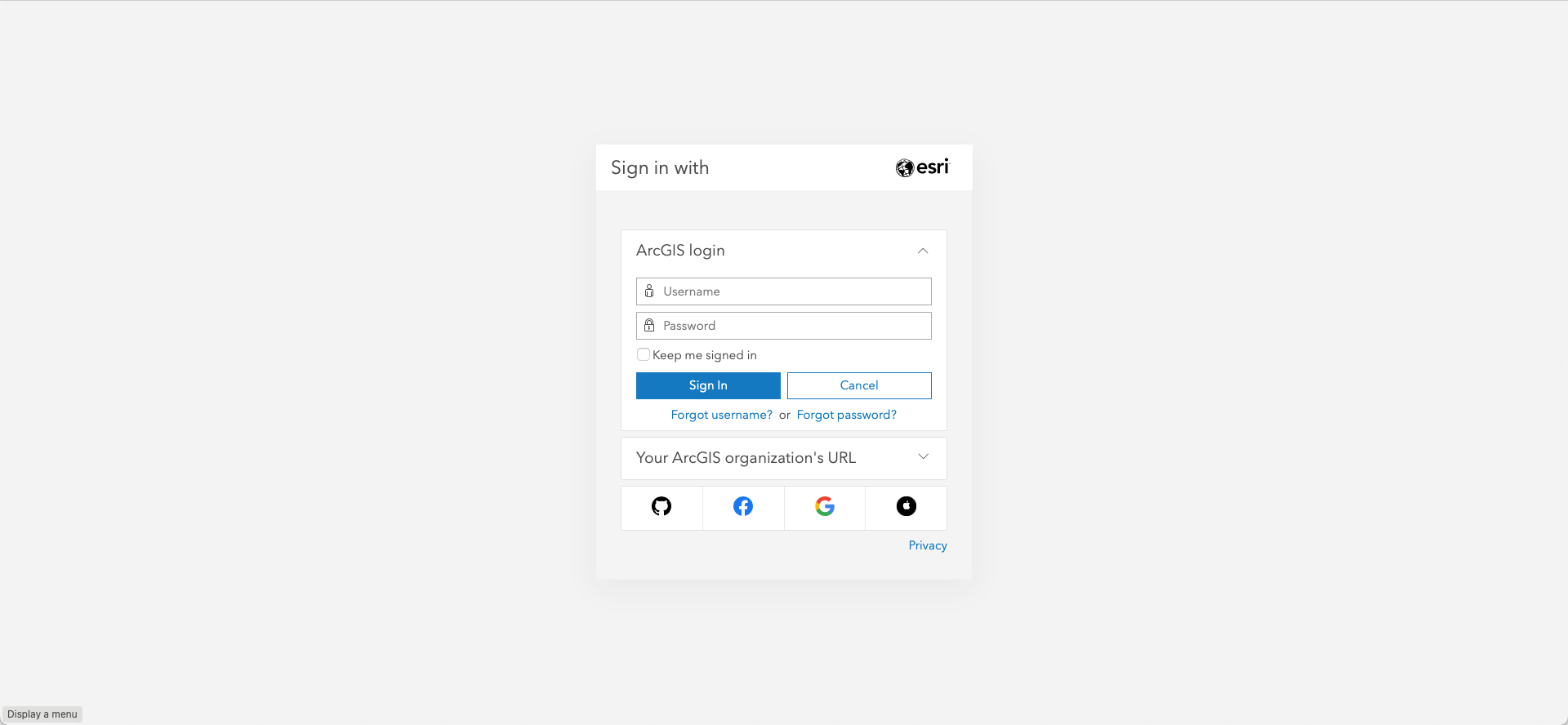
Once you create your account (if you haven't got one yet), you're ready to proceed.
2 Prepare the data
Choose → Prepare → Create → Share
The data we will use in this tutorial is available in the UN Stats Open SDG Data Hub, a collection of geospatially referenced data by sustainable development goals. We're specifically interested in the following dataset:
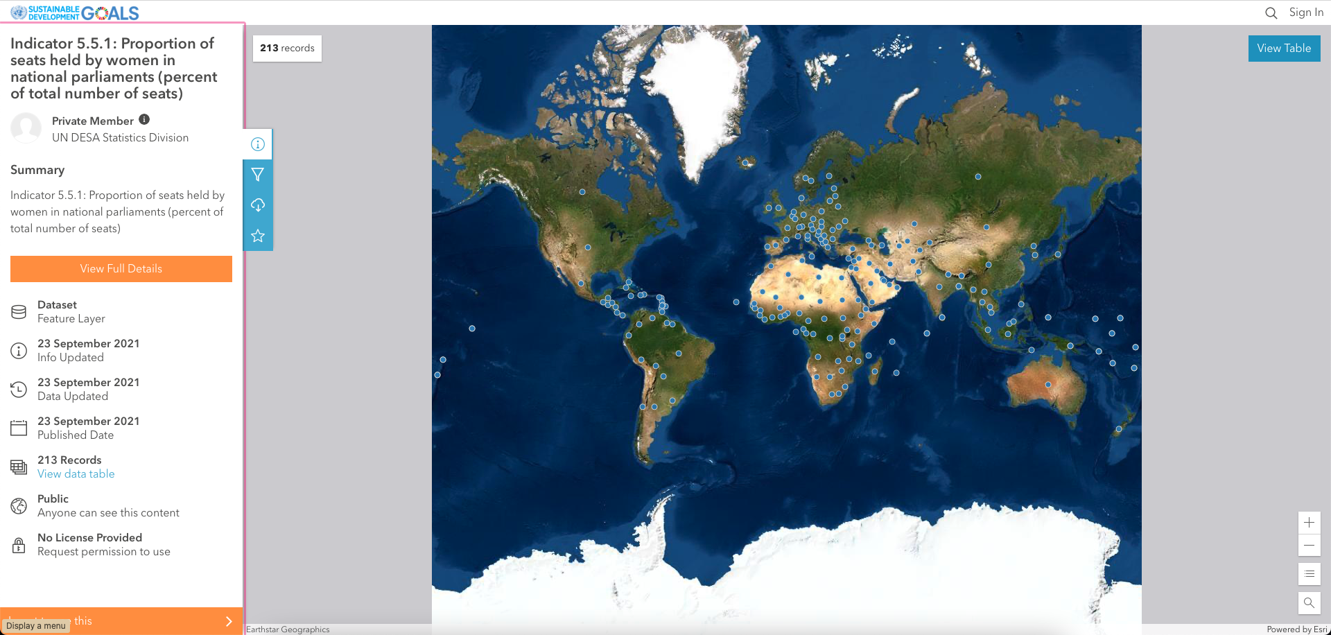
Indicator 5.5.1: Proportion of seats held by women in national parliaments (percent of total number of seats)
Click on More info on the left.
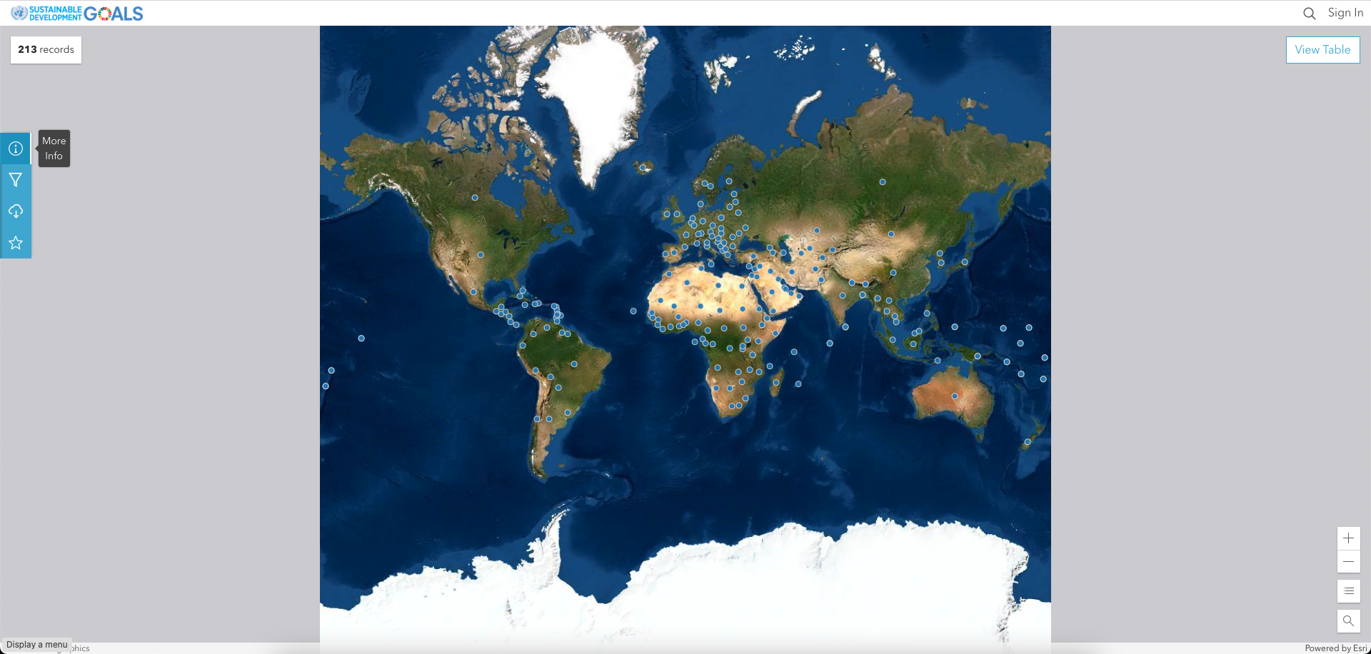
Click on the View table button (on the right) to inspect the data.
Notice that each row corresponds to a country, and each column correspond to an attribute.
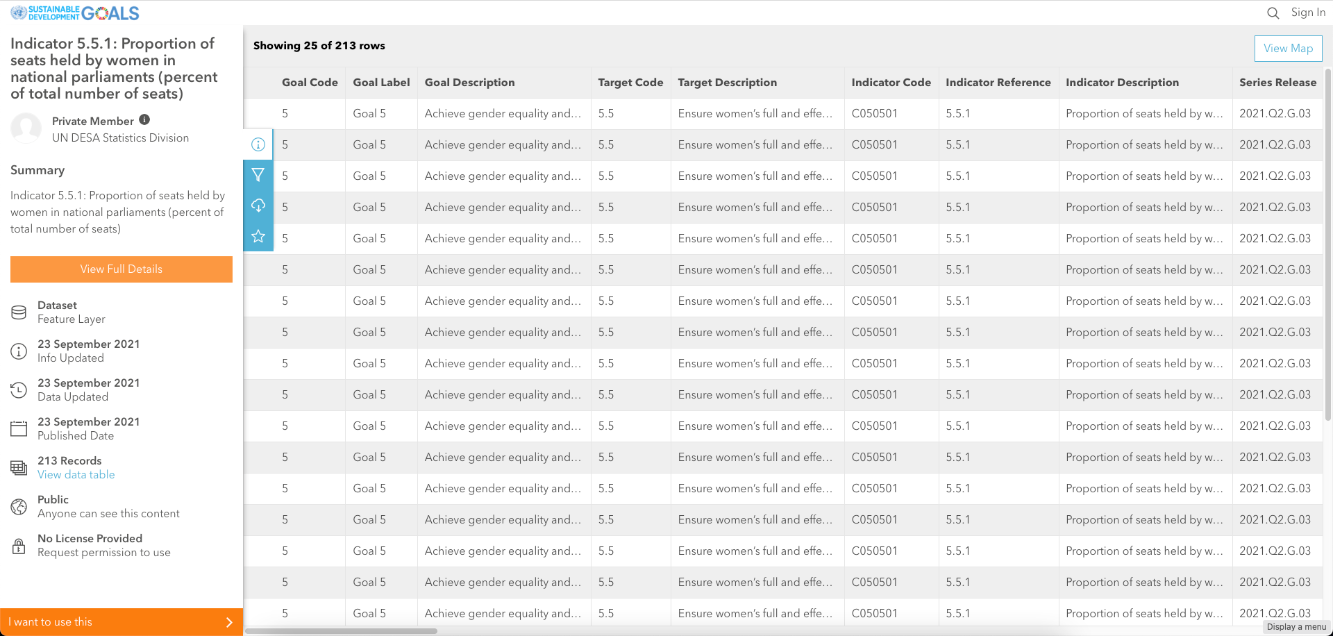
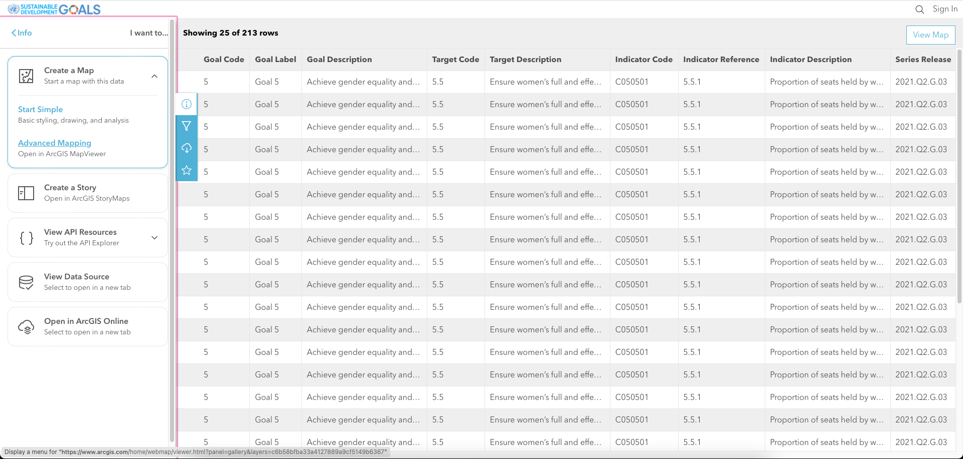
Now we're going to use this dataset to create a web map. So click on I want to use this on the bottom left.
3 Create a visualisation
Choose → Prepare → Create → Share
3.1 Create a web map
Expand Create a Map on the left and select Advanced Mapping.
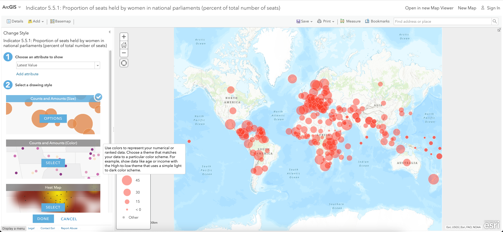
The Classic Map Viewer opens, displaying the data on the map.
Click DONE on the bottom left.
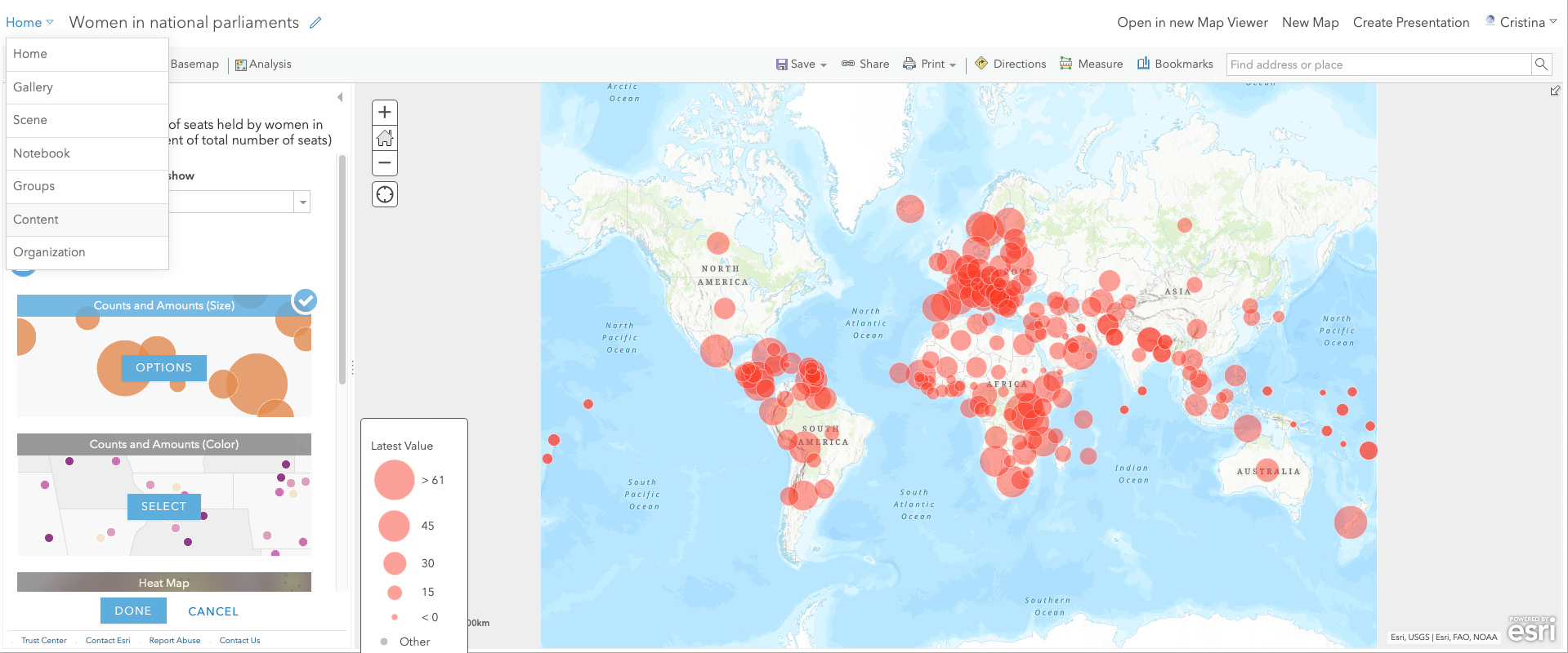
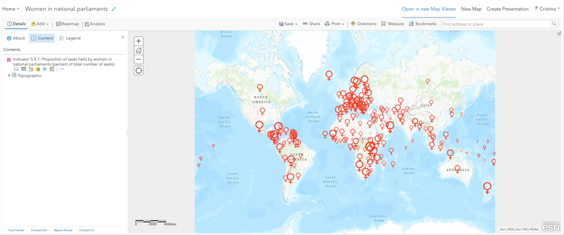
You have surely noticed how the locations (countries) show on the map. We will change this default symbology to an adequate icon later on.
For now, save this map by clicking on the Save As button.
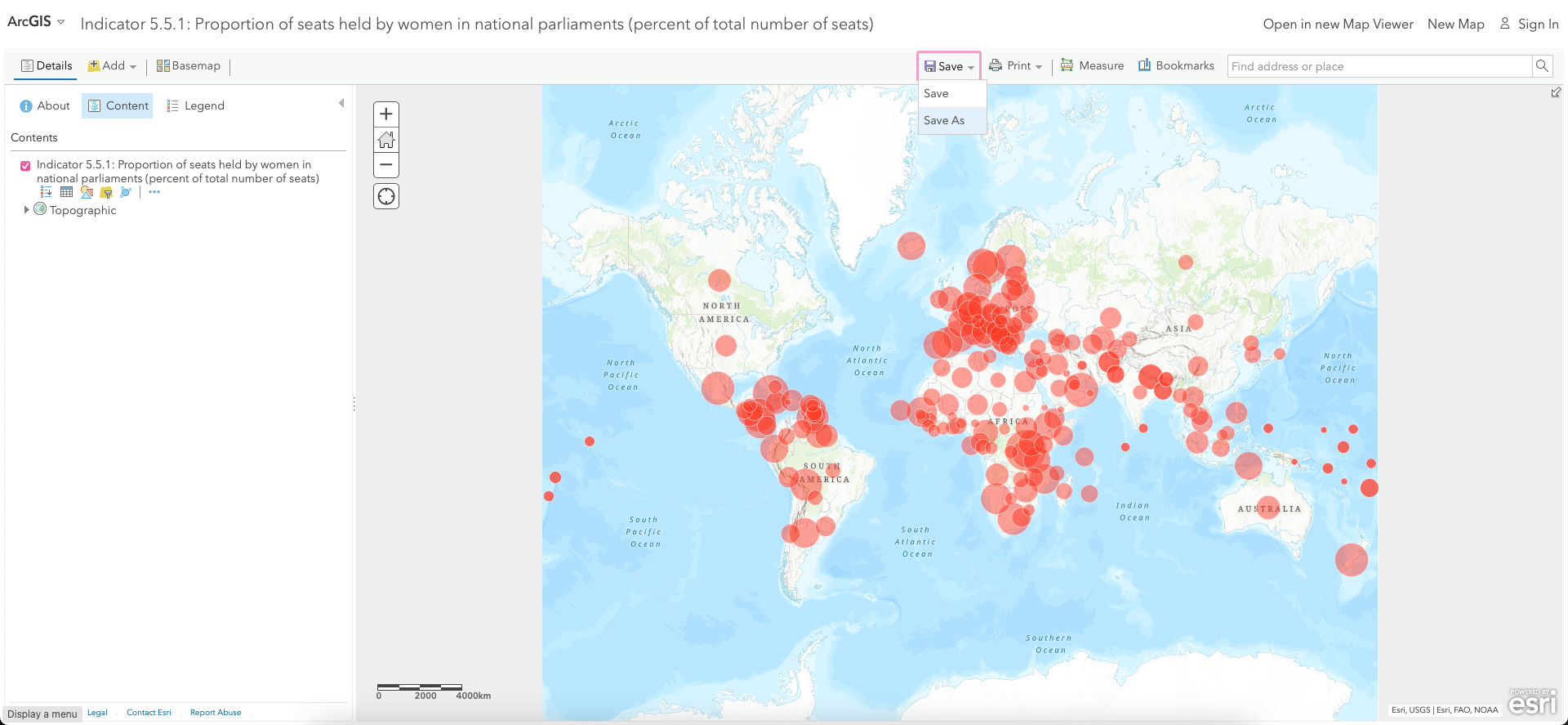
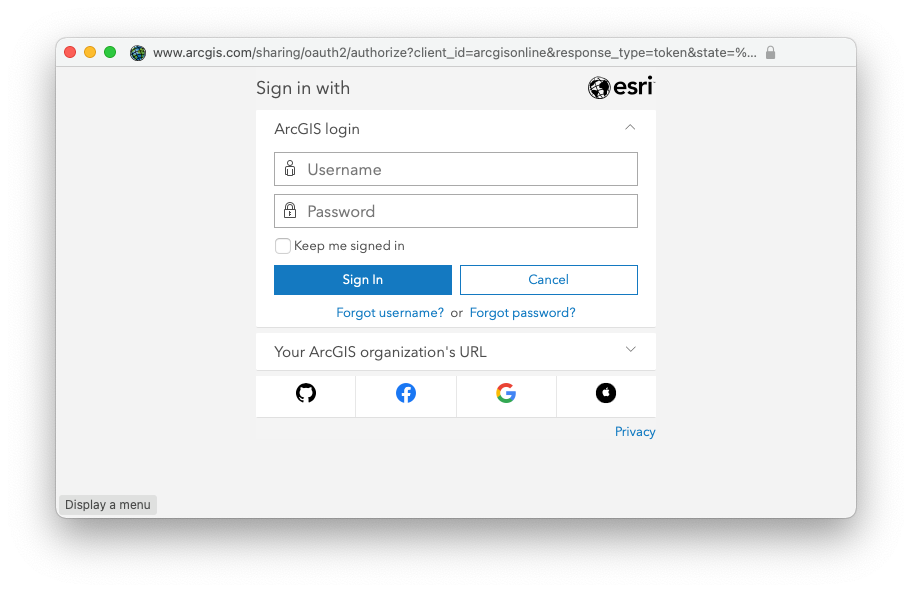
A pop-up window opens for you to Sign In with your account.
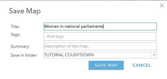
Now give a name to the map (e.g., 'Women in national parliaments') and save it in the desired folder.
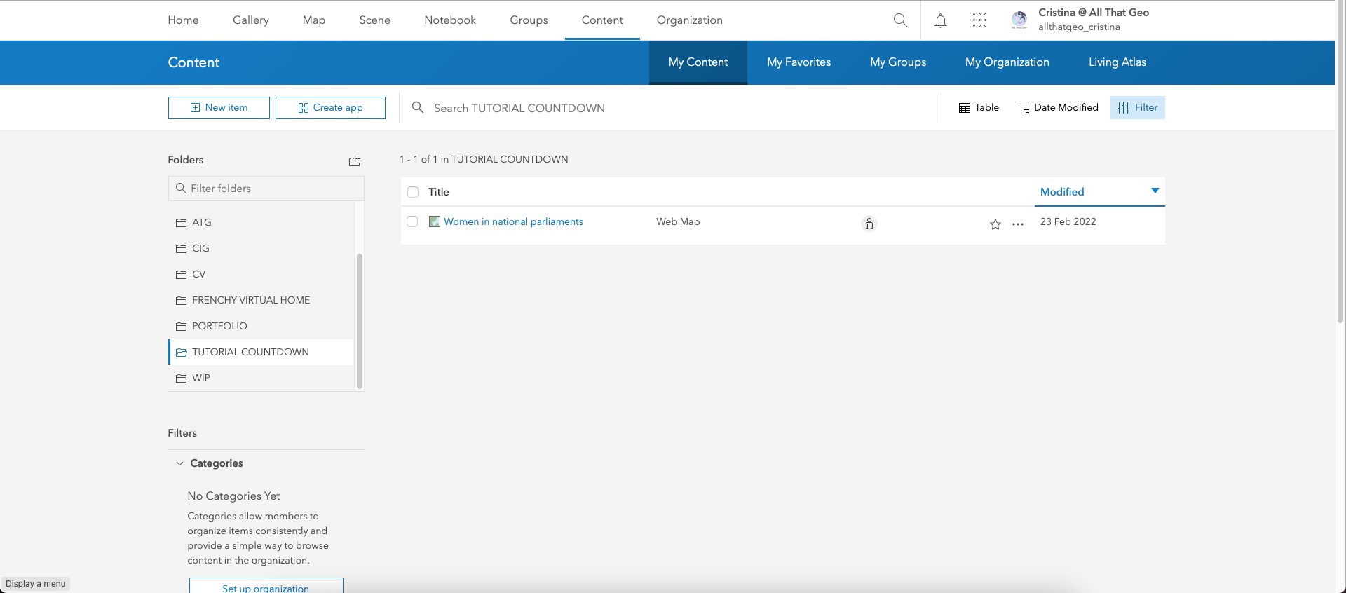
Back to map, expand the Home menu on the top left and choose Content.
Your web map is now visible in your contents.
3.2 Use custom symbology
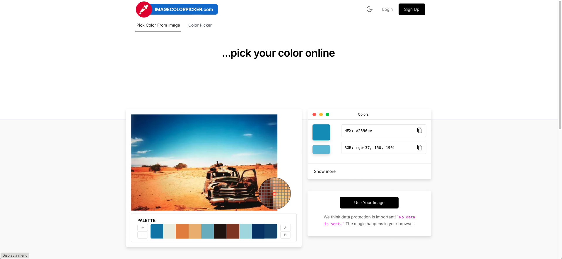
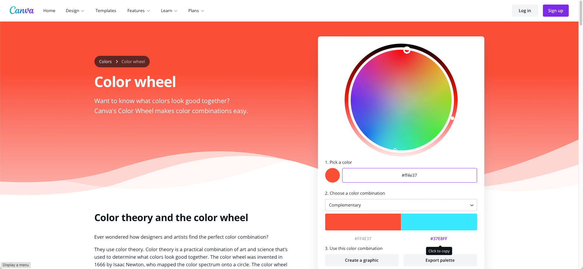
We will try to find a red icon representing women. To ensure we're using the same red as in the goal, go to the https://imagecolorpicker.com website and click on Use Your Image.
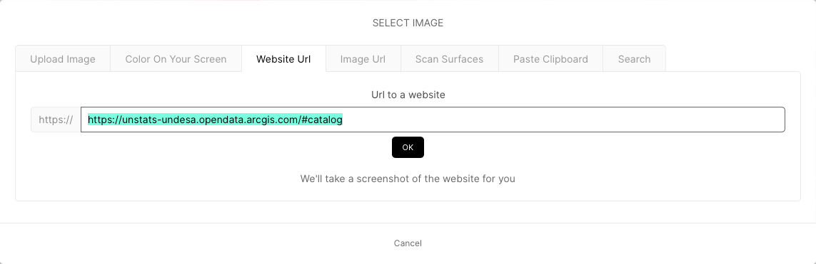
Now select Website URL in the modal and enter https://unstats-undesa.opendata.arcgis.com/#catalog. Hit OK.
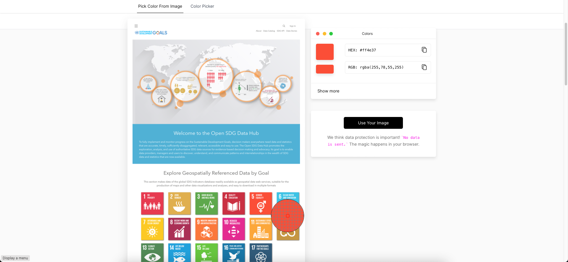
Now hover over Goal 5 and copy the HEX code (without the #): ff4e37.
Now that we have the colour, let's find an icon.
Go to Icons DB and enter 'female' in the search field on the right.
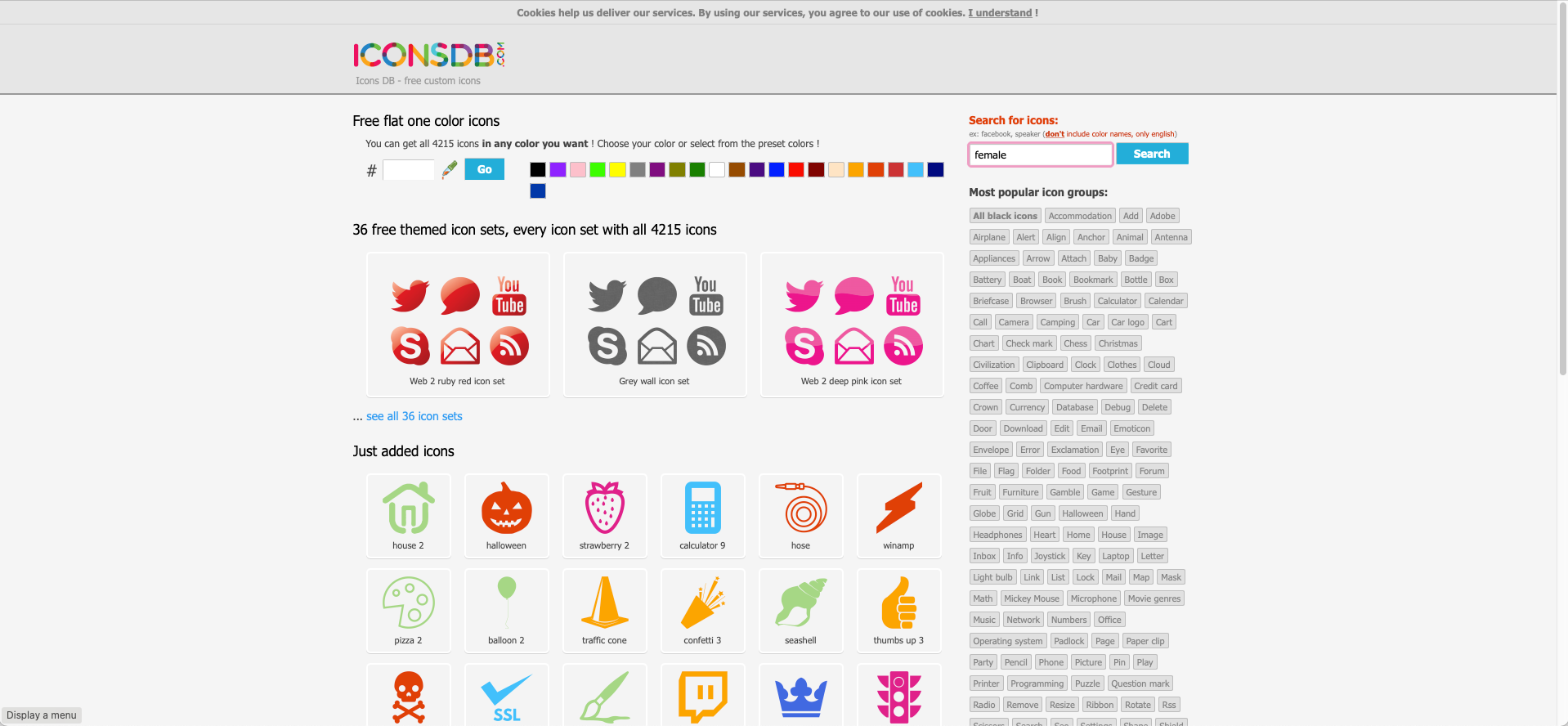
Enter the HEX you copied earlier and paste it in Custom HEX color.
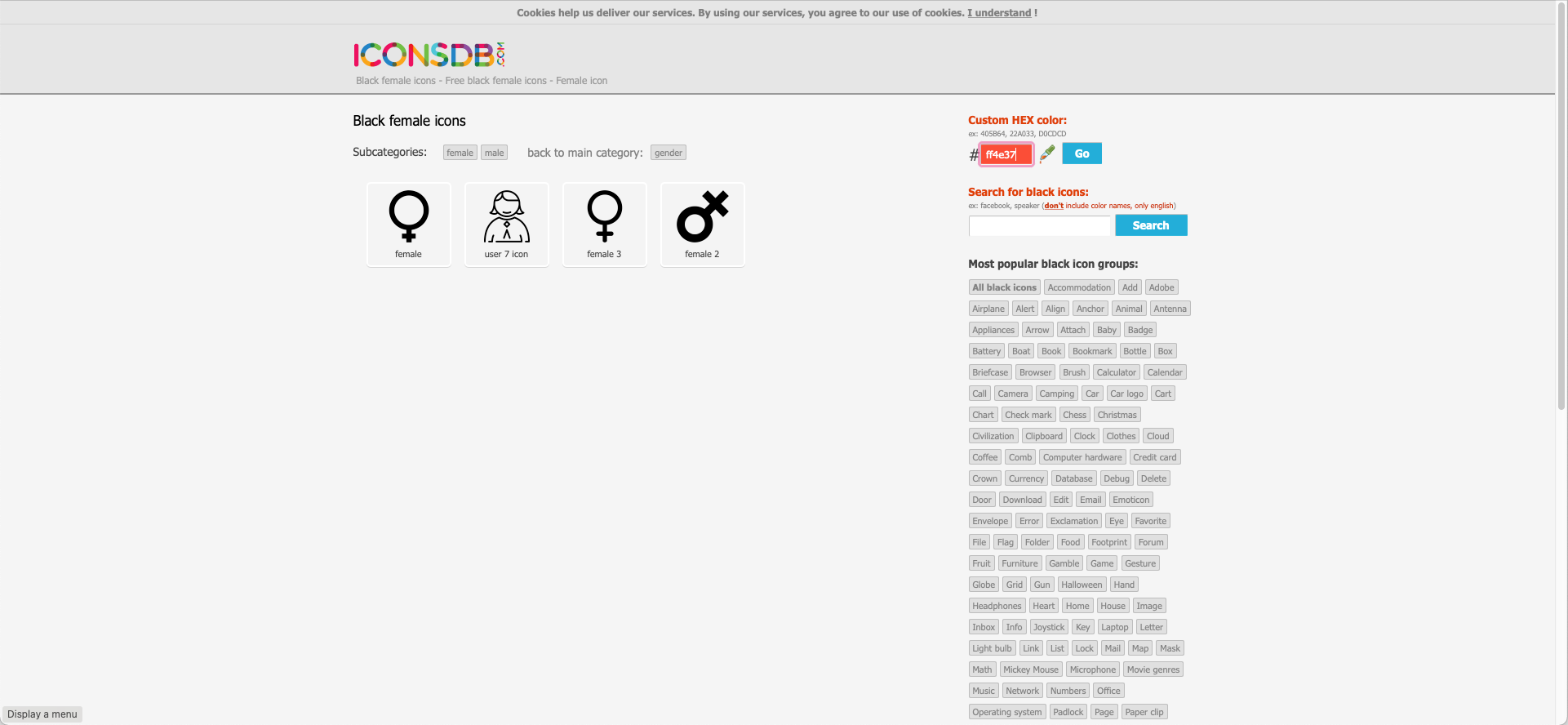
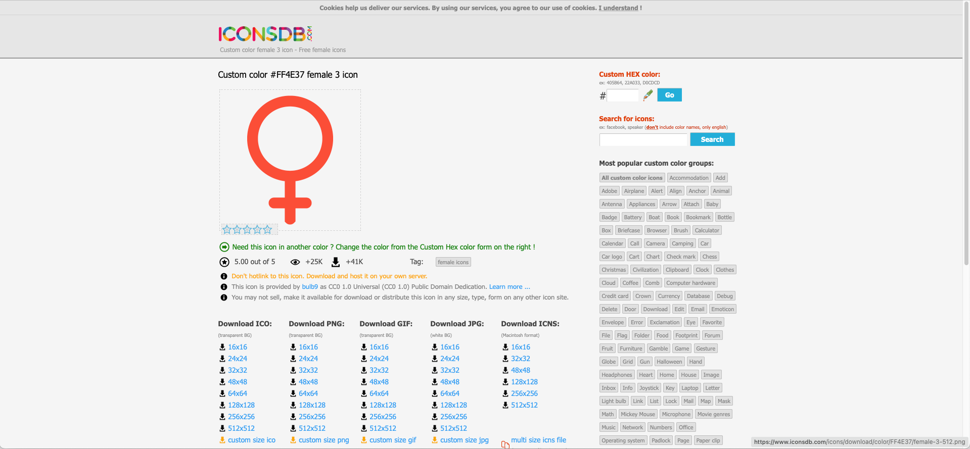
Choose female 3.
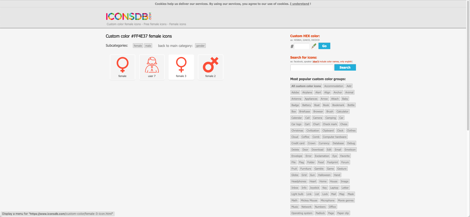
Download this icon in PNG format, 512x512.
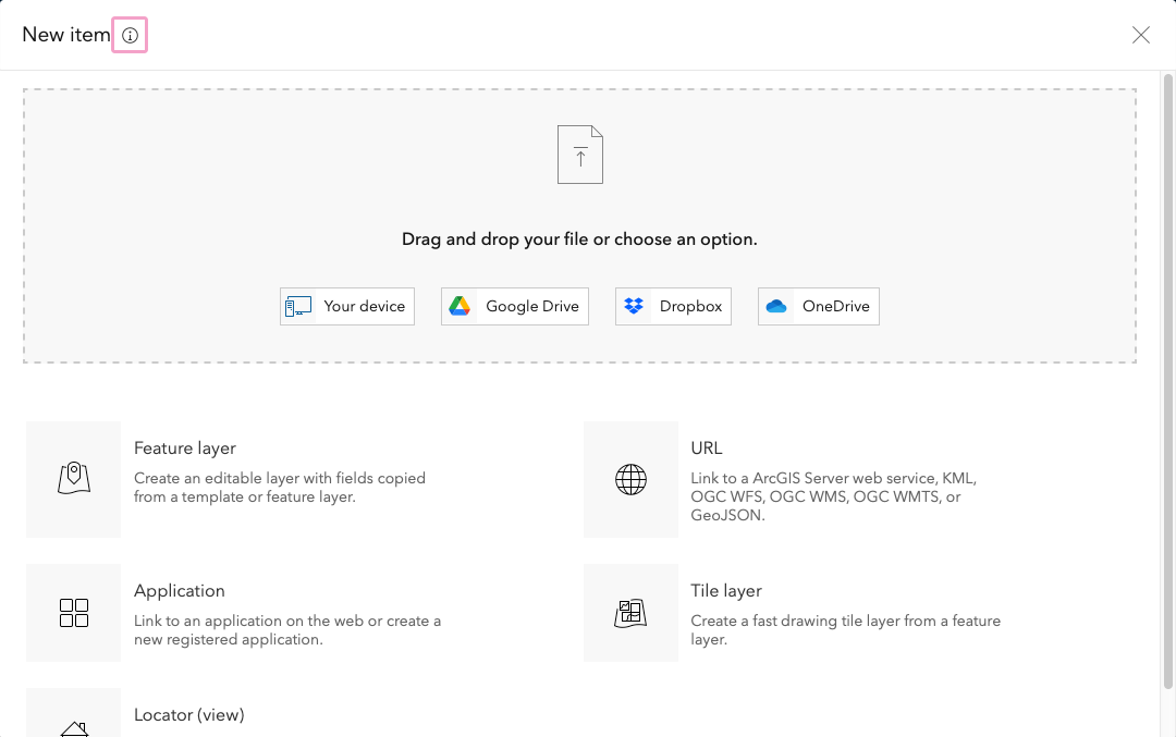
Now that we have the icon to use in the web map, we'll add it to our ArcGIS Online content. In My Content, click on New item on the top left.
Click on Your device and retrieve the female-3-512.png file from your computer.
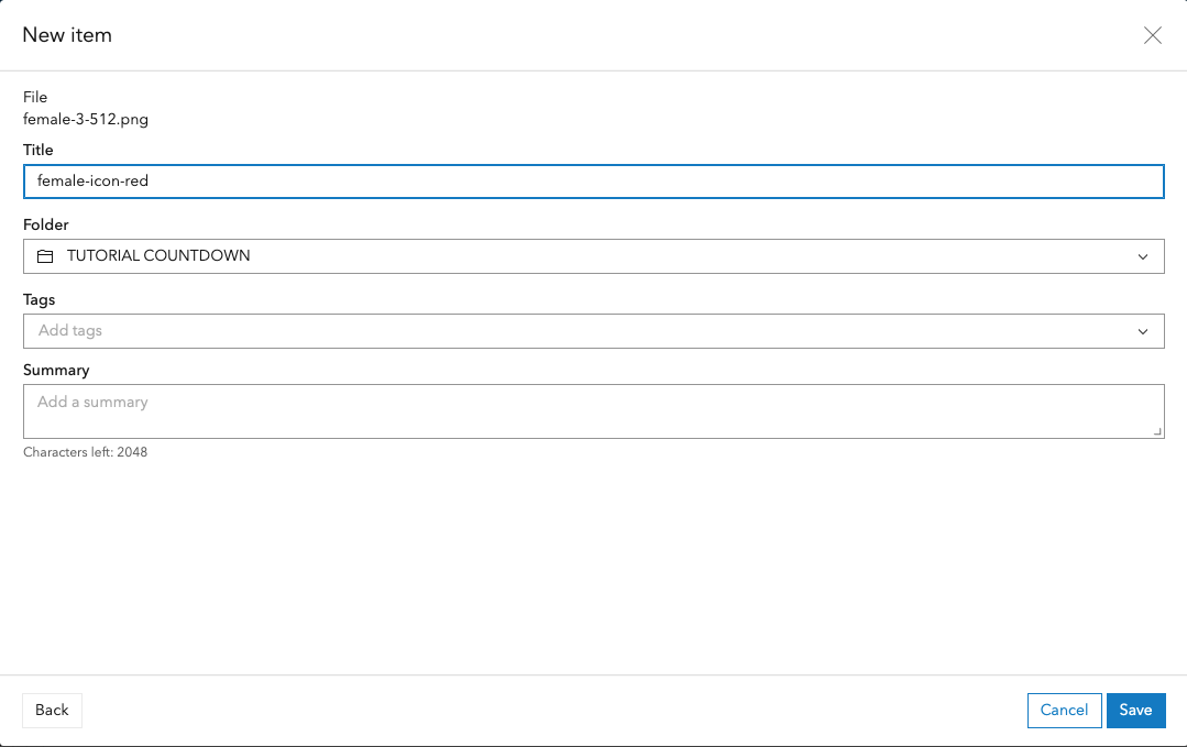
Save it with the title 'female-icon-red' inside the desired folder.
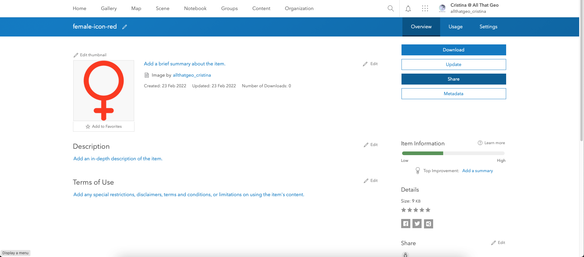
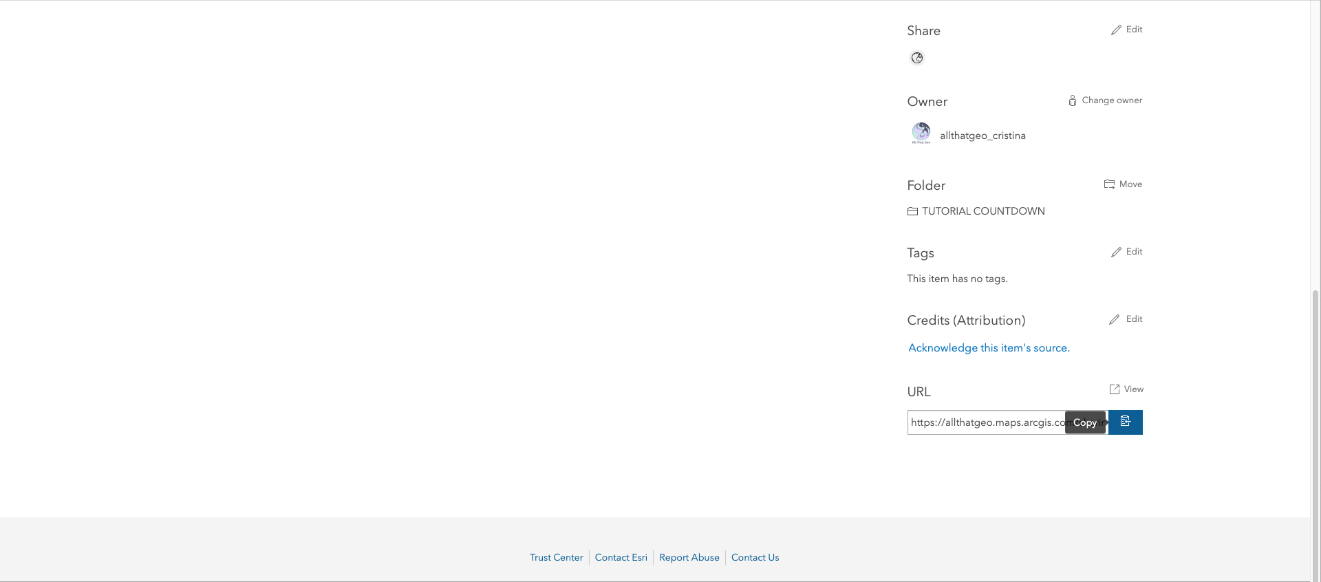
To use this icon in the web map, we need to make it public. Click on Share on the right.
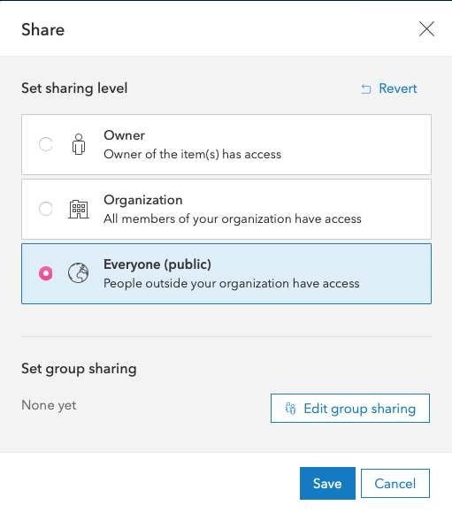
Them, select Everyone (public) and Save.
Now copy the URL. You'll use it to add the icon to the map.
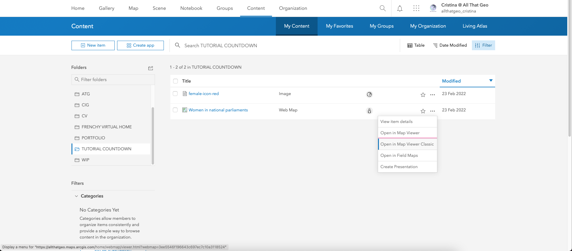
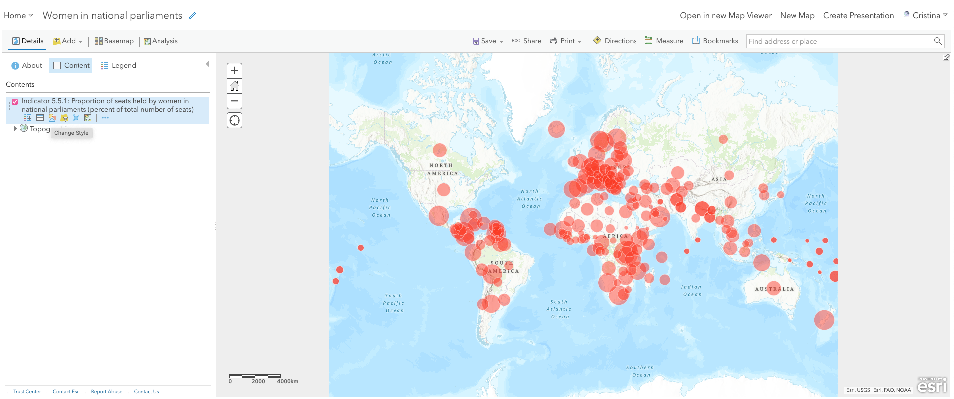
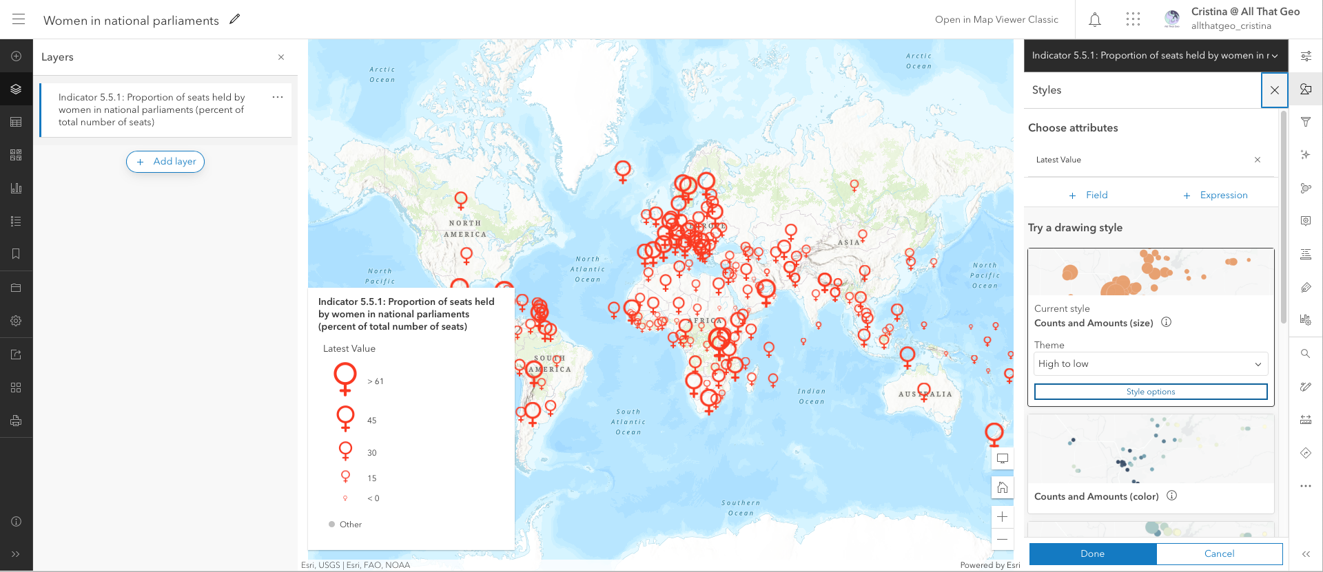
Go back to My Content. Click on the three dots next to the web map you saved earlier, Women in national parliaments, and choose Open in Map Viewer Classic.
Click on Change Style below the layer's name.
In Counts and Amounts (Size), click on OPTIONS.
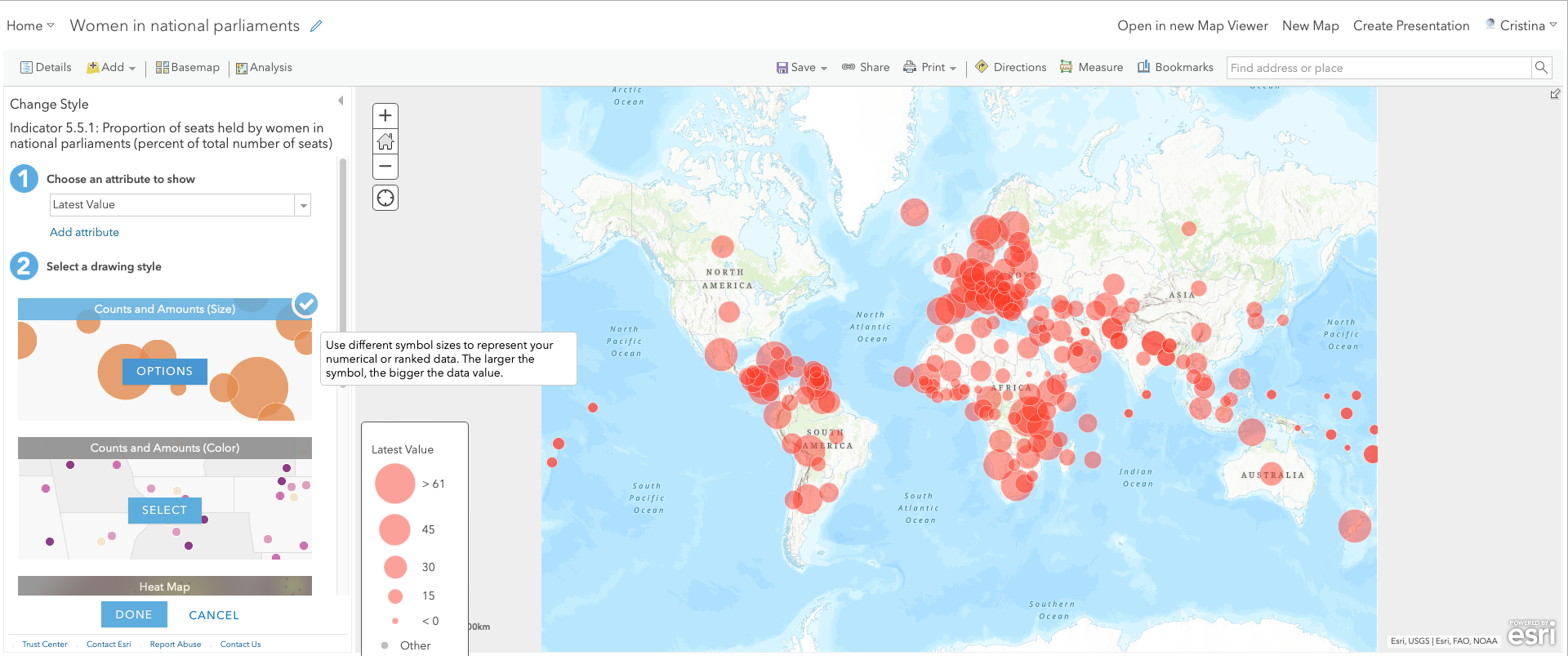
Click on Symbols (below the red circle).
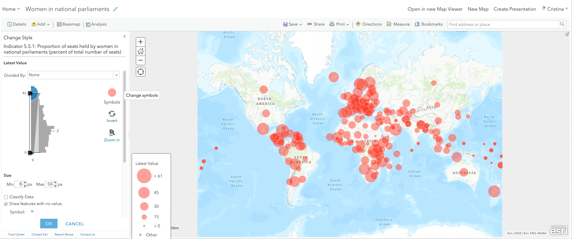
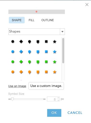
Then, click on Use an Image.
Enter the URL you copied earlier and click on the plus sign.
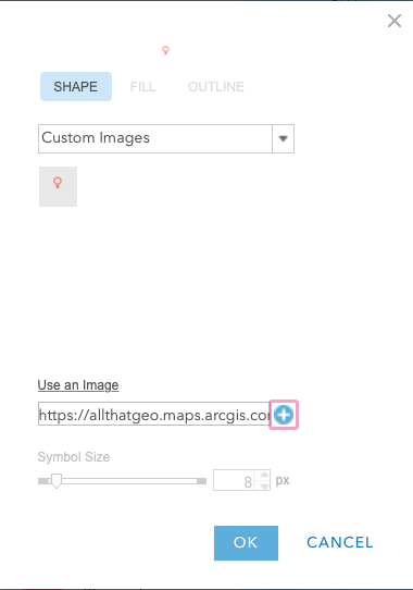
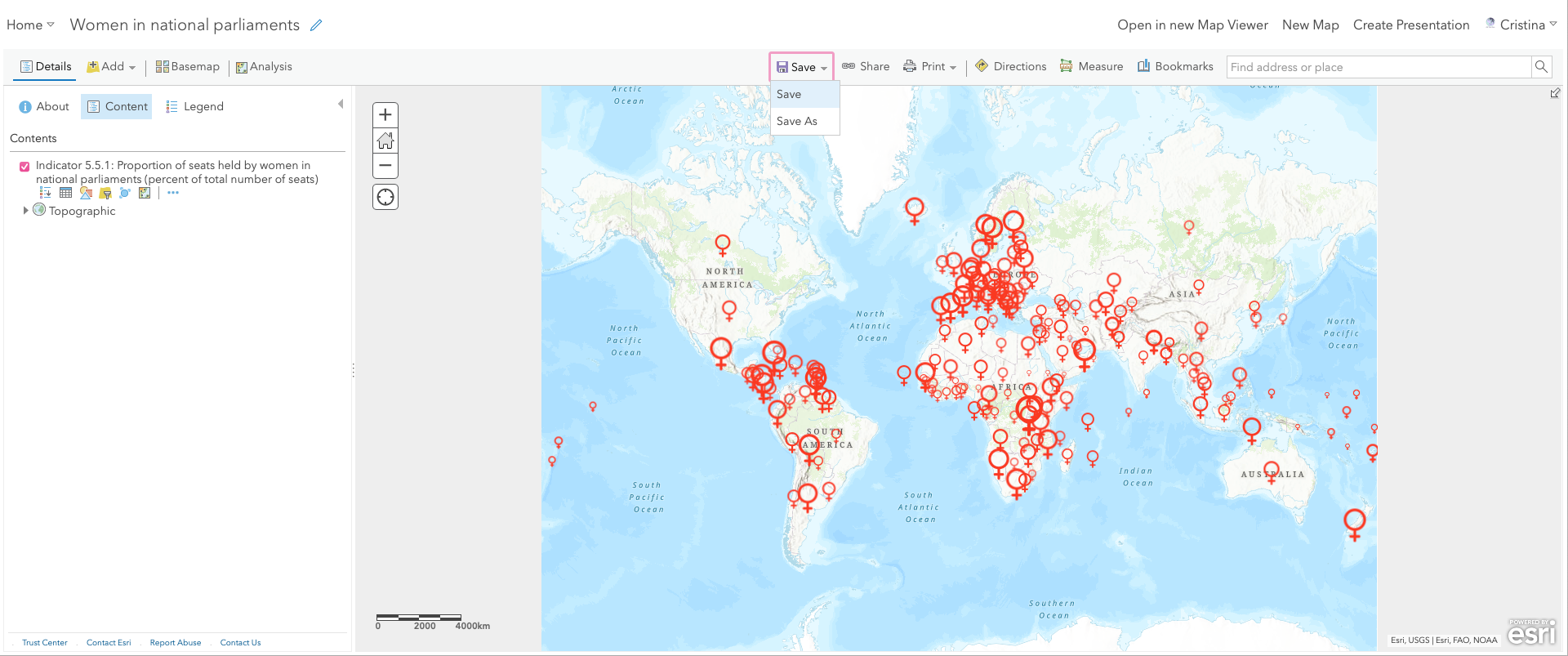
Click OK. Notice the new icon showing on the map. We'll customise it further later. For now, click again on OK and then, DONE.
We're now ready to leave the Map Viewer Classic and go back to the new Map Viewer. But, before that, do not forget to save the map.
Finally, click on Open in new Map Viewer.
Now that we're in the new Map Viewer let's customise the icon even further. Select the layer on the left and click on Styles, on the right, and then on Style options.
In Counts and Amounts (Size), configure as follows:
- In Theme, change to Above. The idea is to highlight the countries where the percentage of women in the national parliament is higher than the average.
- In size range, enable Adjust size automatically.
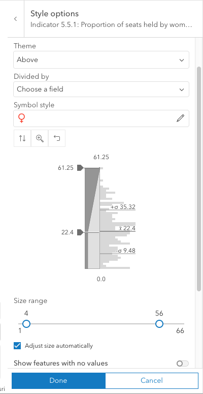
Then, click Done, and again, Done.
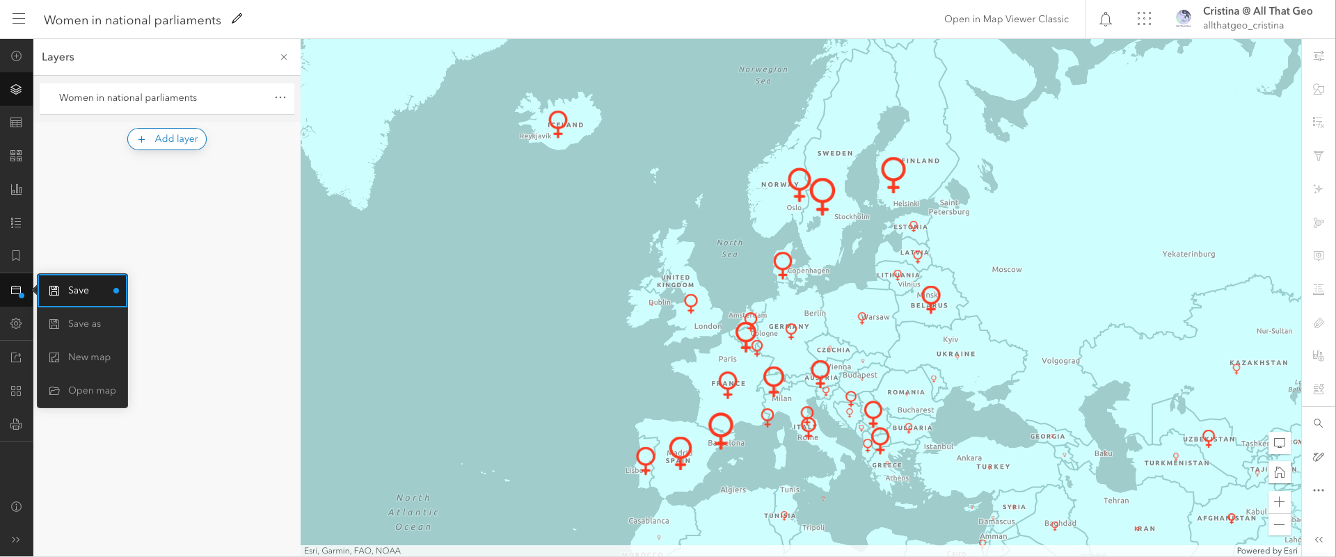
Let's now save the map with all the changes we have made so far. Click on Save on the left side.
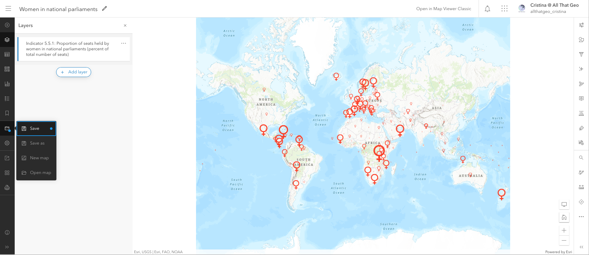
When warned about compatibility, select Save this map.
3.3 Configure pop-ups
Let's now configure pop-ups. The app we'll build later will inherit these pop-ups.
Start by making sure the layer is selected on the left and choose Configure pop-ups on the right.
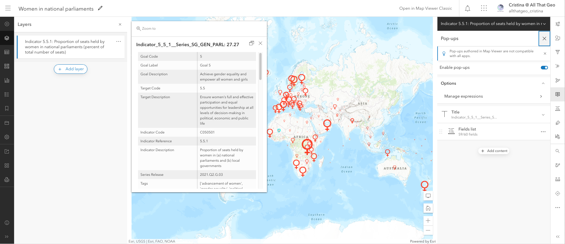
Expand Title and enter 'In {max_year}, {latest_value}% of the seats in the national parliament of {geoAreaName} were held by women'.
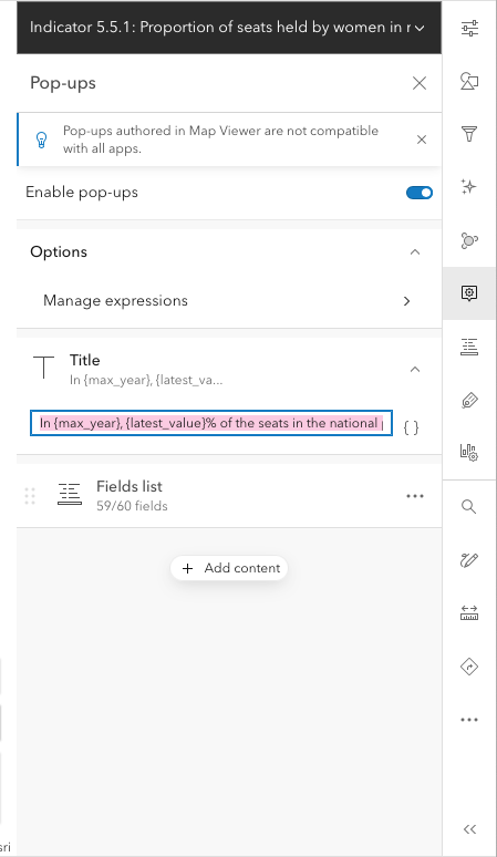
Click on the three dots next to Fields list and select Delete.
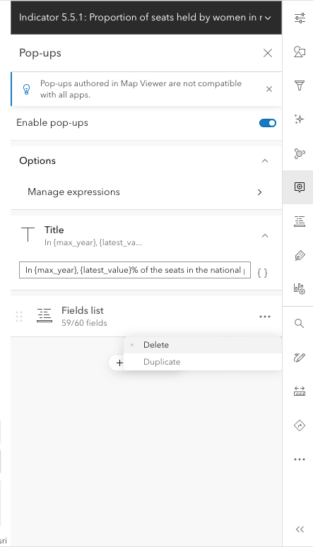
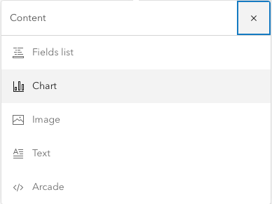
Click on Add content.
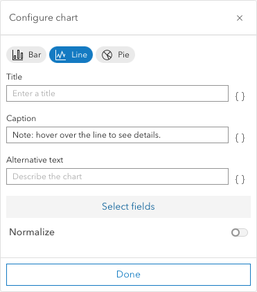
Then, select Chart.
Choose Line and enter the following Caption: 'Note: hover over the line to see details.'.
Click on Select fields.
Select all fields ranging from Value 2000 until Value 2021.
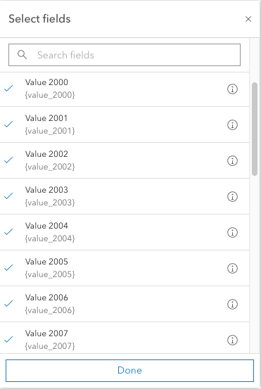
Click Done, and Done again.
In Media, enter the following Title: 'Evolution between {min_year} and {max_year}:'

You've probably noticed how the years on the pop-up show in a poor way, i.e. 2,021. So we'll customise the fields to make this and other information look better.
Click on Configure fields on the right.
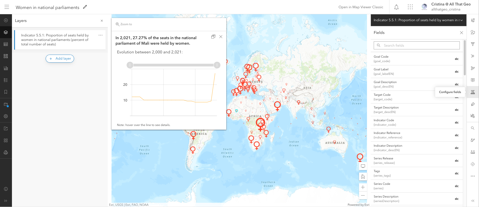
Perform the following changes:
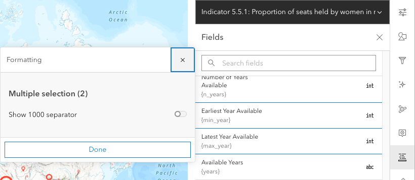
- Disable Show 1000 separator in Earliest Year Available and Latest Year Available. Click Done.
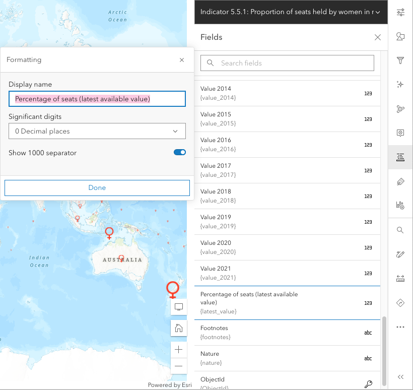
- Change Latest Value to Percentage of seats (latest available value) and 0 Decimal places. This will show on the legend. Click Done.
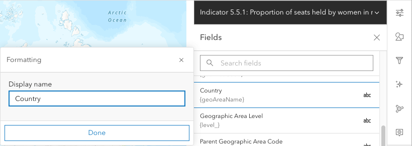
- Change Geographic Area Name to 'Country'. Click Done.
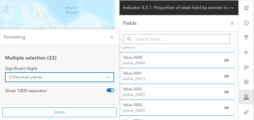
- Select 0 Decimal places in all years from Year 2000 to Year 2021. Click Done.
Now close the Fields pane.
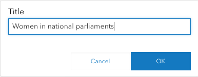
Click on the three dots next to the name in the Layers pane and select Rename.
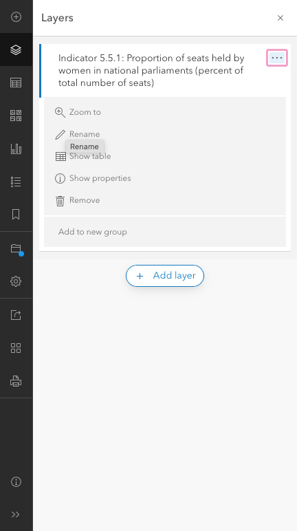
Enter 'Women in national parliaments'. Click OK.
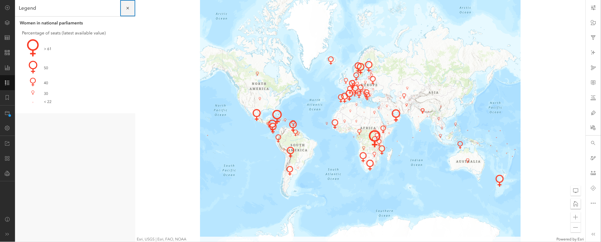
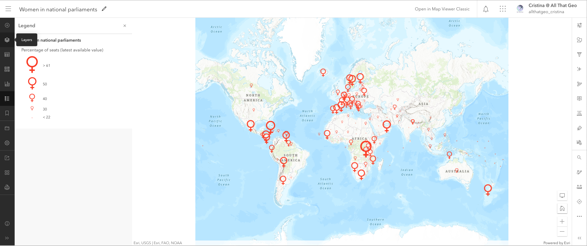
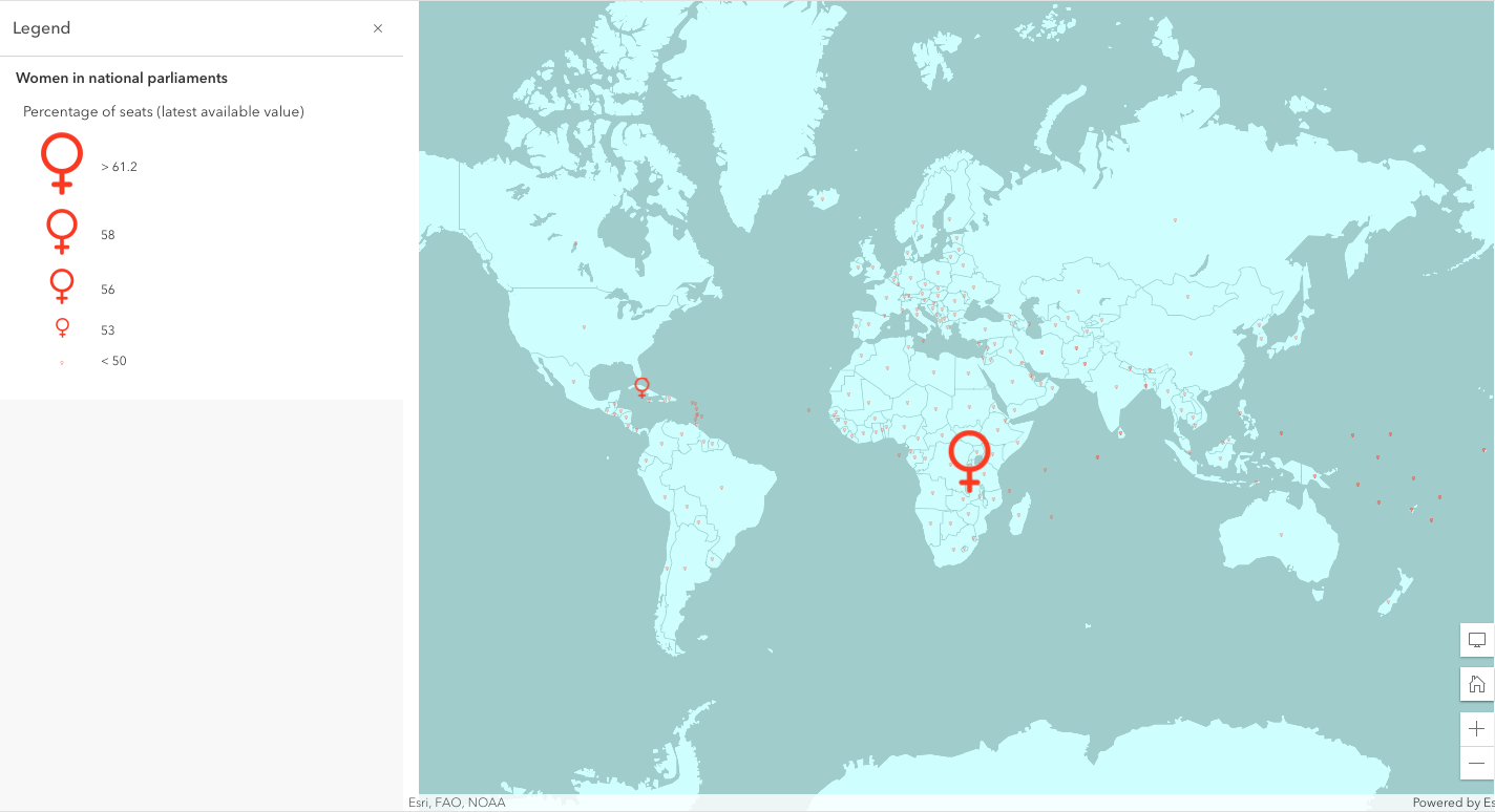
Now select Legend from the left and make sure it shows correctly.
Save the map.
3.4 Create a custom basemap
We're going to customise a unique basemap for this web map. And we're going to do so by using the Vector Tile Style Editor.
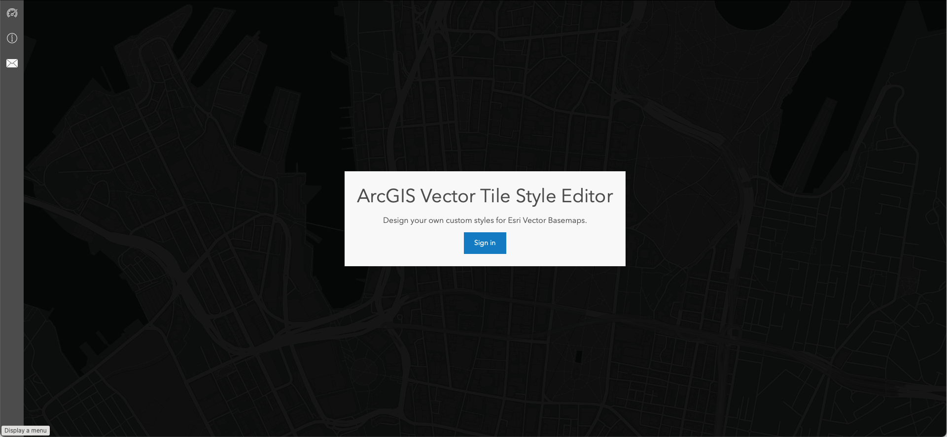
Sign in with your ArcGIS Online credentials.
Then, click on Get Started.
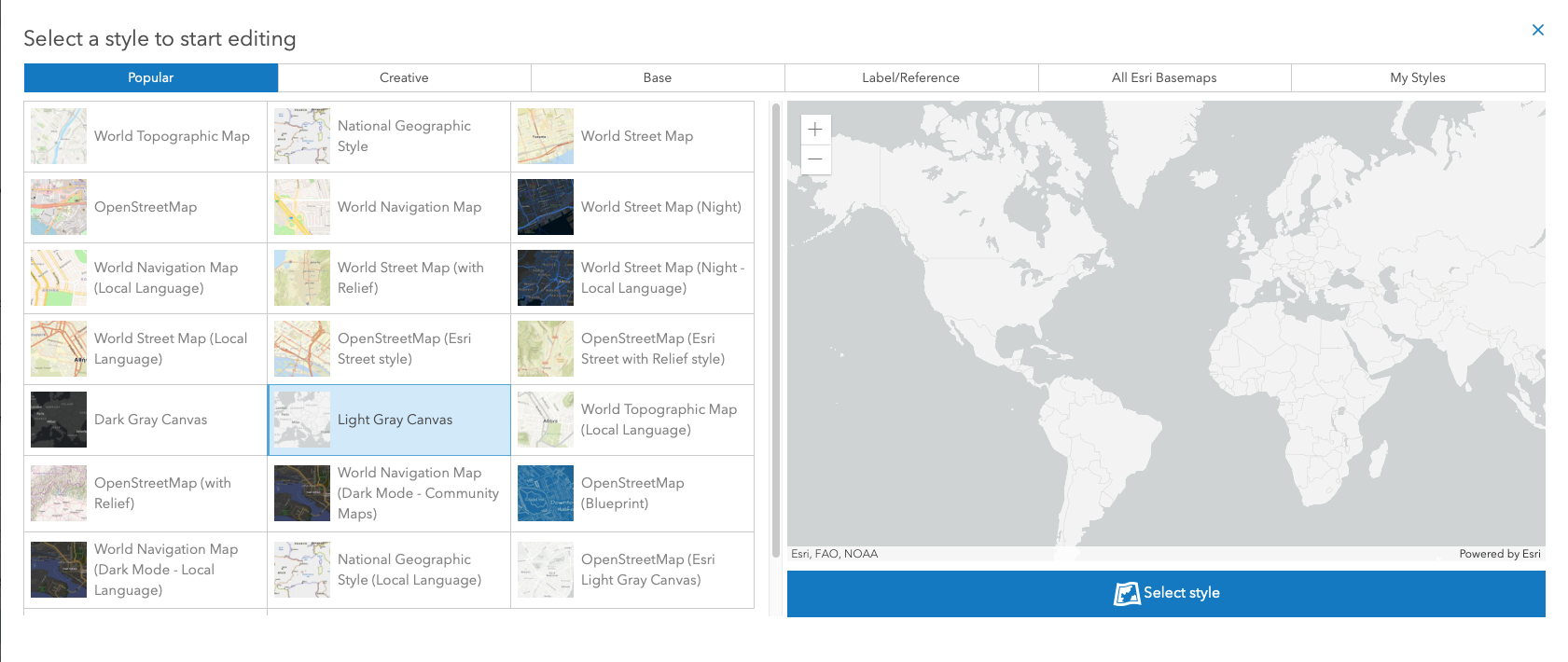
From Popular, select the Light Gray Canvas style. Then, validate your choice by hitting Select Style.
In Quick Edit, change the colour theme to Monochrome.
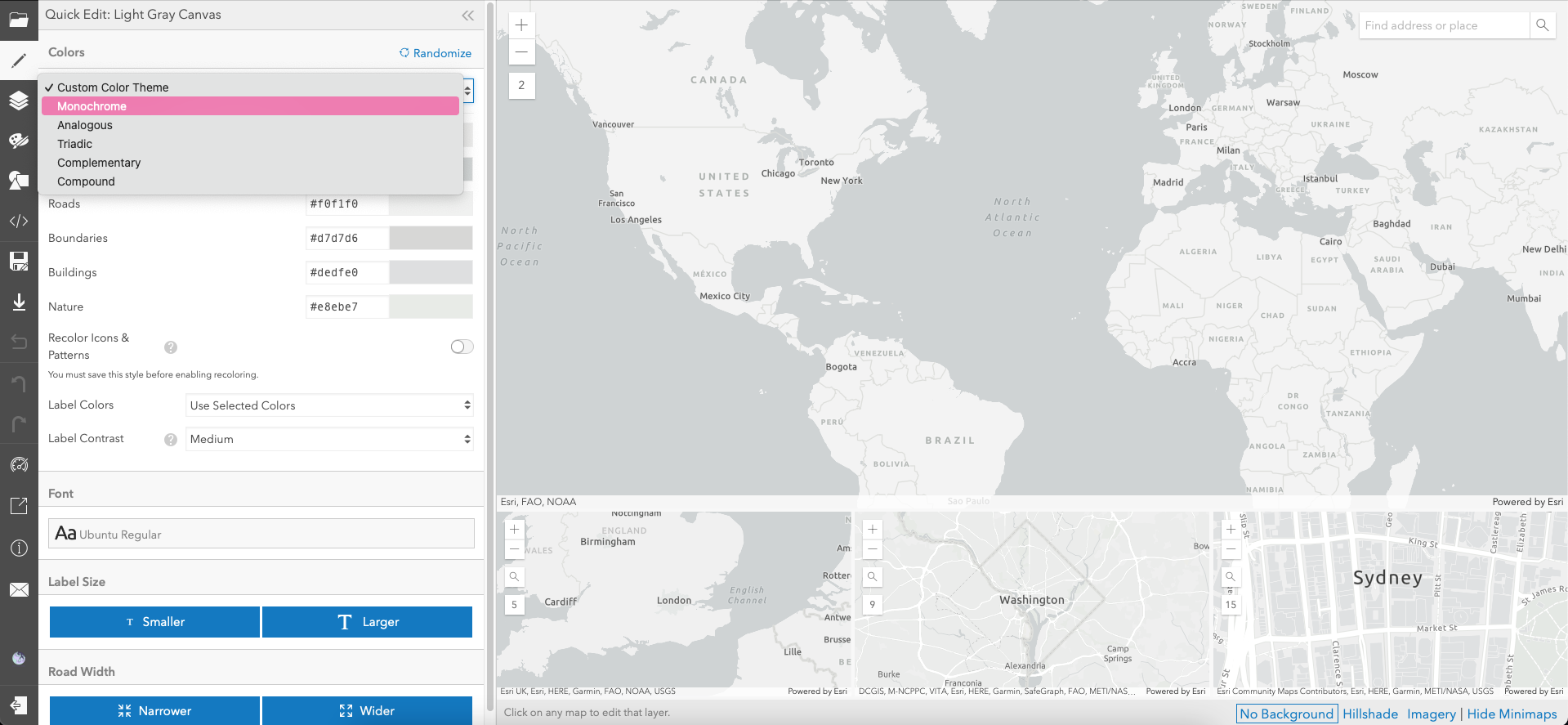
We want to colour the basemap to complement the red on the female icon earlier. So, let's head to Canva Color Wheel website to find that colour. Then, enter the HEX from the icon ('#ff4e37'), choose Complementary colour combination, and you'll obtain blue #37E8FF. Click to copy it.
Go back to the Vector Tile Style Editor and enter '#37E8FF' next to Monochrome.
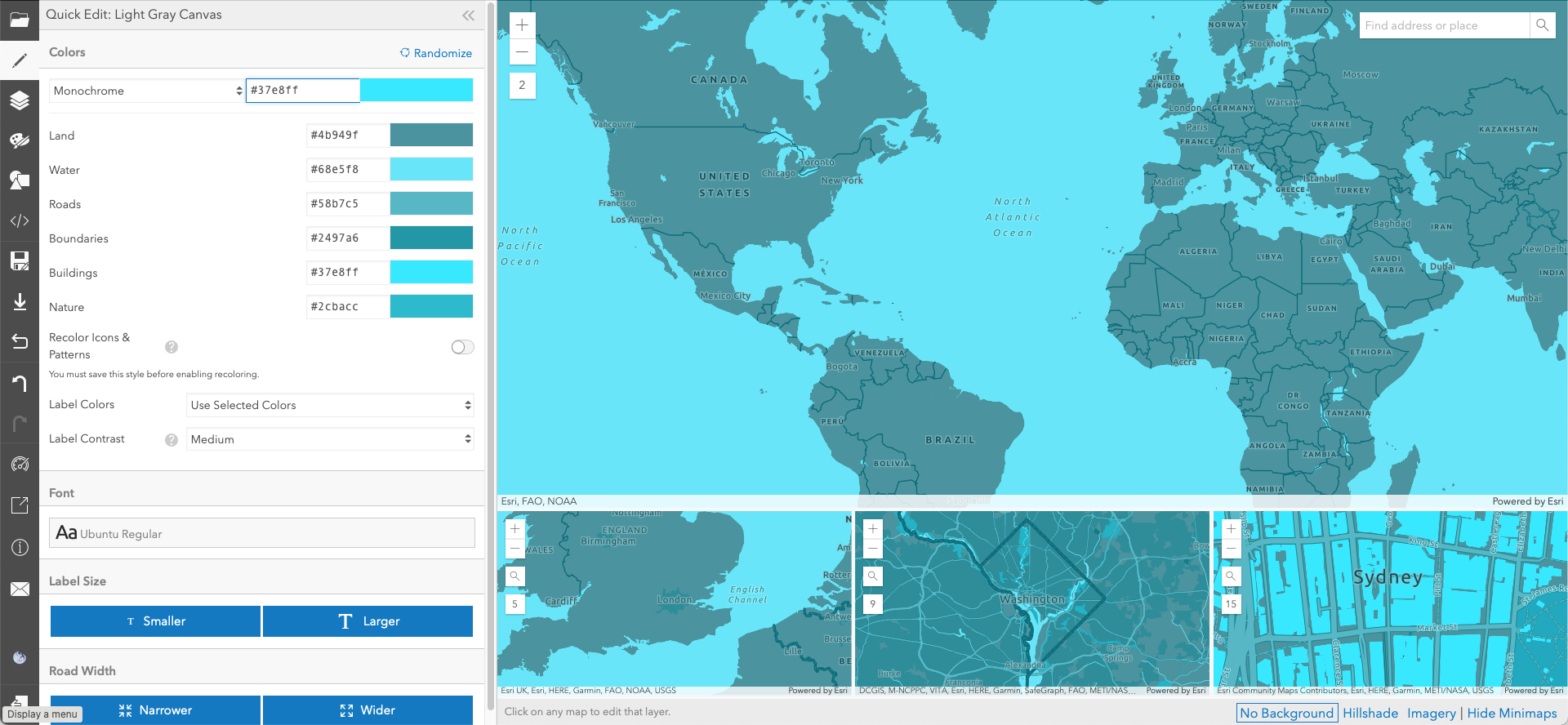
I'm not wildly convinced with the result, as it seems too heavy. Let's click on the blue area next to the HEX.
After trying a few options below Map Colors, I decided to stick with #c9ffff. Choose the map colour of your preference and click Done.
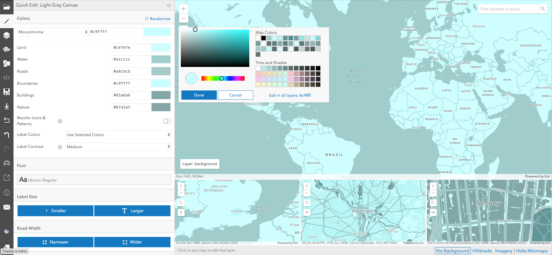
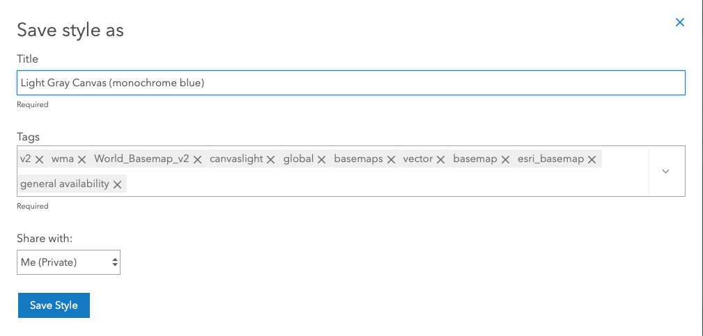
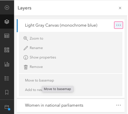
Now let's save this basemap by clicking Save As on the left.
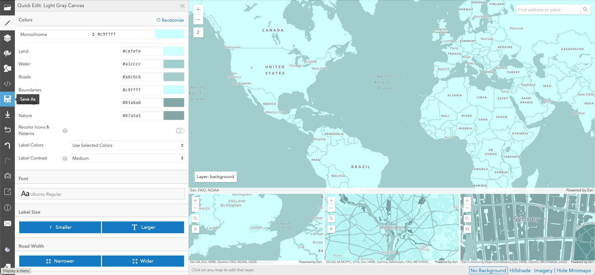
Give it a name (e.g., 'Light Grey Canvas (monochrome blue)') and save.
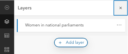
Go back to the map and click on Layers on the left.
Click on Add layer.
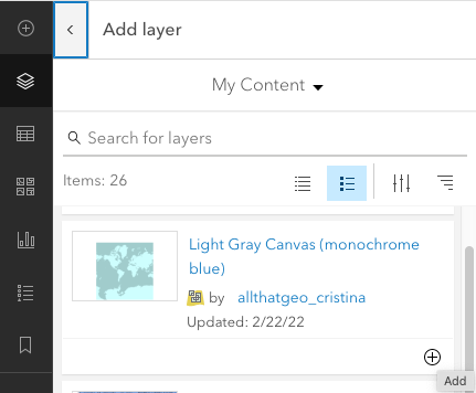
Find the Light Gray Canvas (monochrome blue) from My Content and click the plus sign to add. Then go back to the layers list by clicking on the < sign.
Click on the three dots next to Light Gray Canvas (monochrome blue) and select Move to basemap.
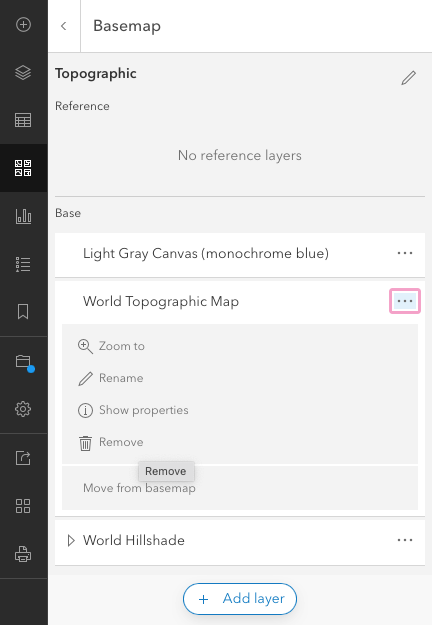
Click on Basemap (on the left), then on Current basemap - Topographic.
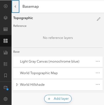
Click on the three dots next to World Topographic Map and select Remove. Next, do the same for World Hillshade.
Finally, pan and zoom to an area of interest and save the map.
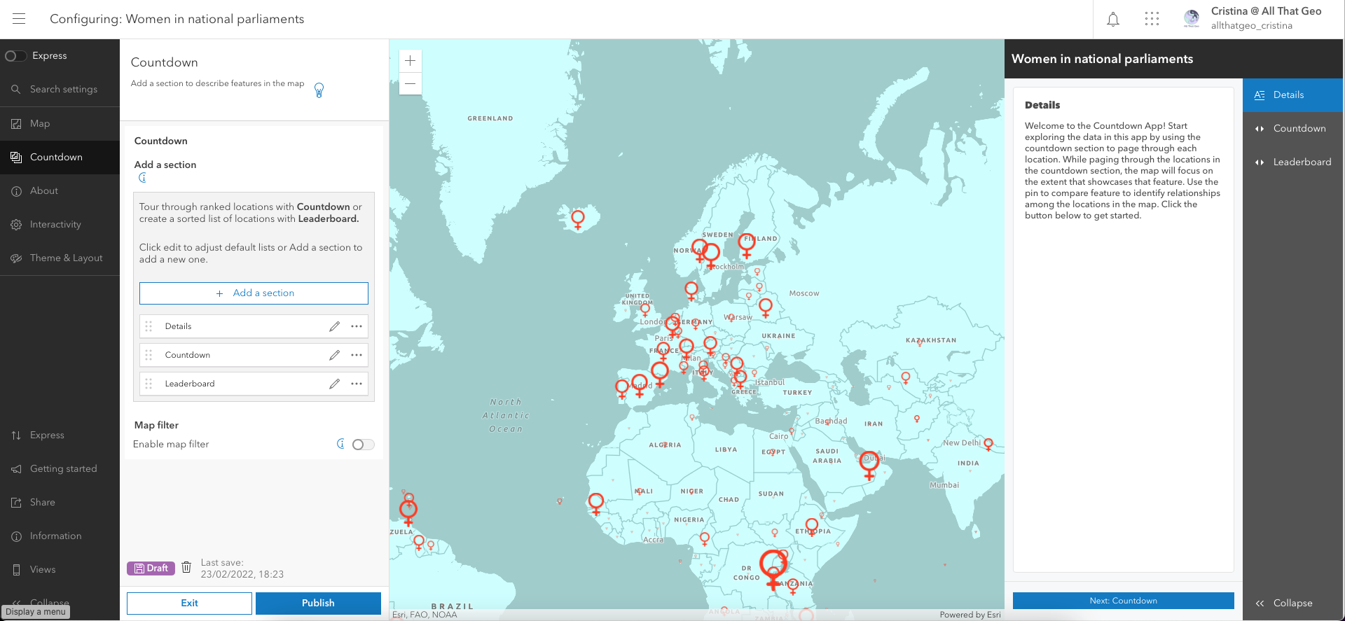
3.5 Build a web app
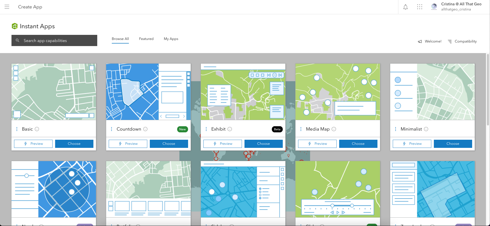
Click on Create app on the left and choose Instant Apps.
Choose the Countdown template.
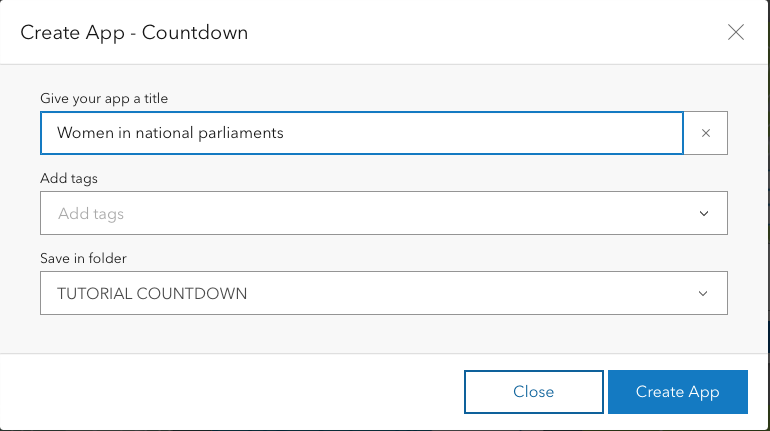
Enter a title, e.g. 'Women in national parliaments' and save it in the desired folder.
Close the modal that appears.
Now turn off the Express mode (move the switch on the top left corner to the left).
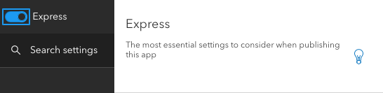
Select Continue on the modal that appears, as we want to access all settings.
We're now going to go through the settings on the left. Keep the Map section as is and move to the Countdown section.
Click the pencil next to Details to configure as follows:
- Details section name: 'Start here'
- Details section title: 'Welcome to the Top 10 countries by the percentage of women in national parliaments'
- Details section content: 'Top 10 countries'
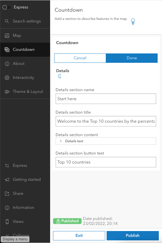
In Details section content, add the following text (or any other of your choosing):
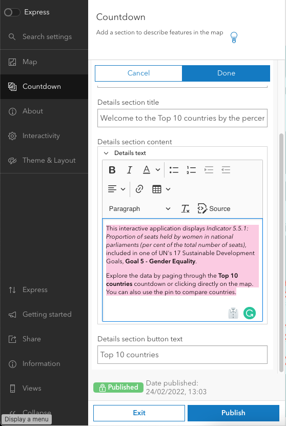
Click Done.
Now click on the pencil next to Countdown and configure this section as follows:
- Countdown section name: 'Top 10 countries'
- Ranking layer: 'Women in national parliaments'
- Number of features to display: 10
- Ranking field: Latest Value
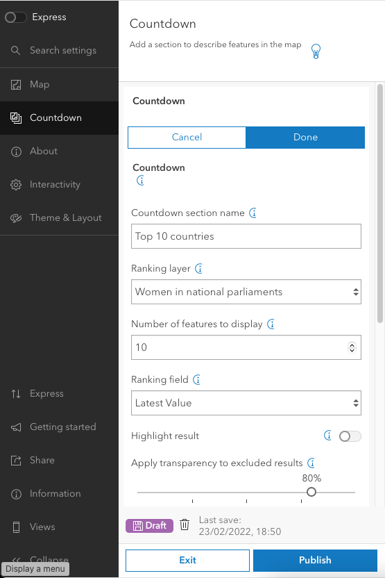
Also:
- Ranking order: High to low
- Paging: 'Page {current} of {total}'
- Enable filtering: on
- Filter fields: Geographic Area Name
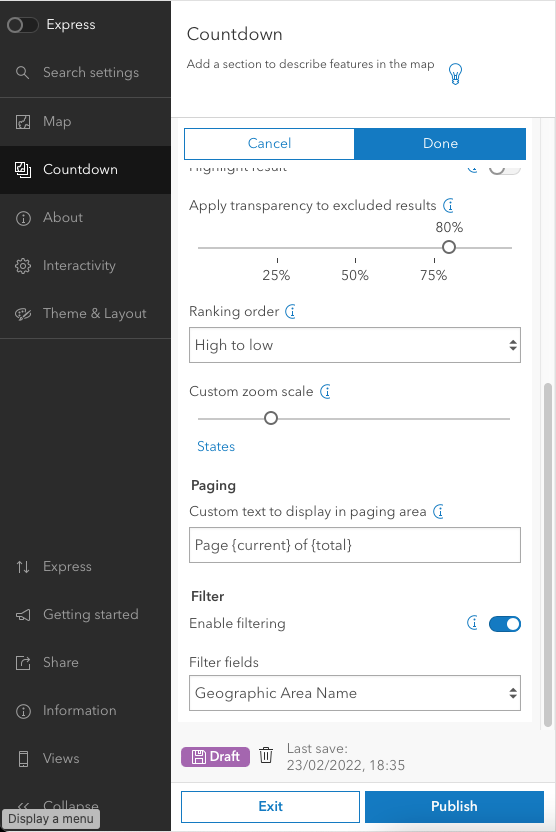
Click Done.
Now click the three dots next to Leaderboard and select Delete.
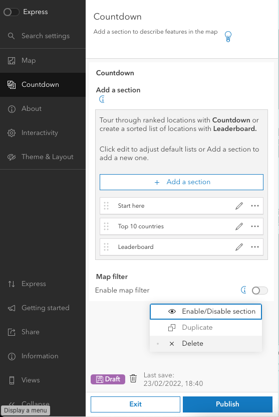
Now Add a section.
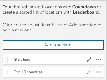
Select Details from the Section drop-down menu.
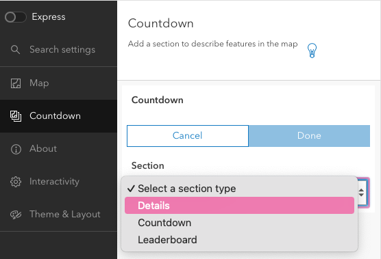
Configure as follows:
- Details section name: 'Credits'
- Details section title: 'Credits'
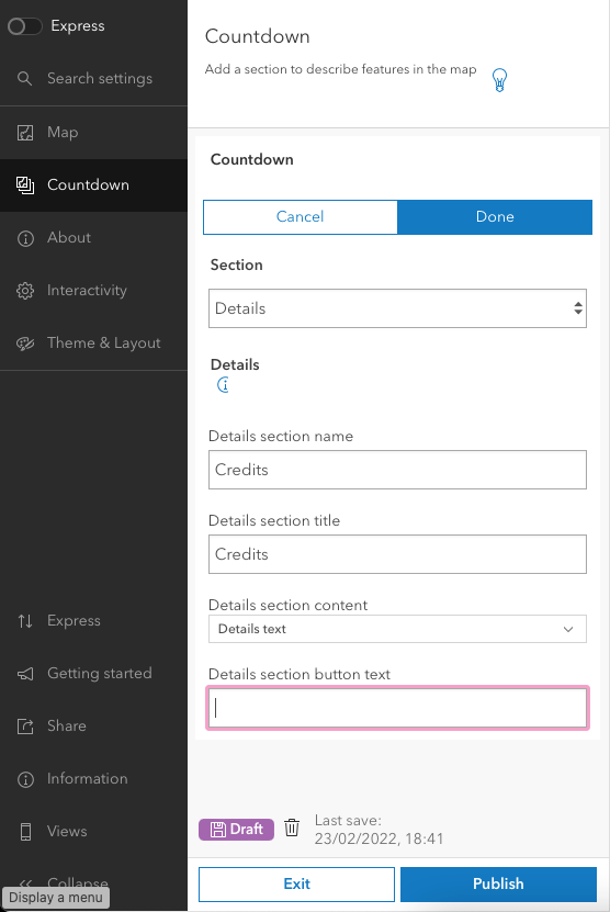
In Details section content, add something similar to the text below (adjusting the authorship, obviously).
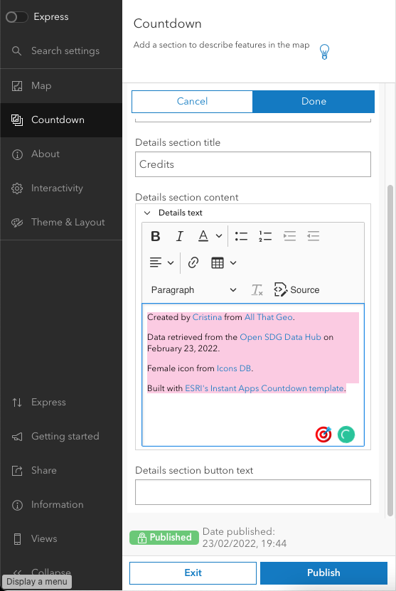
Click Done.
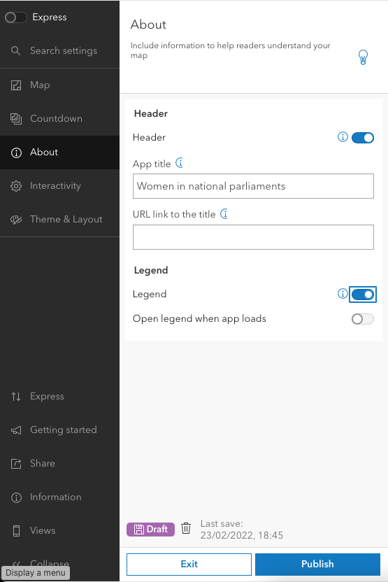
Moving to the About section on the left, enable Legend.
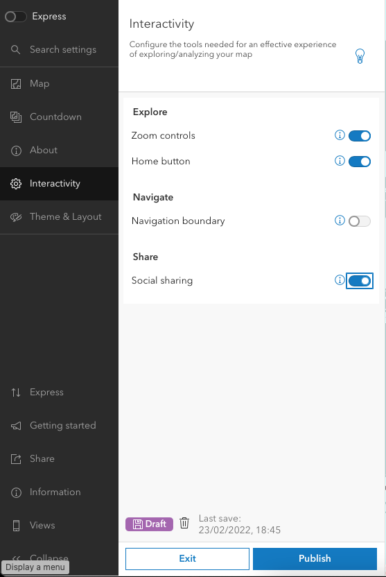
In Interactivity, enable Social sharing.
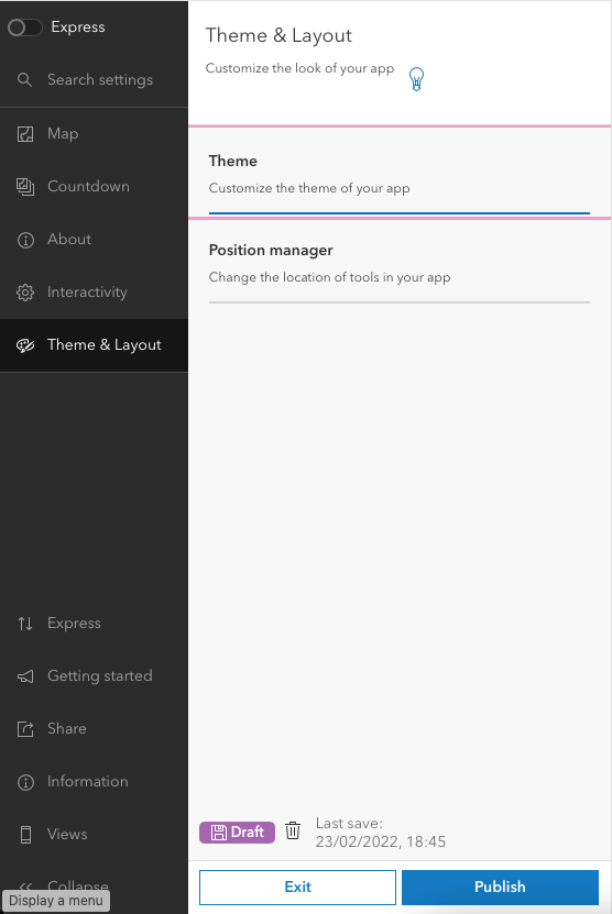
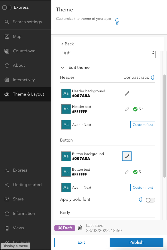
In Theme & Layout, select Theme.
Expand Edit theme and change both header and button background to #007a8a.
4 Share your work
Choose → Prepare → Create → Share
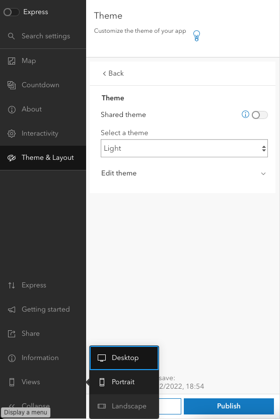
Click on Views (on the left) to ensure the app will show correctly in different screen sizes.
Finally, hit Publish and click Confirm.
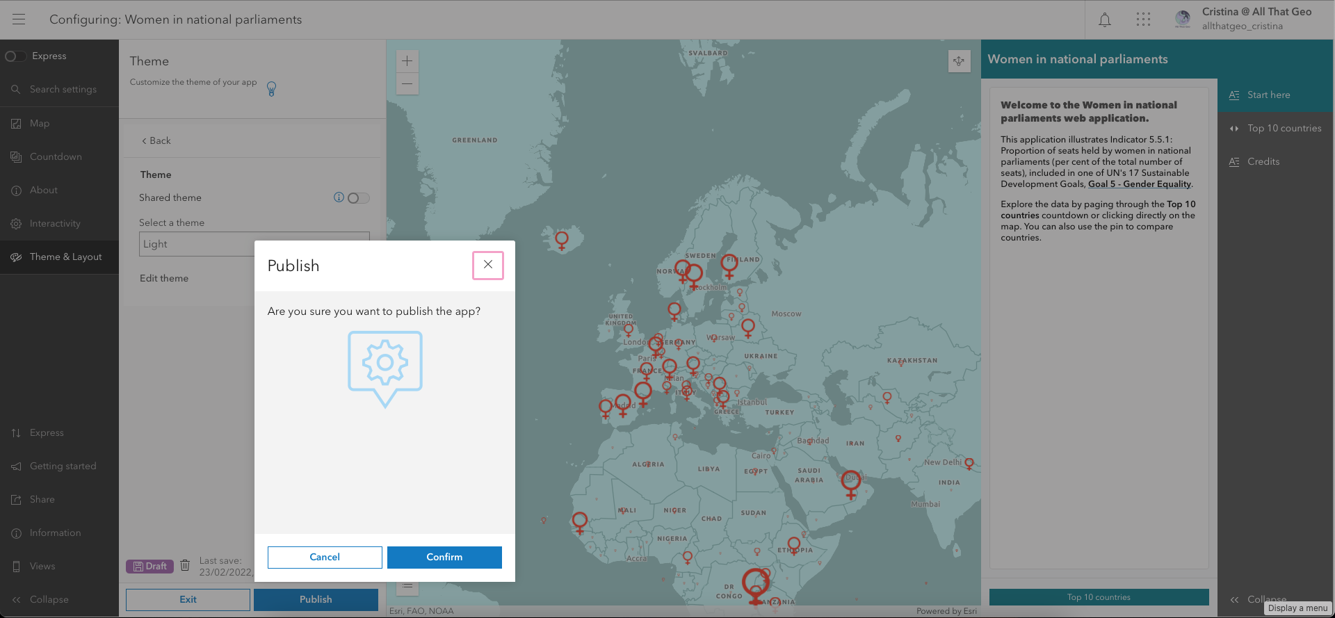
We are now warned that the app is not shared with the public. Click on Change share settings.
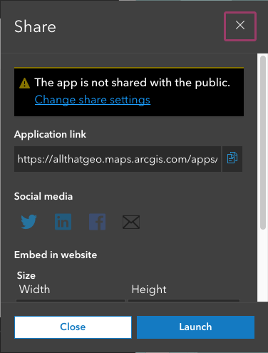
Go back to the app's Overview page and click Share (on the right).
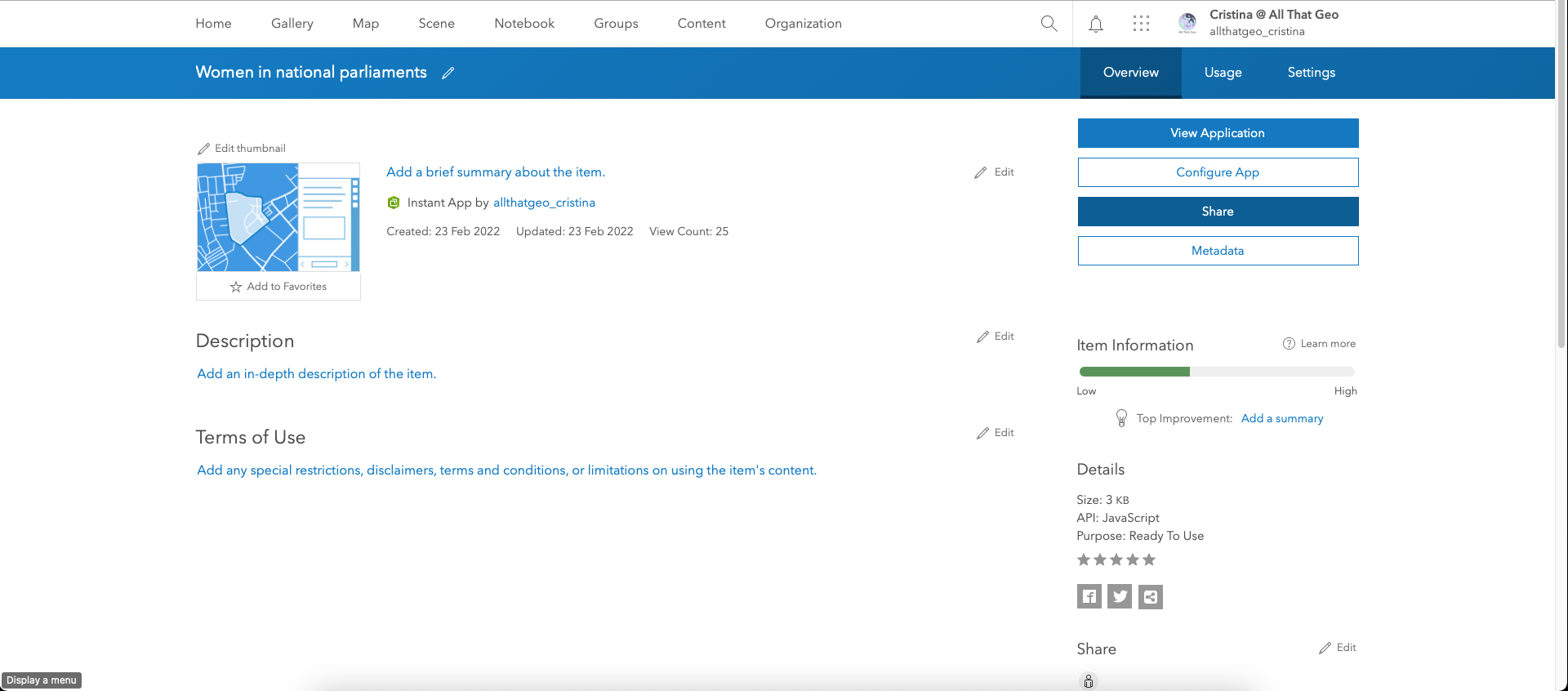
Choose Everyone (public) and hit Save.

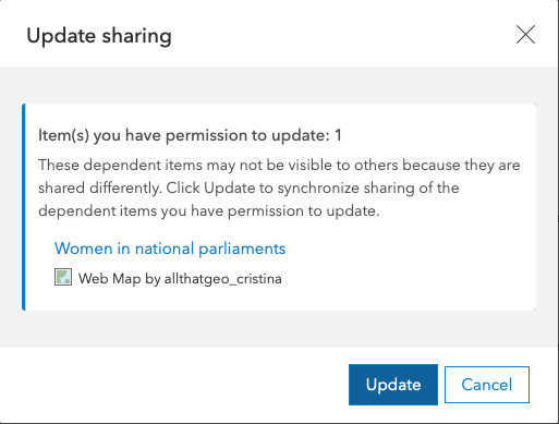
Click Update to update sharing of the web map.
Now copy the URL com the lower right of the page.

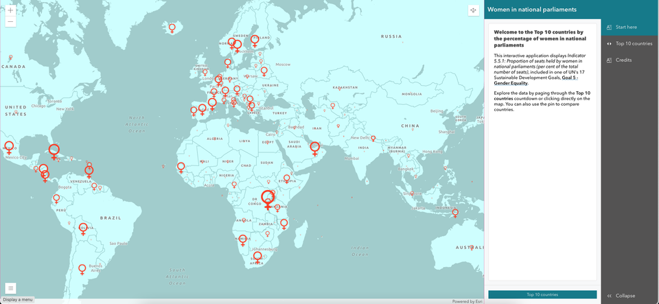
Open it in incognito mode. There's your app - now share away!
Here's mine: https://tinyurl.com/womennationalparliaments 👇
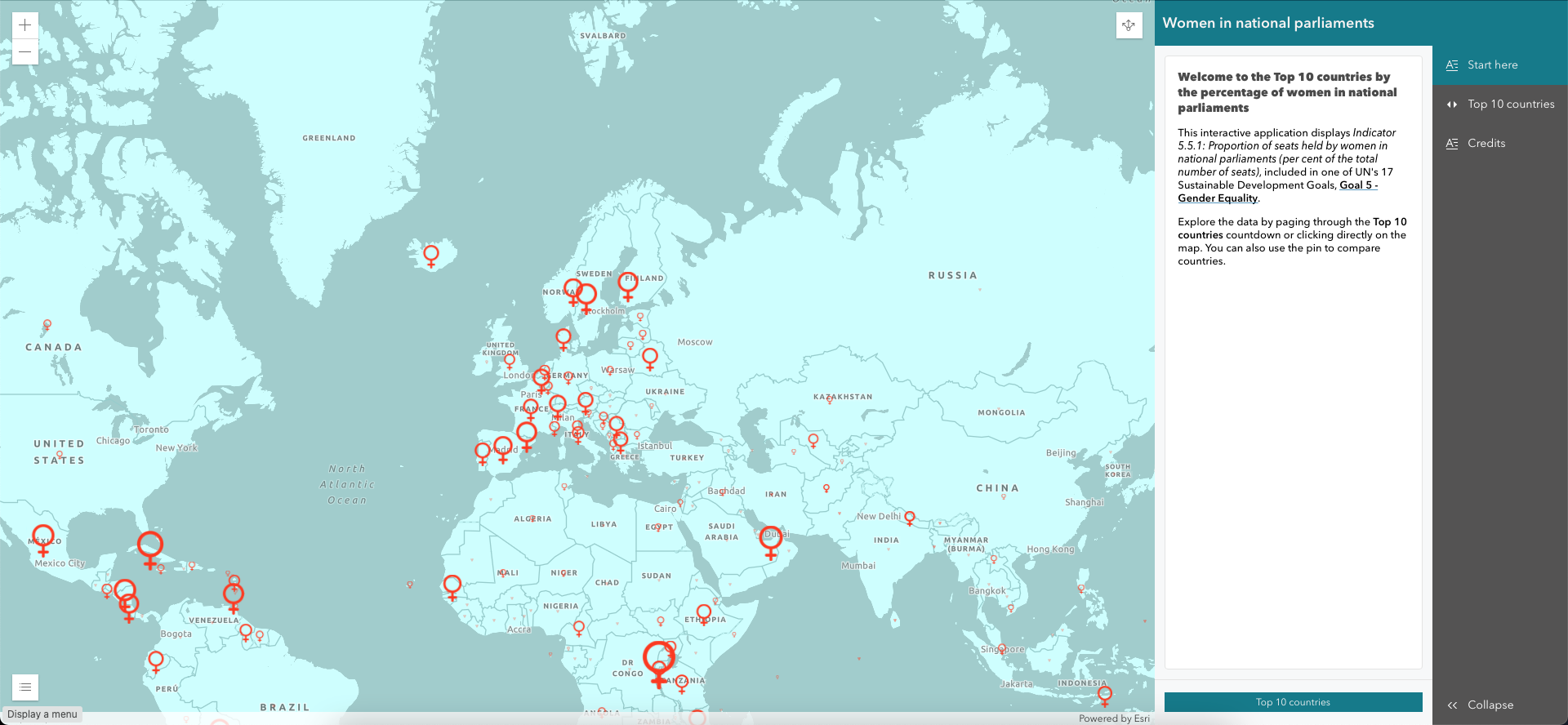
🎉 Congratulations! You have just created an interactive web application with the ArcGIS Instant Apps Countdown template
In this tutorial, you have learnt to:
- Create a web map.
- Use images as icons.
- Add graphs to pop-ups.
- Customise a basemap.
- Set up an app.
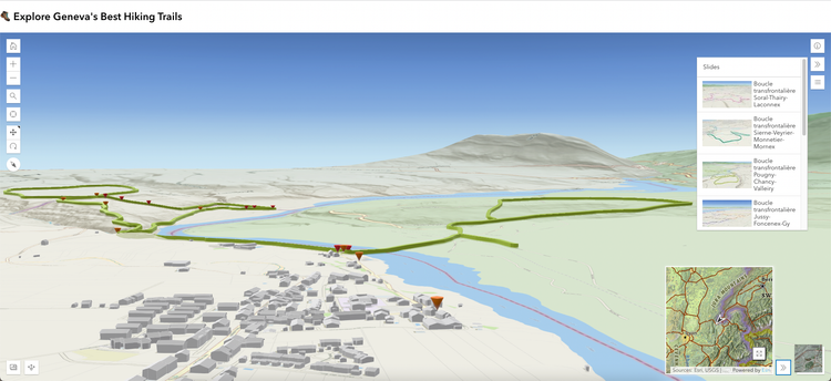
You'll find other examples of the countdown template below:
P.S. I will finish this tutorial by leaving you with an alternative map. If you recall, we highlighted the countries where the percentage was higher than the average when creating the web map. Let's call it the glass half full approach. If we had followed a truly gender equality approach, we would have highlighted the countries where women represent at least half of the seats in national parliaments. Well, this would have been the map:

The Monthly with All That Geo
Want to learn how to use ArcGIS Online for spatial, data-driven storytelling? Sign up for The Monthly with All That Geo and I'll deliver a new example of an interactive web app straight to your inbox every month.
You'll get a behind-the-scenes look at how it was built—from the data collection process through the final app—so you can practice your own data visualisation skills and unlock your creativity as you go.
If you want to find inspiration to start a project that will make a difference in your study area or work, sign up for The Monthly with All That Geo!
Member discussion