
Tutorial – How to create a 3-in-1 app to crowdsource data, perform analytics and share stories
A few months ago, I dedicated myself to a special pet project (pun intended): I wanted to share my dog Frenchy's life story with others.
But, you know, there are so many touching stories about greyhounds out there...
So, in addition to sharing Frenchy's story, I thought about a way I could collect other greyhound stories and showcase them. I wanted to create a web page where greyhound owners could add their dog's stories and meet other greyhounds.
All in one app, if possible!
And then I thought: how cool would it be if there were some analytics to detect trends amongst those dogs' behaviours?
Well, I admit, a bit too ambitious for just one app. But I wanted a one-stop app for greyhound stories so that people wouldn't have to access different apps, whether they were submitting stories or meeting other greyhounds. In other words, I wanted to maximise the user experience when visiting the web page.
The risk was that the app would look messy and unusable.
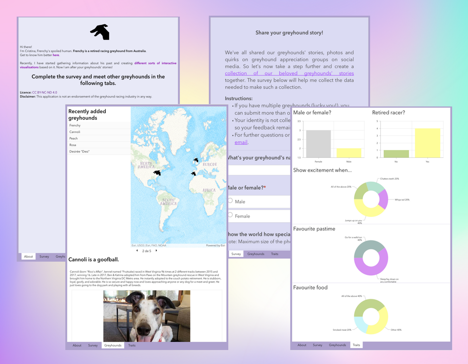
But first things first. I knew that I had to start with a survey to collect those stories. Then, I would be able to show the results in the form of a dashboard (you can tell stories with dashboards, too 😉). Finally, I knew I had to be mindful of the user interface since all these items were to show. And that was the trickiest part since dashboards usually look bad on mobile...
That's when I found a way to make the dashboard look great in every screen size: by using the Experience Builder 🙌
So, in this tutorial, I'm sharing the step-by-step workflow I followed to build a 3-in-1 web app that allows for crowdsourcing data, performing analytics and sharing stories while looking good on both desktop and mobile:
- Choose the tool(s): Survey123, Dashboards, Experience Builder.
- Prepare the data: configure a survey to crowdsource data and prepare a web map to display greyhounds' locations.
- Create a visualisation: make a dashboard (items include a map, list, text, photos, charts, and embedded content), customise it and set up actions between the items.
- Share your work: build a dashboard for mobile viewing from the existing dashboard and create a web experience to show the dashboard in different screen sizes.
🤔 But Cristina, how can this kind of 3-in-1 web app be helpful to me?
- You want to collect data from users, visualise their submissions and perform analytics on the fly, sharing just one URL.
- You are researching a particular topic that requires crowdsourced data, and you want to monitor the submissions in real time.
- You want to ensure your dashboard shows correctly on every screen size.
Let's get started!
1 Choose the tool
Choose → Prepare → Create → Share
In this workflow, we're going to use three applications from the ArcGIS Online stack of apps:
- Survey123 to collect stories.
- Dashboards to embed the survey, showcase stories and perform analytics on the fly.
- Experience Builder to ensure the dashboard's user interface adjusts nicely to different screen sizes.
You can access these apps in ArcGIS Online; check out the post below for more information on the available options.
 Cristina
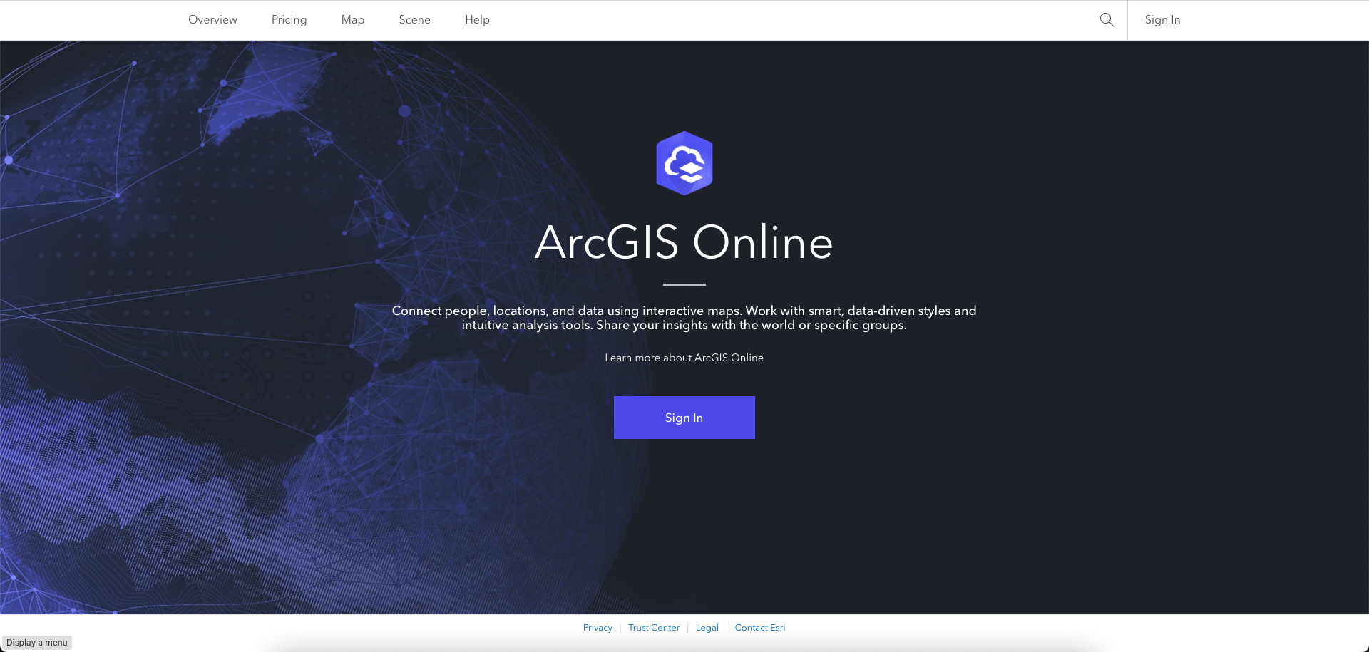
Once you create your account (if you haven't got one yet), you're ready to proceed.
2 Prepare the data
Choose → Prepare → Create → Share
2.1 Configure a survey to crowdsource data
As I mentioned earlier, the data in our 3-in-1 app will be crowdsourced from greyhound owners. That is why we need to create a survey in Survey123.
Sign in to your ArcGIS Online account.
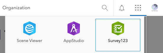
In the app launcher (the button with the dots in the top bar), select Survey123.
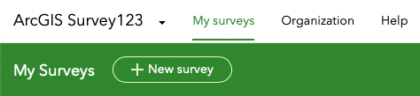
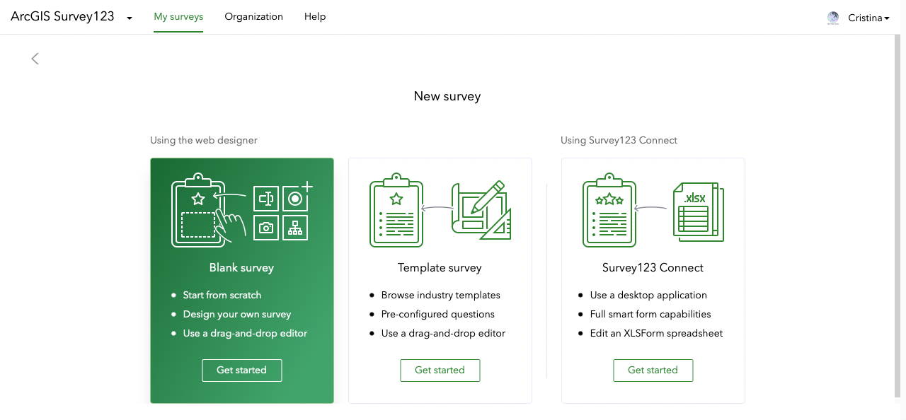
Click on + New survey.
From the three options shown, choose Blank survey.
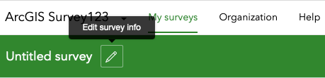
Click on the pencil to Edit survey info.
Let's now give the survey a Name.
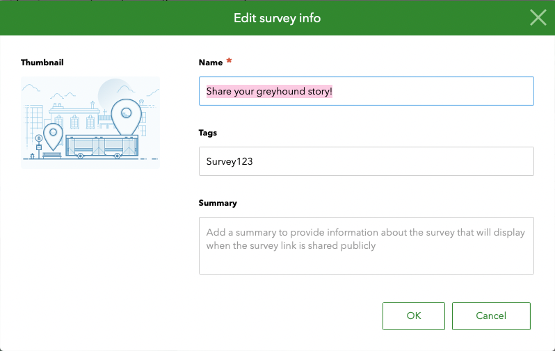
Click OK.
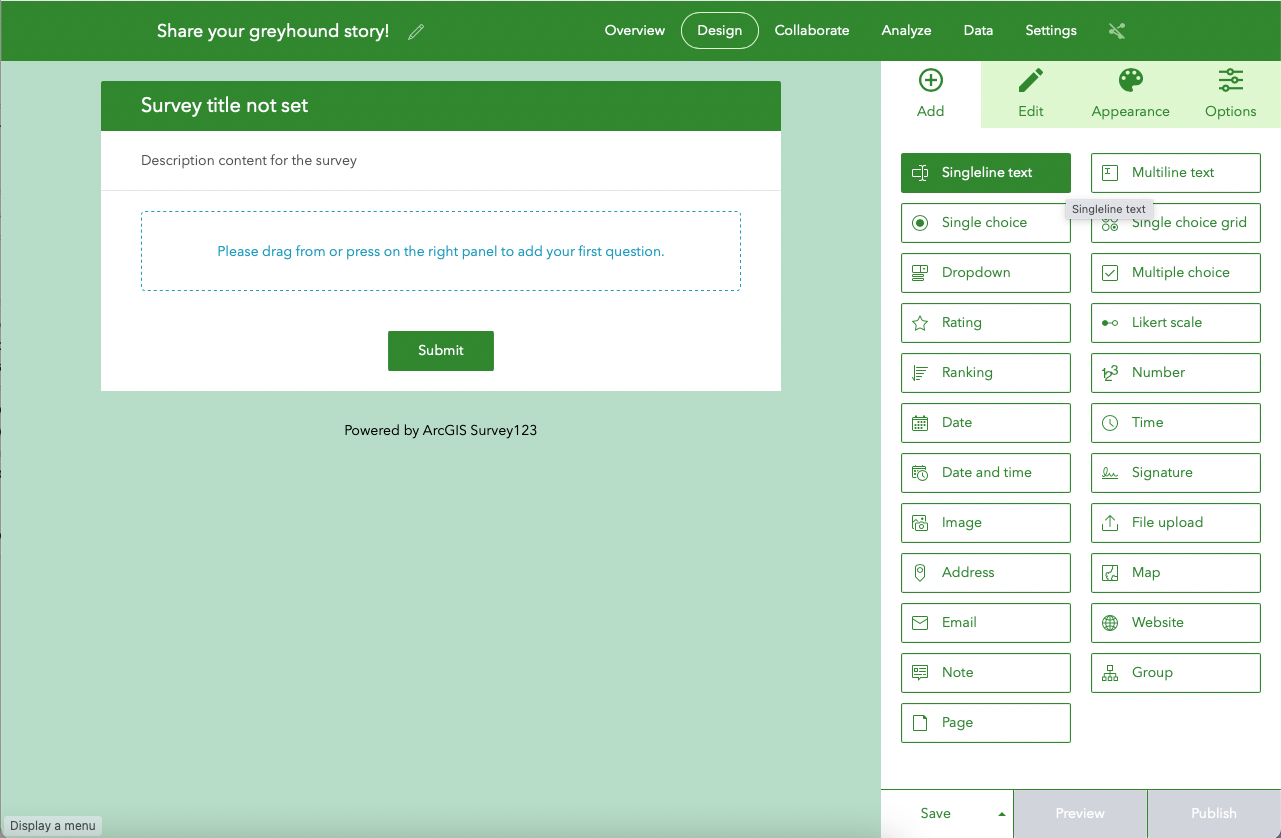
You are now taken to the Design section of the survey.
Notice the tabs on the right: Add, Edit, Appearance and Options. Let's start with Add.
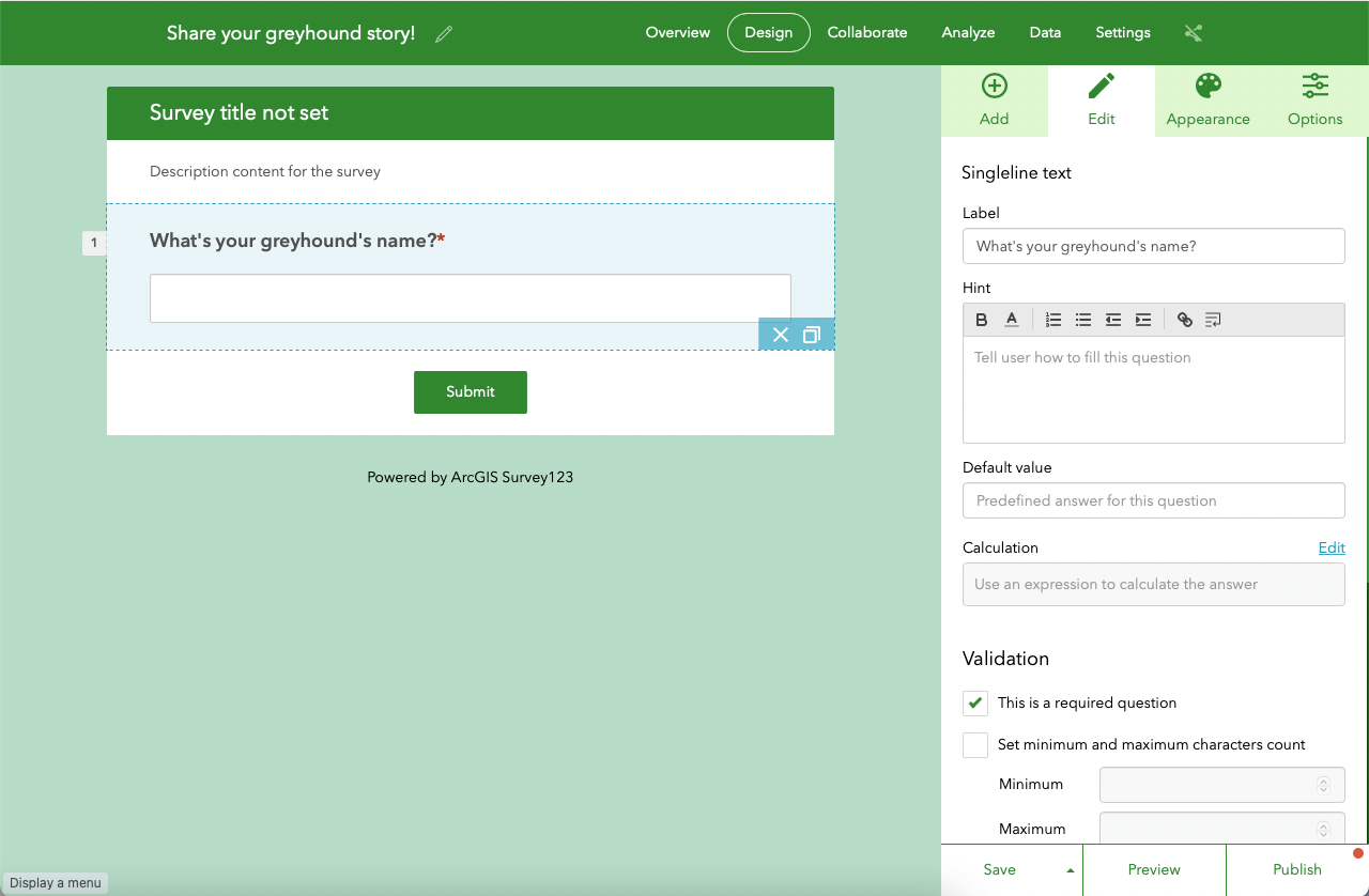
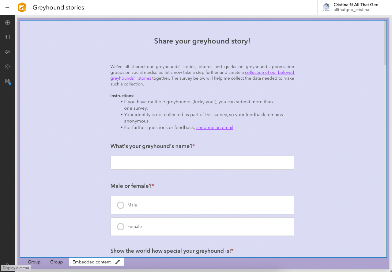
Here, you’ll choose the type of questions you want to add to your survey form. Start with Singleline text.
You are taken to the Edit tab. There, add a Label ('What's your greyhound's name?') and tick the This is a required question checkbox.
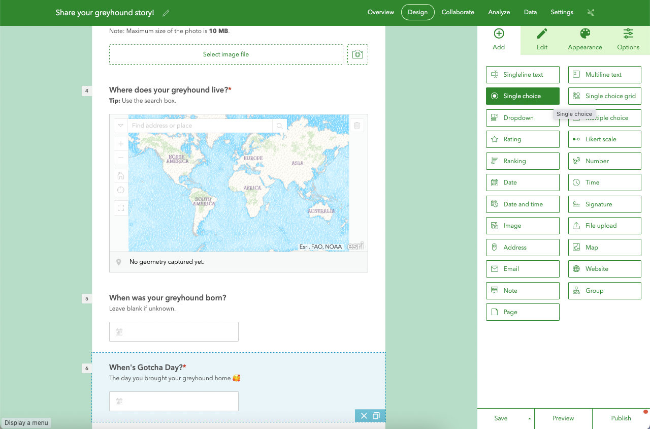
Go back to the Add tab and choose Single choice.
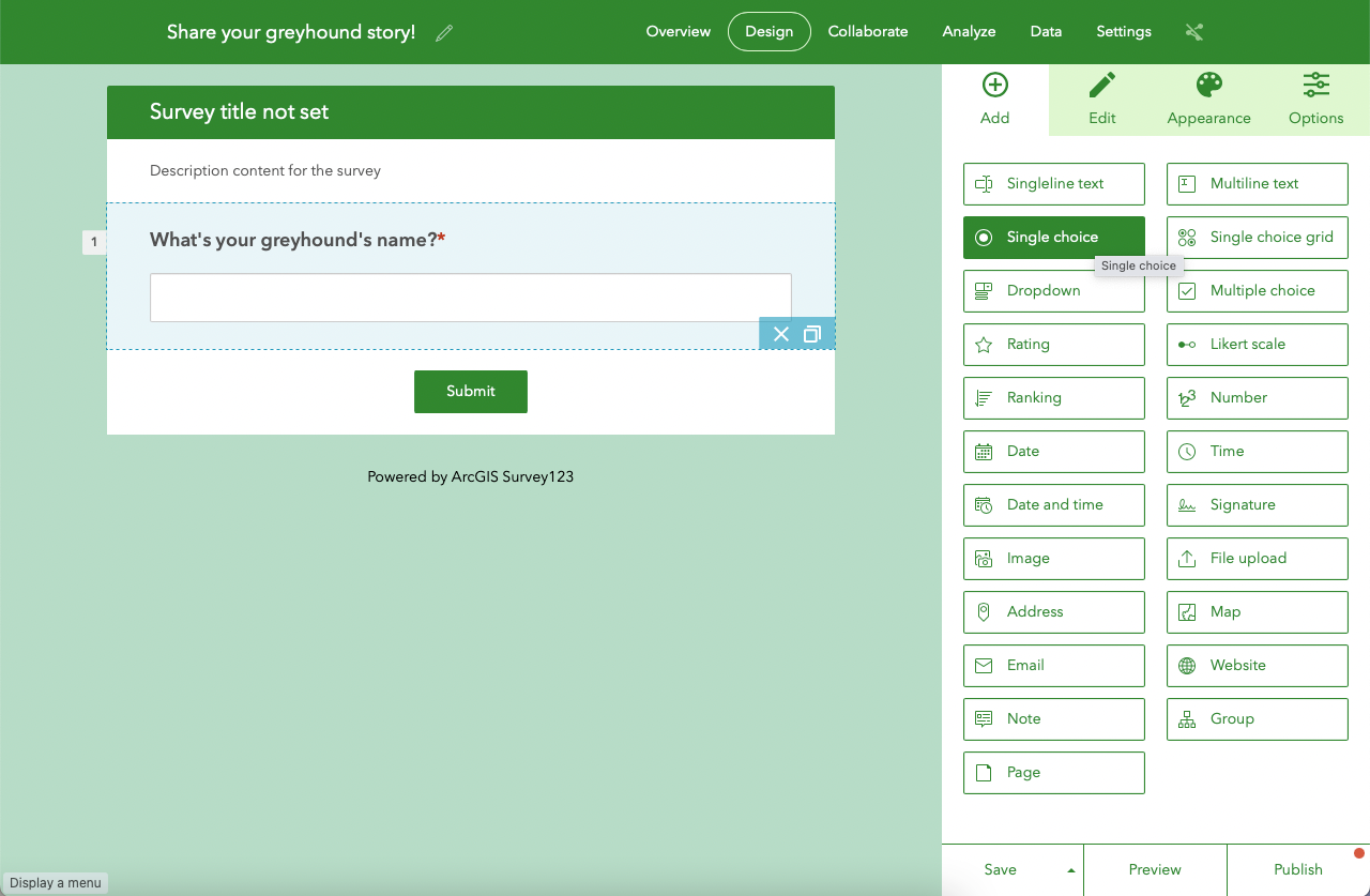
In the Edit tab, add a Label ('Male or female?').
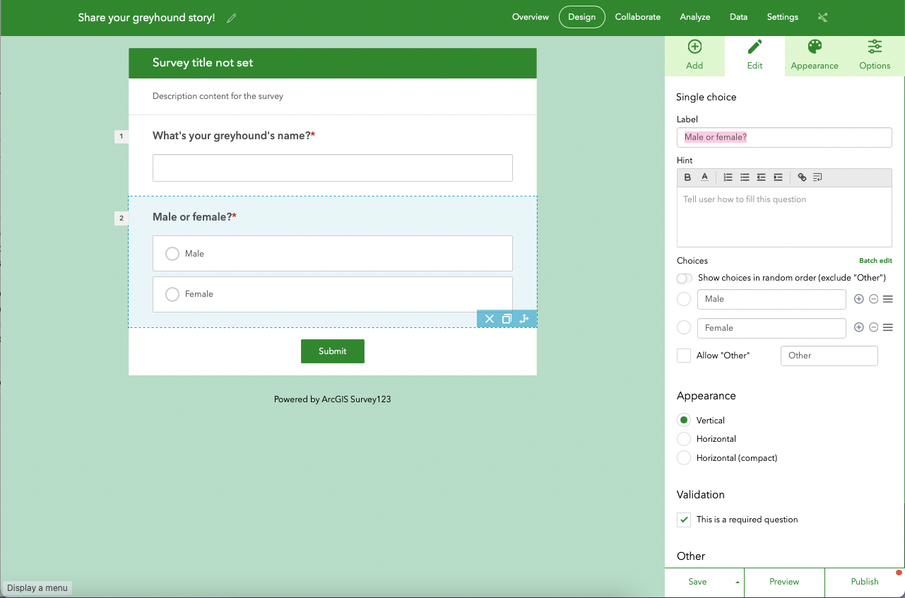
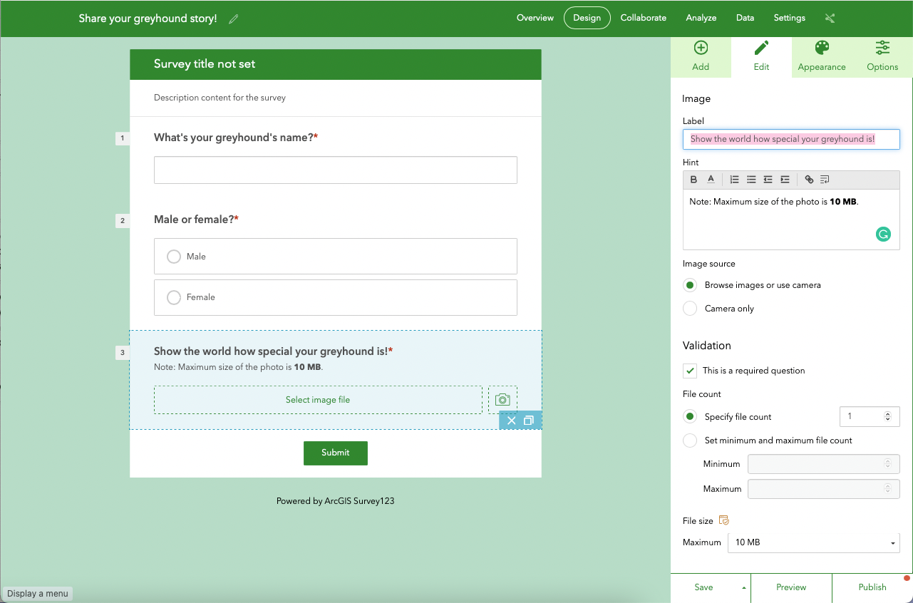
Return to the Add tab and choose Image.
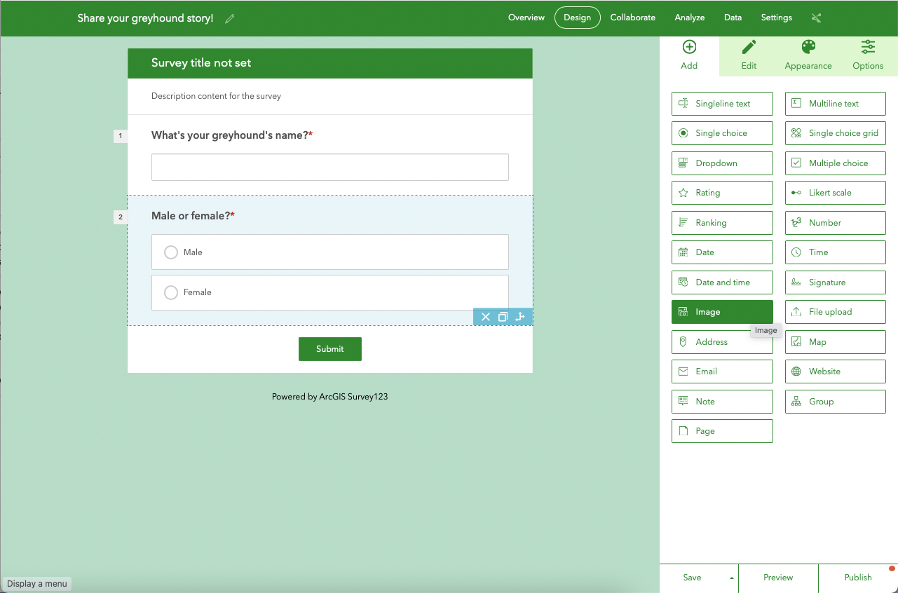
In the Edit tab, enter a Label. Also, give the user a helpful Hint such as the one below:
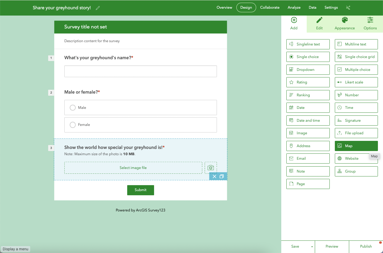
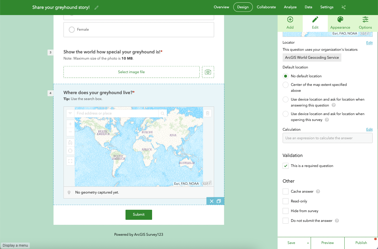
Go back to the Add tab again and choose Map.
In the Edit tab, enter a Label and a Hint text like so:
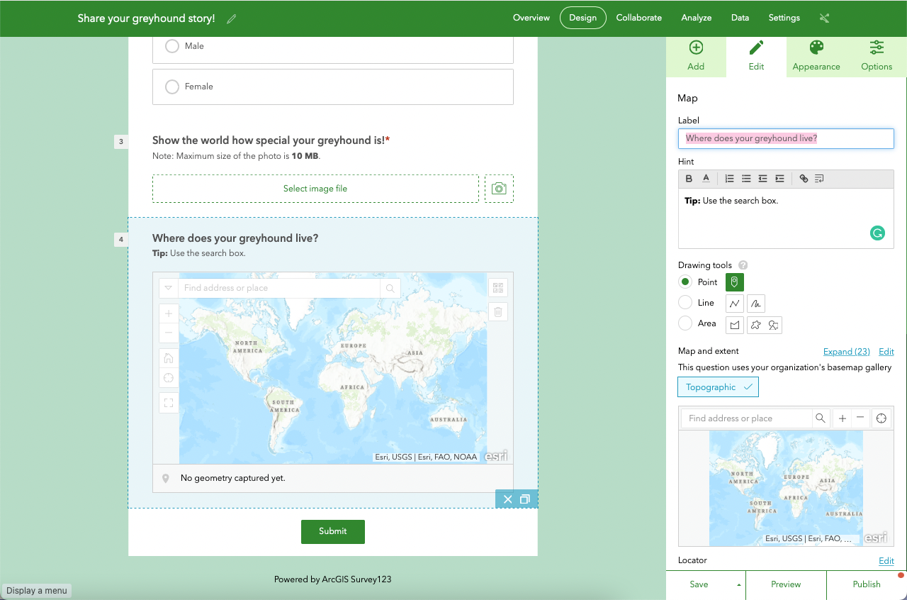
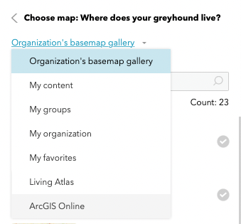
Let's now focus on Map and extent. Click on Edit. Then, change the basemap if your wish.
Under Default location, select No default location. In this case, users will have to add their location manually. That is OK; they may prefer not to share where they live with their greyhounds with great geographic precision.
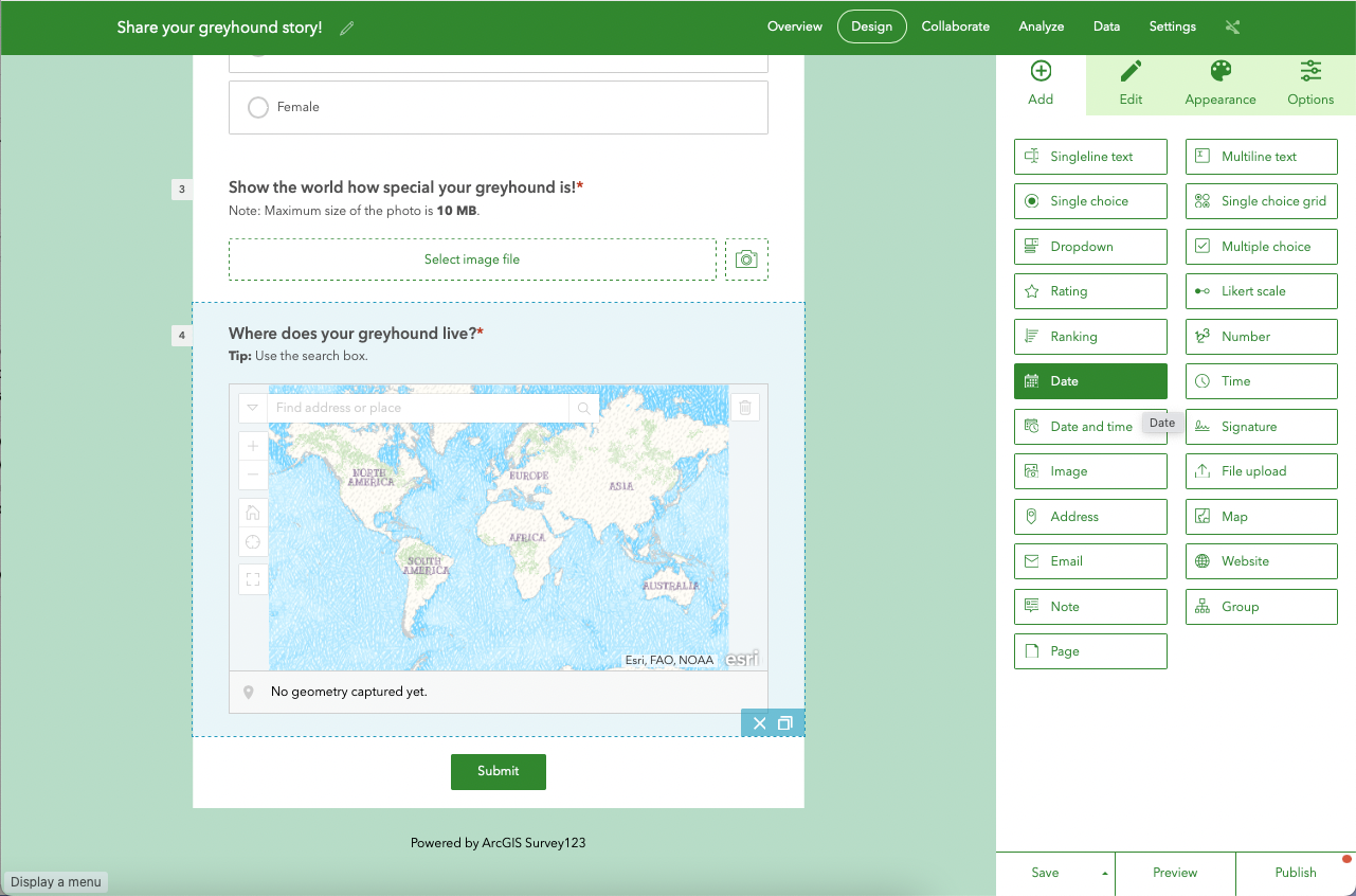
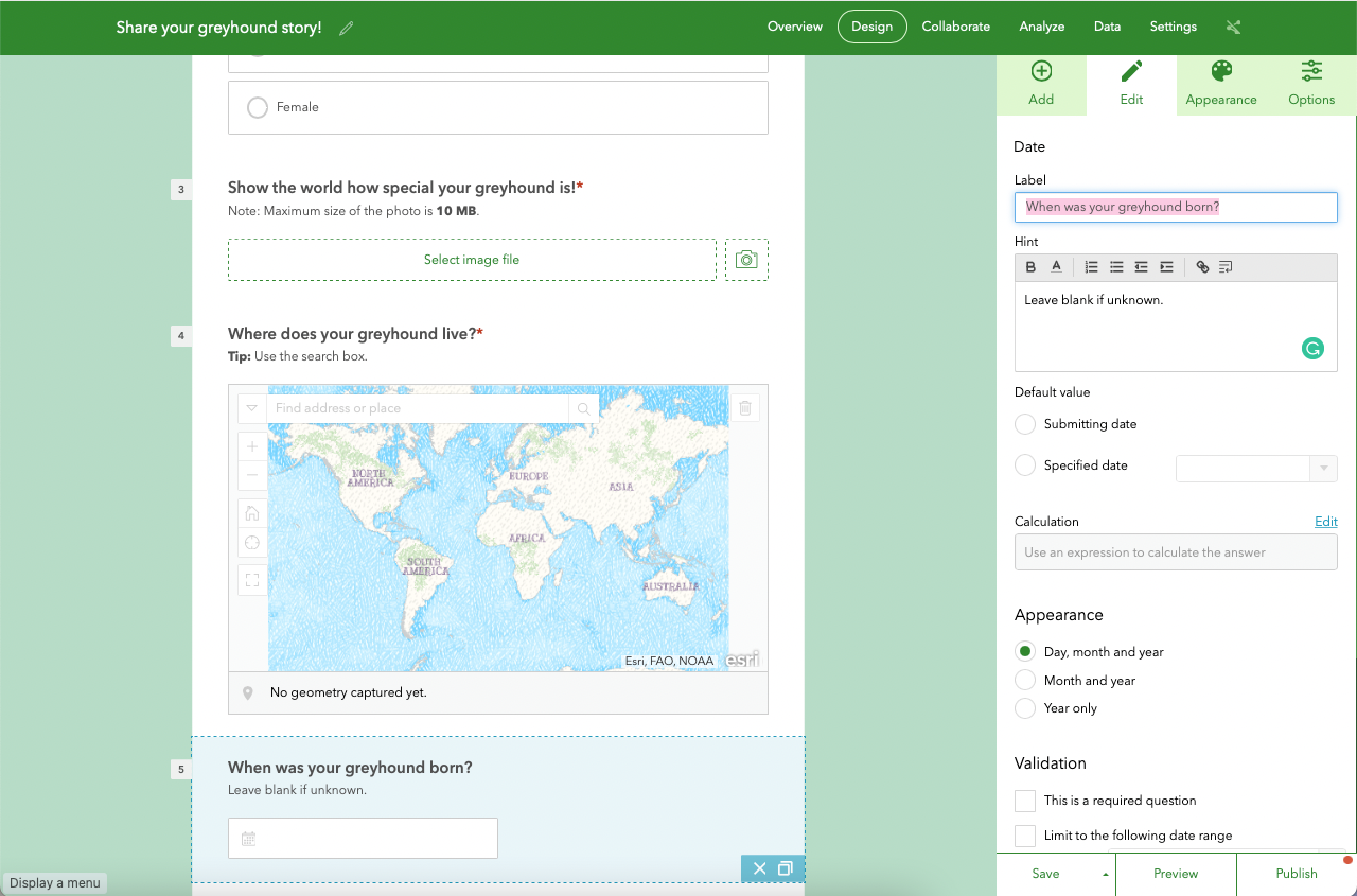
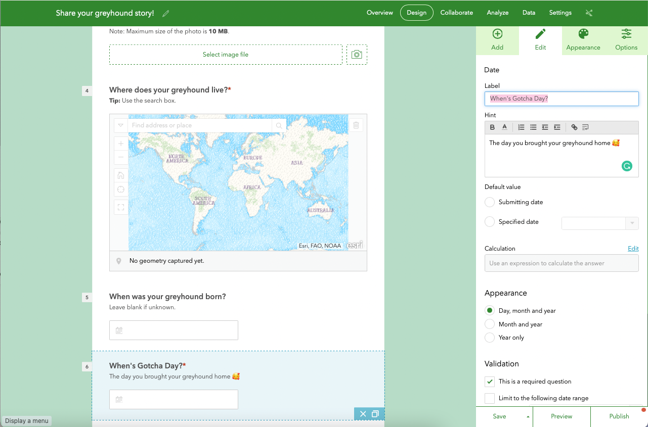
Go back to the Add tab again and choose Date.
Enter a Label and a Hint like so (leave This is a required question unchecked):
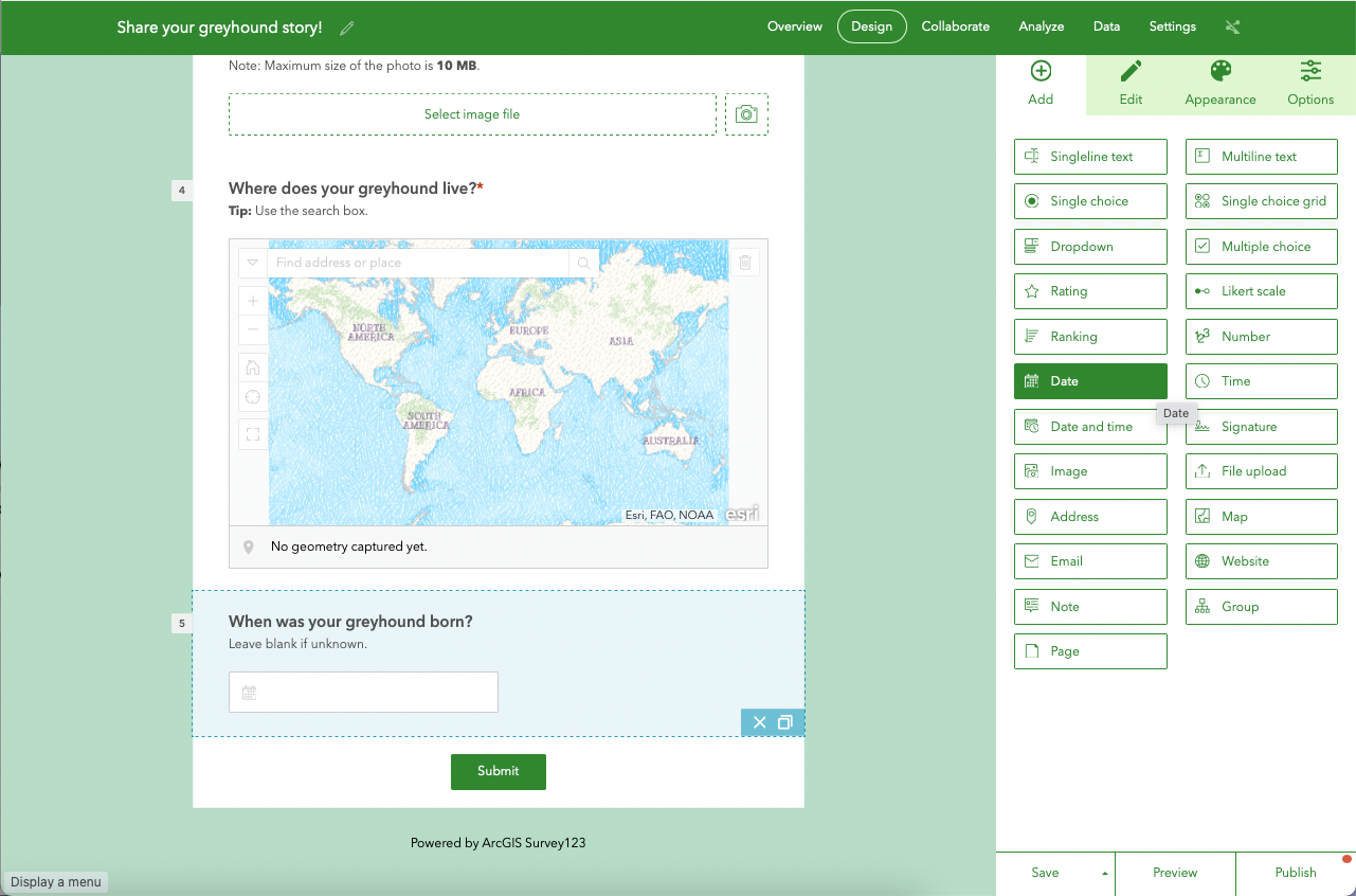
Go back to the Add tab and choose Date again.
Enter a Label and a Hint like so:
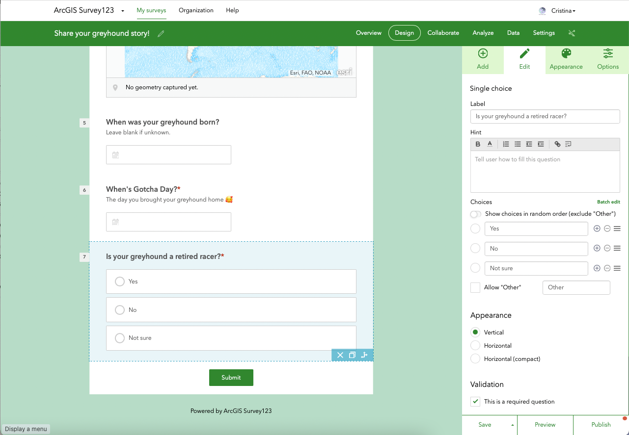
Go back to the Add tab again and choose Single choice.
Enter a Label like so.
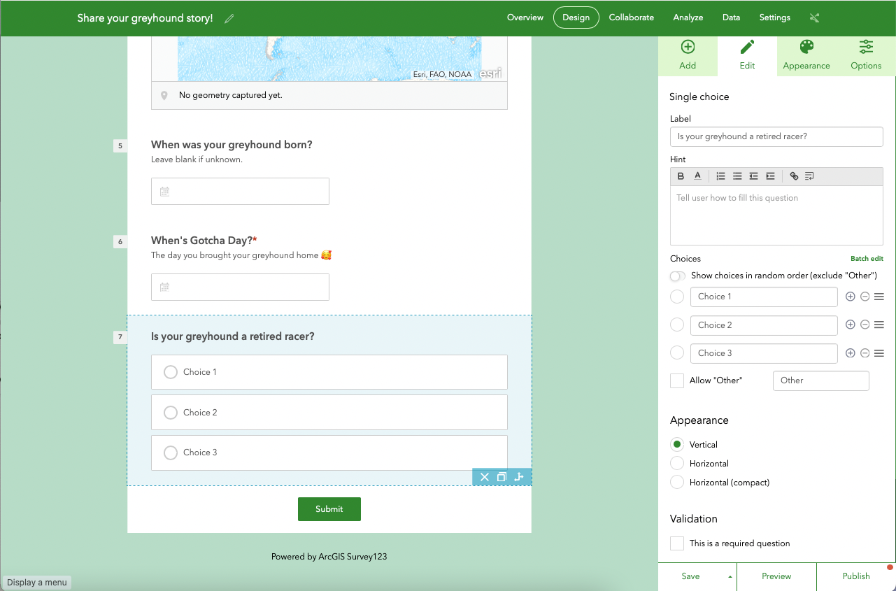
Let's now focus on the Choices section. Click on Batch edit and enter the following:
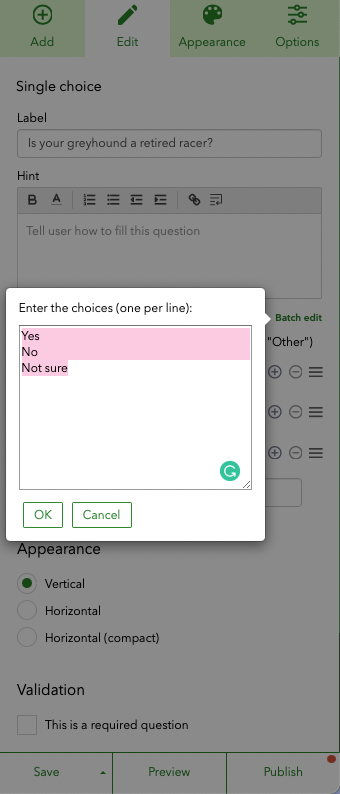
Click OK.
Make sure it does look like the screenshot below.
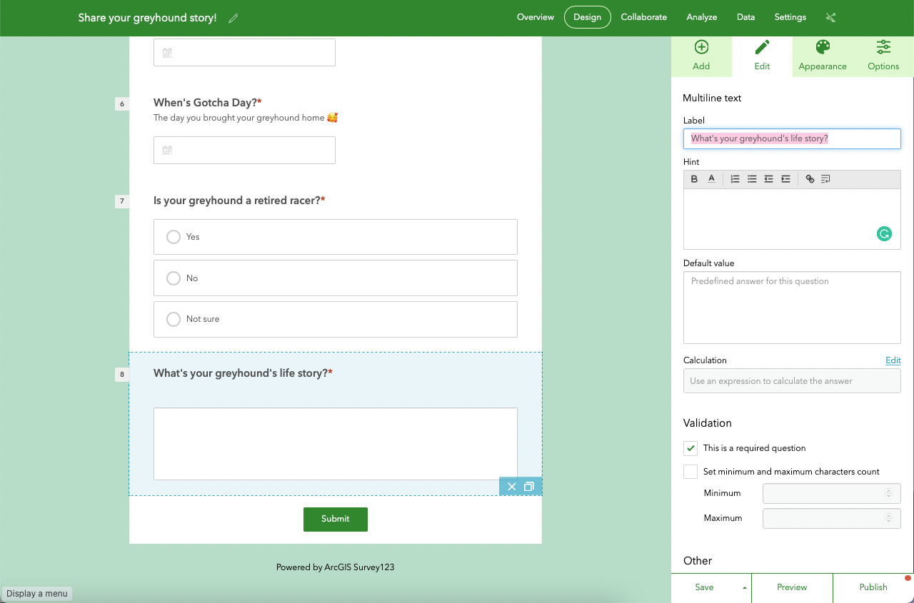
Go back to the Add tab again and choose Multiline text.
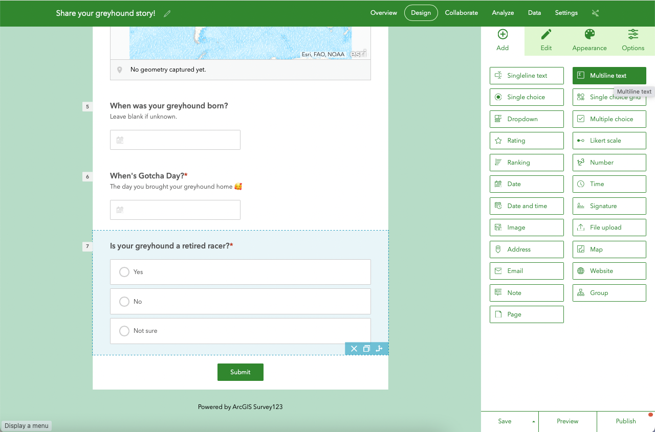
Enter a Label like so:
Now, we're going to add three questions about the dog's personality. They all have a similar structure to the 'Is your greyhound a retired racer?'.
Go back to the Add tab again and choose Single choice. Enter a Label and Choices, not forgetting to tick the Allow "Other" checkbox and define it as 'Other':
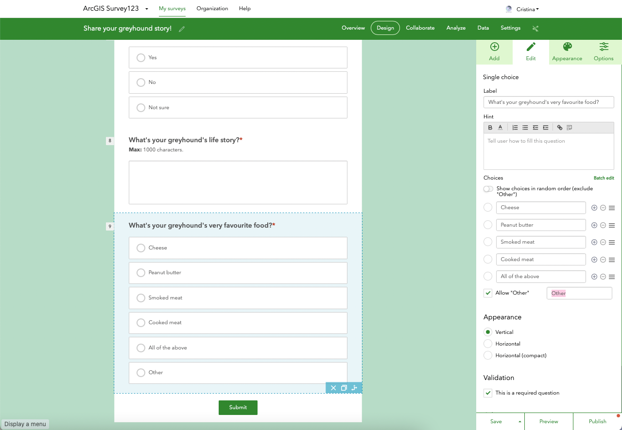
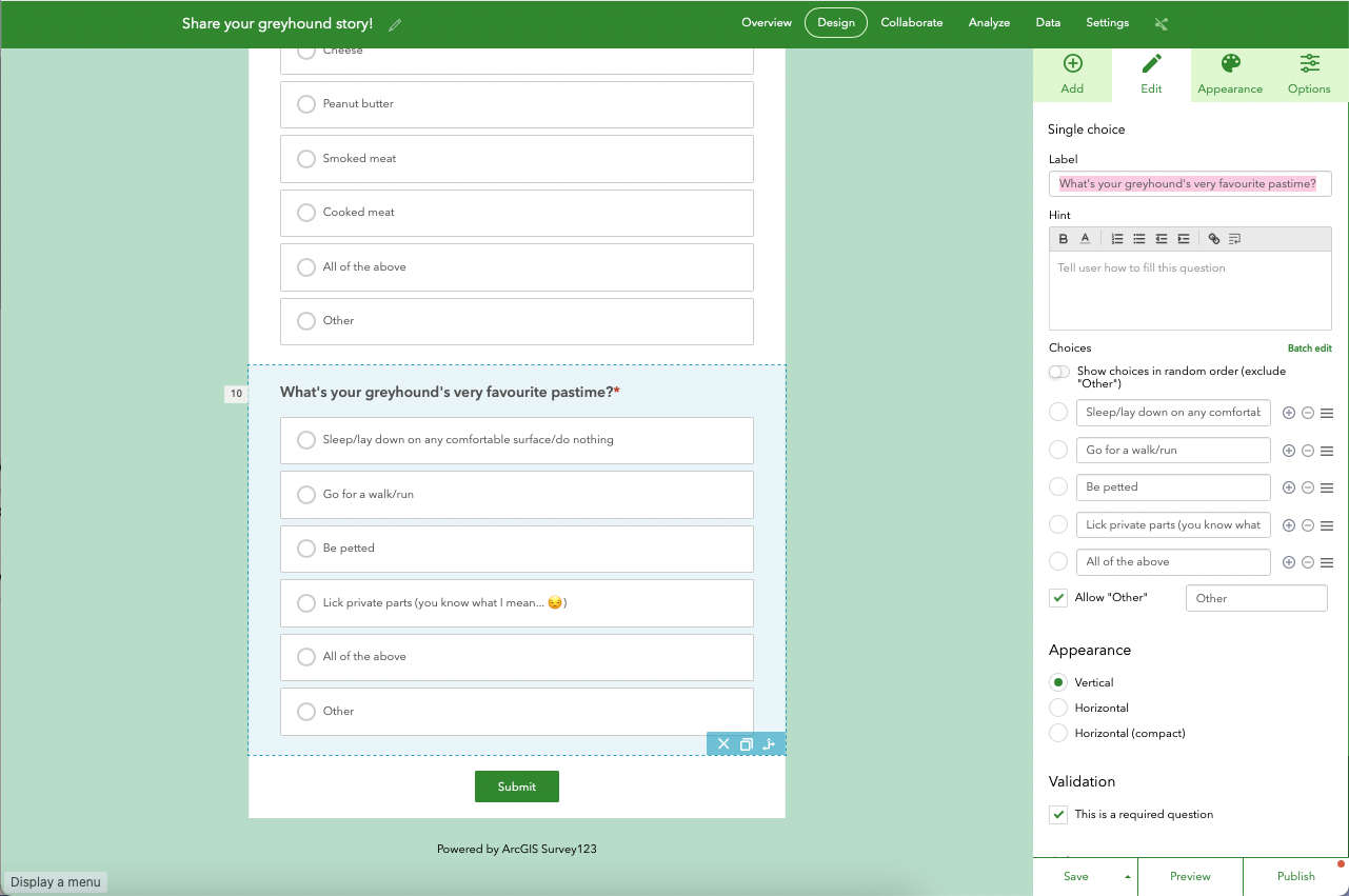
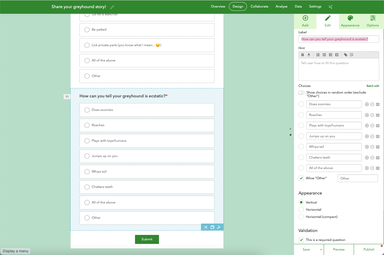
Repeat the process for the following two questions. You've probably got a good grasp of it by now!
- What's your greyhound's very favourite pastime?
- How can you tell your greyhound is ecstatic?
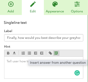
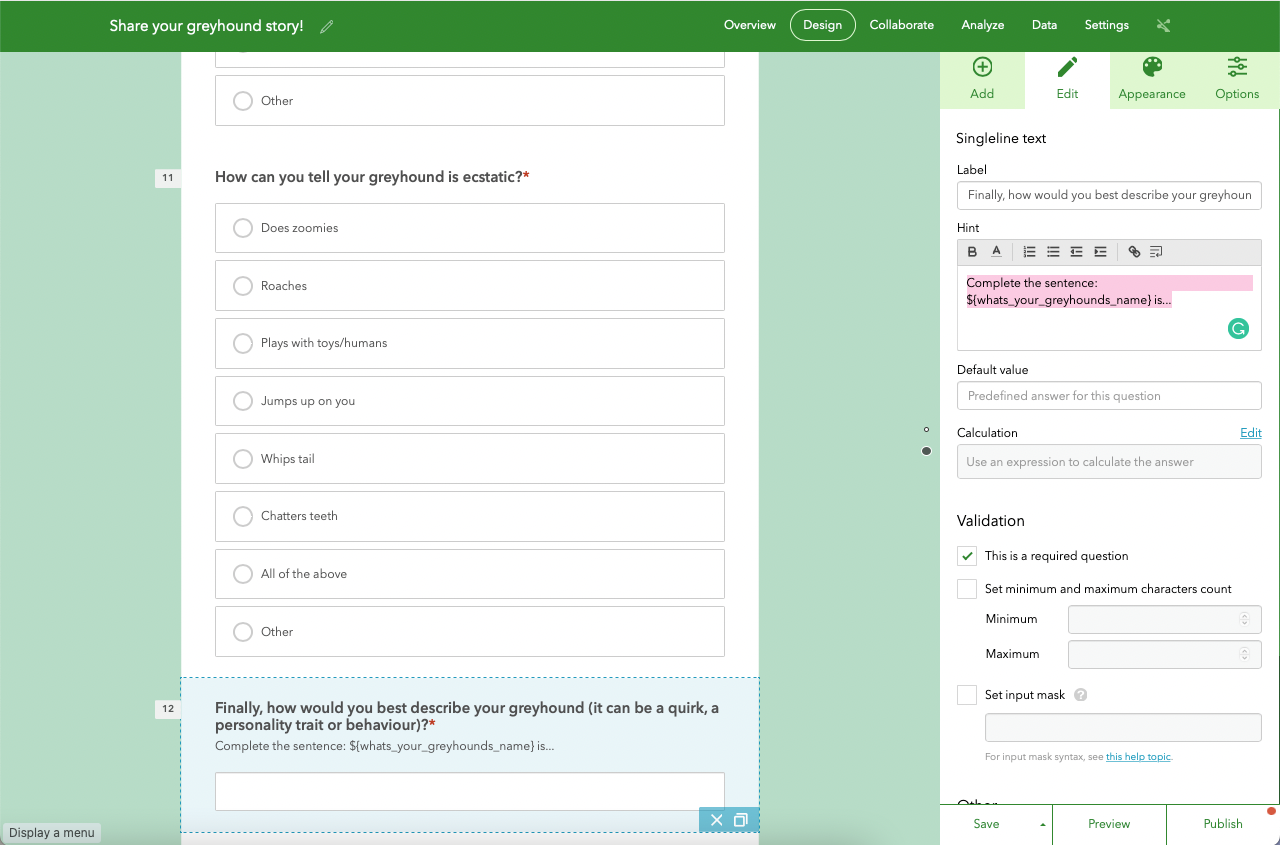
Go back to the Add tab again and choose Singleline text. Enter a Label 'Finally, how would you best describe your greyhound (it can be a quirk, a personality trait or behaviour)?' and, under Hint, click the last icon to Insert answer from another question.
Choose the first question.
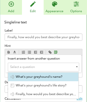
Now make sure you complete the Hint with more text, like so:
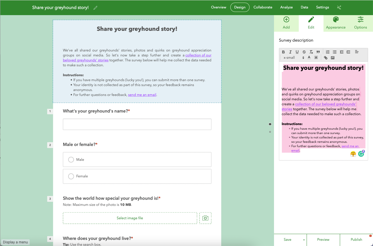
Now we have all our survey questions. Click on the top of the survey, where you see Description content for the survey. Delete the text on the right.
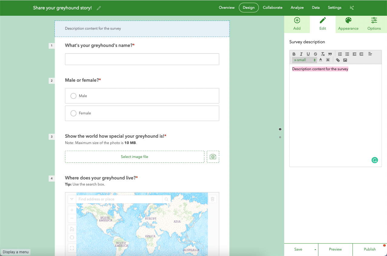
Here, you want to let users know what the survey is about. Of course, its success will depend on how well you describe your endeavour! Feel free to add the text of your choice.
Hit Save (if you haven't done so yet).
Now that we have defined all questions in the form, let's move on to the Appearance tab.
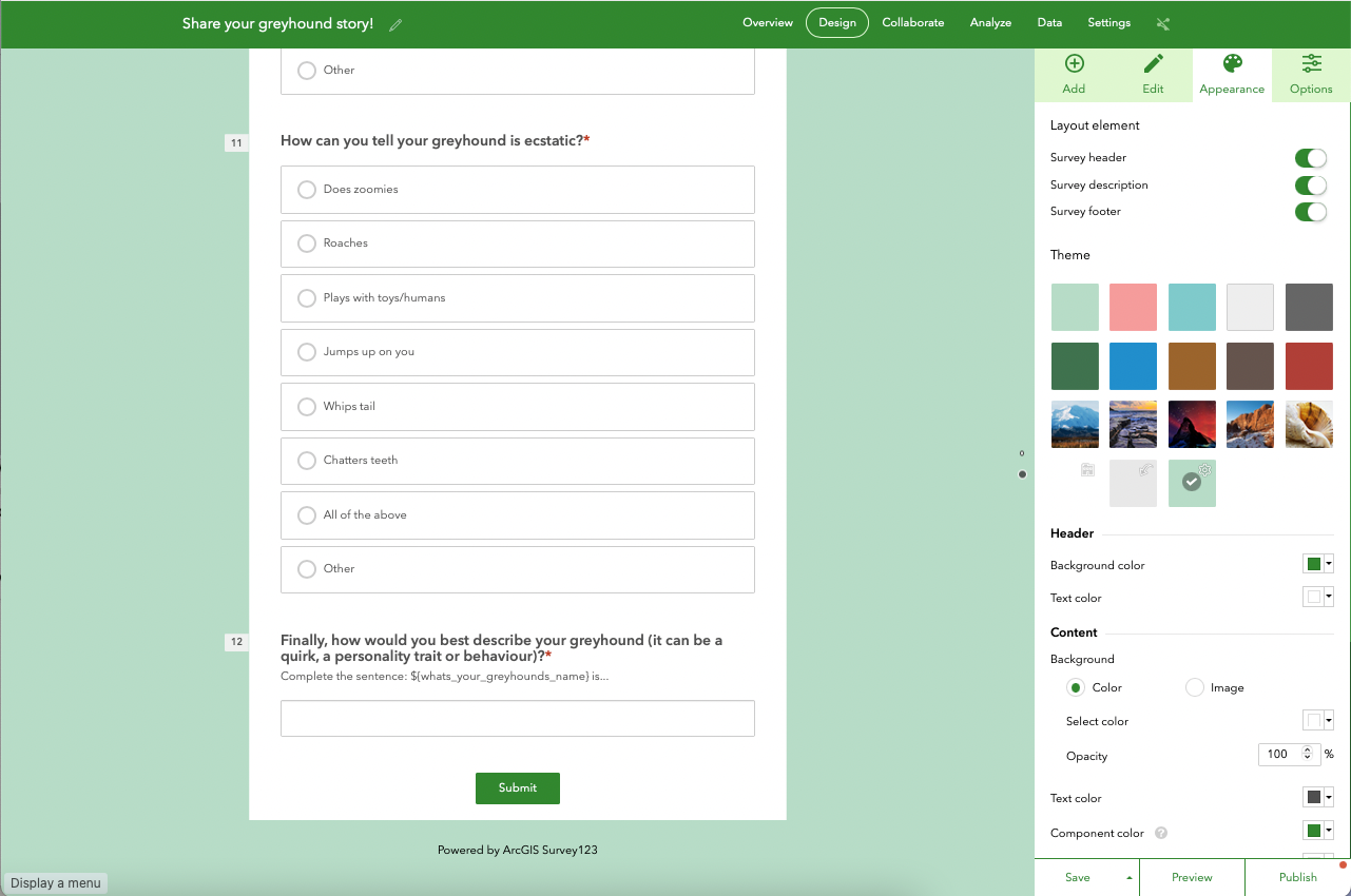
Make sure only Survey description is enabled. As for the colours, feel free to choose yours!
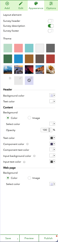
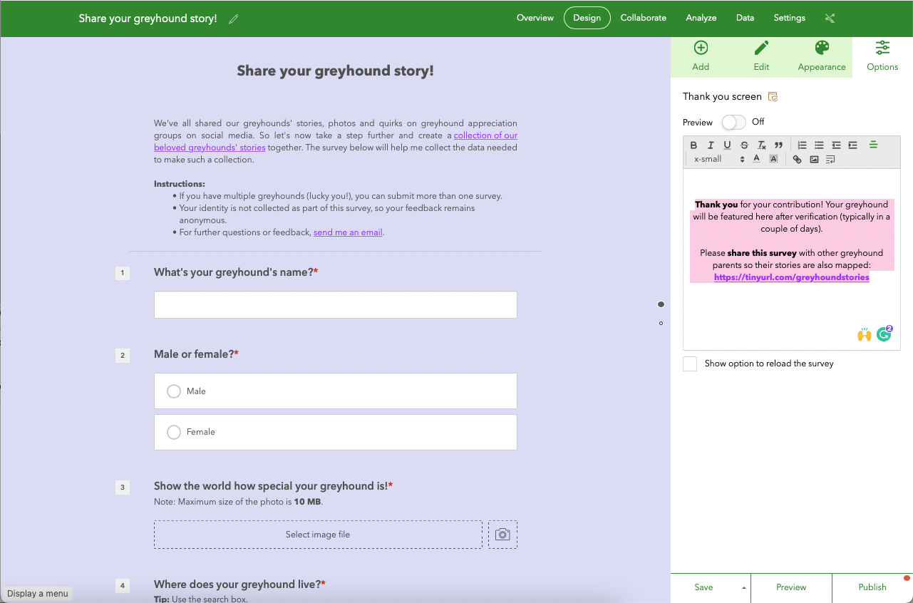
Let's now move on to the last tab, Options. Here, you'll customise what the respondents see after their submission. Delete the existing content and enter a text of your choice. This is probably the best time to thank your respondents and let them know about what will happen to their contribution.
Hit Save.
Now that we finished setting up the survey, we are ready to publish and share it with the world. Hit Publish.
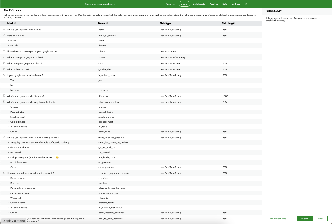
You are now given the option to Modify schema. This will allow you to customise the field name for each form question.
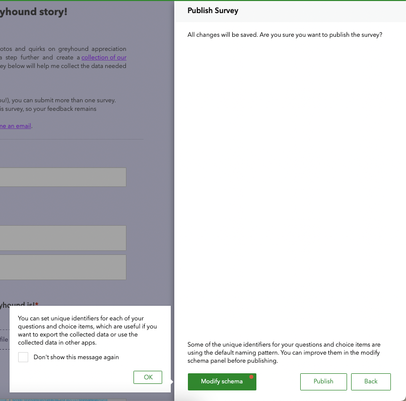
Feel free to change the field names as desired (click on top of the words to overwrite). I prefer shorter names, as you can see below. Once you're done, hit Publish.
Move to the Collaborate section, and in Who can submit to this survey, tick the option Everyone (public). This is necessary to allow the wider public to submit answers to your survey questions. Hit Save.
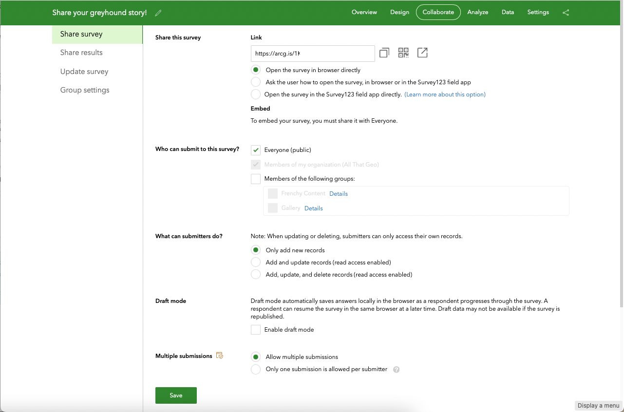
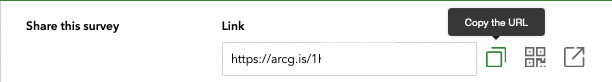
Copy the URL and keep it handy since this is the URL you'll embed in the dashboard later.
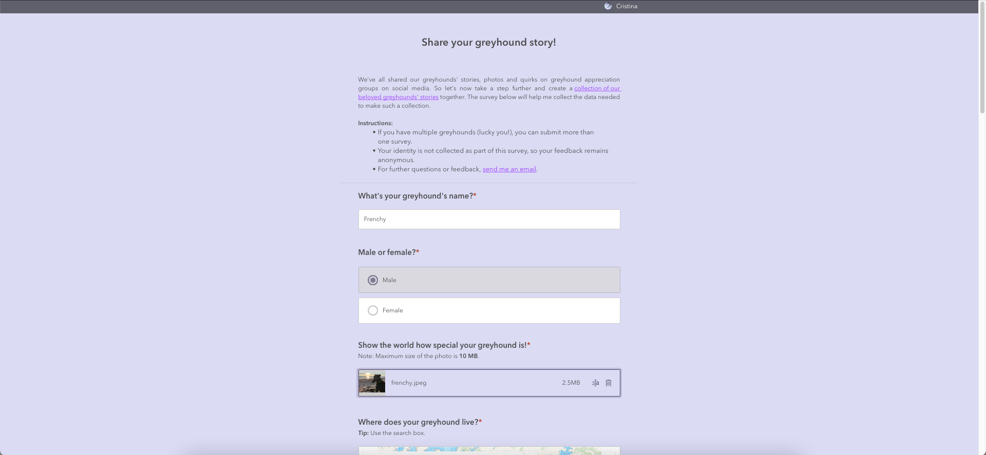
For now, open the survey in a new tab. Submit a response to your survey (it can be a dummy one!). Having a survey response already submitted will help build the dashboard, as you'll see the data being turned into dynamic items.
2.2 Add a vetting field to your survey data model
If you're worried about inappropriate submissions, you may want to have a look at sections 2.2, 2.3 and 2.4 of the following tutorial:
Cristina
2.3 Prepare a web map to display greyhounds' locations
Once you have set up a survey, you can map the responses obtained from it.
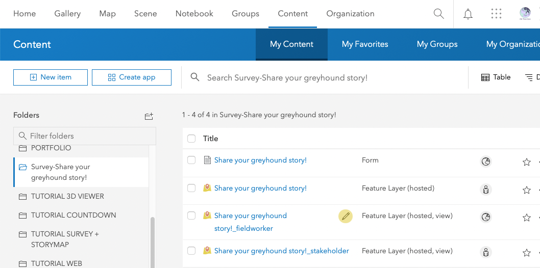
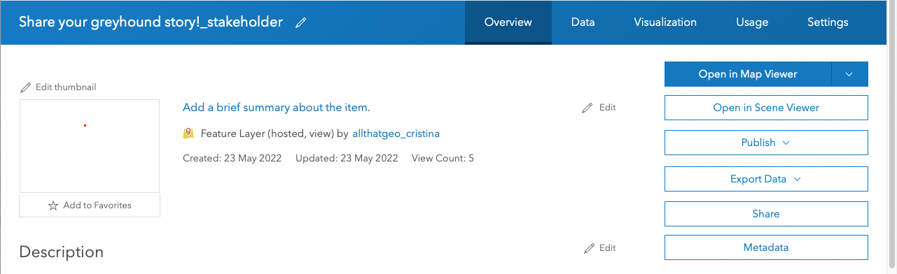
Go to Content > My Content, and find the Survey-Share your greyhound story! folder on the left. Click on the Feature Layer (hosted, view) named Share your greyhound story!_stakeholder.
Click on the Share button on the right.
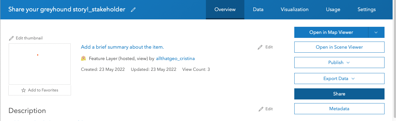
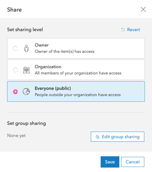
You'll need to share the view publicly so that everyone sees the submitted survey entries in the map tour you'll create shortly. To do so, choose Everyone (public) and hit Save.
Now click on Open in Map Viewer.
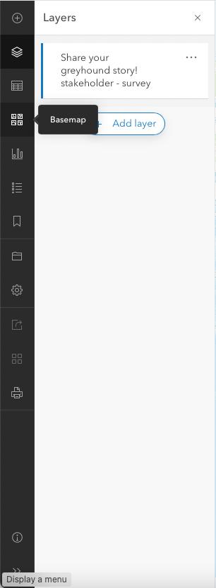
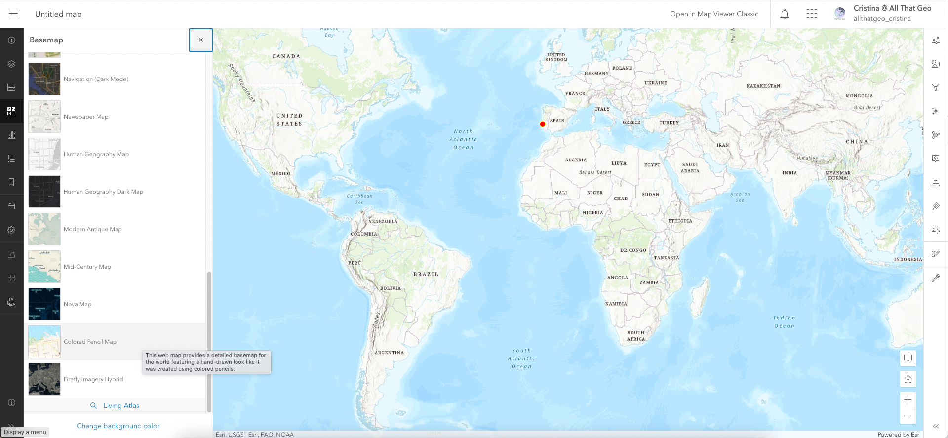
Go to Basemap, on the left.
Choose a basemap of your liking.
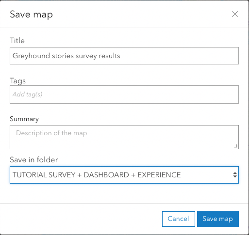
Now save the map. On the left, click on Save > Save as.
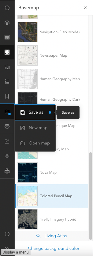
Give the map a Title, then click on Save map.
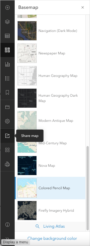
You now have to share the web map so that we can add it later to the dashboard. Click on Share map on the left.
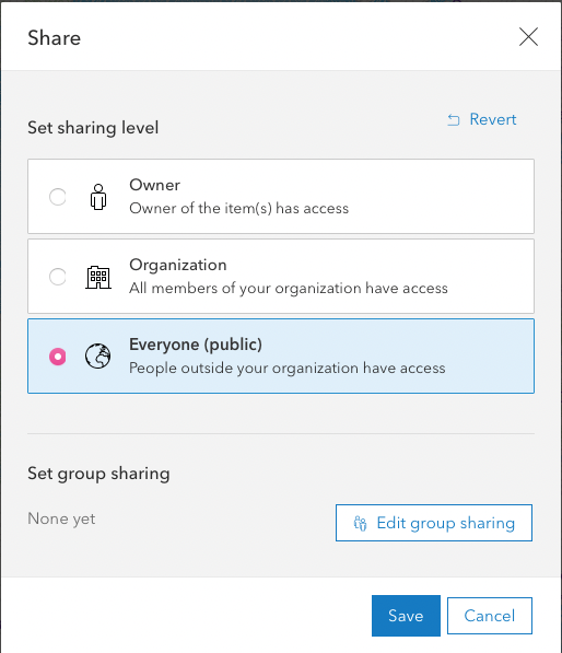
Set sharing level to Everyone (public) and hit Save.
3 Create a visualisation
Choose → Prepare → Create → Share
So this is what we've got so far:
- a survey to collect stories
- a web map built from the survey's responses
Now, we want to encapsulate all that, plus showcase the greyhounds' stories and present the results in the form of charts in one single, dynamic and visually pleasing app.
That is why we are building a dashboard.
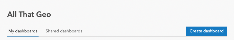
Create a new dashboard
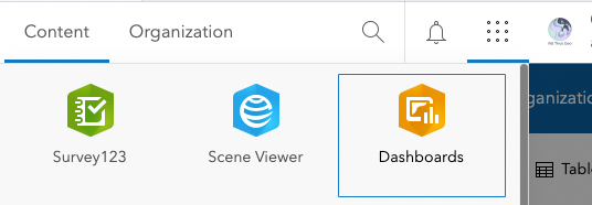
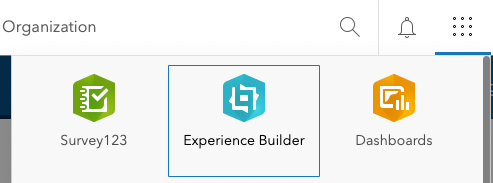
Go to the app launcher and choose Dashboards.
Click on Create dashboard.
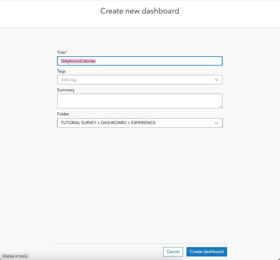
In Create new dashboard, enter a Title. Then, hit Create dashboard.
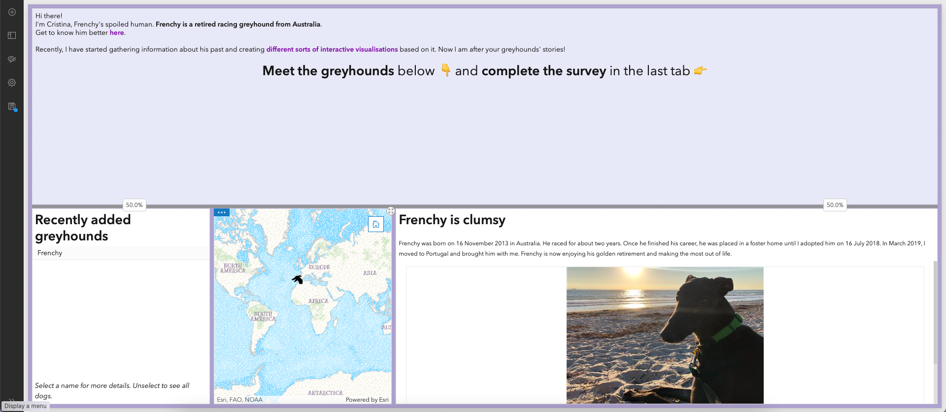
Add the web map of greyhounds' locations
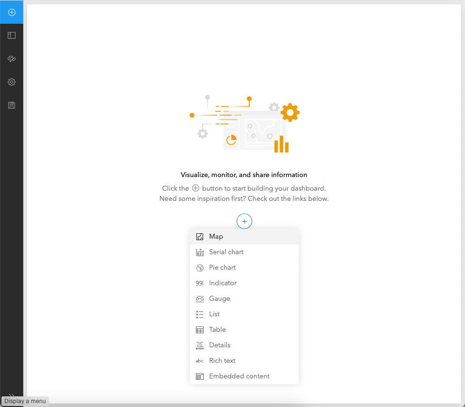
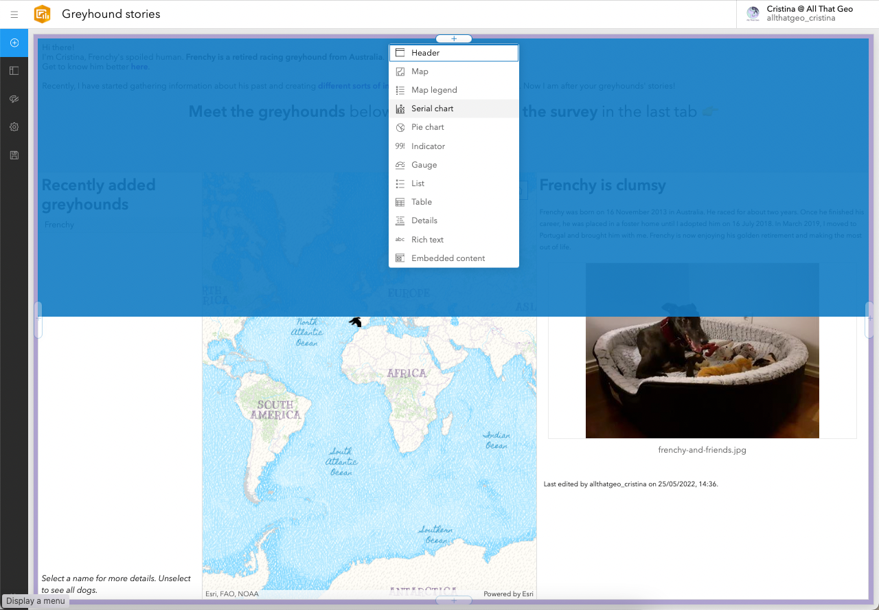
Now you're in the dashboard builder. Click on the ⨁ in the centre and choose Map from the list.
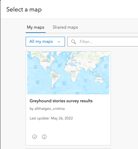
In Select a map, retrieve the web map you created earlier.
In Settings, apply the following configuration:
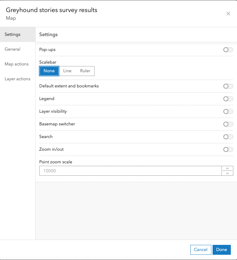
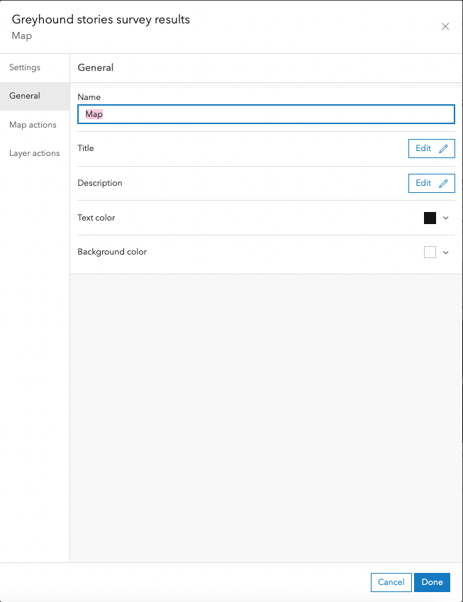
Move to General. There, change the name to 'Map'. Naming the items is helpful for specific dashboard tasks, such as creating actions etc. However, it is basically for internal use only. Click Done.
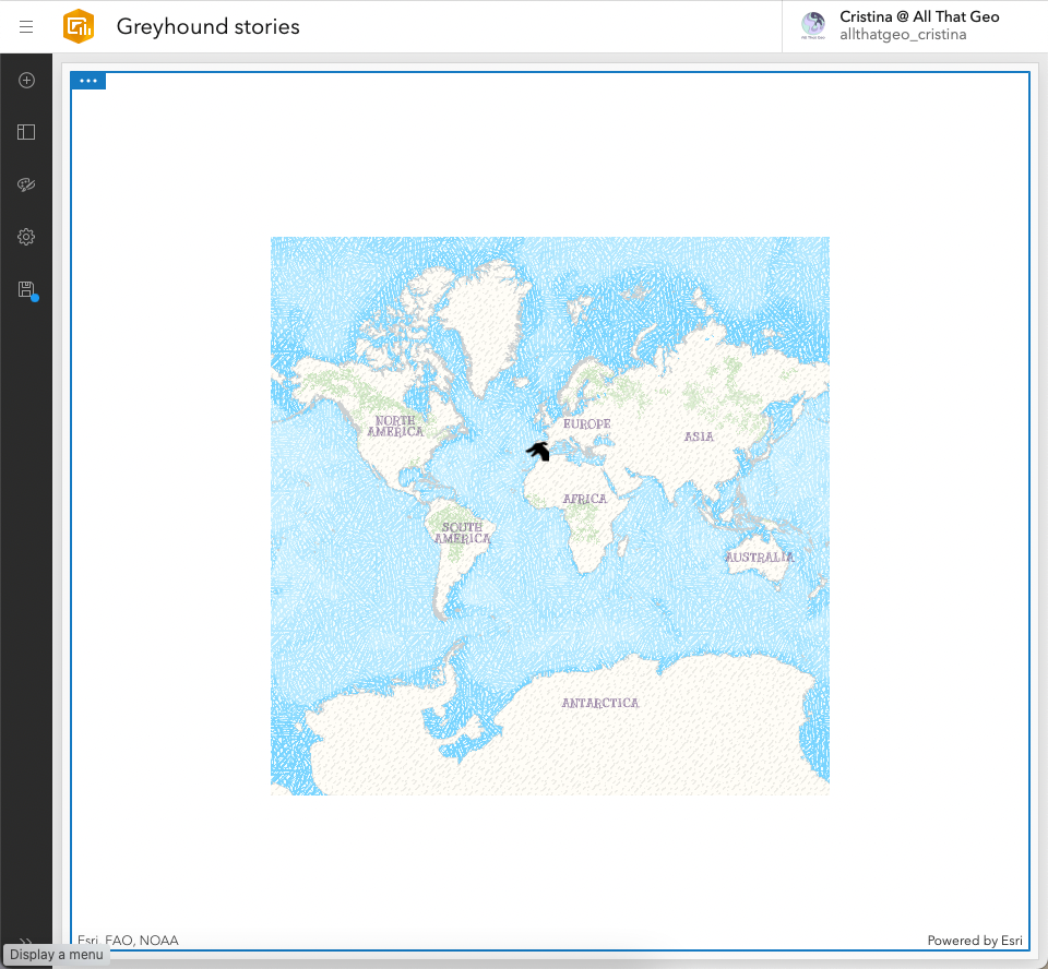
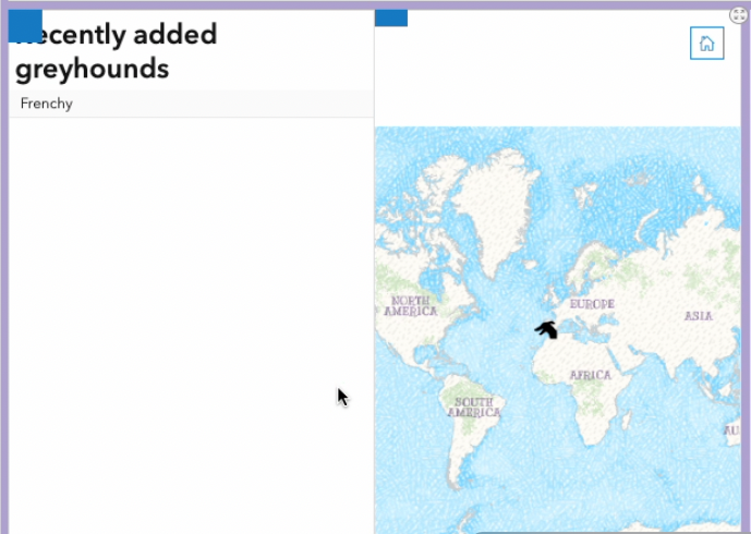
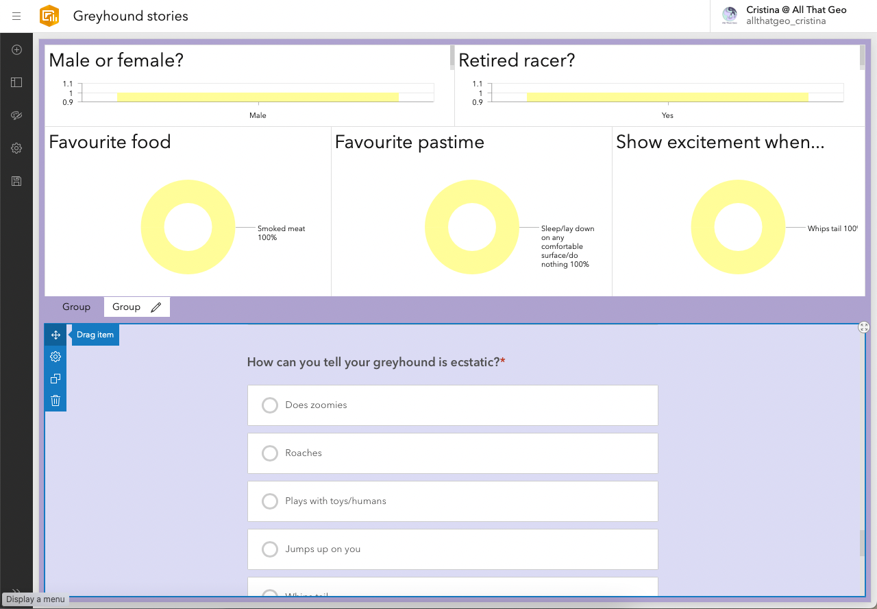
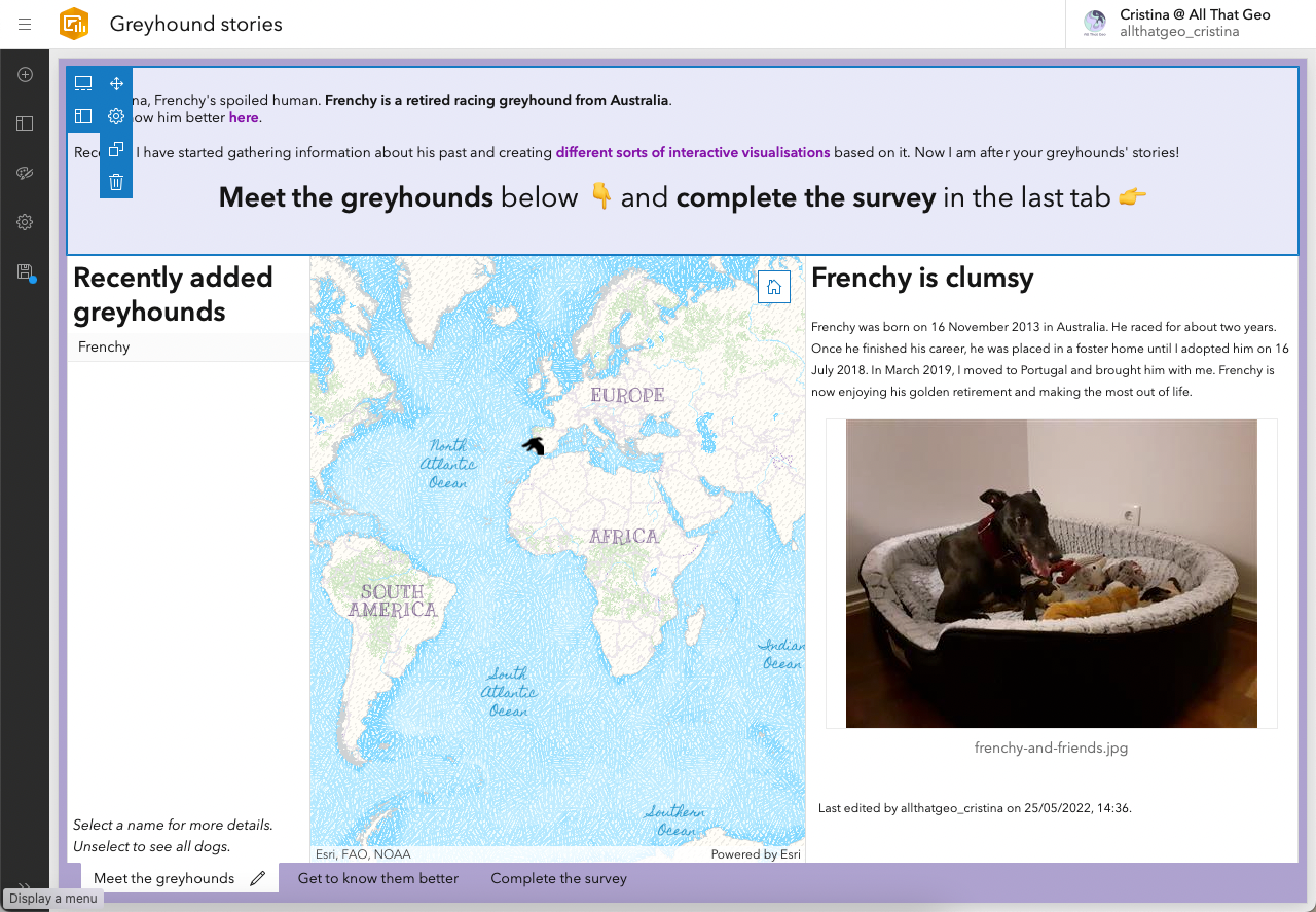
You now have the web map showing the locations of the responses obtained so far inside the dashboard.
Add a list of the greyhounds' names
Now that we have the greyhounds' locations, we want to list their names alongside the web map.
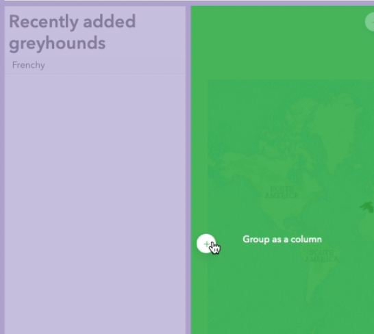
Click on the ⨁ sign on the top left, then click on the ⨁ sign on the middle left (where you want the item to be added).
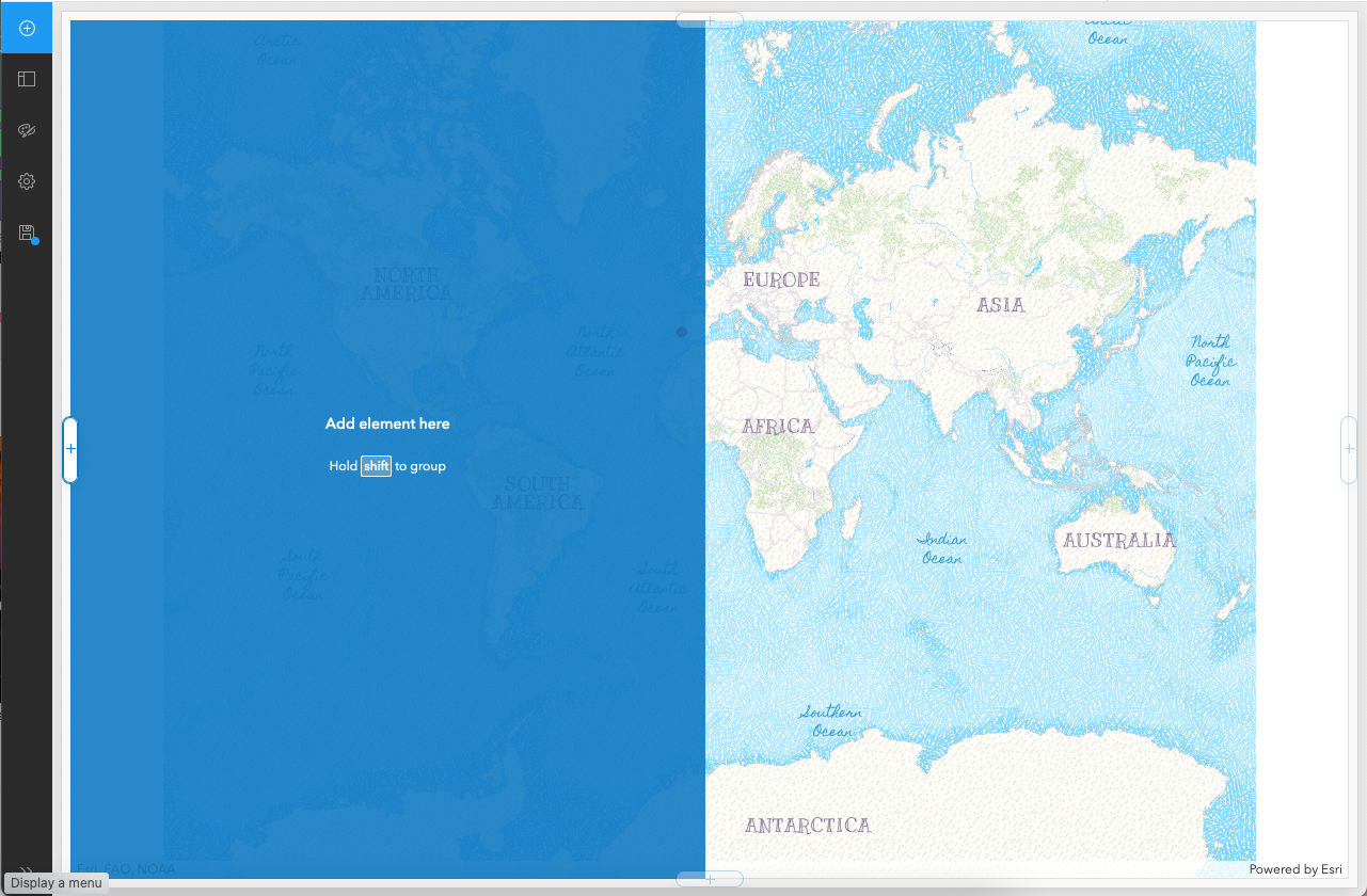
Now choose the type of element you want. Click on List.
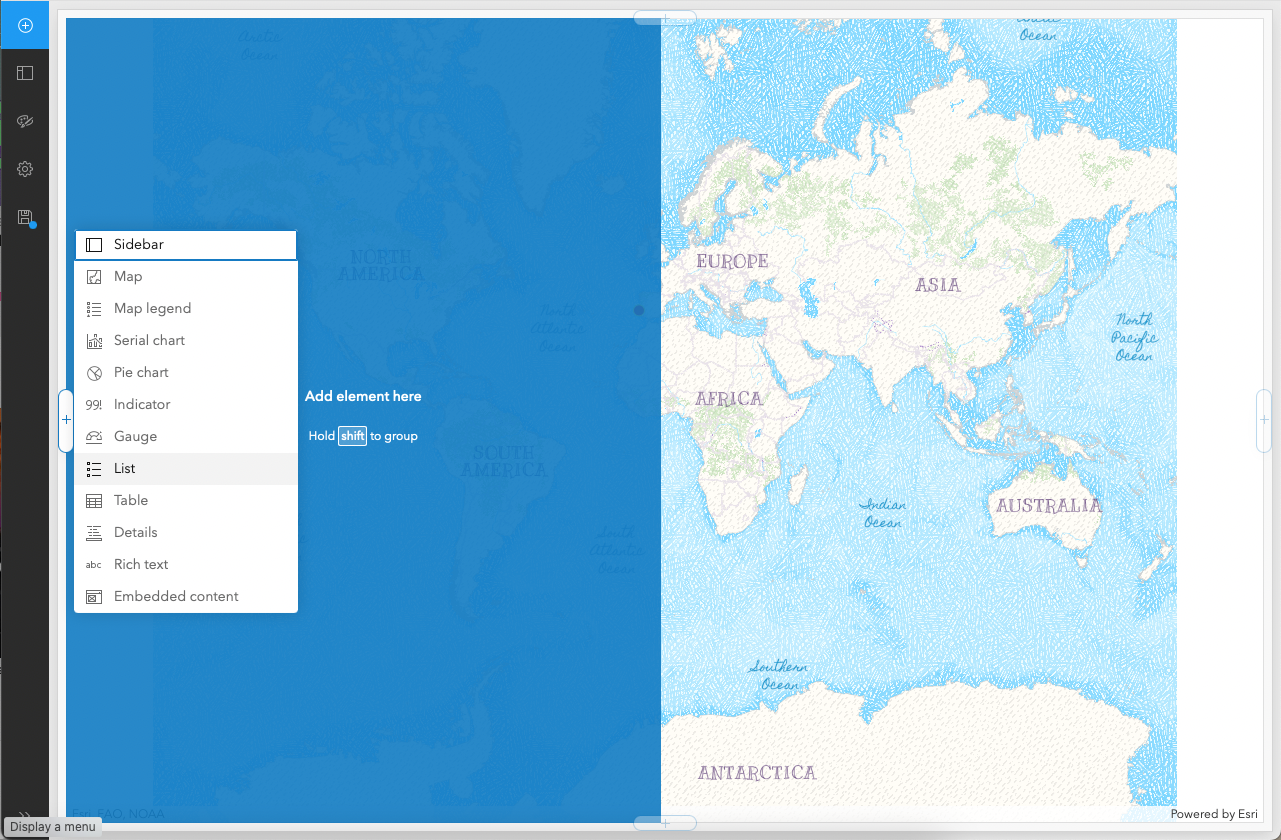
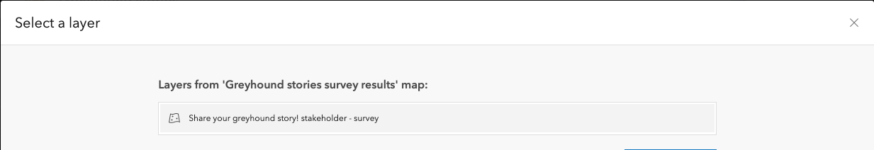
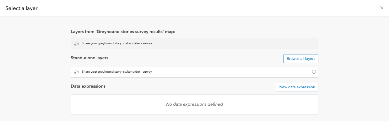
In Select a layer, click on the layer shown (the layer used in the web map). We will select this layer in all dashboard items.
Change the Maximum features displayed to a number that makes sense to your use case in data. As an example, I changed it to '1000'.
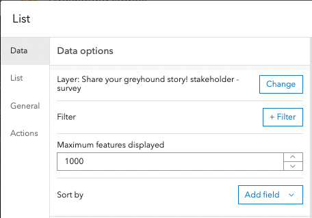
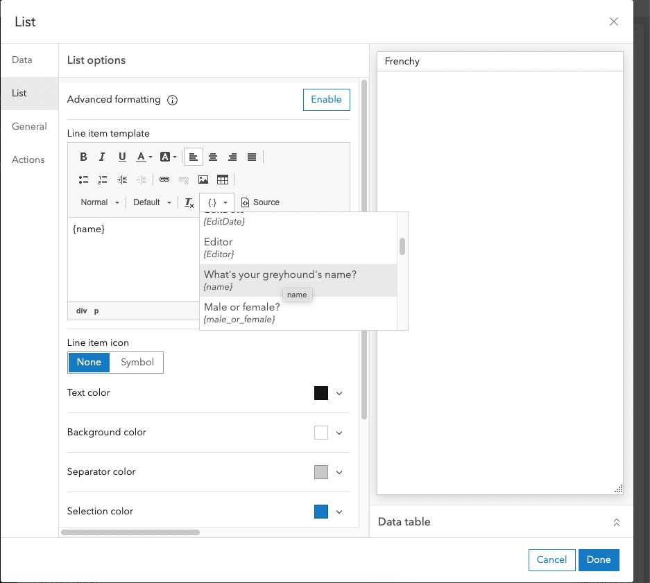
Move to List. There, enter the field name that corresponds to what you want to show on the list. Since we want the greyhounds' names to display, click on {.} and retrieve {name}. Change Line item icon to None.
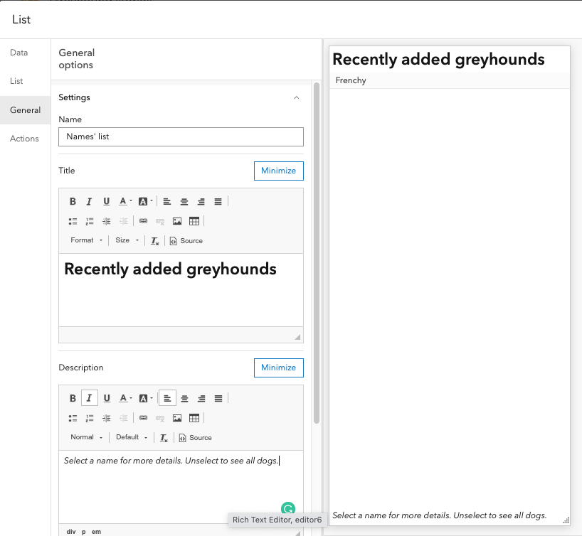
Move to General. There, enter a Name (for internal use only) and a Title. The title will tell the users what the list is about.
Also, in the Description, enter a short instruction on how to use the list. Click Done.
Add the story with a photo
Now, to the highlight of the dashboard; the greyhounds' stories and photos!
Click on the ⨁ sign on the upper left, then click the ⨁ sign on the middle right and choose Details.
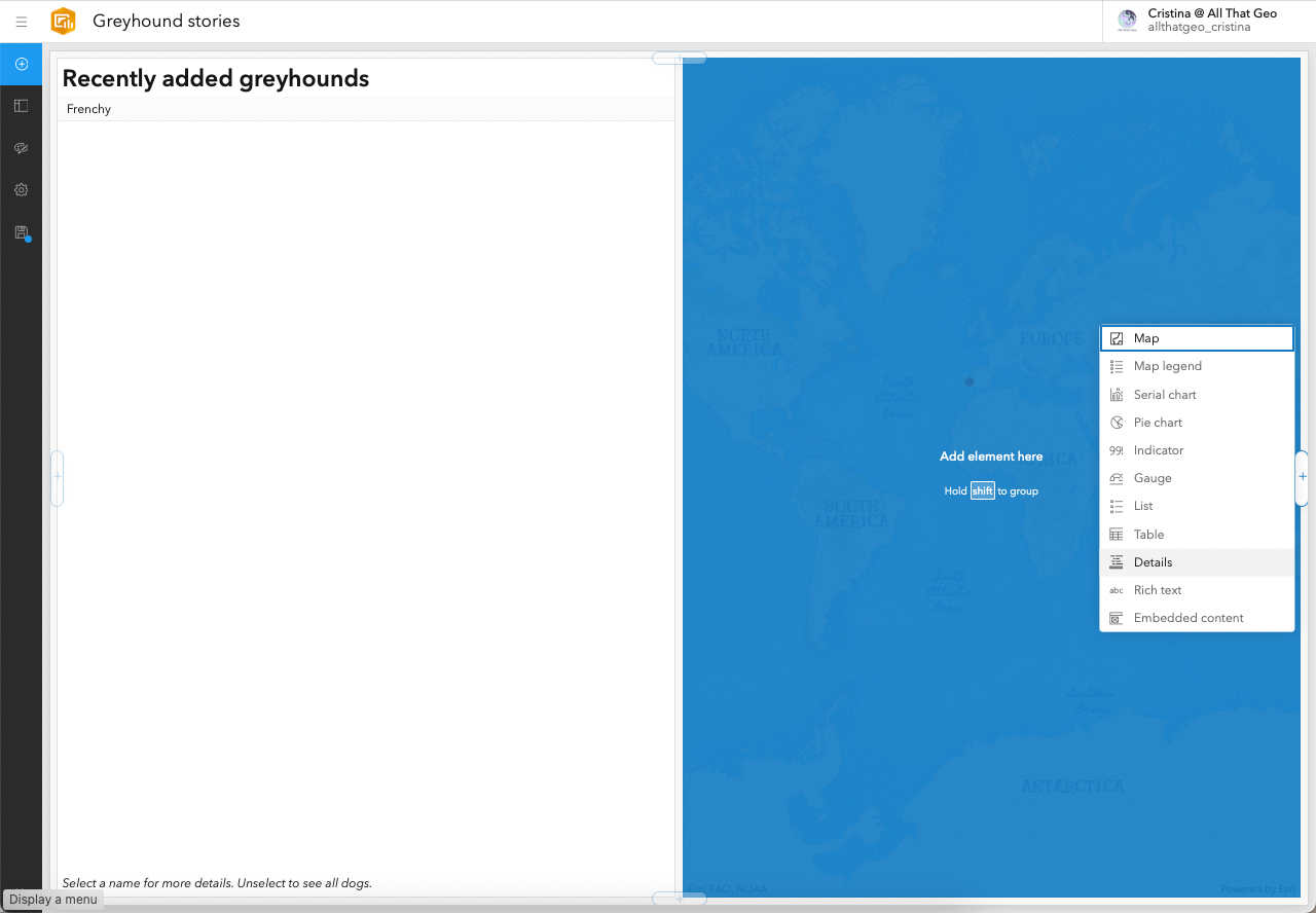
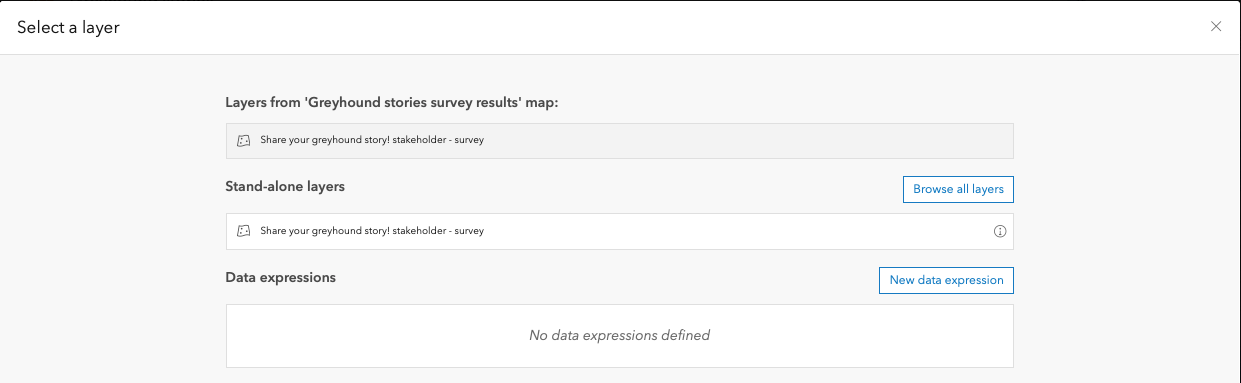
In Select a layer, choose the same layer we've been using so far (the one from the web map).
In Data, change the Maximum features displayed to the same number you entered in the List element earlier.
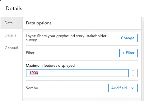
Move to Details. There, leave only Attachments on.
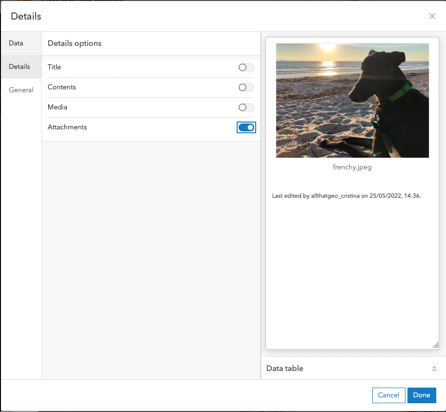
Move to General. There, enter the Title like so:
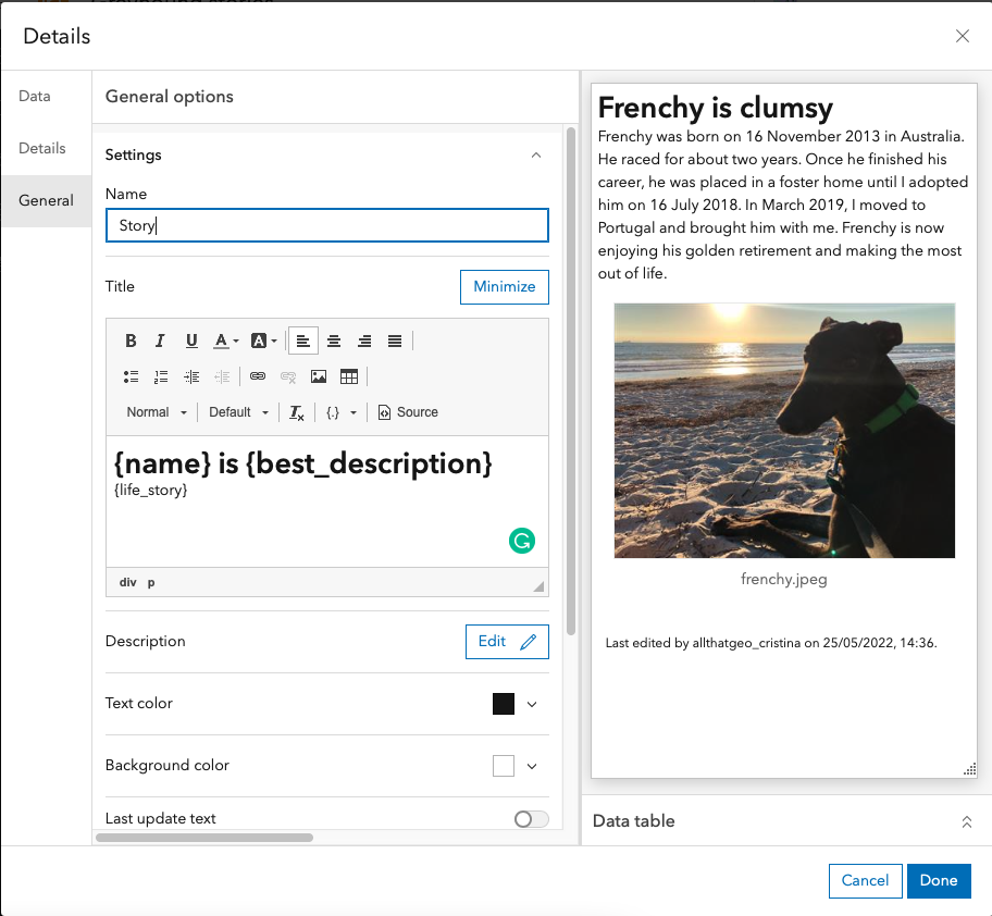
Click Done.
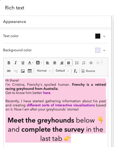
Add an introduction to the dashboard
We want to add a brief introduction to what this dashboard is all about so that the users don't feel lost.
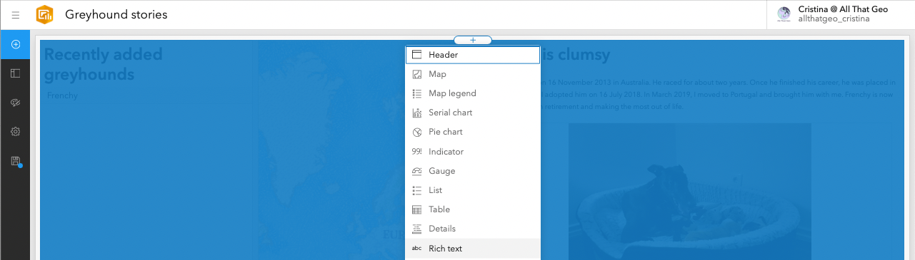
Click on the plus sign on the top left and then click on the plus sign in the middle centre of the page.
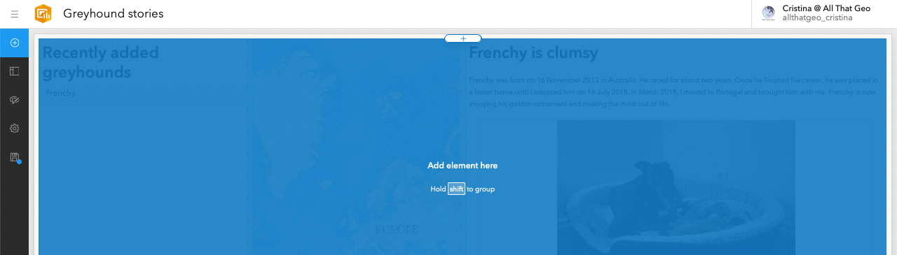
Choose Rich text.
Enter a short introduction, as desired. You can also change the Background color. Then, click Done.
Customise the dashboard
Now that we have all the items we want to show, we can adjust the items' size by clicking and dragging the lines between the items.
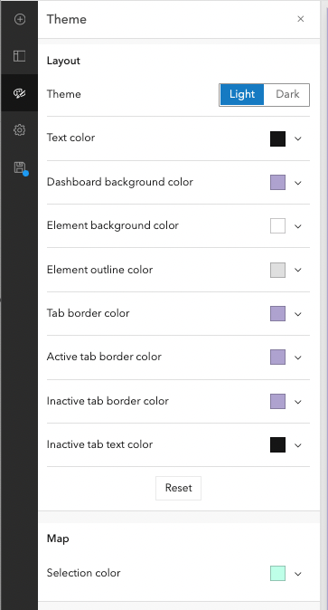
You can customise the dashboard further by clicking on Theme (left side). Feel free to change the colours as you see fit. Close the pane when you're done.
Now, have you noticed the separation between the items? If you want to make it smoother, you can group them. To do so, go to Drag item.
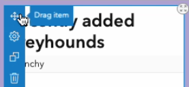
While pressing the SHIFT key, drag and drop it next to another item (notice how it turns green).
Now, these two items remain side by side, but with a smoother separation between them.
Repeat this process for all items.
Set up actions
Remember when we added an instruction to the user on using the greyhounds' names list? The idea was that when the user selects a name, both the map element and the story element are filtered, showing only that dog.
We need to set up actions in the list element for that to happen.
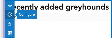
Hover over the top left corner of the list element and click on the cog icon, Configure.
In Actions, configure the Filter like so:
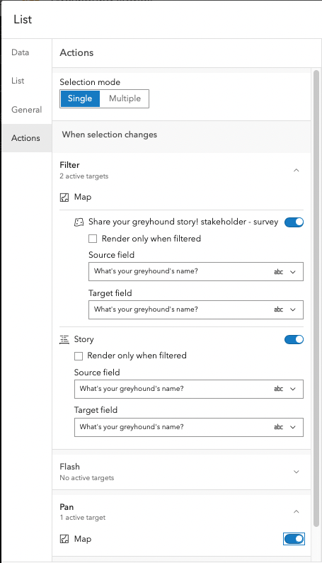
Click Done.
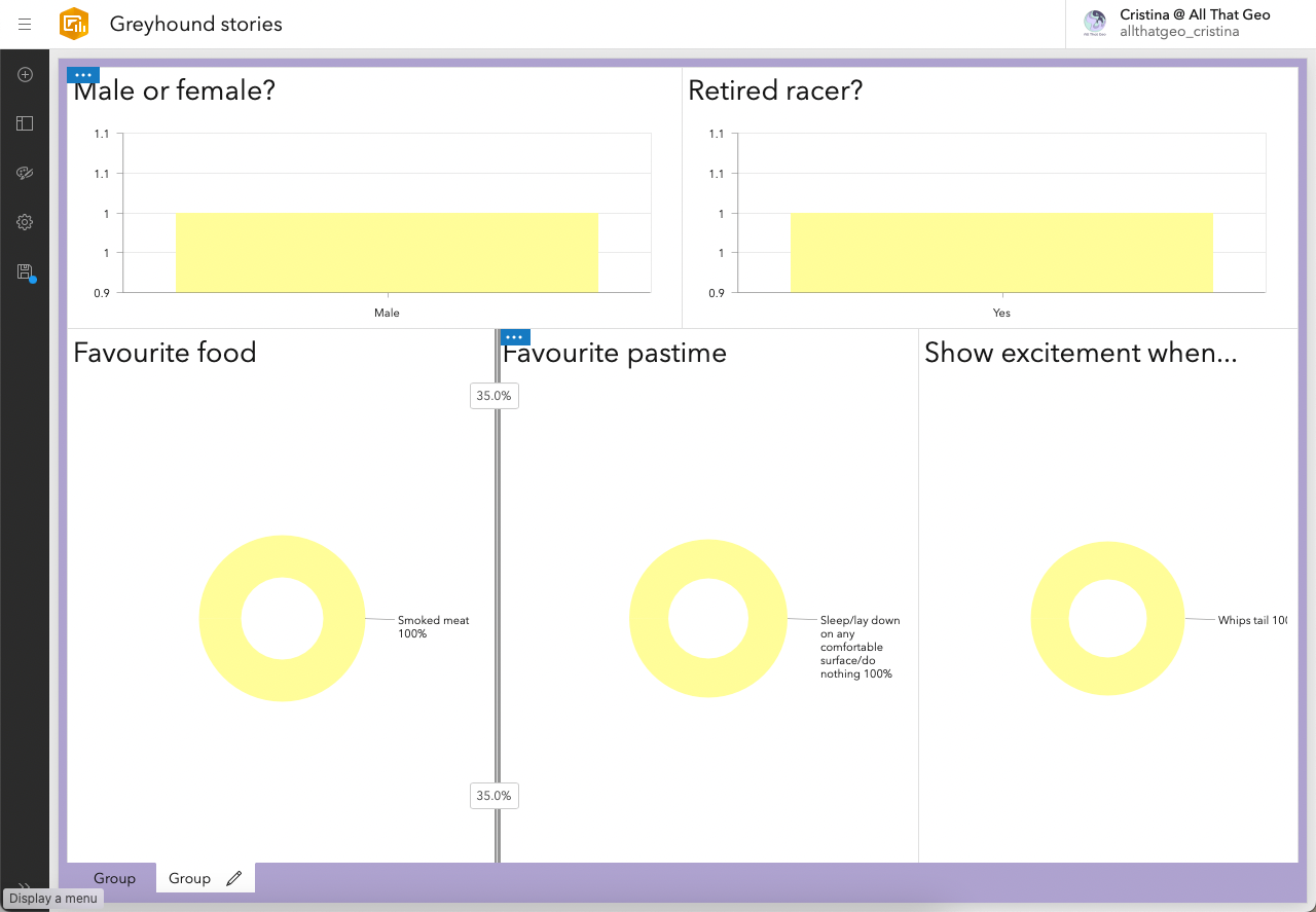
Create charts to analyse responses
When we started, the idea for this dashboard was to show greyhounds' stories, analyse the responses and embed a survey. For that to happen, the dashboard will have to contain multiple tabs to avoid a cluttered interface.
What we're going to do now is to create a chart and then move it to a second, new tab in the dashboard.
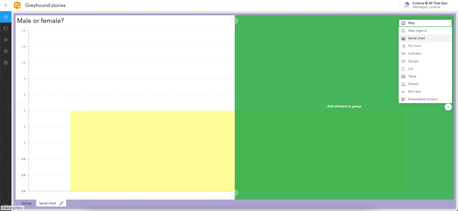
Click on the ⨁ sign on the top left. Next, click on the ⨁ sign in the top centre and choose Serial chart.
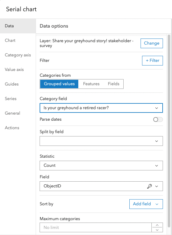
Select the same layer we've been using until now.
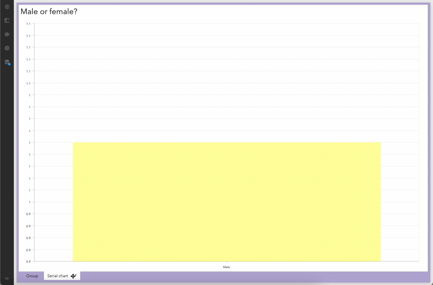
In data, choose the category field Male or female?
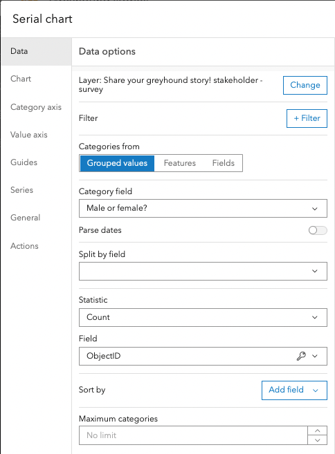
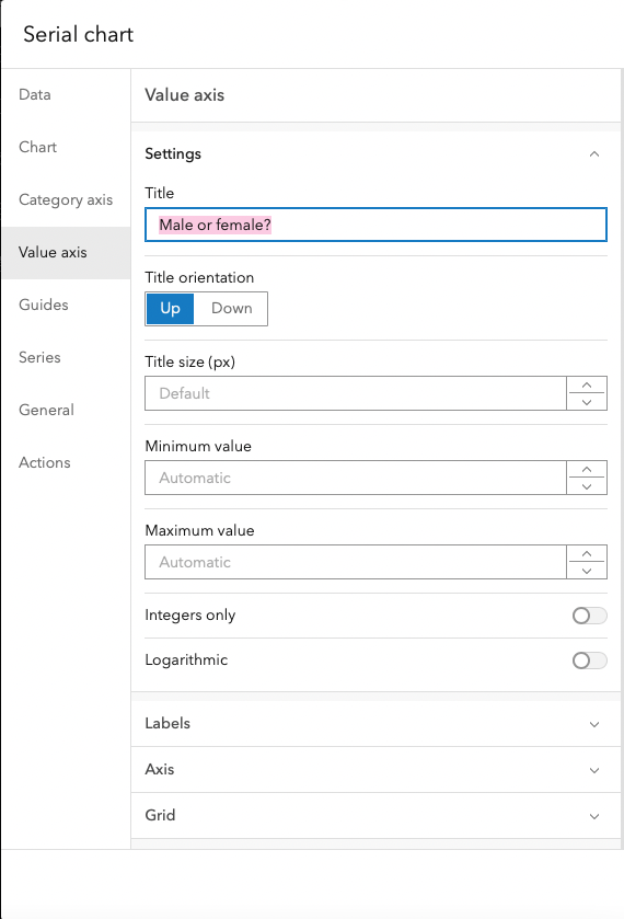
Move to Value axis. There, give the serial chart a Title.
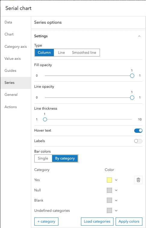
Move to Series. There, set Bar colors to By category and change the colours as desired:
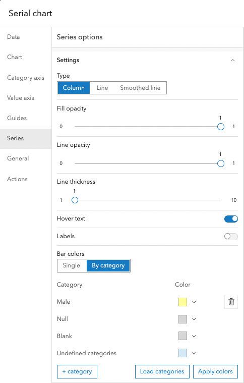
Move to General. There, enter a Name and the Title of the serial chart.
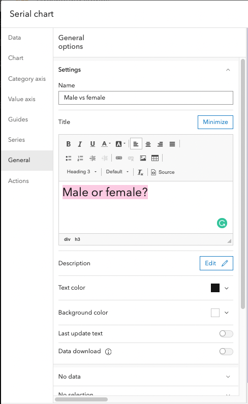
Click Done.
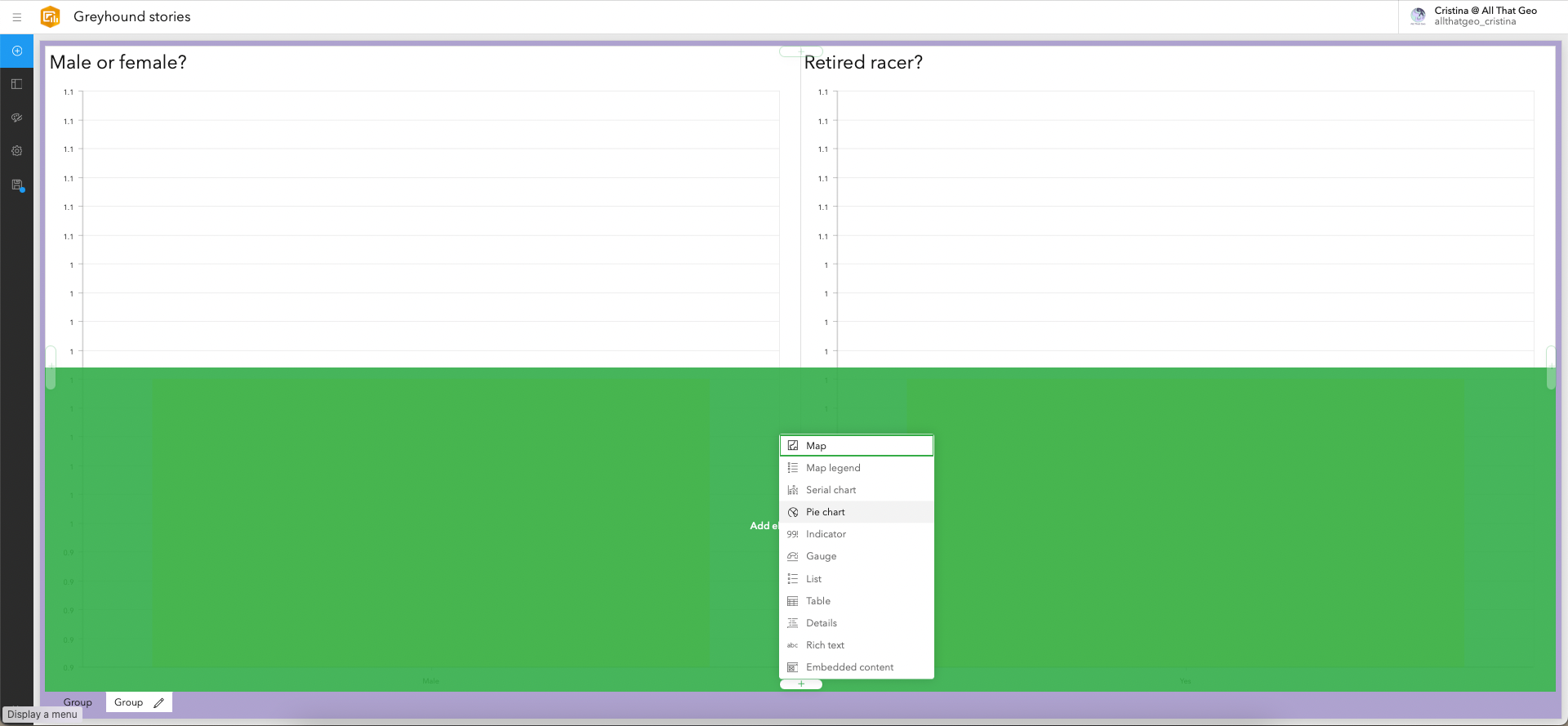
Now that we have created our first chart, we want to move it to a new tab, where all the charts will be grouped.
Hover over the top left corner of the serial chart and click on Drag item.
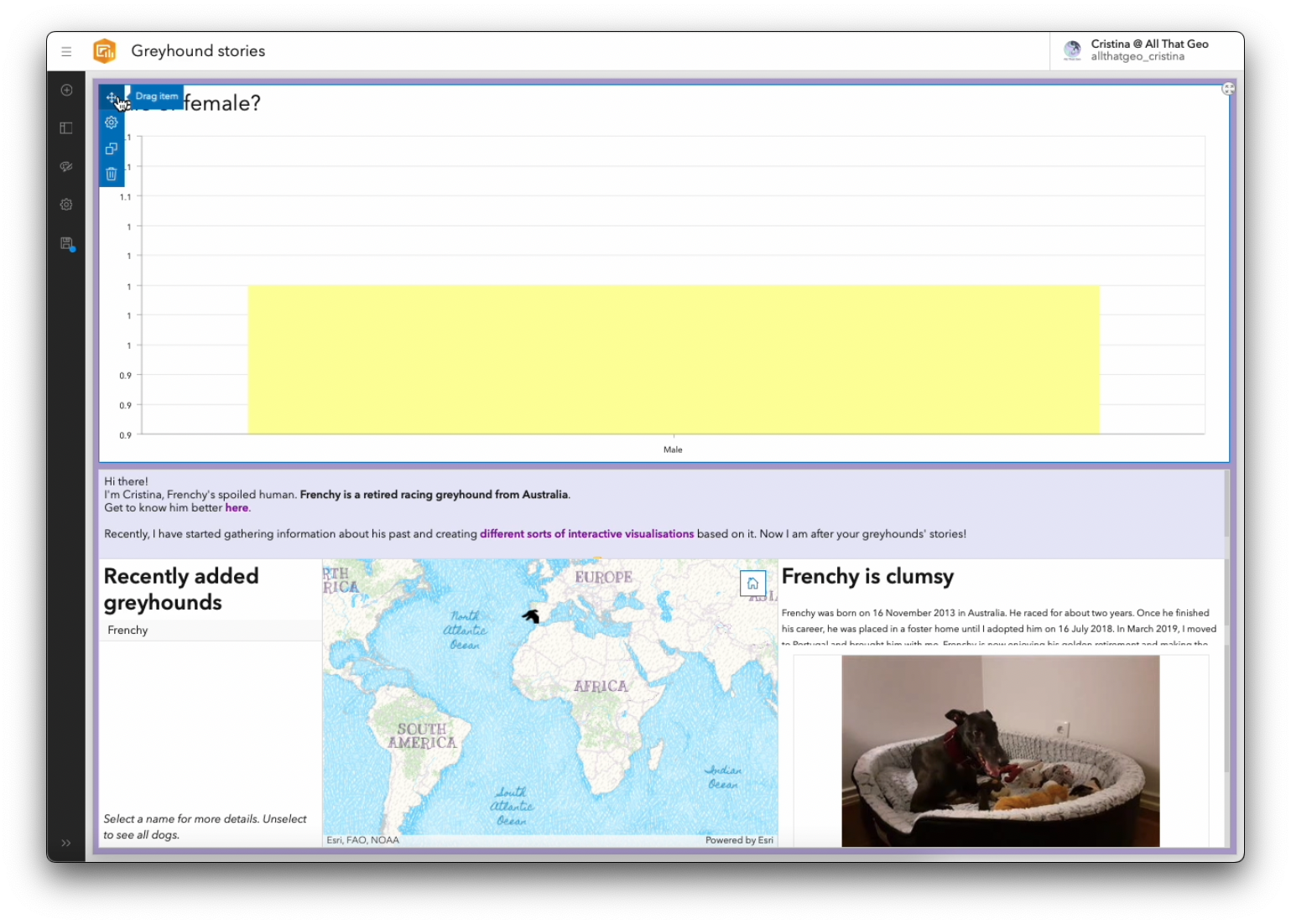
Drag it until it is on top of the lower half of the screen. Then, Stack the items.
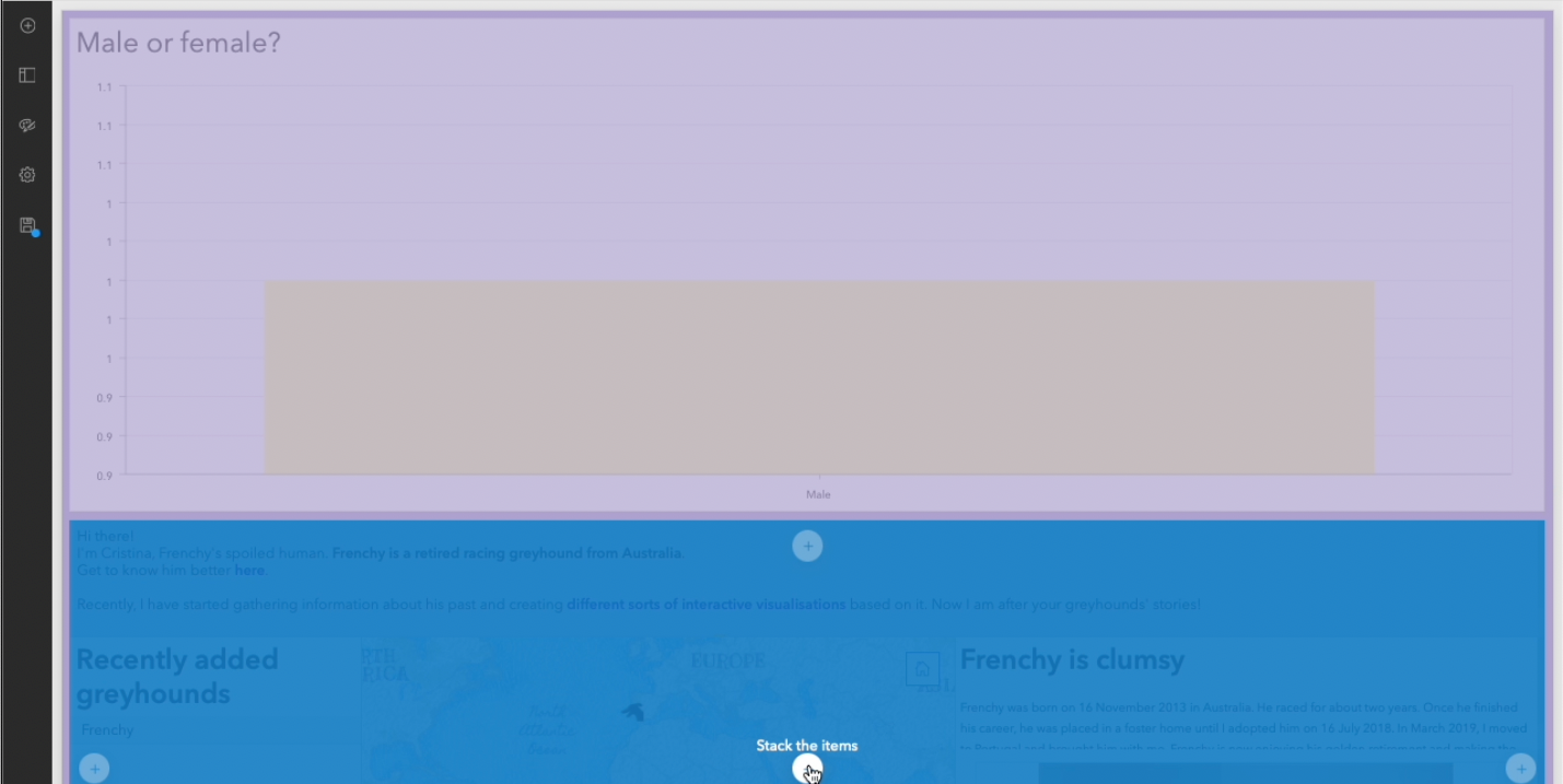
You've now created a second tab in your dashboard (notice the lower bar with two tabs).
Click on the plus ⨁ on the top left, and while pressing the SHIFT key, click on the ⨁ sign on the middle right. Choose Serial chart.
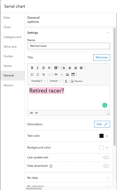
In Data, choose the Category field you want to show in this chart: Is your greyhound a retired racer?.
Move to Series. There, change the Bar colours to By category. Change the colours if desired.
Move to General. There, enter a Name and a Title. Click Done.
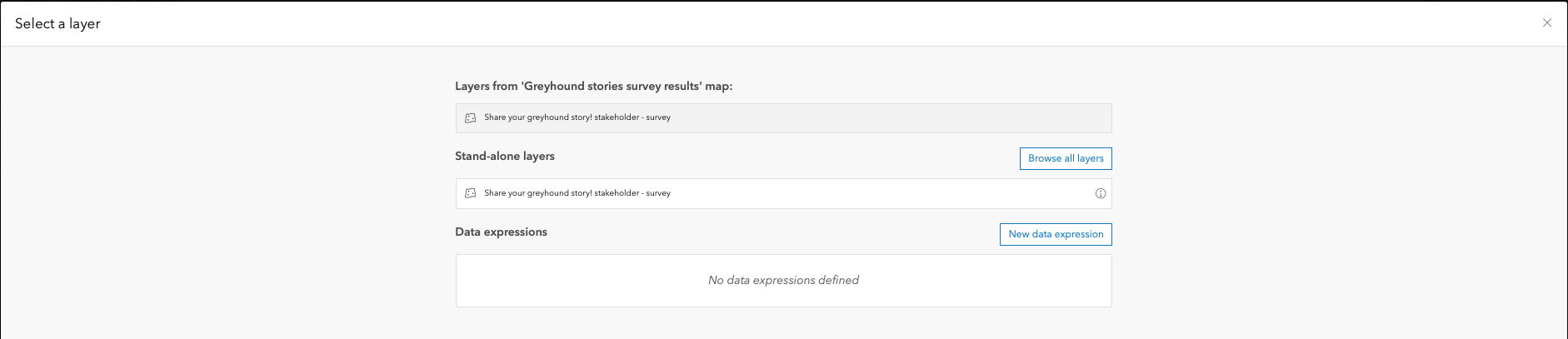
Now, click on the ⨁ sign on the left, and, while pressing SHIFT, click on the bottom ⨁ sign and choose Pie chart.
Select the same layer we've been using.
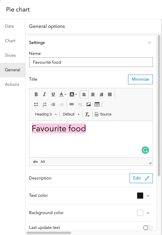
In Data, set the Category field to What's your greyhound's very favourite food?.
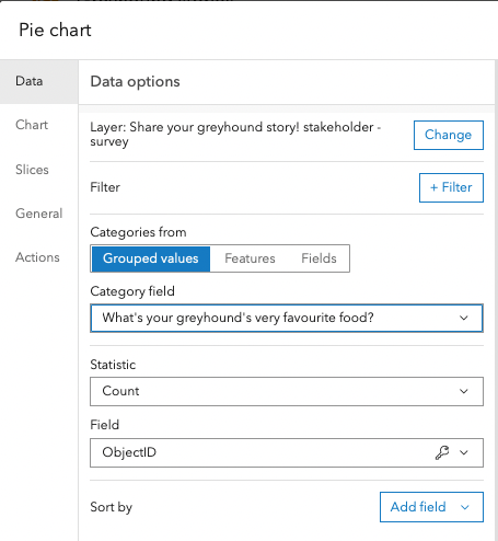
Move to Chart. There, change the Inner radius (%) to 50. This is how you turn a pie chart 🥧 into a doughnut 🍩!
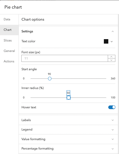
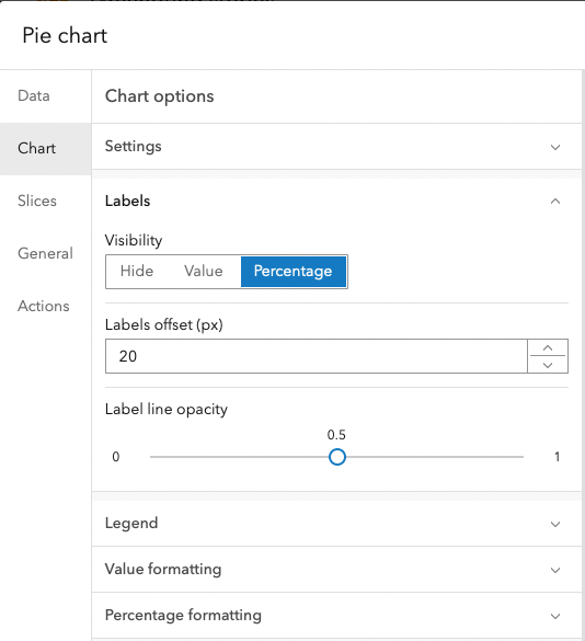
Expand the Labels section. Set the Labels offset (px) to 20.
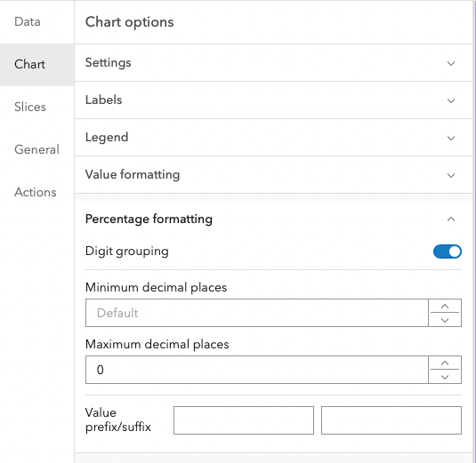
Expand the Percentage formatting section. Change the Maximum decimal places to 0.
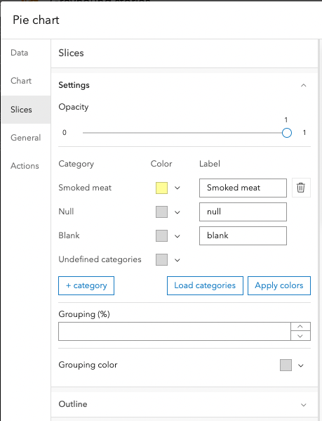
Move to Slices. There, change the colours as desired.
Move to General. Define a Name and a Title. Then, hit Done.
We now want to create two other pie charts to visualise the responses to the following questions in the survey:
- What's your greyhound's very favourite pastime?
- How can you tell your greyhound is ecstatic?
Instead of repeating the process of creating a pie chart, we can simply copy the one we've already made and just change the data field it illustrates.
To do so, hover over the top left corner of the Favourite food item and click Duplicate. Do it twice.
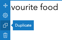
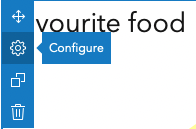
Then, click on the cog of one of the copied pie charts and configure it to one of the questions above. Next, repeat this process for the other copied pie chart.
Perform size adjustments on the dashboard items as desired.
Embed the survey
The last element we want to add to our dashboard is the survey. Add and embed it so that the user does not need to open a different link to enter the responses. Instead, they can do it straight from the dashboard.
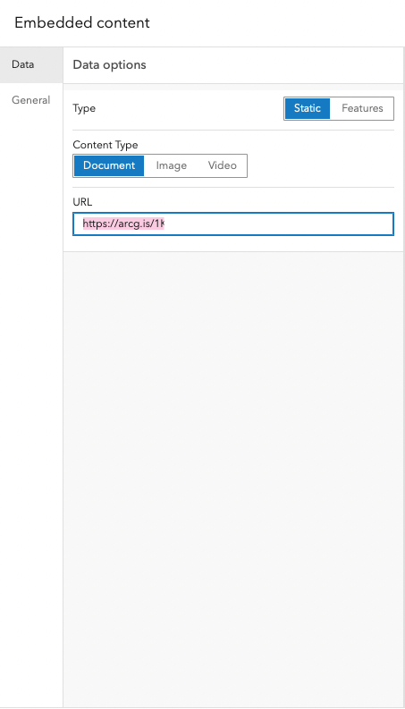
Click to add a new item (⨁ sign on the upper left corner) and click on the ⨁ sign in the lower centre. Choose Embedded content.
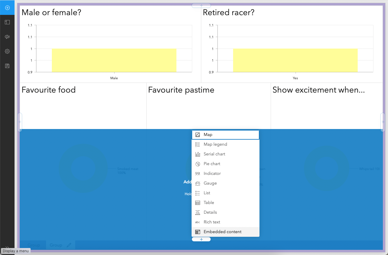
In Data, enter the link to the survey you created earlier in this tutorial.
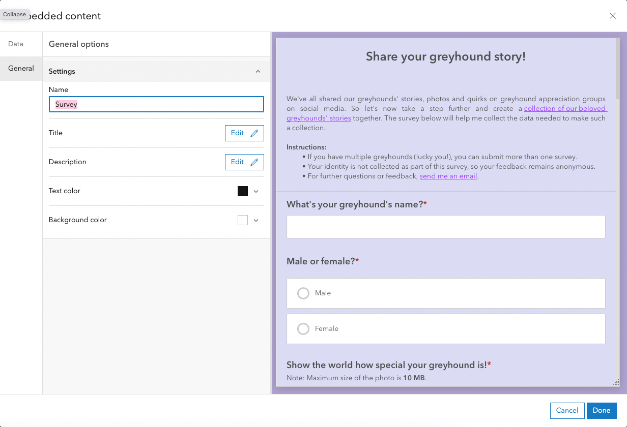
Move to General. There, Name the item and click Done.
Let's move the survey to another tab. To do so, hover over the top left, click on Drag item and, as the name says, drag it to the centre of the page (in the same way you did for the first chart).
You now have a third tab with the survey embedded in it. Notice the tabs bar at the bottom of the page.
Click on the pencil and change the names of each tab as desired.
Save the dashboard if you haven't done so yet.
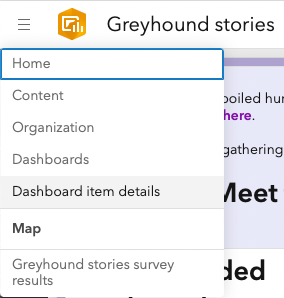
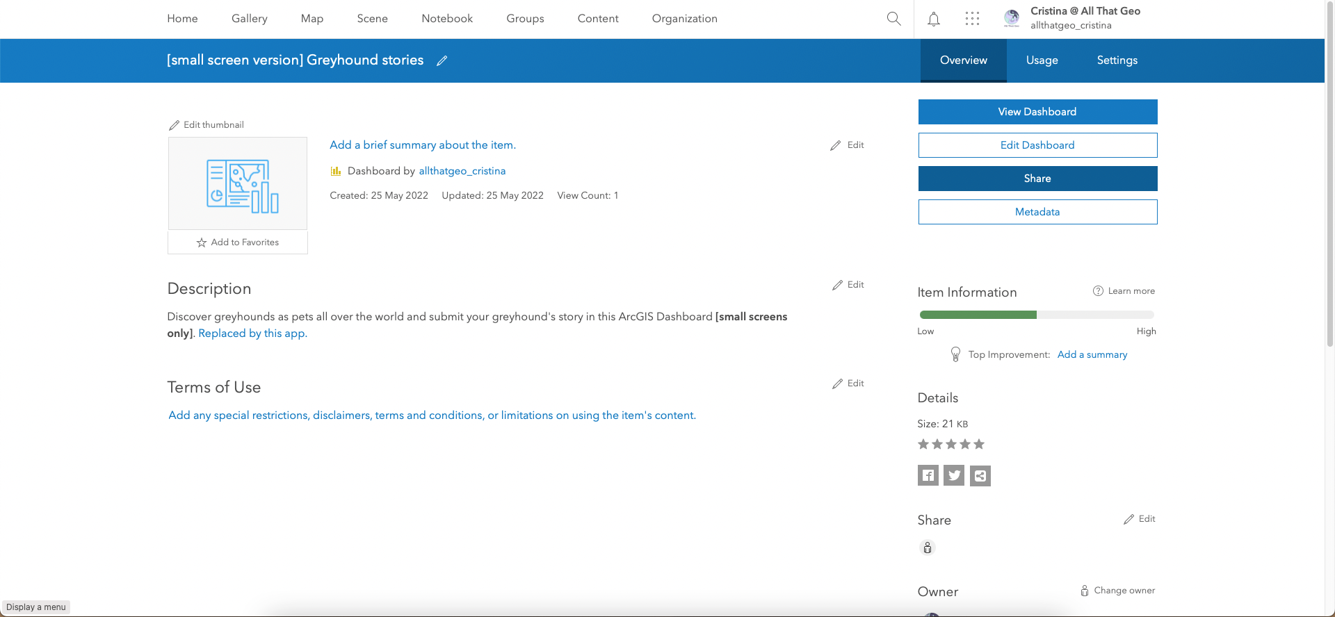
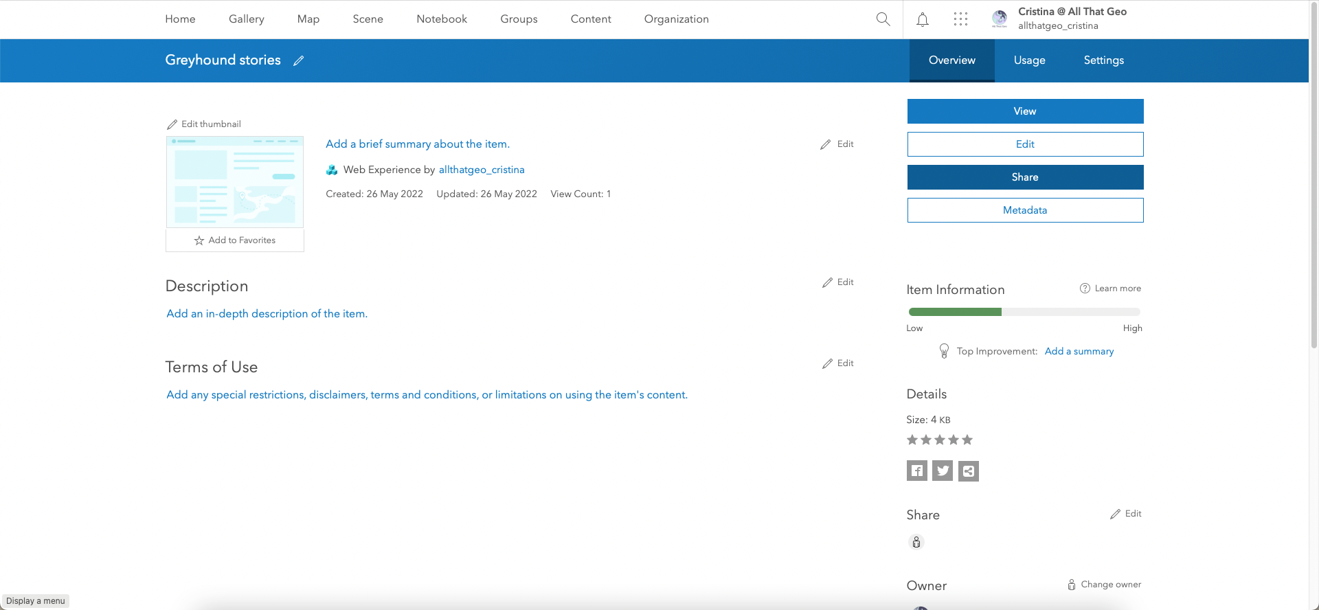
Now that the dashboard is complete, we will share it. Click on the top-left icon and choose Dashboard item details.
In Overview, click on Share.
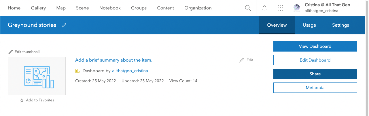
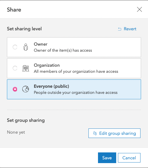
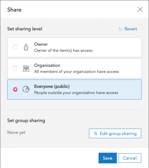
Notice that the Sharing Level is set to Owner, which means no one but you will be able to access the dashboard.
Set sharing level to Everyone (public). Hit Save.
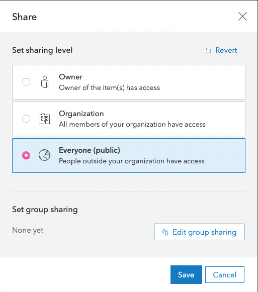
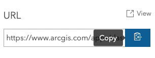
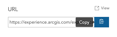
The app is now public. Click on Copy link and keep it handy for later.

4 Share your work
Choose → Prepare → Create → Share
One of the questions you should ask yourself when you create a web app is how the audience will access it. In this case, we can anticipate that the audience will access the dashboard from different screen sizes (desktop, tablet, mobile), and we need to make the layout responsive.
So, here we are, thrilled to share the beautiful app we built with utmost care! Only there is one problem... we open the dashboard on a mobile device to test it, and it looks like this:
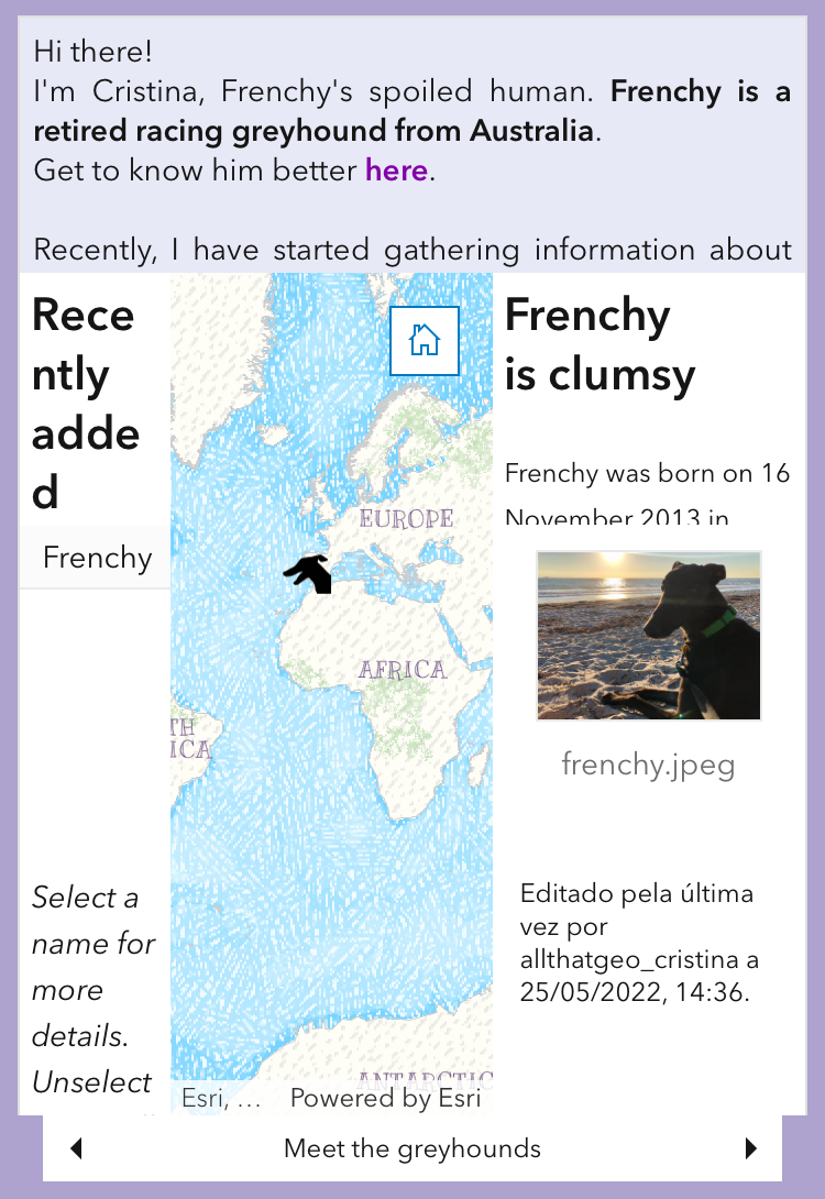
Not responsive at all! At this point, your emotions will range from despair to downright panic 😱.
Fear not; Experience Builder has your back.
We'll start by creating a mobile version of the dashboard and then build a web experience with both the desktop version (that you've already created) and the mobile version. After that, the experience web app will automatically display the dashboard that best fits the screen size.
Still, you're probably not feeling very reassured, as you remember all the work it took for you to build one single dashboard. And now you're told to make another one 😰.
Guess what? You can repurpose the dashboard you created and just move a few items around to make it look good on mobile 😉
4.1 Build another dashboard for mobile viewing
Let's start by copying your dashboard. To do so, go to the dashboard URL (the one you copied earlier) and do the following:
Add 'new#id=' after 'dashboards/'
You'll end up with something similar to this:
https://[my-organization].maps.arcgis.com/apps/dashboards/new#id=[id]
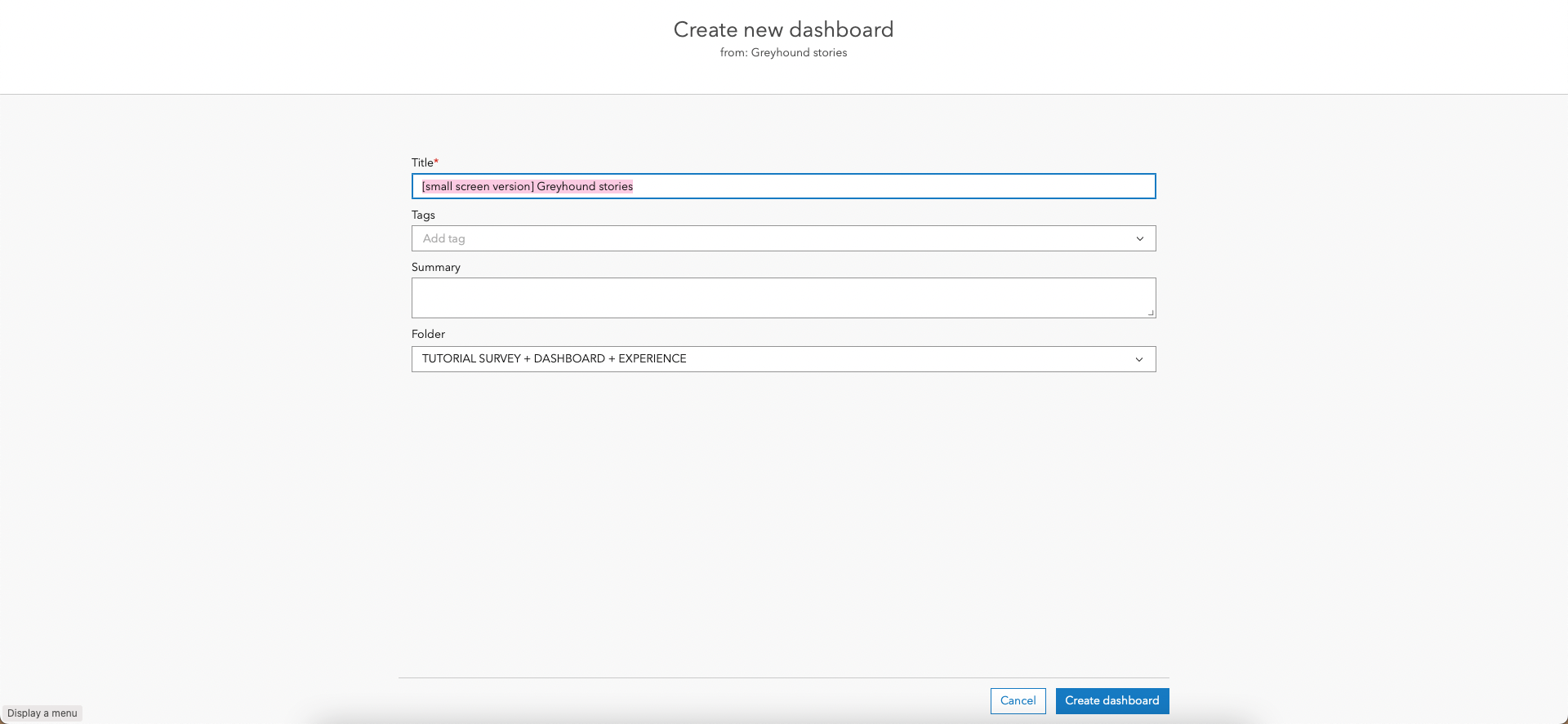
Once you click enter, you're taken to the Create new dashboard page, where you need to give a Title to this new dashboard. I suggest you append something that will differentiate this dashboard from the former, e.g. [small screen version]. Click Create dashboard.
You have now duplicated the dashboard! From this point onward, you can apply the skills you learned while building the first dashboard and rearrange the items to look good on a smaller screen.
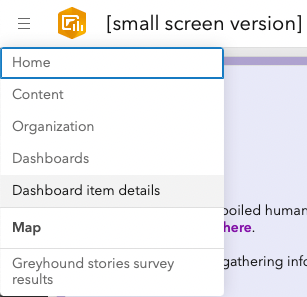
When you're happy with the result, save it and go to Dashboard item details (top left corner).
Click on Share.
Change the sharing level to Everyone (public). Click Save.
Copy this mobile dashboard's URL and save it for later.
4.2. Create a web experience to show the dashboard in different screen sizes
Find the Experience builder from the app launcher.
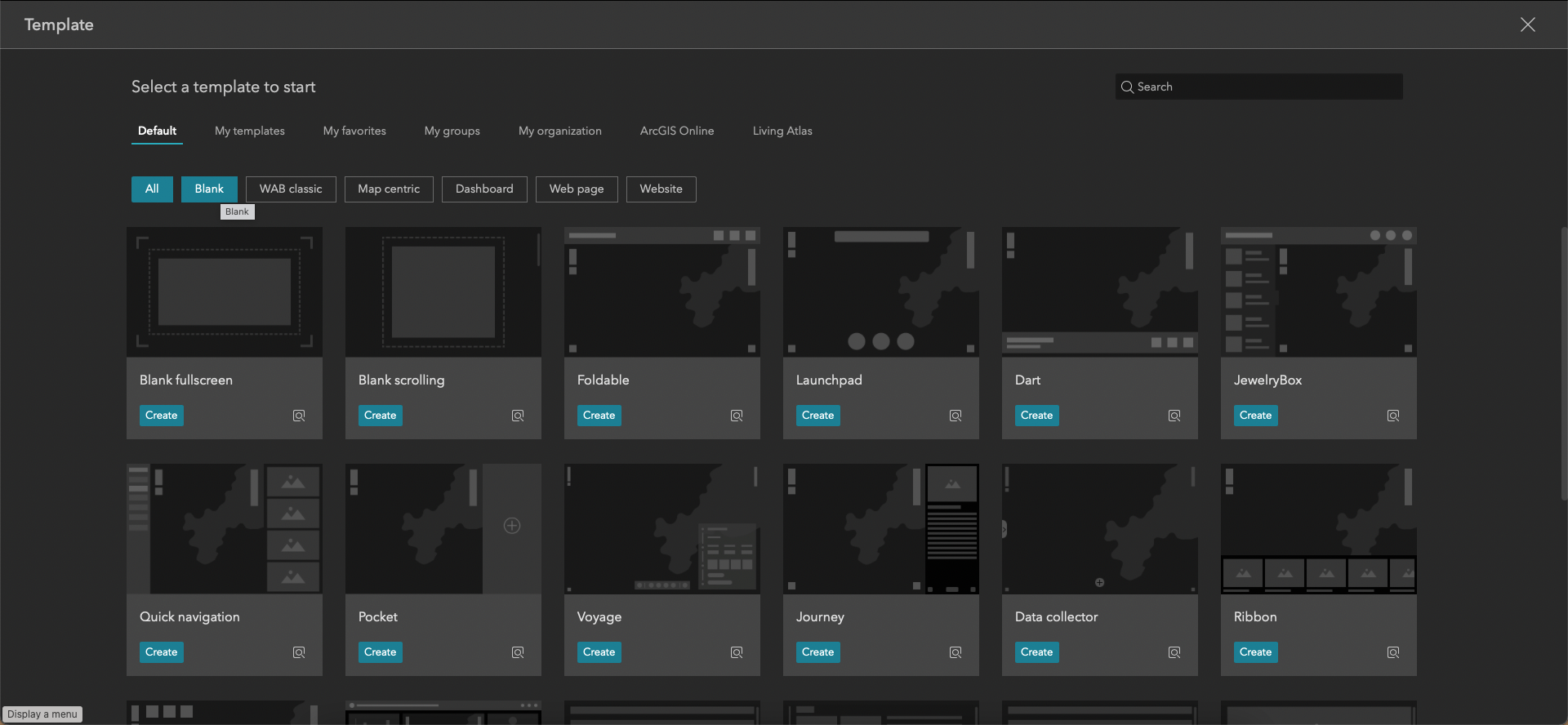
Click on Create new.
Choose Blank fullscreen and click on Create.
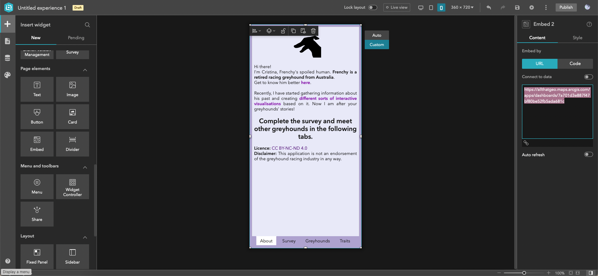
You're now in the builder. In Insert widget, New (on the left), find Embed and drag it to the centre of the canvas.
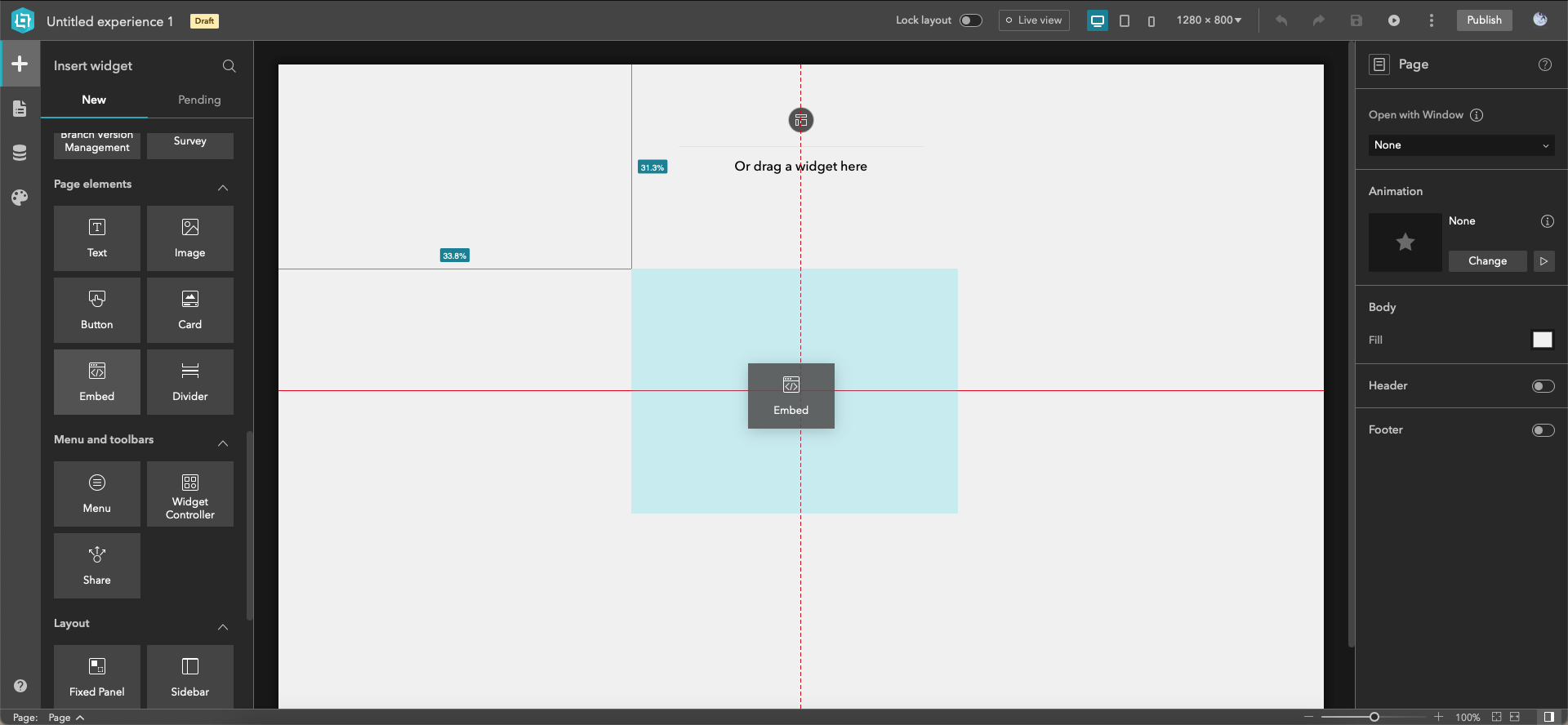
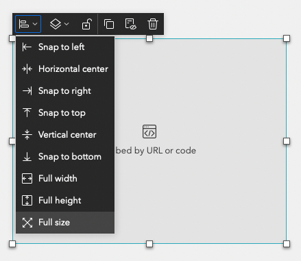
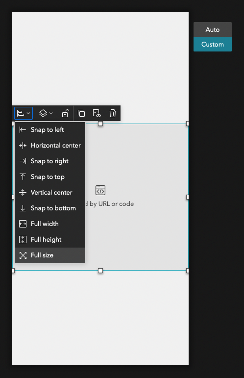
Open the first icon's dropdown and choose Full size.
Under Embed by (on the right), paste the URL of the first dashboard you created.
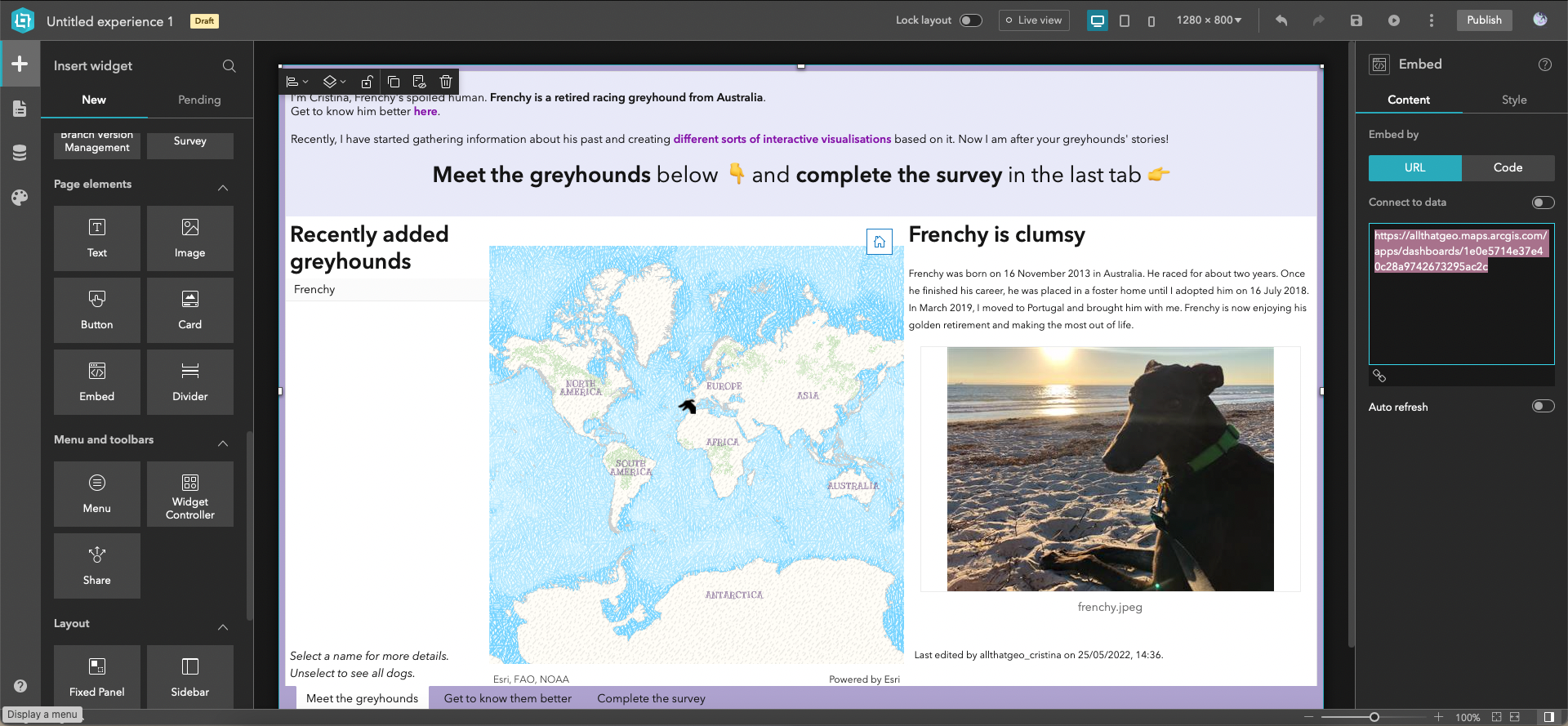
So that will be the dashboard shown on larger screens. Let's now define the dashboard that will be shown on smaller screens.
On the top bar, click on the small screen devices icon.

Enable Custom.
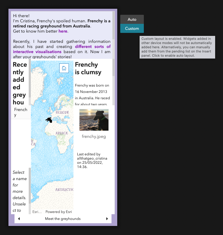
Move to the pending list.
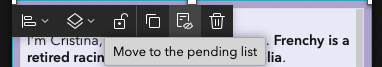
Now we have a blank canvas for smaller screens. Drag the Embed widget from the left and drop it at the centre of the canvas.
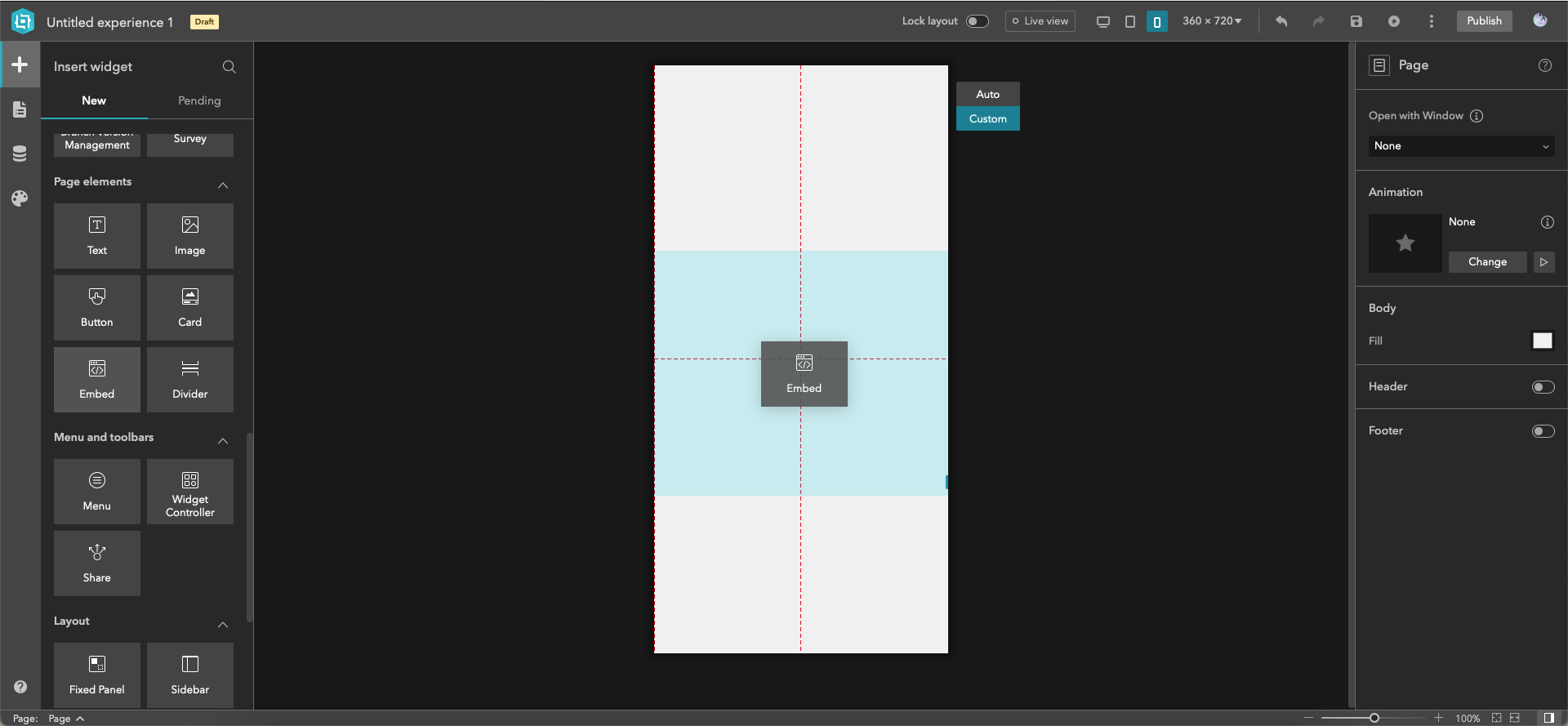
Open the first icon's drop-down menu and choose Full size.
On the right, under Embed by, paste the URL of the second dashboard you created (the small screen version).
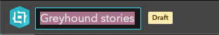
Set the experience name on the top left corner.
Save the experience.

Now it's time to Publish it!

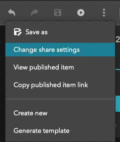
After publishing, click on the three dots and select Change share settings.
Click on Share.
Set sharing level to Everyone (public) and hit Save.
The app is now public. Click on Copy.
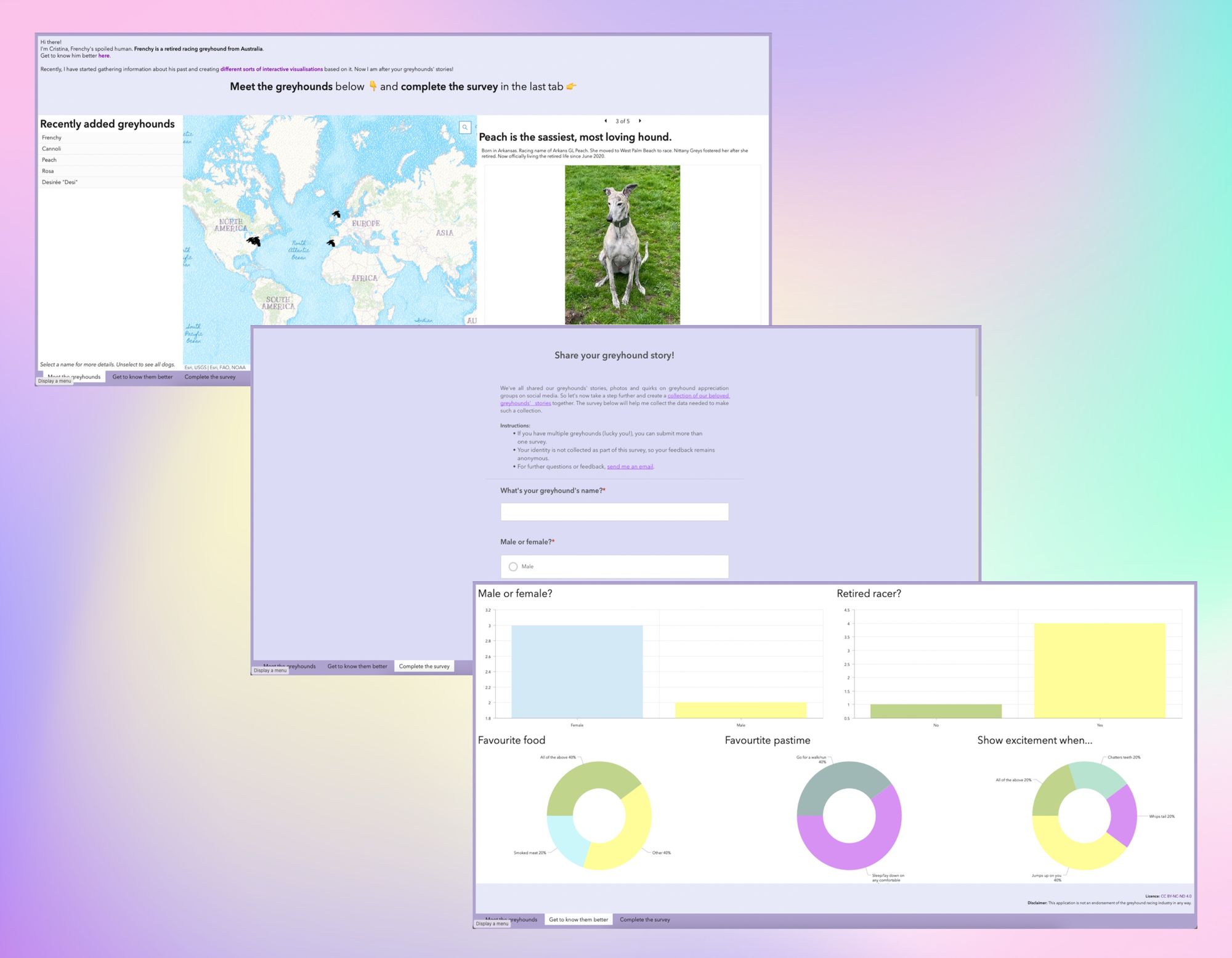
Open a new window and paste the link in incognito mode. There's your web app - for both desktop and mobile viewing - now share it away! You'll start collecting stories and analysing data in no time.
🍲 Swap out moment
Like in a cooking TV show, here's the one I prepared earlier 👇

4.3 Make a short URL to customise your app even further
Can't wait to share the fantastic app you've built with your fellow greyhound owners? You probably now need to make your URL memorable (in every way!). I wrote a post on using a short URL here:
Cristina
🎉 Congratulations! You have just created a 3-in-1 web app!
In this tutorial, you have practised:
- Configuring a survey to crowdsource data.
- Preparing a web map to display greyhounds' locations.
- Creating a dashboard with a web map of greyhounds' locations, a list of the greyhounds' names, their stories with a photo, an introduction, charts to analyse responses, and an embedded survey.
- Customising the dashboard and setting up actions between items.
- Building a dashboard for mobile viewing from the existing dashboard.
- Creating a web experience to show the dashboard in different screen sizes, using a single URL.

Member discussion