
Tutorial – How to find areas that match a set of demographic variables and produce infographics
The increase in longevity is an excellent achievement for humankind, but it also introduces various challenges to our societies. Older people have their own particular needs that require attention. We must make their lives as comfortable as possible, whether we're talking about autonomous and active individuals or the ones who are dependent on care by a third party.
How we treat senior citizens, especially the vulnerable ones, says a lot about our society.
That got me thinking: if I were to offer some service directed to the well-being of the elderly, how would I identify the areas most in need?
I used to have a neighbour, Sandra, who is in senior care. She knows much more about this subject than I do... but I have geographic skills. So, in the hypothetical case we decided to start a not-for-profit organisation, where would we locate it? Which criteria would we use to make that decision? And how would we present our decision-making process to potential investors?
That is where the Business Analyst Web App comes to the rescue! 🦸♀️
From my experience, it is a less-known app with great potential. It makes demographic mapping, site selection, suitability analysis and creation of infographics and reports a breeze.
In this month's tutorial, I'm sharing how I used Esri Demographics + smart map search to find US counties with a vulnerable elderly population and produce infographics with the Business Analyst Web App. Here's the high-level workflow:
- Choose the tool: ArcGIS Business Analyst Web App.
- Prepare the data: Work with five criteria from Esri Demographics and set custom ranges.
- Create a visualisation: Use the Smart Map Search capability and create sites from selected areas.
- Share your work: Save the analysis to your ArcGIS Online content and run/export infographics.
🤔 But Cristina, how can this workflow be helpful to me?
- You work in the local/state/central government in charge of social affairs and want to identify geographic areas where service improvement is needed.
- You want to start a not-for-profit organisation and are unsure where to locate it.
- You know what to look for (set of criteria), but you don't know how to get and apply the data.
- You must share the decision-making process with stakeholders in a practical, impactful way.
1 Choose the tool
Choose → Prepare → Create → Share
In this workflow, we will use the Business Analyst Web App (BAO for friends) available in ArcGIS Online. If you do not have an account but want to give the app a try, have a look at the free options in the post below:
Once you create your account (if you haven't got one yet), you're ready to proceed.
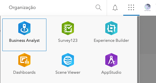
You can access the app from your account by finding it in the app launcher...
... or signing in directly on the ArcGIS Business Analyst page:
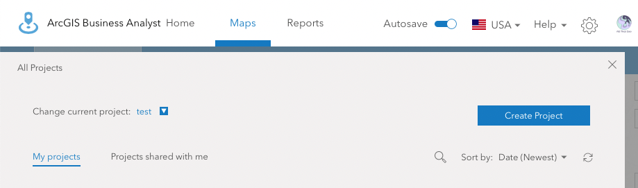
Once you're logged in, Create Project.
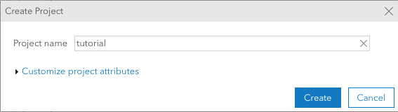
Give a name to the project and click Create.
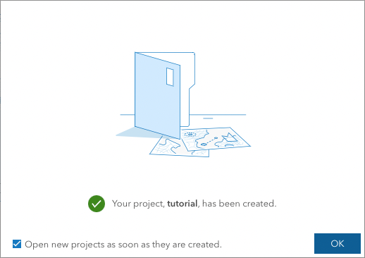
Click OK to open your project.
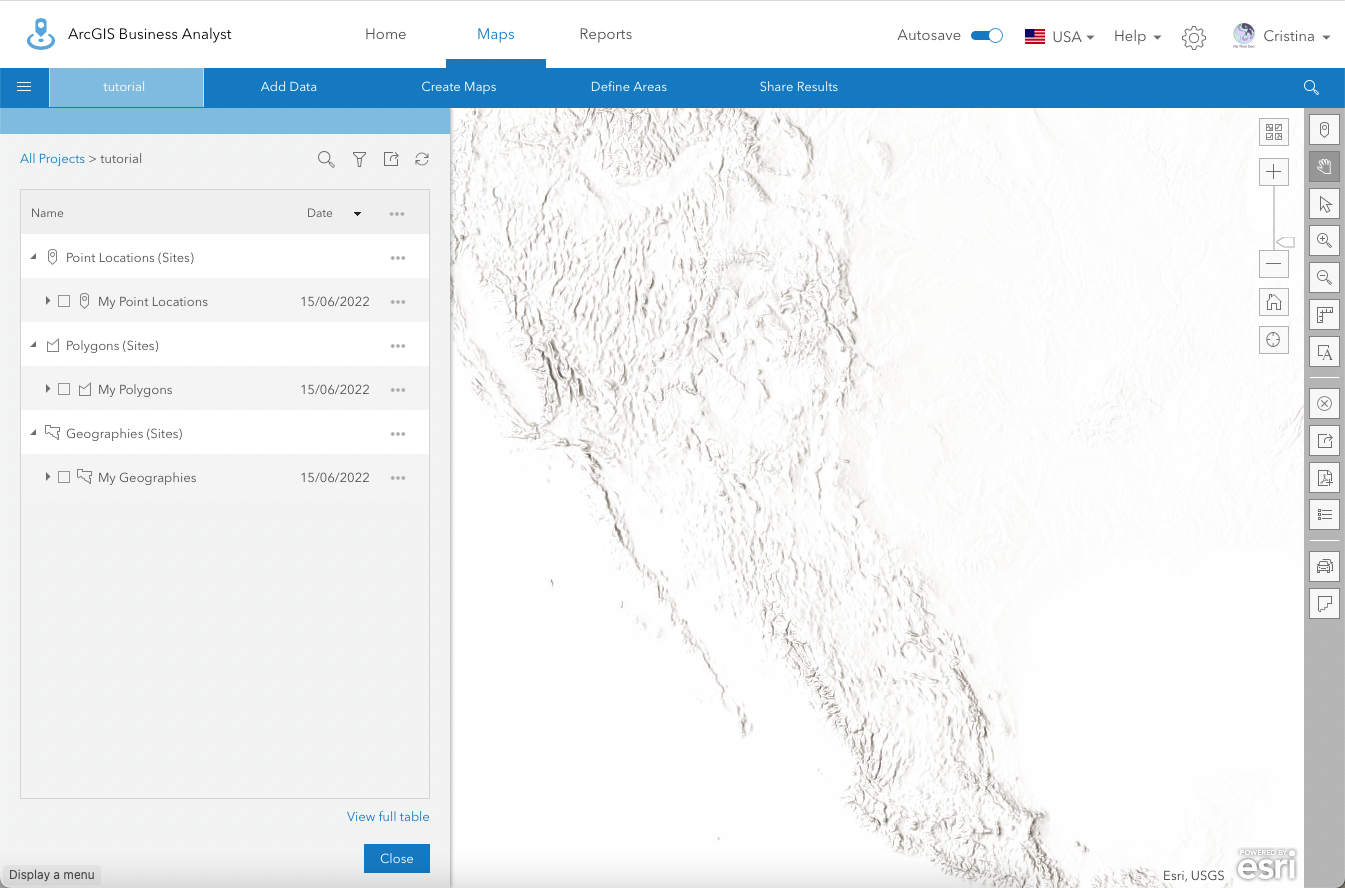
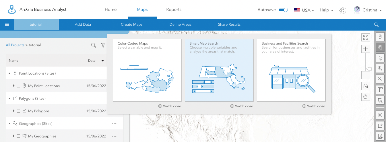
You're now in the map interface of the Business Analyst Web App.
2 Prepare the data
Choose → Prepare → Create → Share
Esri Demographics
Notice the flag on the top right. Although we'll be focusing on the United Stated in this tutorial, you can change the country (by clicking on the pointing down arrow) to suit your use case.
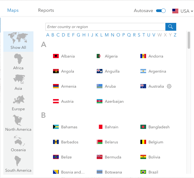
This selection will determine the data from Esri Demographics that will be available in the app. The data will vary greatly depending on the chosen country.
Smart Map Search
Go to Maps > Create Maps > Smart Map Search.
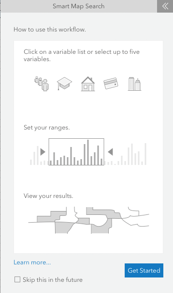
You're now presented with a wizard introducing the Smart Map Search functionality. Click Get Started.
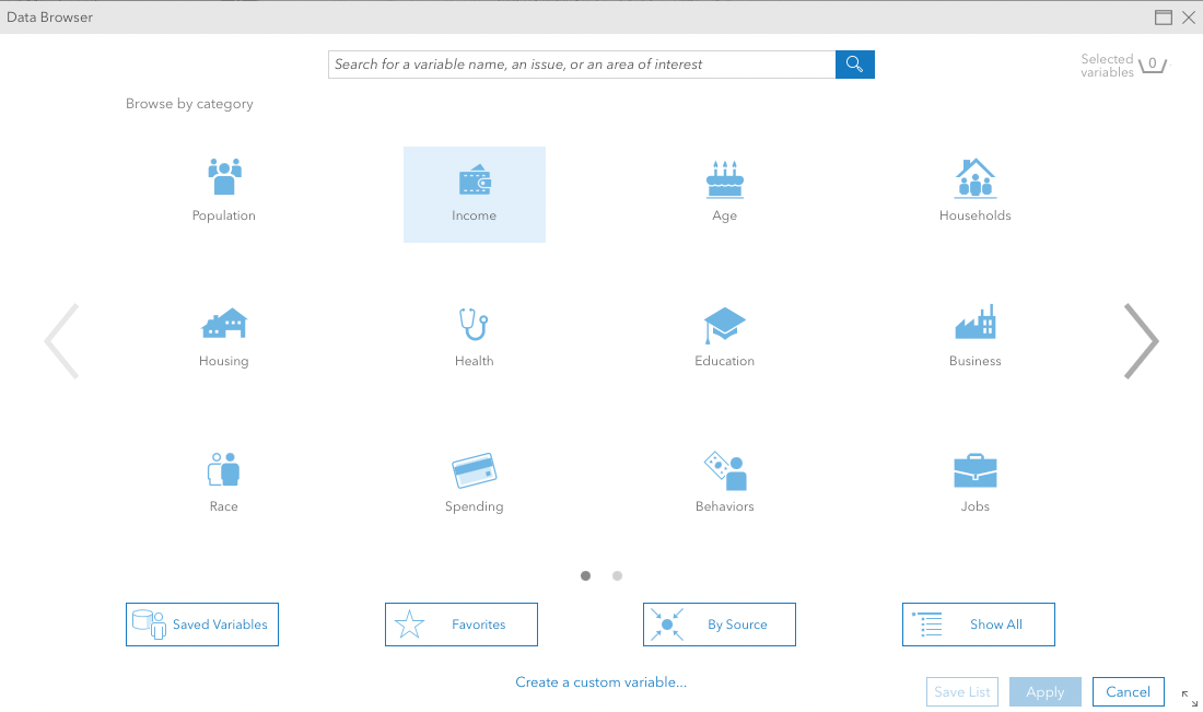
Go to Browse All Variables.
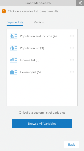
Now, we will look for variables that allow us to detect the vulnerable elderly population. Let's start with those with a low income. Select Income.
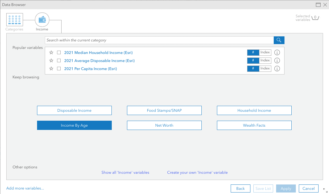
Now, select Income By Age.
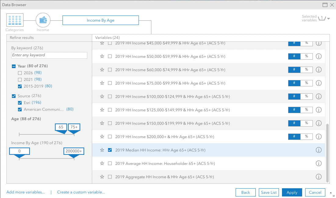
In the Refine results section on the left, filter results by Year 2015-2019 and Age 65-75+. Select 2019 Median HH Income: HHr Age 65+ (ACS 5-Yr) and click Apply.
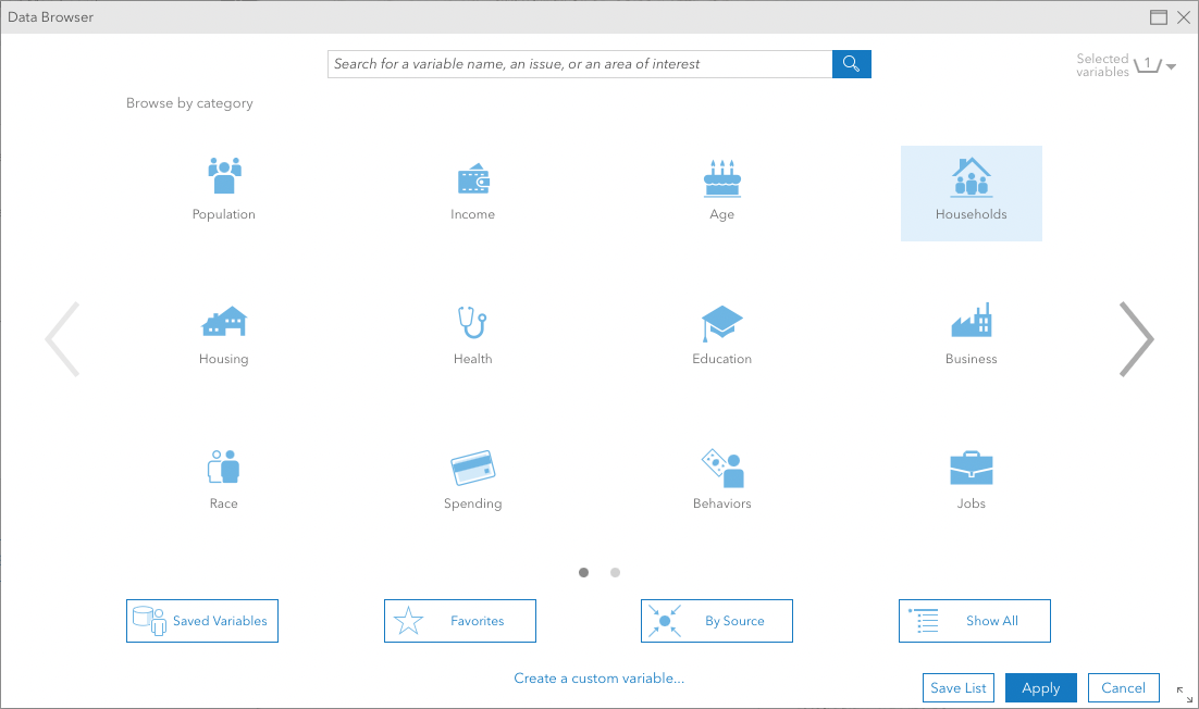
Now let's find the elderly living alone. Click Back and then select Households.
In the search box, type' 1 person' and hit ENTER.
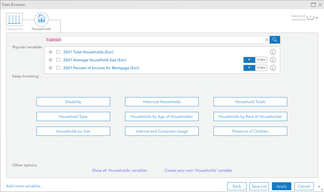
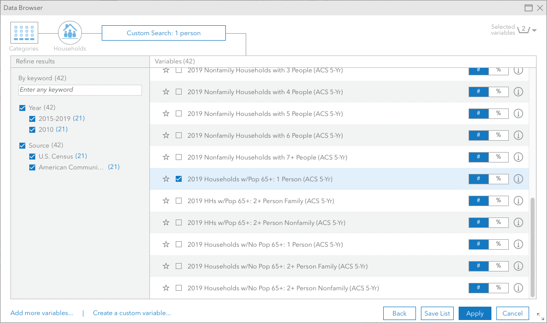
Select 2019 Households w/Pop 65+: 1 Person (ACS 5-Yr) from the results and hit Apply.
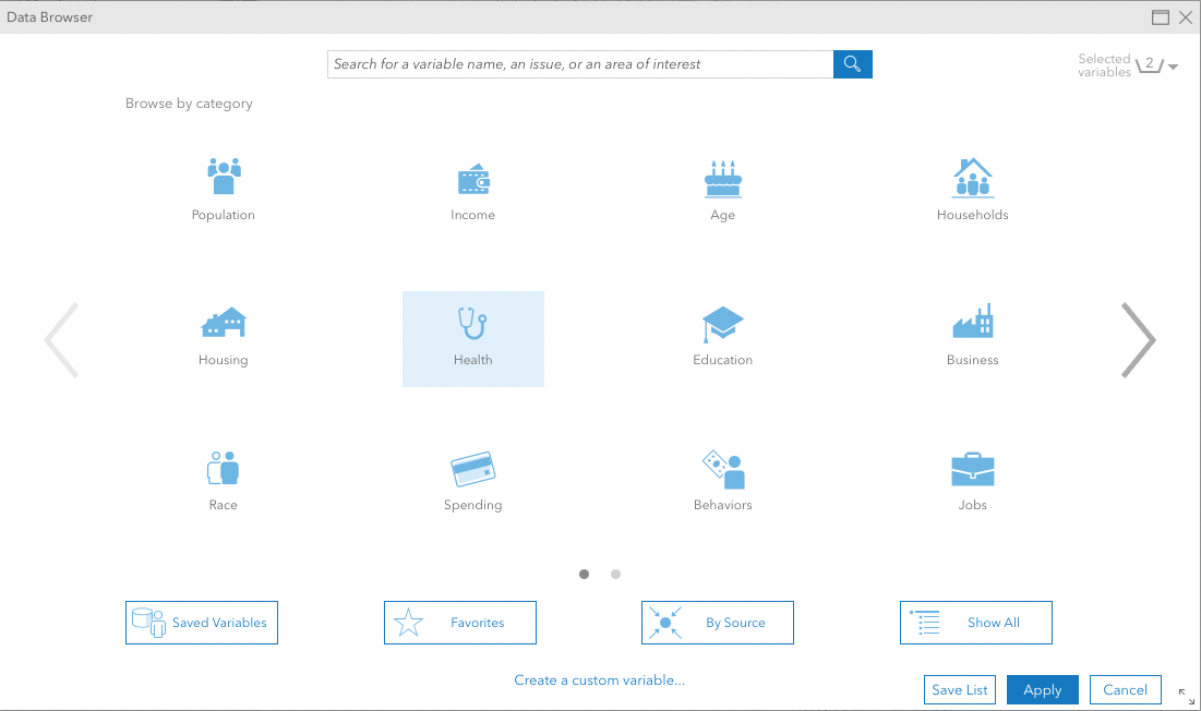
Next, we'll try to find older people without health insurance. Click Back and select Health.
Click on Health Insurance Coverage.
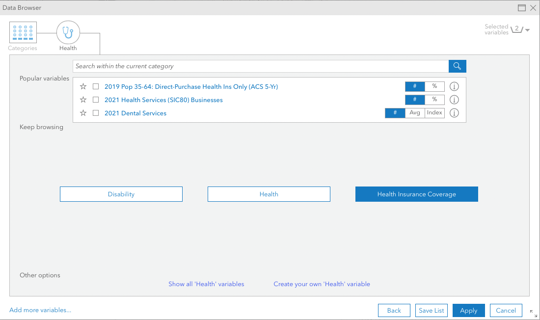
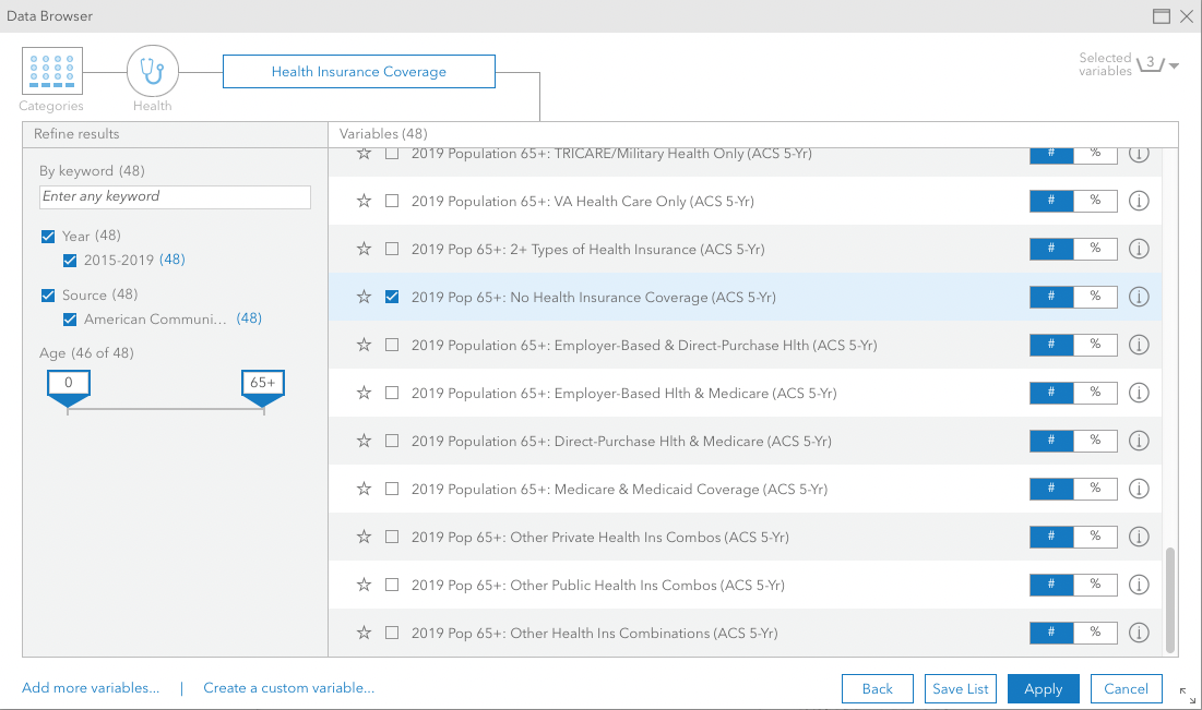
Find 2019 Pop 65+: No Health Insurance Coverage (ACS 5-Yr) from the results and click Apply.
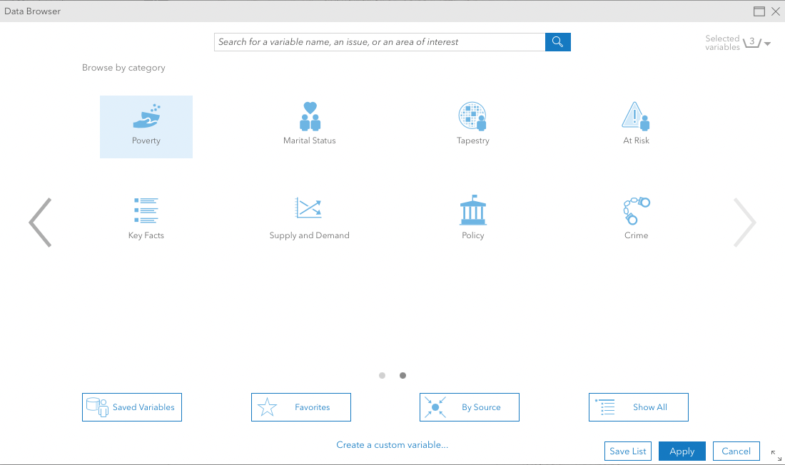
The fourth variable has to do with older people on food stamps. Click Back and select Poverty.
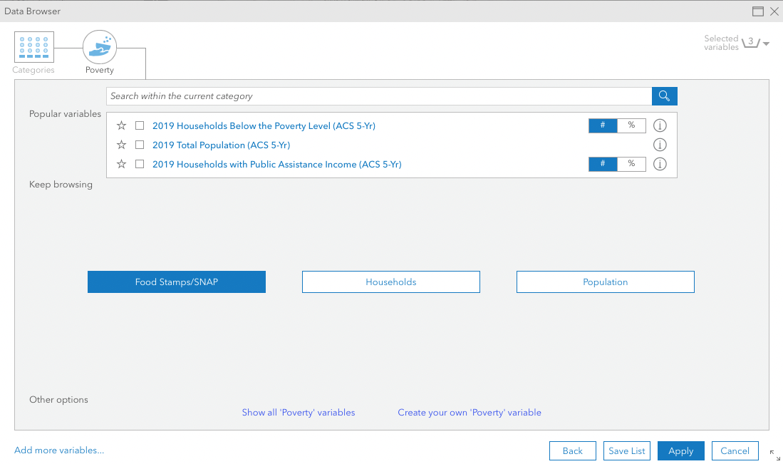
Click on Food Stamps/SNAP.
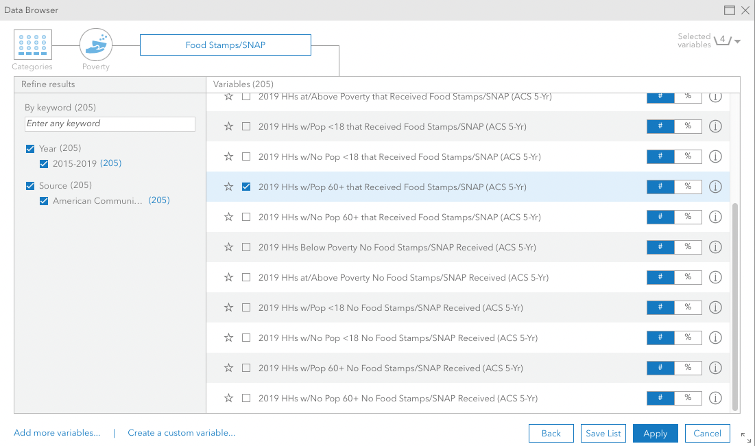
Find 2019 HHs w/Pop 60+ that Received Food Stamps/SNAP (ACS 5-Yr) from the results and click Apply.
Finally, let's try to find older adults with communication issues. Remember Sandra, who is in elderly care? She is from a Hispanic background, which comes in handy to help the population that only speaks Spanish.
Click Back and select At Risk.

In the search field, type 'no english' and hit ENTER.
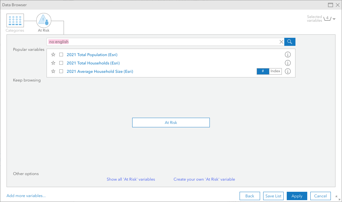
Select 2019 pop 65+ Speak Spanish & No English (ACS 5-Yr) from the results, and click Apply.
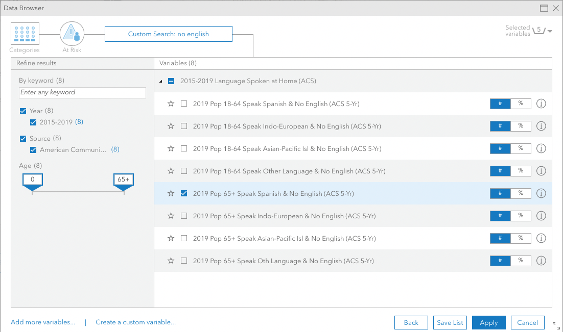
Now notice how the variables you chose appear on the left.
3 Create a visualisation
Choose → Prepare → Create → Share
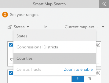
As you might have noticed, the map is showing US states. These large geographic areas are not very helpful to our analysis. Click on the pointing down arrow next to States and change to Counties.
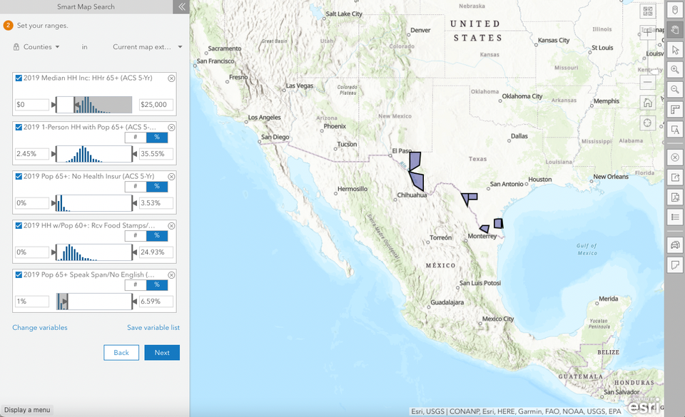
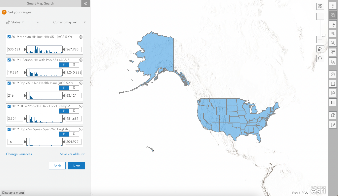
Now, we will adjust the ranges in each variable to filter the most vulnerable older population.
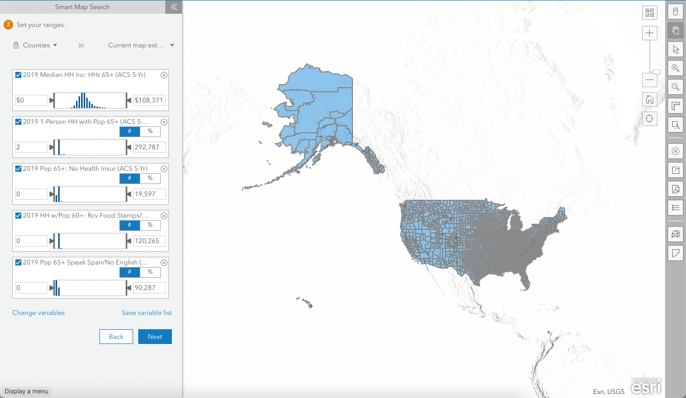
In the image below, you can find my configuration.
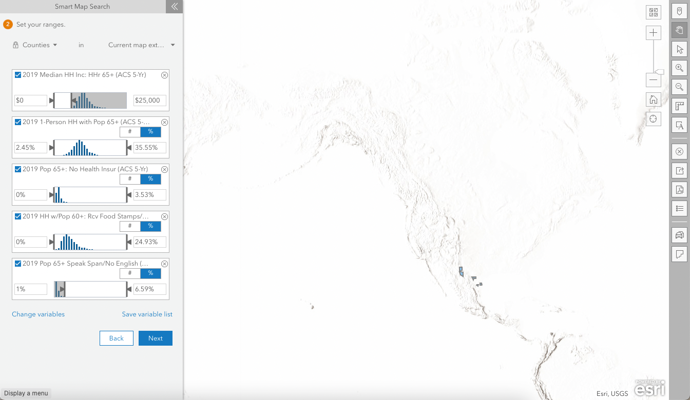
Feel free to do it differently, depending on your use case, variables, geographic context etc. Notice that the counties (on the right) will match the ranges as you change them. Once you're done, click Next.
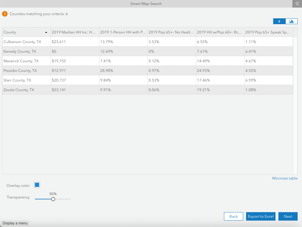
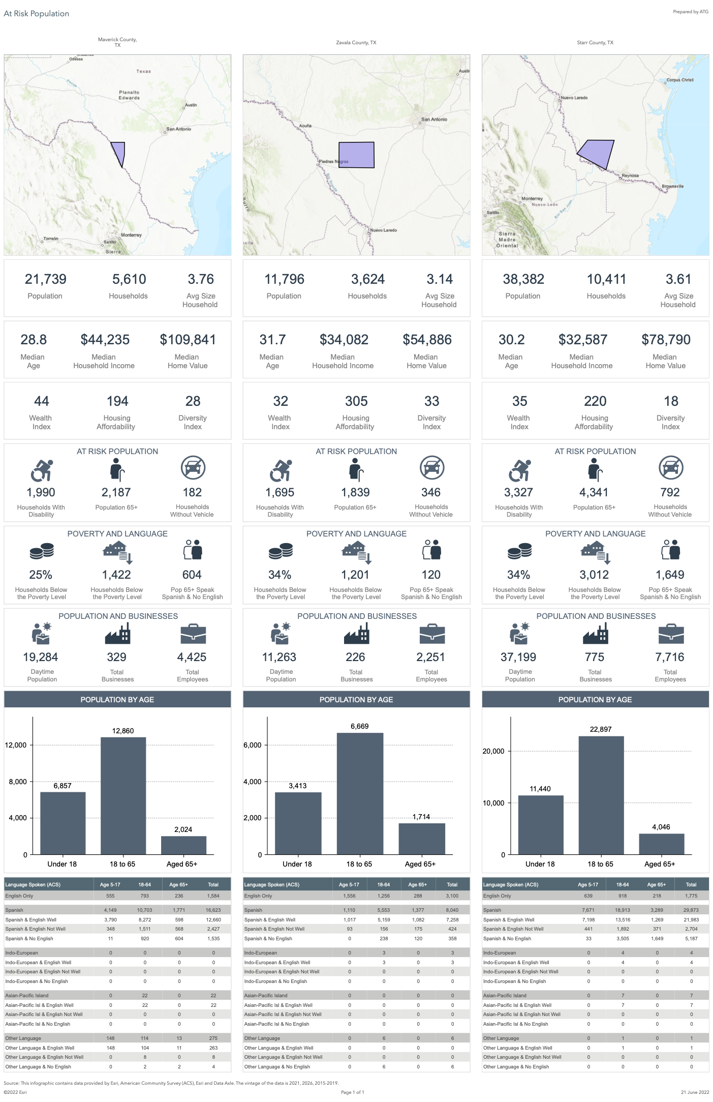
My smart map search (using five variables with custom ranges) retrieved six counties.
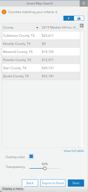
Click on View full table to overview the differences between the six counties.
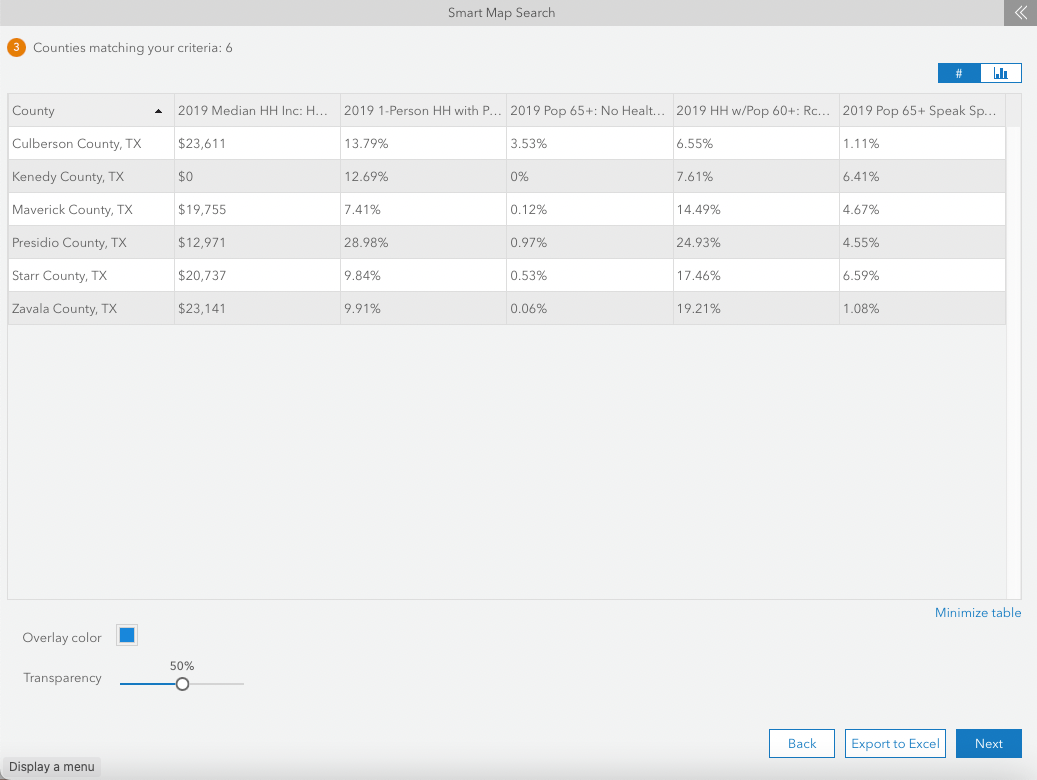
You can also Export to Excel to save this table for future reference/analysis.
Here's mine 👇
Then, click Next.
Click I'm Done.
Use the map tools (pan, zoom in/out) to see the counties.
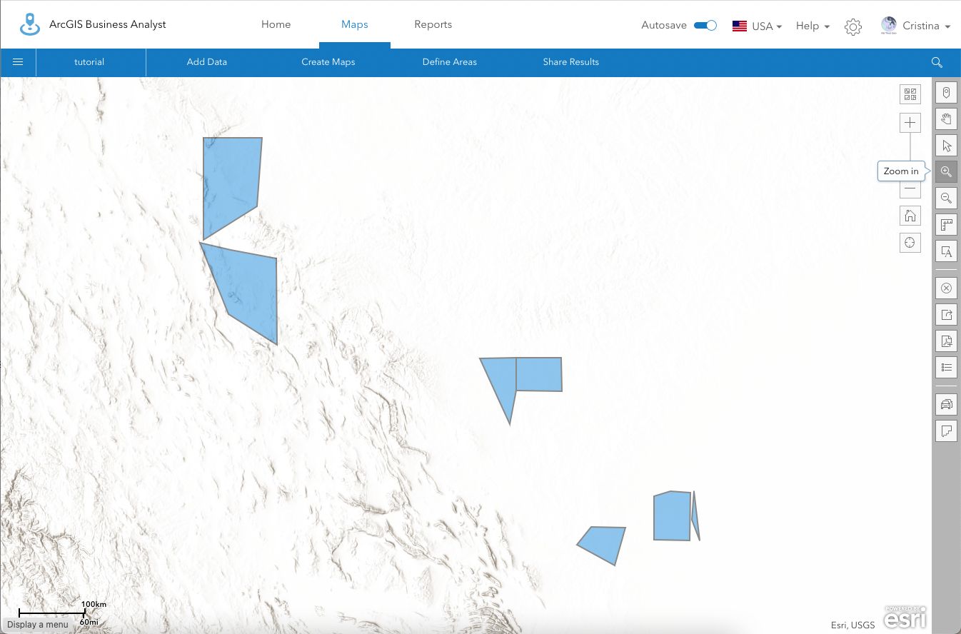
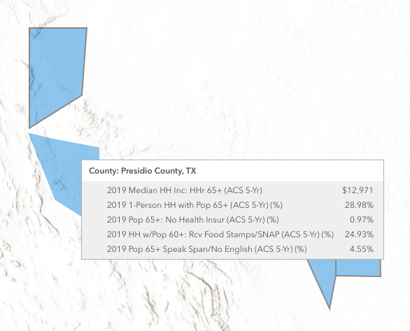
Notice the pop-ups that show up when you hover over the counties.
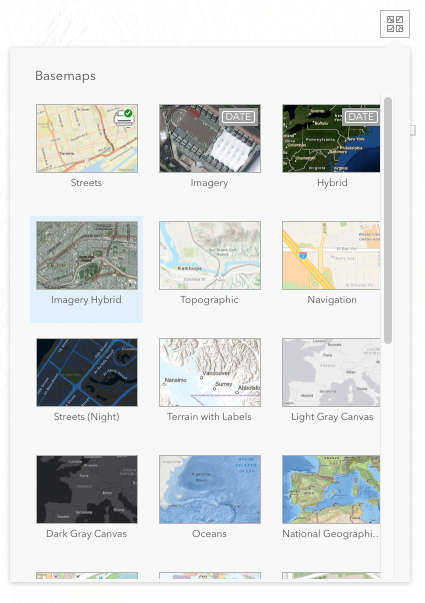
If desired, you can also change the basemap by clicking on the bottom on the top right of the map.
Create sites from selected areas
To save these selected counties, you'll have to keep them as sites. To do so, click on each polygon and select Create site.
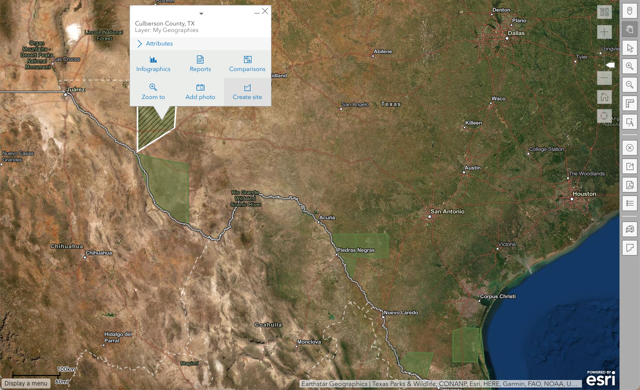
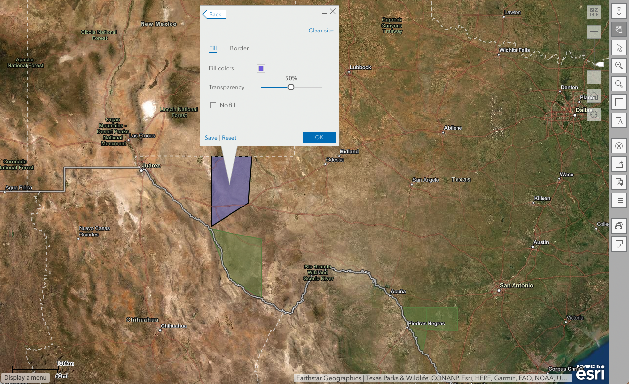
Note that you can also change the polygons' appearance. Once you've repeated the process for all polygons, click OK.
4 Share your work
Choose → Prepare → Create → Share
Save the analysis to your ArcGIS Online content
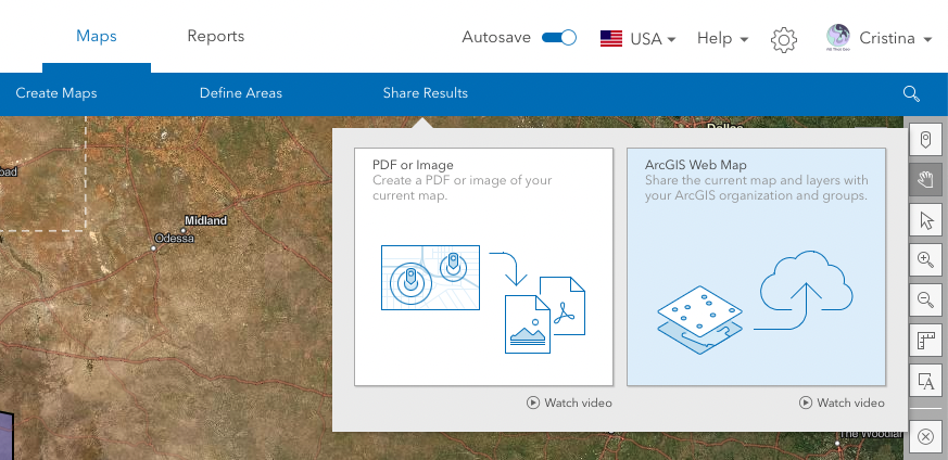
You might want to save this analysis in your ArcGIS Online account for future reference, add it as input to further investigation or share it with others. To do so, go to Share Results > ArcGIS Web Map.
In the Share Map window, Enter map details and click Share.
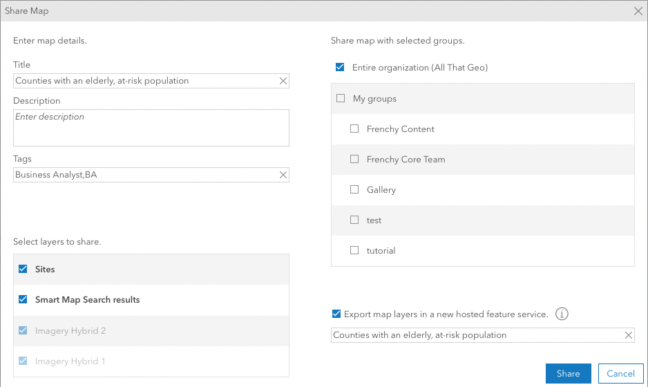
From this point on, you'll be able to retrieve the current map and layers on your ArcGIS Online Content page.
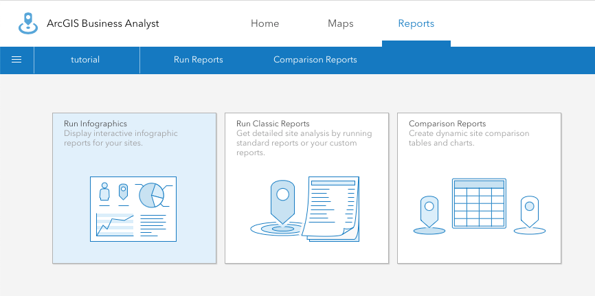
Run infographics
Infographics are an effective way to share your analysis in a visually pleasing way. You can share it in PDF and HTML format and quickly send or embed it.
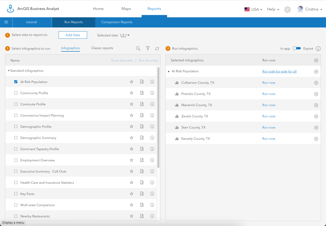
Go to Reports > Run Infographics.
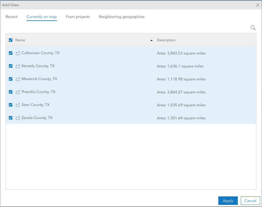
Click on Add Sites.
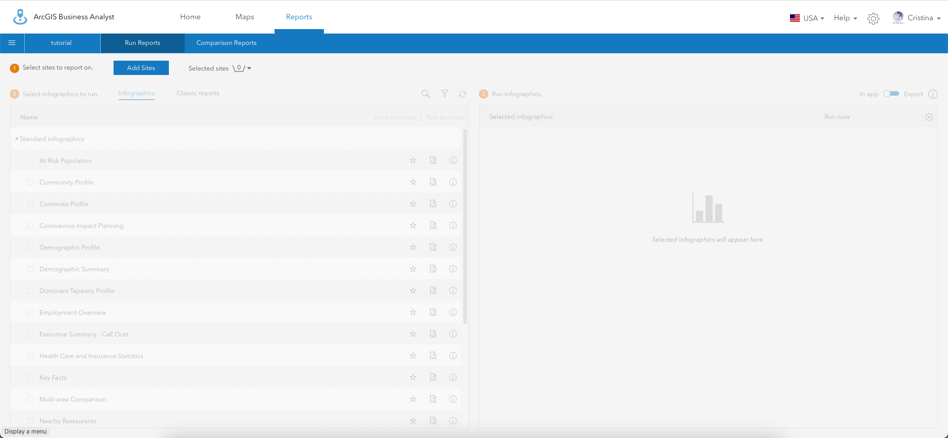
Select the six sites you saved earlier and click Apply.
Now, choose At Risk Population on the left. Then, click on Run side-by-side for all on the right.
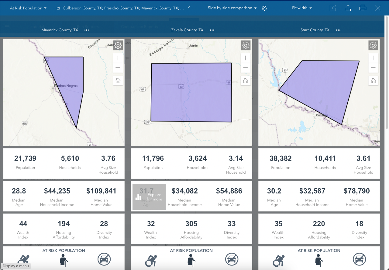
Here's your infographic, with side-by-side information on all six counties.
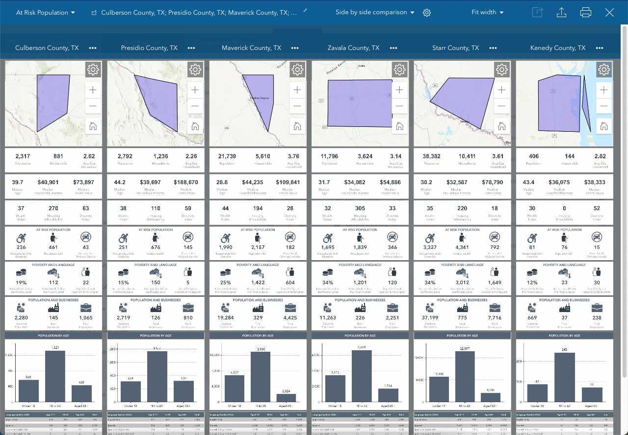
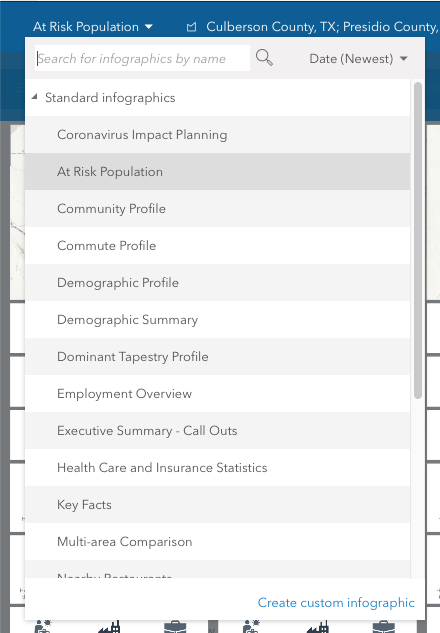
Notice the drop-down list on the top left. You can change it to a different infographic on the fly. However, be mindful of service credits usage 😉
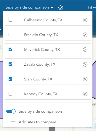
Since the infographic is a bit cluttered, we'll focus on the counties with a higher population (because of the scale effect). Under Side by side comparison, unselect Culberson County, Presidio County and Kenedy County.
Better, right? 😉
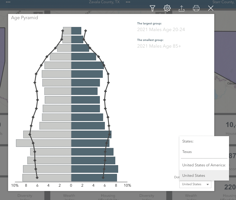
Notice that the infographic is also interactive. Hover over a variable and click on Explore for more.
You can also make comparisons with other geographic areas (e.g., in the Age Pyramid, by clicking on the lower right drop-down list).
Close the window.
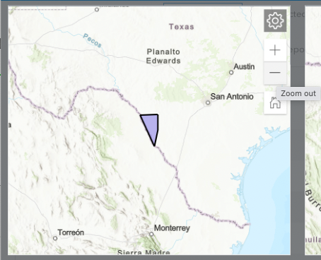
You can zoom out if the maps do not show the geographic context properly.
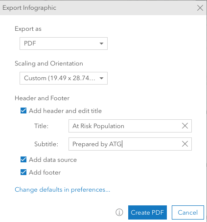
Export the infographics
Now, let's export the infographic. You can export it to PDF and to Dynamic HTML.
Let's start with PDF. Click on the Export infographic icon on the top left.

In the Export Infographic window, fill out the details as desired. Then, click on Create PDF.
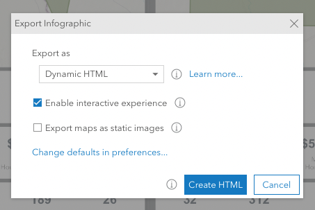
If you prefer to export as a Dynamic HTML (e.g., embed it on a website), repeat the process but select Dynamic HTML in the drop-down list. Then, click on Create HTML.
🍲 Swap out moment
Like in a cooking TV show, here's the one I prepared earlier 👇
🎉 Congratulations! You have just found areas that match a set of demographic variables and produced an infographic on it
In this tutorial, you have practised:
- Working with ArcGIS Business Analyst Web App.
- Applying five criteria from Esri Demographics and set custom ranges.
- Using the Smart Map Search capability and creating sites from selected areas.
- Sharing your analysis to ArcGIS Online and running/exporting infographics.
🚀 How to further this workflow
With a Business Analyst Advanced License you can, amongst other things:
- Create custom infographics, i.e., infographics that match your organization's branding and showcase your choice of variables.
- Perform site selection, where you can add your data, e.g. existing similar services in the area and commercial rent.

Member discussion