Create high-impact 4D geospatial visualisations with Kepler.gl

Have you ever wondered how to map time-enabled data? And create 4D geospatial visualisations?
Kepler.gl from Uber is a free, open-source, web-based application for geospatial analysis. It facilitates mapping four dimensions: latitude, longitude, height (or another attribute), and time.
Once you create a visualisation with Kepler, you can choose to export the map as an image, export the data, export the map to HTML or JSON, and share a public URL (you’ll need a Dropbox account for this).
For a sneak peek at some Kepler's capabilities (and performance!), have a look at the animated visualisation of California earthquakes comprising 20 years’ worth of data. Did it inspire you? Follow the user guides and create your own data visualisation.
From my experience, Kepler is a joy to use; it is simple enough for beginners, still producing high-impact visualisations.
P.S. Do you want to create your own app with Kepler.gl and share it? Then, you might find this tutorial helpful:
 Cristina
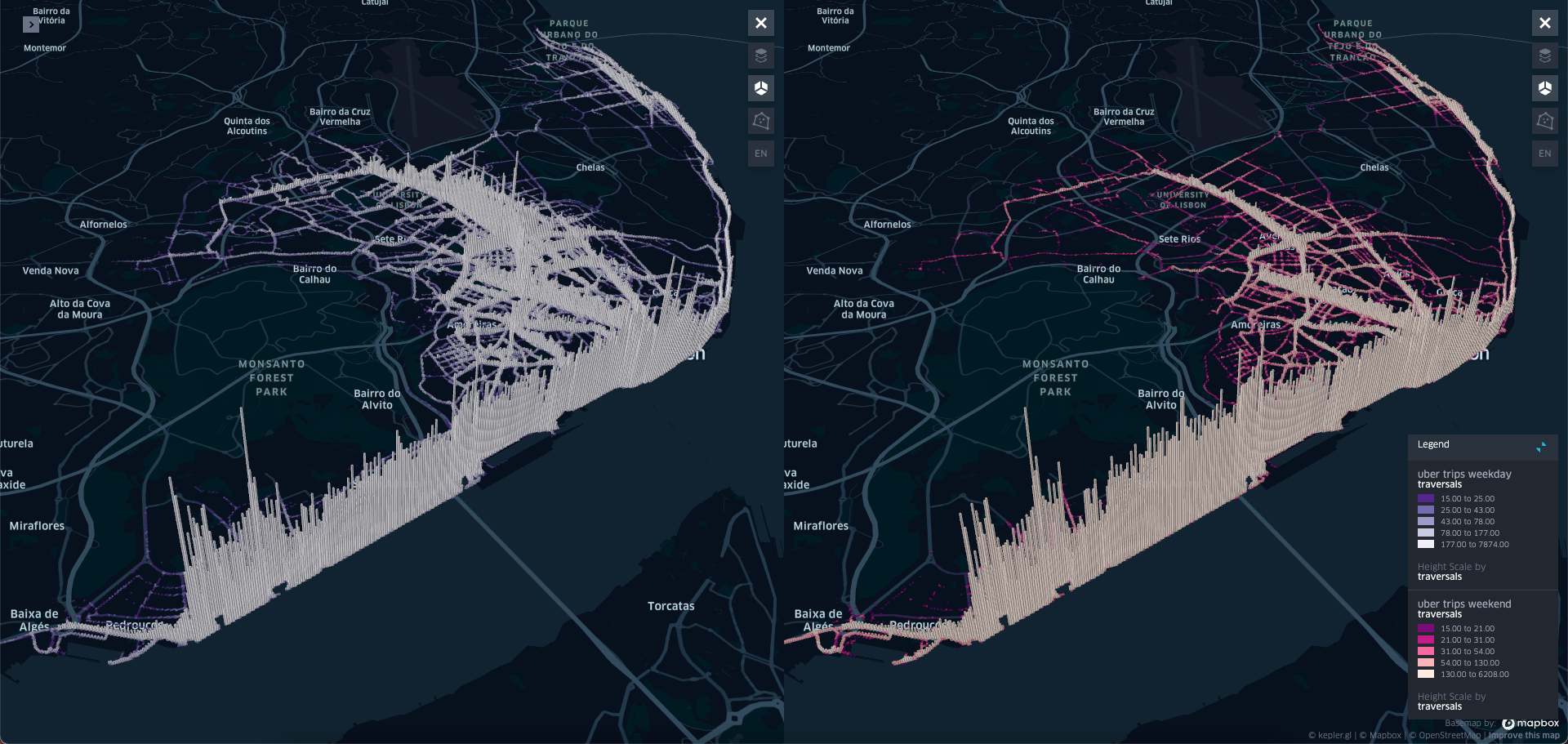

The Monthly with All That Geo
Want to learn how to use ArcGIS Online for spatial, data-driven storytelling? Sign up for The Monthly with All That Geo and I'll deliver a new example of an interactive web app straight to your inbox every month.
You'll get a behind-the-scenes look at how it was built—from the data collection process through the final app—so you can practice your own data visualisation skills and unlock your creativity as you go.
If you want to find inspiration to start a project that will make a difference in your study area or work, sign up for The Monthly with All That Geo!


Member discussion