Tutorial – How to create a 4D visualisation of urban mobility data with Kepler.gl
1 Choose the tool
Choose → Prepare → Create → Share
There are two compelling arguments for you to use Kepler.gl: it is free and produces high-impact visualisations of location data. Add that to being a browser-based tool, and you have a winner.
This tutorial demonstrates how I created a visualisation of mobility in Lisbon that takes advantage of two of the tool's best capabilities: Split Map and 3D.
You can follow along and adapt this tutorial to your projects: you can use a side-by-side comparison of a map area for temporal changes in an area's biodiversity and 3D to enhance the communication with the viewer.
2 Prepare the data
Choose → Prepare → Create → Share
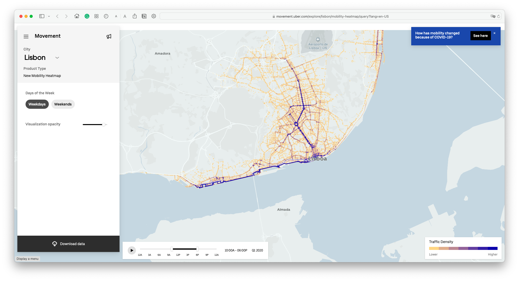
I retrieved a dataset on urban mobility, more specifically, on Uber trips, from Urban Movement. Since I was looking into studying Lisbon's mobility - and the differences in traffic between workdays and weekends - I found precisely the data I needed here.
Feel free to choose a different city by clicking on the arrow next to Lisbon (other options include New Delhi, Nairobi, Brussels, amongst others).
Head to the lower-left corner of the page and click Download data.
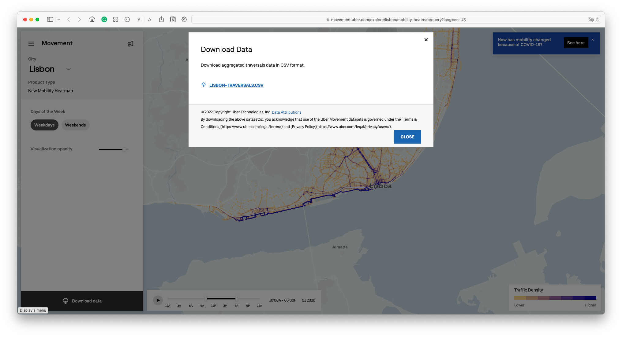
Download the lisbon-traversals.csv file (or the one of your chosen city) to your computer. Alternatively, get the same dataset used in this tutorial from here (retrieved 25.1.2022).
CSV is one of Kepler.gl's accepted data formats, so we're good to go. No further data transformation is necessary.
3 Create a visualisation
Choose → Prepare → Create → Share
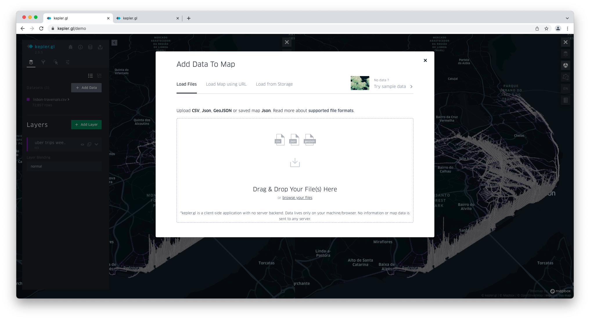
Open https://kepler.gl/ in your browser and click on GET STARTED.
A modal window opens for you to add data.
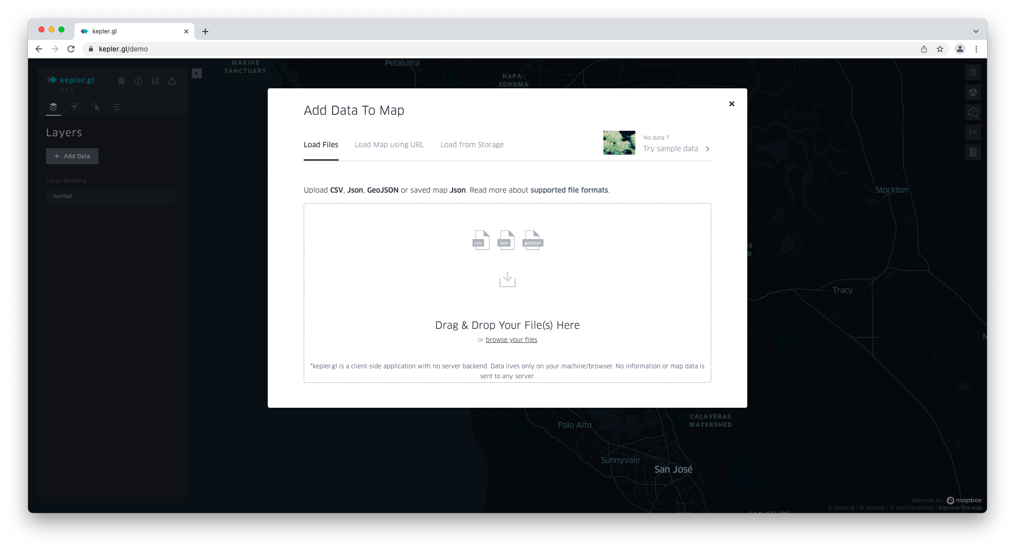
In the Load Files tab, click browse your files and locate the lisbon-traversals.csv file.
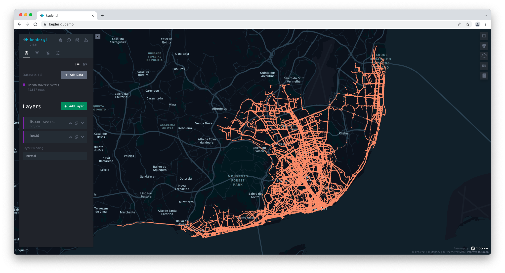
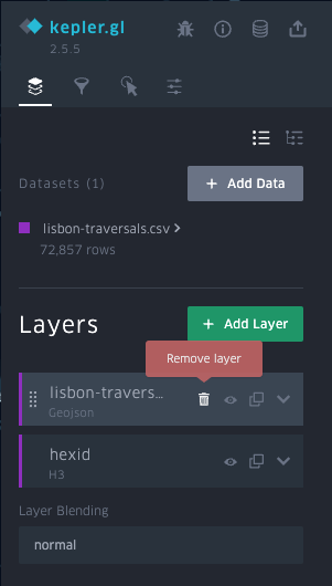
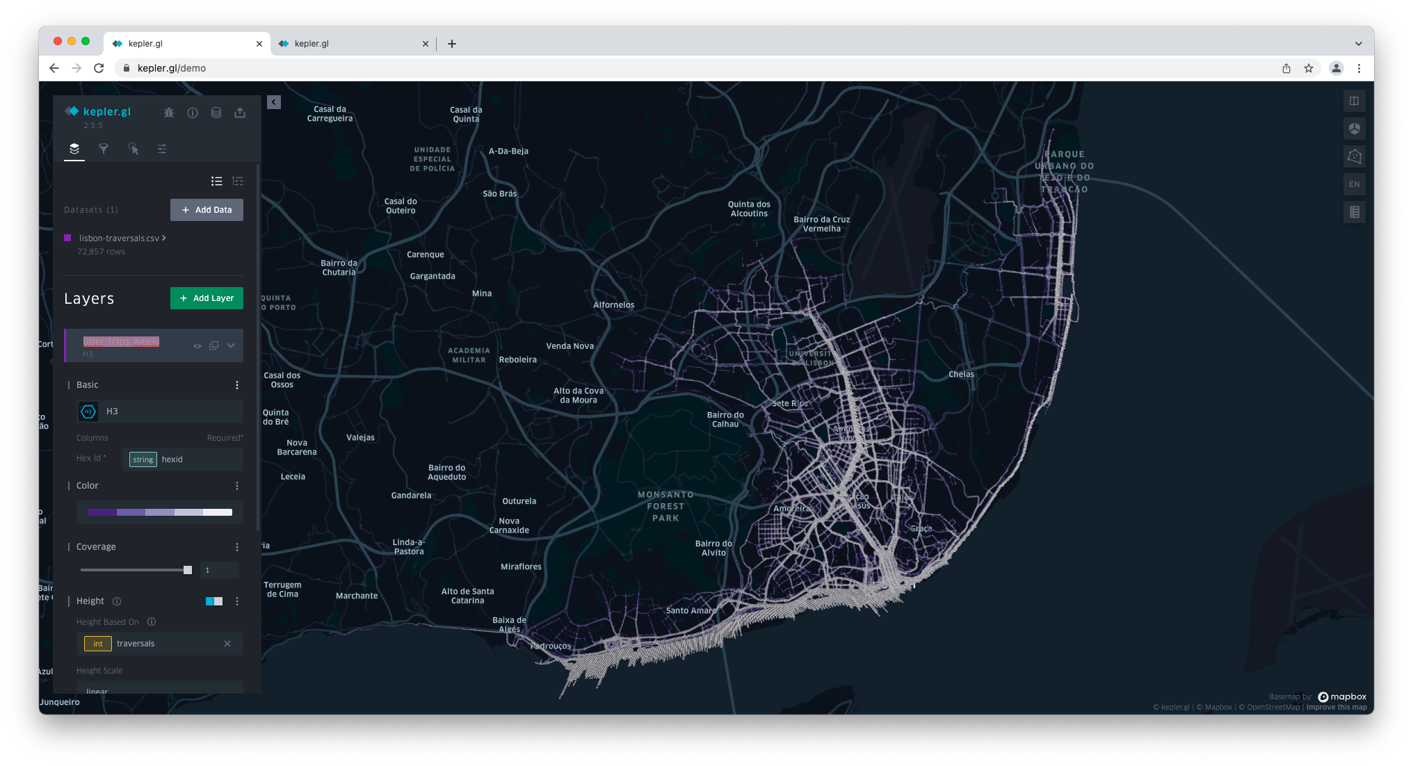
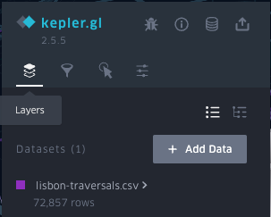
Once the dataset has been uploaded, it shows under Datasets on the left-hand side panel.
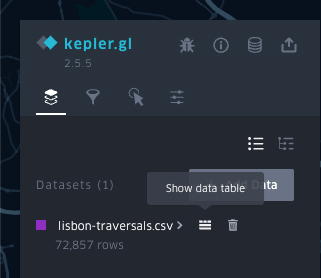
Hover over the dataset name and click on the first icon on the right to Show data table.
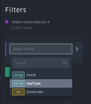
Inspect the data, focusing on the columns (attributes).
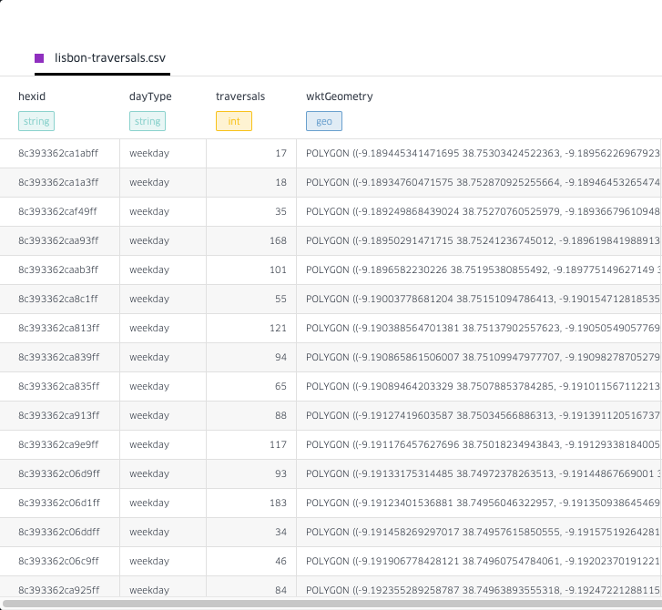
Notice the presence of the attribute wktGeometry. This is the one that will enable you to map the trips. Additionally, the attribute hexid identifies each hexbin.
Close the data table.
Layers
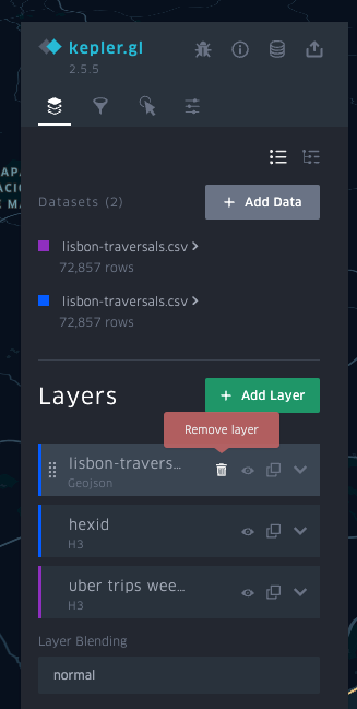
Two layers were added under Layers after uploading the dataset: lisbon-traversals and hexid. Since we're not going to use the former, remove it.
Now, let's configure the hexid layer by clicking the Layer settings arrow next to it.
hexid's layer type is H3 and uses the hexid attribute from the dataset. More information on it is here.
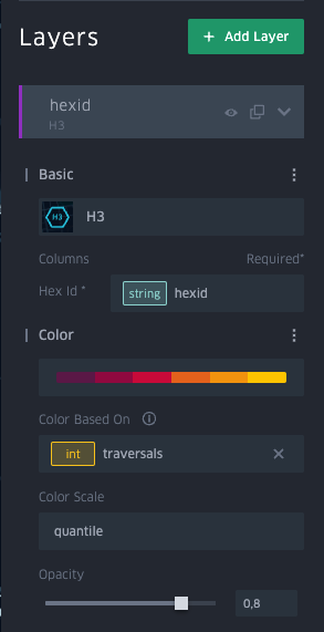
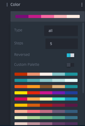
Click on Color. Change the palette to purples, Steps to 5, and enable Reversed.
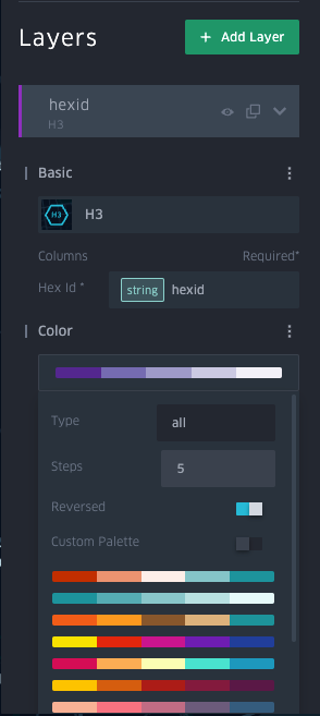
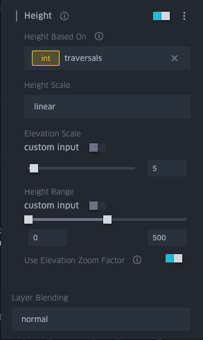
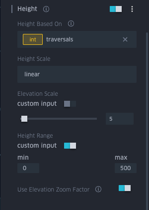
Now, enable Height (this will be necessary to allow 3D, later) and click on Height to configure it. Then, set Height Based On to traversals (which stores the number of traversals in each hexbin).
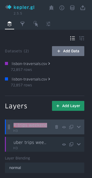
End the customisation of this layer by renaming it. Select the current name and replace it with uber trips weekday.
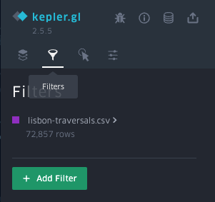
Filters
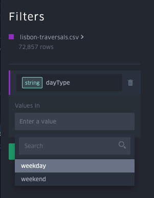
Click on Filters. Here, you'll create a filter to show only the traversals on weekdays (excluding the ones on weekends for now).
Start by clicking the Add Filter button.
In Select a field, choose dayType.
In Enter a value, choose weekday.
3D
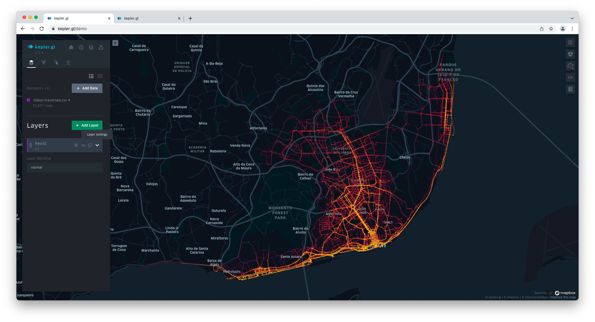
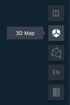
You're now going to enable 3D. Head to the icons on the far right and click on the second one (3D Map).
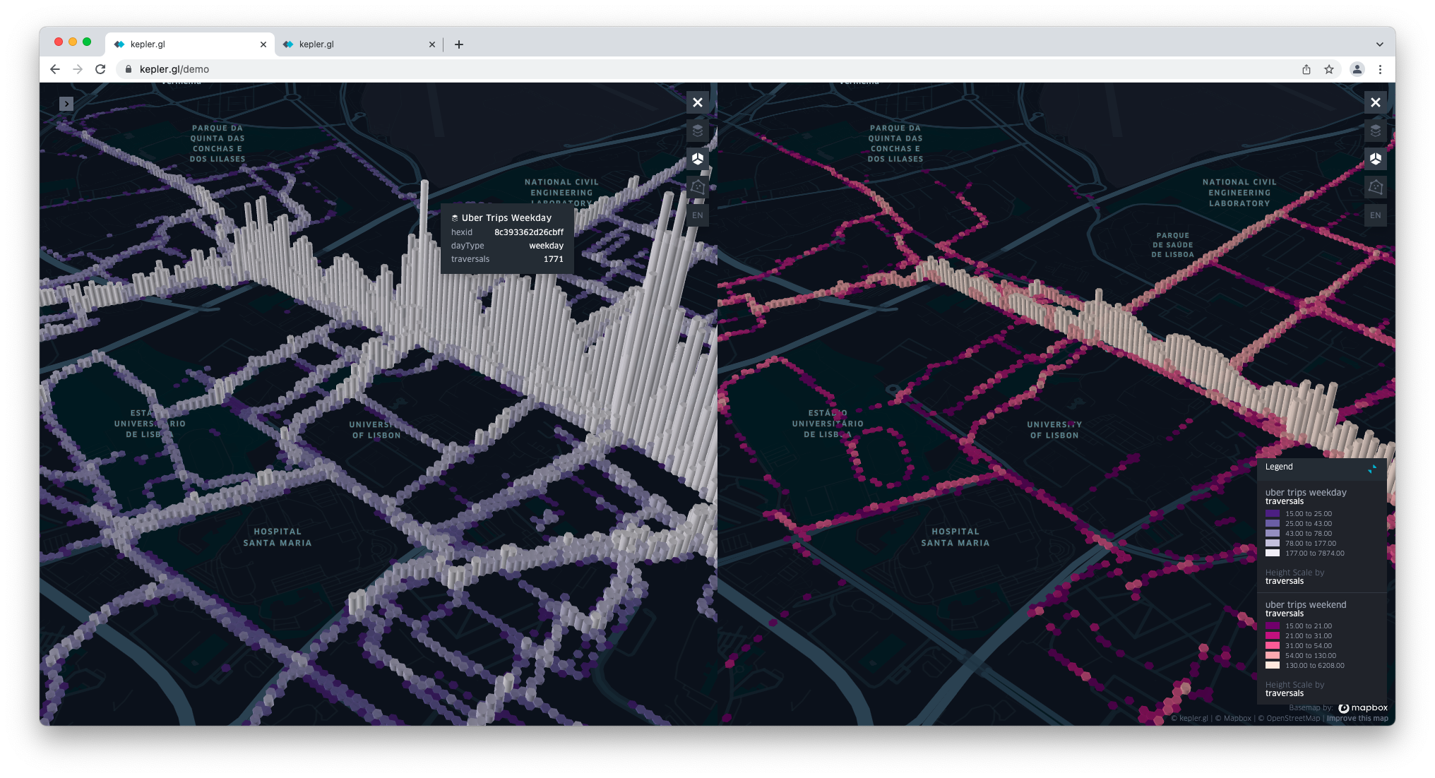
You are now seeing weekday traversals in 3D.
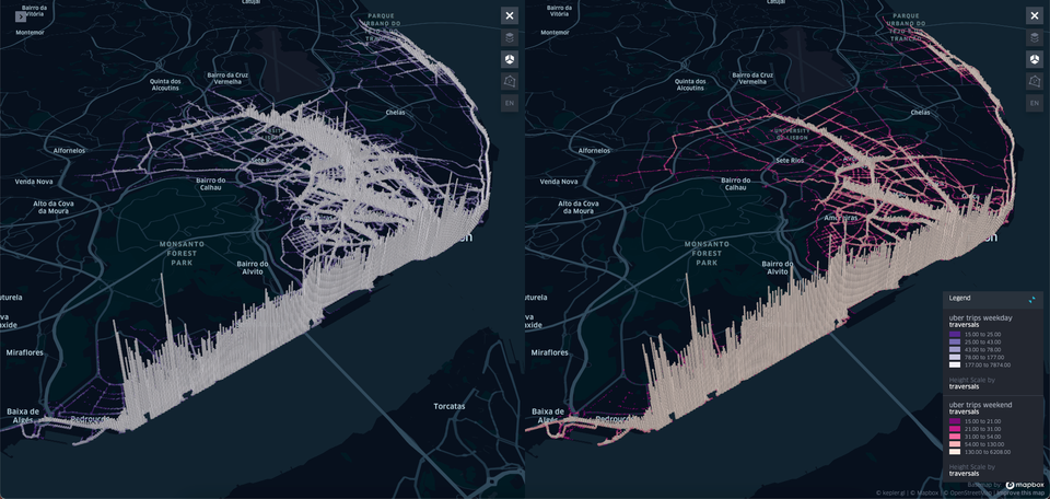
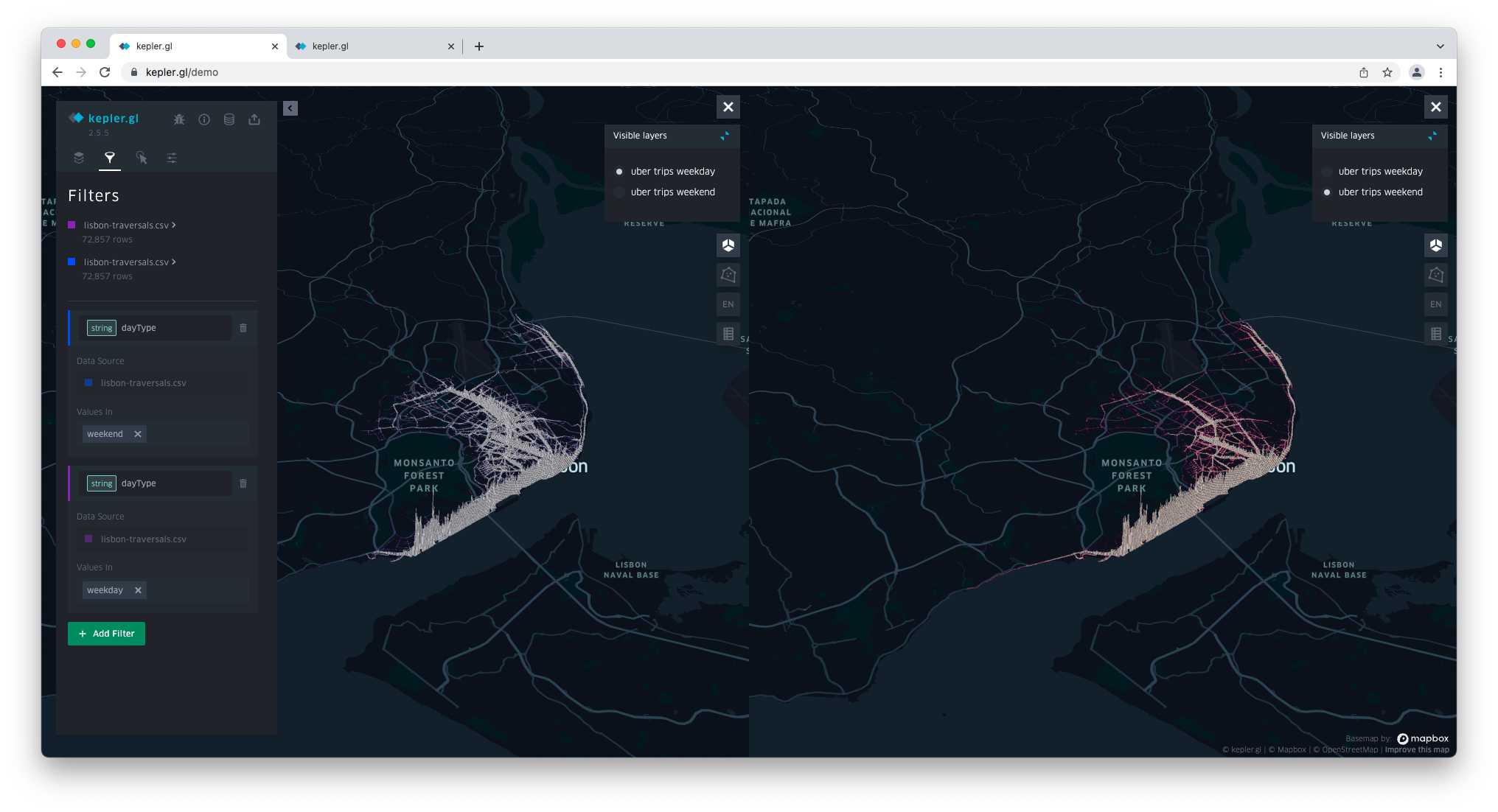
Dual map view
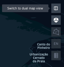
If you remember, the idea behind this visualisation is to compare weekday traffic vs weekend traffic. To do so, Switch to dual map view by clicking on the first icon on the far right.
Now, let's configure the map to show weekend traversals. Head back to Layers and click Add Data.
The Add Data To Map modal opens. Add the lisbon-traversals.csv file again.
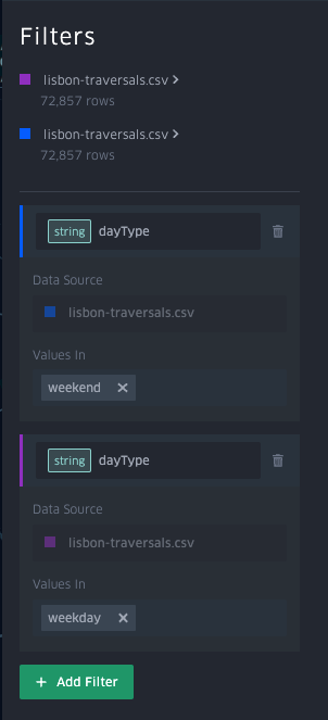
Notice how this second dataset has a different colour label from the first one you added. This will help you identify which layer is using which dataset.
In the following images, you'll find that the first dataset (the one used to map weekday traversals) has a purple label, whereas the second one (the one you're going to use to create the weekend map) has a blue label.
From here forward, you will repeat the process you followed for the first dataset. Start by removing the lisbon-traversals layer.
Now rename the layer to uber trips weekend.
Under Color, choose a pink palette, change the Steps to 5 and enable Reversed.
Enable Height and set Height Based On traversals.
Go to Filters.
Click on Add Filter – the new filter will appear on top of the existing one. Set the Data Source to lisbon-traversals.csv (the one with the correct colour label, in this case, blue), in Select a field choose dayType and set Values in to weekend.
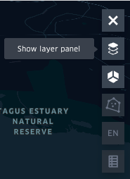
Now that the filters for both maps are set up, you can finish setting up the split view. Click on the Show layer panel icon (far right).
Unselect the uber trips weekend layer on the left-hand map and unselect the uber trips weekday layers on the right-hand map.
Enable the legend on both maps by clicking on the Show legend icon.
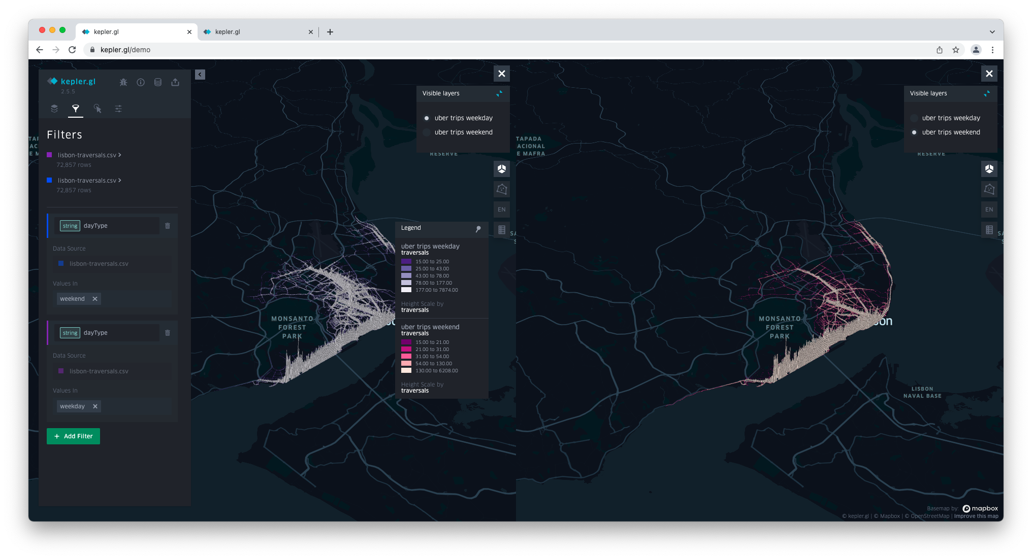
Click on the blue pin to place the legend in the lower right corner of the visualisation.

Click on the blue icon next to Visible layers to hide the layer list on both maps.

Click on the arrow next to the left side panel to collapse it and get a better view of both maps.
Now feel free to zoom in to an area of interest and compare weekday and weekend traffic on particular roads (e.g. the ones by the University of Lisbon).
That's it; you're done building the visualisation!
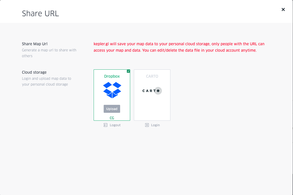
4 Share your work
Choose → Prepare → Create → Share
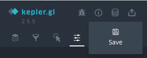
Save
Kepler.gl gives you the option to save your map to cloud storage. To do so, you'll need a Dropbox or CARTO account. Here, we'll exemplify saving the map to Dropbox.
Click on the storage icon (third from the top) and then click Save.
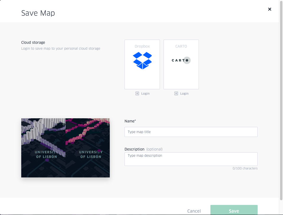
In the modal, select Dropbox > Login.
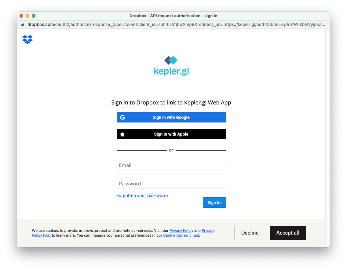
Login with your credentials. From now on, Kepler.gl will be linked to your Dropbox account.
Once you're signed in, you can enter the map's name and description. Then hit Save.
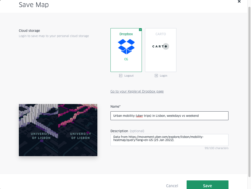
You'll find the map you saved in the Kepler.gl Web App folder in your Dropbox account.
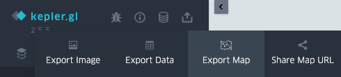
Share
When you create a visualisation with Kepler.gl, you can choose to export the map as an image, export the data, export the map to HTML or JSON, and share a public URL (you'll need a Dropbox account for this too).
Here, we're going to exemplify exporting the map and share the map URL.
Export map
Click on the Share icon (the fourth option) and click Export Map.
The Export Map modal opens. Here, you're given two choices of format: HTML and JSON.
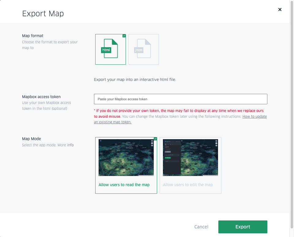
• Choose HTML if you want to embed the map in your website (with or without edit permissions). Click Export.
• Choose JSON if you're planning to come back to the map later and continue to work on it. Click Export.
Share Map URL
Click on the Share icon again (the fourth option) and click on Share Map URL.
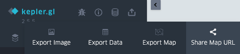
The Share URL modal opens. Click on Dropbox and add the map by clicking Upload.
A link to the map is produced and shown in Share URL.
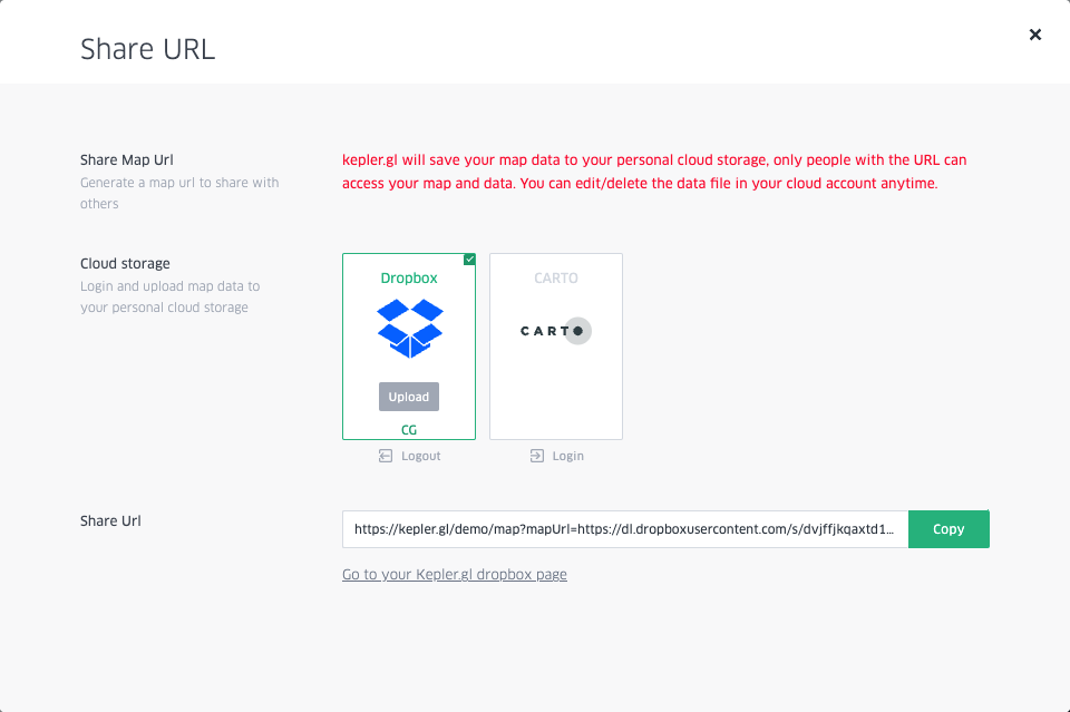
Copy the link and open it in incognito mode. There's your map - now share away!
Here's mine 👇


The Monthly with All That Geo
Want to learn how to use ArcGIS Online for spatial, data-driven storytelling? Sign up for The Monthly with All That Geo and I'll deliver a new example of an interactive web app straight to your inbox every month.
You'll get a behind-the-scenes look at how it was built—from the data collection process through the final app—so you can practice your own data visualisation skills and unlock your creativity as you go.
If you want to find inspiration to start a project that will make a difference in your study area or work, sign up for The Monthly with All That Geo!

Member discussion