The Monthly with All That Geo – July 2022

Welcome back to The Monthly with All That Geo by me, Cristina. Each month I bring you a new learning experience on geospatial data visualisation, analysis and storytelling.
In this issue:
- New learning resources are coming to All That Geo!
- Find areas that match a set of demographic variables and produce infographics.
📣 New learning resources are coming to All That Geo!
Throughout the second half of 2022, which we're just entering, I will introduce a couple of new learning resources. They are in the oven at the moment 😉 But I'll let you know about it in this newsletter's following issues.
Keep an eye on your inbox!
👵 Find areas that match a set of demographic variables and produce an infographic
The increase in longevity is an excellent achievement for humankind, but it also introduces various challenges to our societies. Older people have their own particular needs that require attention. We must make their lives as comfortable as possible, whether we're talking about autonomous and active individuals or the ones who are dependent on care by a third party.
How we treat senior citizens, especially the vulnerable ones, says a lot about our society.
That got me thinking: if I were to offer some service directed to the well-being of the elderly, how would I identify the areas most in need?
I used to have a neighbour, Sandra, who is in senior care. She knows much more about this subject than I do... but I have geographic skills. So, in the hypothetical case we decided to start a not-for-profit organisation, where would we locate it? Which criteria would we use to make that decision? And how would we present our decision-making process to potential investors?
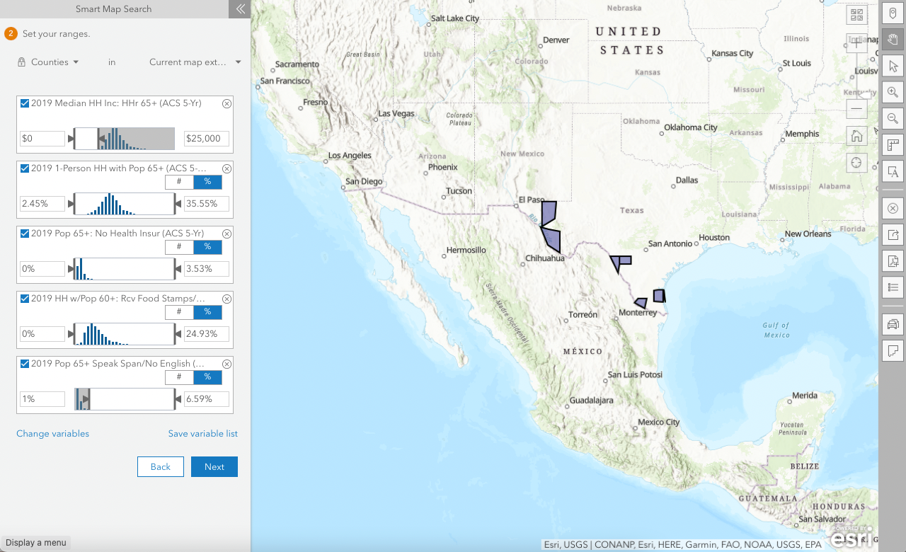
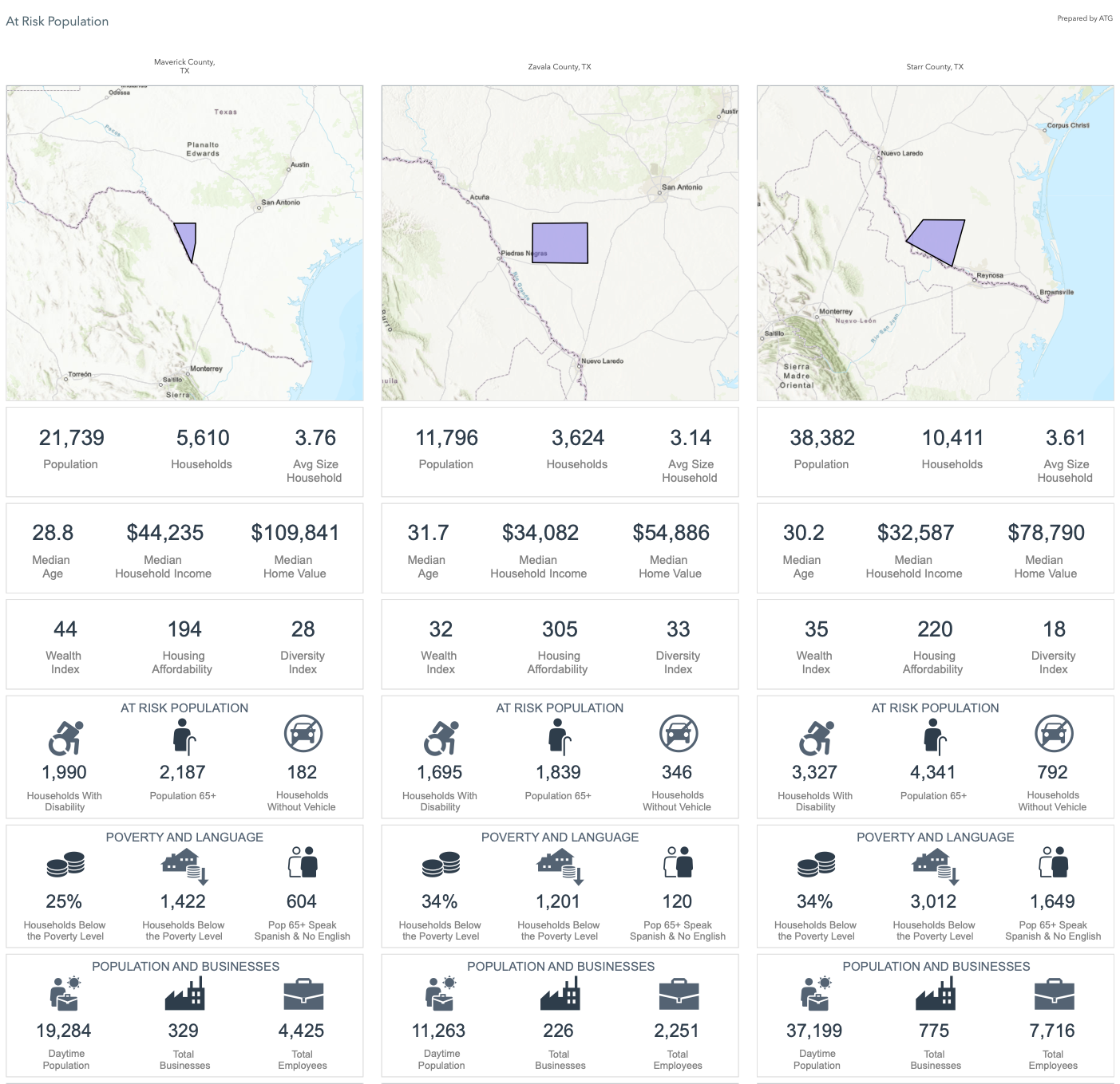
That is where the Business Analyst Web App comes to the rescue! 🦸♀️
From my experience, it is a less-known app with great potential. It makes demographic mapping, site selection, suitability analysis and creation of infographics and reports a breeze.
In this month's tutorial, I'm sharing how I used Esri Demographics + smart map search to find US counties with a vulnerable elderly population and produced infographics with the Business Analyst Web App.
🤔 But Cristina, how can this workflow be helpful to me?
- You work in the local/state/central government in charge of social affairs and want to identify geographic areas where service improvement is needed.
- You want to start a not-for-profit organisation and are unsure where to locate it.
- You know what to look for (set of criteria), but you don't know how to get and apply the data.
- You must share the decision-making process with stakeholders in a practical, impactful way.
Anything else? Hit reply to send me feedback or say hello.
See you next month!
Take care and keep learning,
P.S. Missed the last newsletter? I wrote about How to create a 3-in-1 app to crowdsource data, perform analytics, and share stories. Read it here.


Member discussion