Tutorial – How to assemble your web apps and build a hub site in ArcGIS Online
In this tutorial, you'll find the workflow I followed when building Frenchy's Virtual Home in ArcGIS Online. Since Frenchy's Virtual Home includes multiple web apps, it would be unfeasible to provide you with a comprehensive tutorial featuring all of them in one go. That is why I will go through the high-level workflow only.
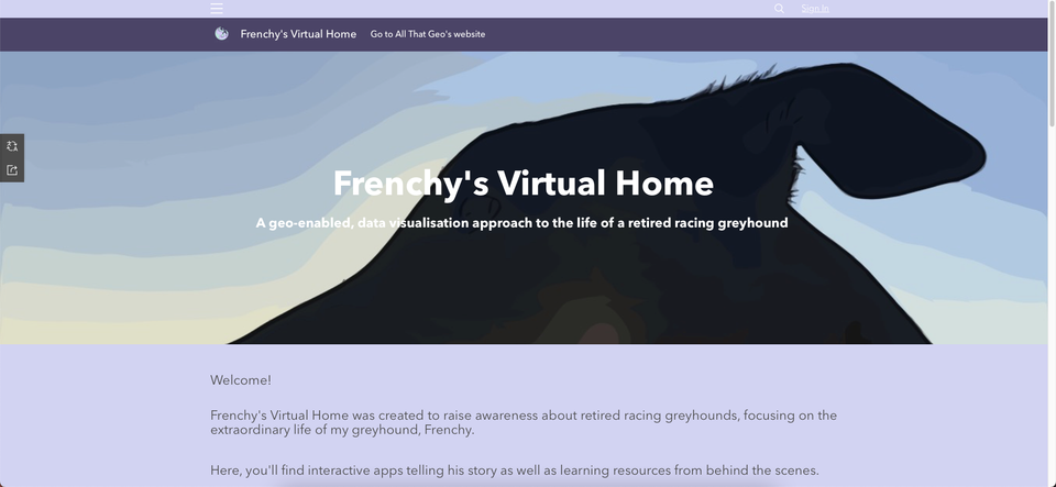
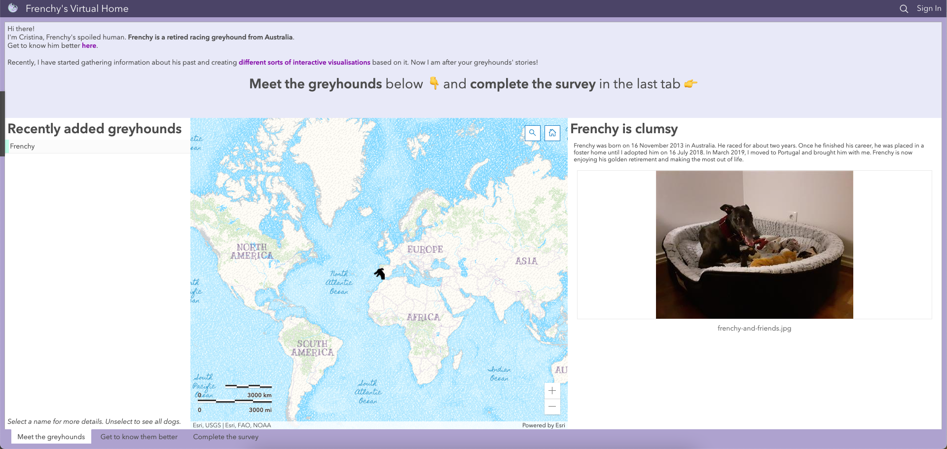
Frenchy's Virtual Home is a hub site that sits on Esri's ArcGIS Online and showcases the ecosystem of apps in action. Currently, it includes a story map, a dashboard, a workbook and a web experience (that consists of two dashboards and a survey).
Let's get started!
1 Choose the tool
Choose → Prepare → Create → Share
The tool of choice for this project was ArcGIS Online. This platform provided me with a range of apps that I could interconnect to highlight different aspects of Frenchy's life.
Apart from Insights (a premium app), you can access all the other apps for free with any of the following options:
2 Prepare the data
Choose → Prepare → Create → Share
Frenchy's racing data and his family's racing data were retrieved from The Greyhound Recorder.
I exported the data to a spreadsheet, cleaned it and uploaded the file to my ArcGIS Online account. As I uploaded the file, I geocoded the tracks and trainers' locations to map them. Beware that this geocoding process consumes credits. These datasets were then published as hosted feature layers and hosted table to be accessible across the platform. You can find them below:
3 Create a visualisation
Choose → Prepare → Create → Share
3.1 Web maps
I started by creating a few web maps from the datasets above in the new Map Viewer. The basemap I used a custom style based on the Colored pencil basemap. To design it, I used the ArcGIS Vector Tile Style Editor. More information on how to do it is here.
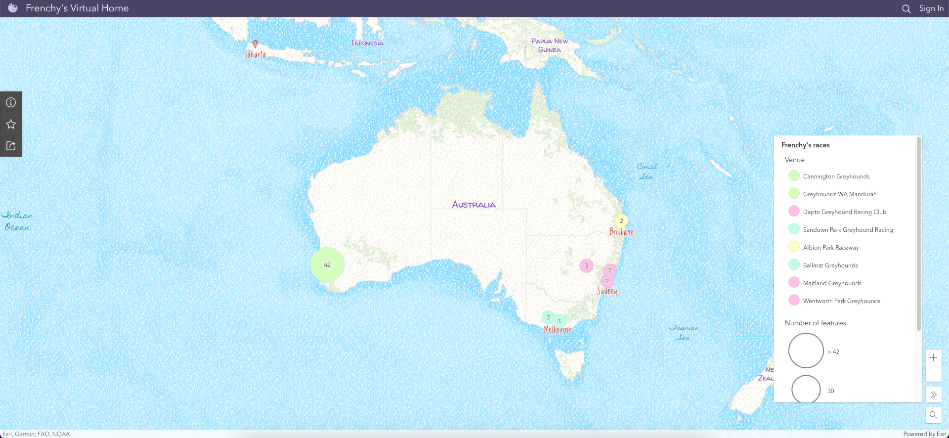
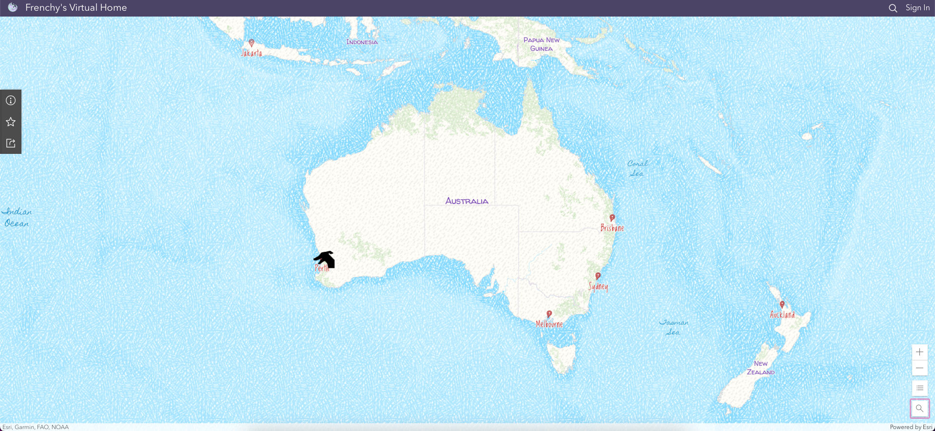
The first web map I created was named Frenchy's racing record and displayed all Frenchy's races. Their locations were aggregated in clusters to highlight the main geographic areas.
Since I wanted to highlight Frenchy's career's start and end in the narrative, I created two more web maps with the race dates filtered to show only the first and the last race.
The symbology used in those maps consists of an image I authored and stored in ArcGIS Online. Unfortunately, I had to use the Map Viewer Classic to apply it, as it is not yet available in the new Map Viewer.
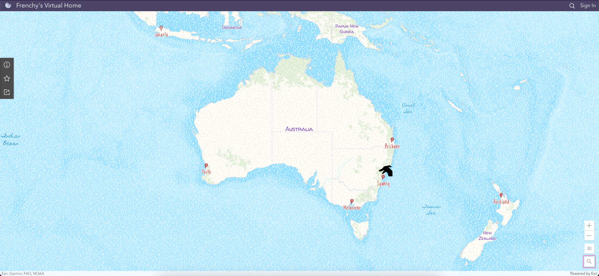
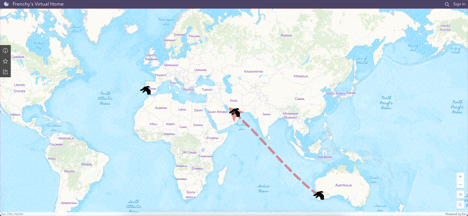
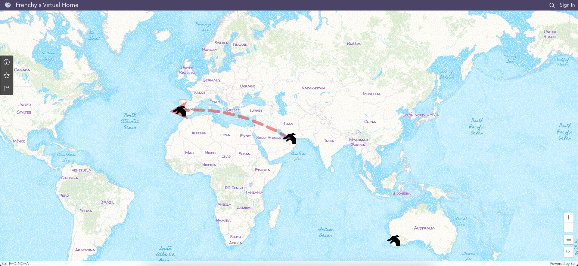
Later, I created two more web maps to highlight Frenchy's journey from Perth to Dubai and then from Dubai to Lisbon.
To do so, I created points representing the three airports. Then, I input those three points in the Find Nearest tool to draw the connecting lines representing the flights – the output has a more natural look than the manually drawn lines. Note that the Find Nearest tool is only available in the Map Viewer Classic for the moment and that it consumes credits.
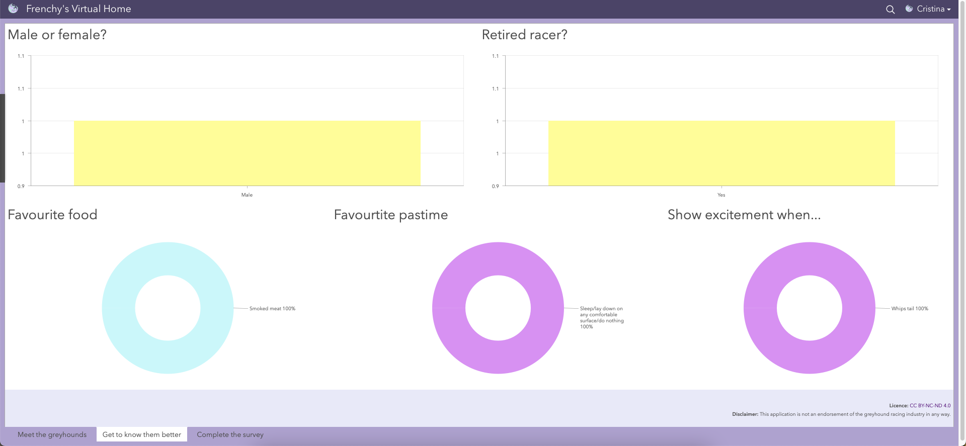
3.2 Dashboards
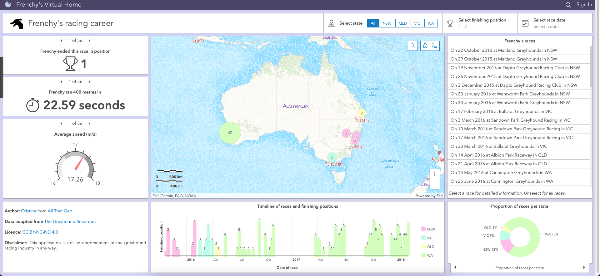
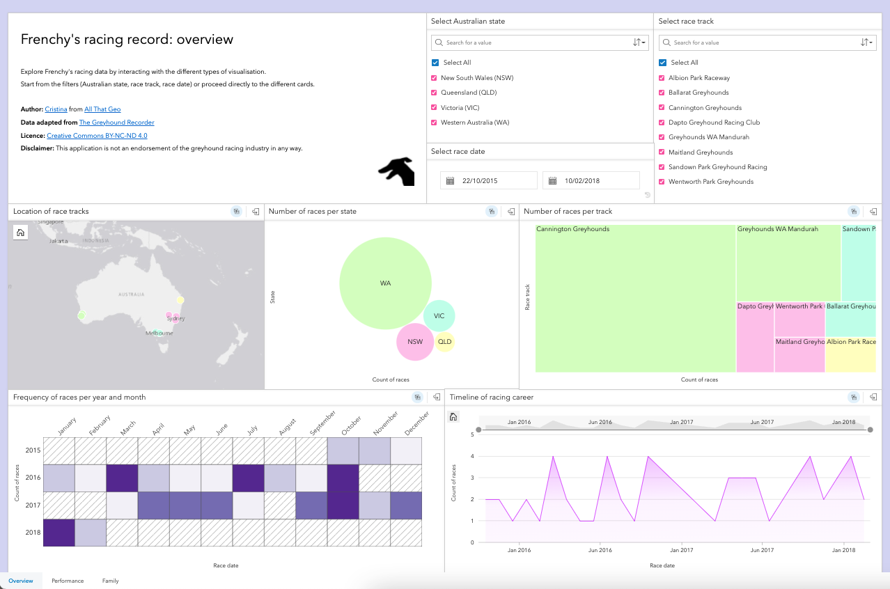
Based on the web map Frenchy's racing record, I created a dashboard called Frenchy's racing career to monitor Frenchy's racing performance. This dashboard features a variety of elements such as selectors, indicators, gauges, and charts. In addition, actions were set up so that the dashboard reacts to user input (e.g., choice of a particular race from the list).
3.3 Insights
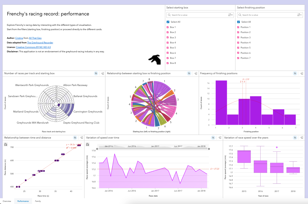
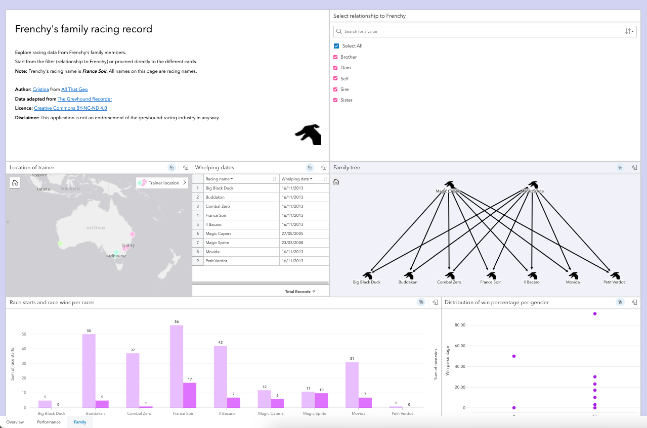
As you might have already noticed, I am a fan of ArcGIS Insights. This app was just what I needed to perform an exploratory analysis on Frenchy's racing data. Thus, I created an Insights Workbook, Explore Frenchy's racing record, using my hosted featured layers and hosted table.
This workbook is composed of three pages: Overview, Performance and Family. All three pages include various chart types such as box plot, chord diagram, data clock and heat chart, amongst others. In addition, both predefined and cross filters enhance interactivity across the workbook.
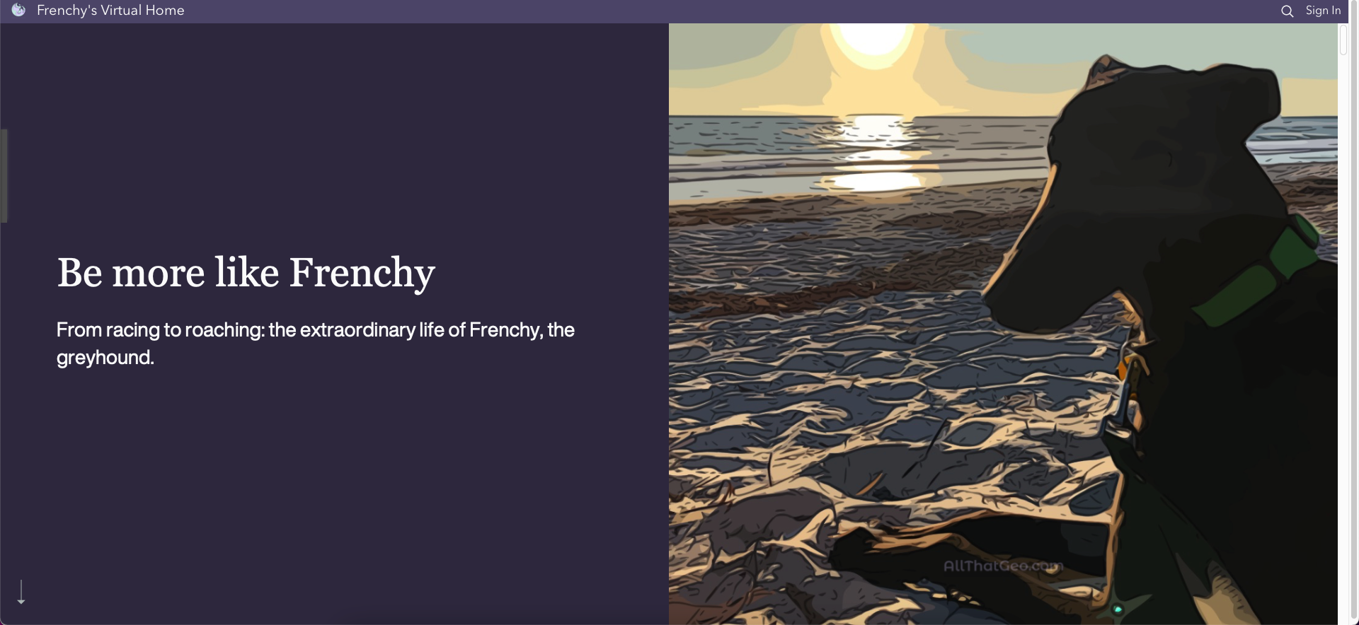
3.4 StoryMap
I created a story map, Be more like Frenchy, to tell Frenchy's story and integrate the web maps and apps in the narrative. To further customise the story to my liking, I created a theme. Head here to learn how to do it.
4 Share your work
Choose → Prepare → Create → Share
To share the apps I created, I set their sharing privileges and the data behind them to Public.
4.1 Hub
At this stage, I had created three separate applications on Frenchy's life: a story map, a dashboard and a workbook. A good way of organising them on the same public website was to create a hub.
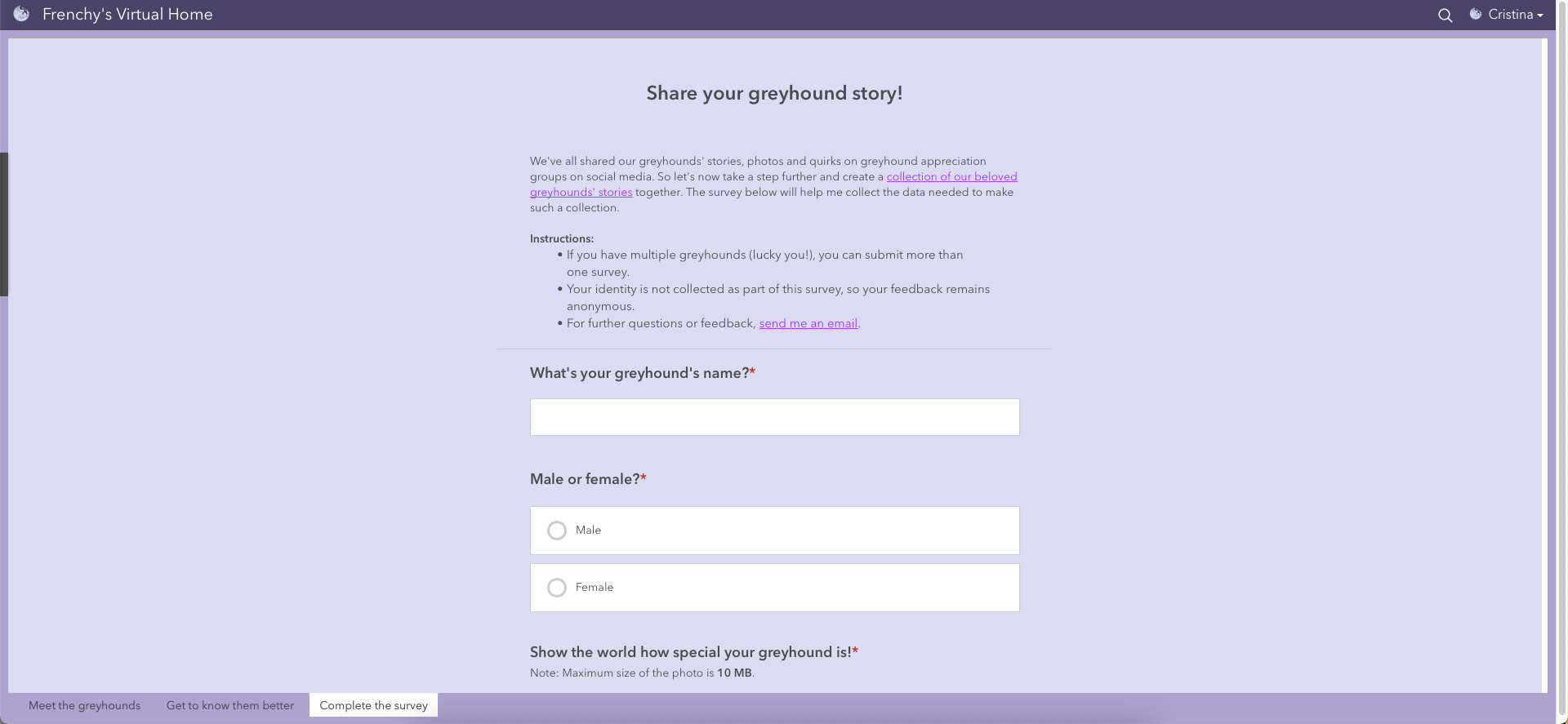
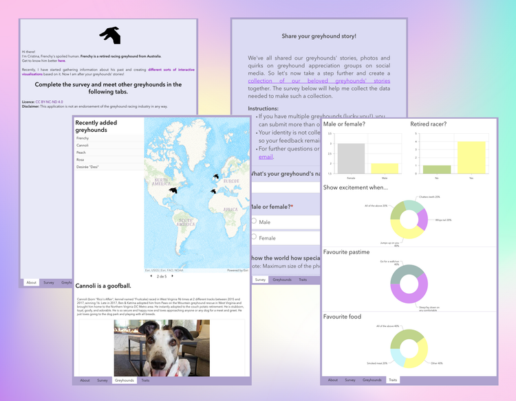
4.2 Survey123 + Dashboard
The sharing process can sometimes be a two-way process. On the one hand, you're sharing information and knowledge. On the other, you might need to crowdsource data.
At a later stage of this workflow, and since I was working on the theme of greyhounds, I became interested in collecting and sharing stories like Frenchy's with everyone.
I started by creating a survey in Survey123 to ask for stories. I then built a dashboard, named Put your greyhound on the map, with that survey embedded and a web map showing the survey results, alongside a few other elements. This dashboard contains multiple tabs to avoid a cluttered interface.
4.3 Experience Builder
Since I anticipated my survey's audience to access this dashboard mainly on a mobile device, I needed to make sure the layout was responsive. After testing, it was clearly not (as it often happens with dashboards).
That's when I found a way of overcoming it here. I created a mobile version of the dashboard and built a web experience with both desktop and mobile versions. The experience web app would automatically display the dashboard that best fits the screen.
This web experience was then added to the other three apps in the hub.
Finally, as you might have noticed, URLs from ArcGIS Online are not easy to remember and share! When shareability is a concern, TinyURL is a great resource. Currently, I have set up these friendly URLs:
- Be more like Frenchy: tinyurl.com/bemorelikefrenchy
- Put your greyhound on the map: tinyurl.com/greyhoundstories
- Frenchy's virtual home: tinyurl.com/frenchyvirtualhome
Your turn now!
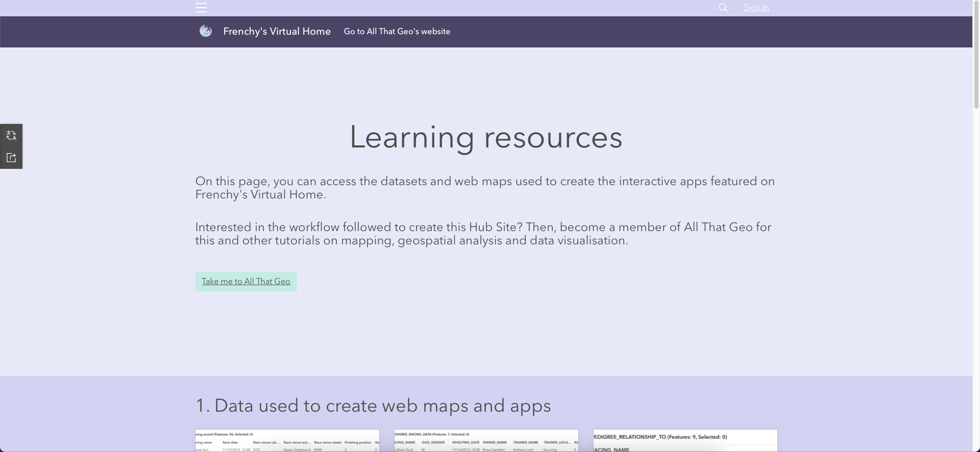
All the resources mentioned in this tutorial are featured on the Learning Resources page of the hub site. So, you can download and reuse them to practice your data visualisation and spatial analysis skills in ArcGIS Online. Please beware, though, that all work by All That Geo is licensed under CC BY-NC-ND 4.0.

The Monthly with All That Geo
Want to learn how to use ArcGIS Online for spatial, data-driven storytelling? Sign up for The Monthly with All That Geo and I'll deliver a new example of an interactive web app straight to your inbox every month.
You'll get a behind-the-scenes look at how it was built—from the data collection process through the final app—so you can practice your own data visualisation skills and unlock your creativity as you go.
If you want to find inspiration to start a project that will make a difference in your study area or work, sign up for The Monthly with All That Geo!
Member discussion