The Monthly with All That Geo – June 2021

Welcome to the June issue of The Monthly with All That Geo by me, Cristina!
Each month, I bring you a three-part newsletter focused on the learning of mapping and data visualisation skills:
- In The Spotlight – I’ll introduce you to data visualisation tools I have personally explored and reviewed.
- Geo For Good – you’ll discover inspiring organisations and projects enabled by location data.
- Frenchy’s Tip – you’ll get valuable tips to make your mapping and data visualisation journey easier.
In The Spotlight
 Cristina
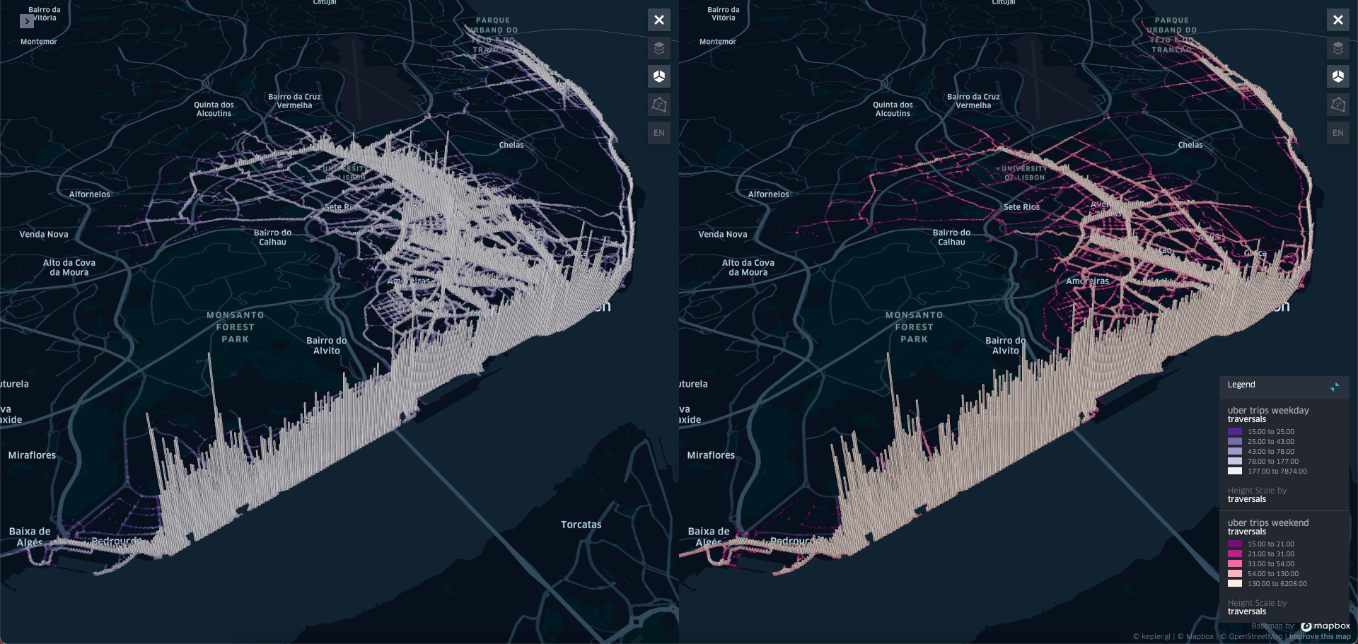
Geo For Good
Cristina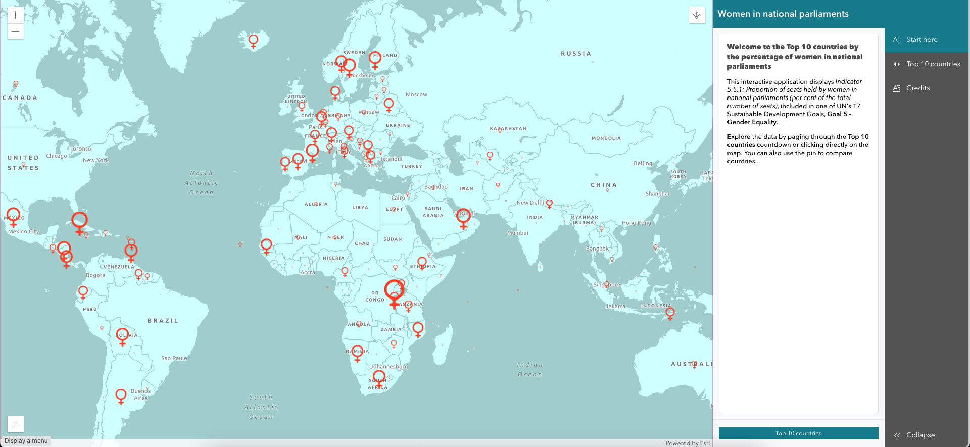
Frenchy's Tip*
*This section is named after my dog Frenchy. He’s a retired racing greyhound from Australia, living it up in Portugal.
Cristina
You are more than welcome to write back! Just reply to this email and share your thoughts and suggestions on any part of this newsletter. I read every reply.
Finally, I hope you get the most value out of this newsletter. If you think this newsletter might interest someone you know, by all means, suggest a visit to allthatgeo.com or forward this email.
That’s all for now. See you next month for a new issue of this newsletter!
Take care and keep learning,
P.S. Did you know you can download your listening data from your Spotify account? How cool would it be to create data visualisations that enable you to get insights into your listening habits? I created this free mini-course to inspire and guide you in your exploration. You’ll end up with a data visualisation you’re proud of (or not; it depends on your music choices 😉) to share with the world!
 Cristina
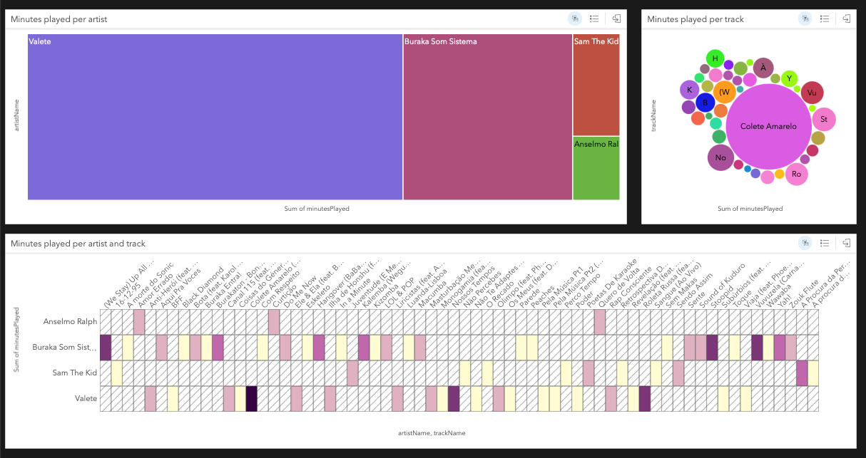


Member discussion