Tutorial – How to create an animated visualisation of earthquakes data with Kepler.gl
1 Choose the tool
Choose → Prepare → Create → Share
There are two compelling arguments for you to use Kepler.gl: it is free and produces high-impact visualisations of location data. Add that to being a browser-based tool, and you have a winner.
This tutorial demonstrates how I created a visualisation of earthquakes' location that takes advantage of one of the tool's best capabilities: geo-temporal playback. You can follow along and adapt this tutorial to other projects where time is of the essence, such as the ones relating to the COVID-19 virus spreading.
2 Prepare the data
Choose → Prepare → Create → Share
I retrieved the dataset on earthquakes from the Real-time Notifications, Feeds, and Web Services from the USGS Earthquake Hazards Program of the U.S. Geological Survey (USGS).
How did I choose the data format from all the available options? Well, Kepler.gl accepts three different data formats: Comma Separated Values (CSV), JavaScript Object Notation (JSON) and GeoJSON. For this tutorial, I used the Spreadsheet Format. I could've used the data in GeoJSON format instead, but this format does not allow labels and icons in the visualisation.
Start by downloading the following dataset: Past 30 Days – All Earthquakes to your computer.
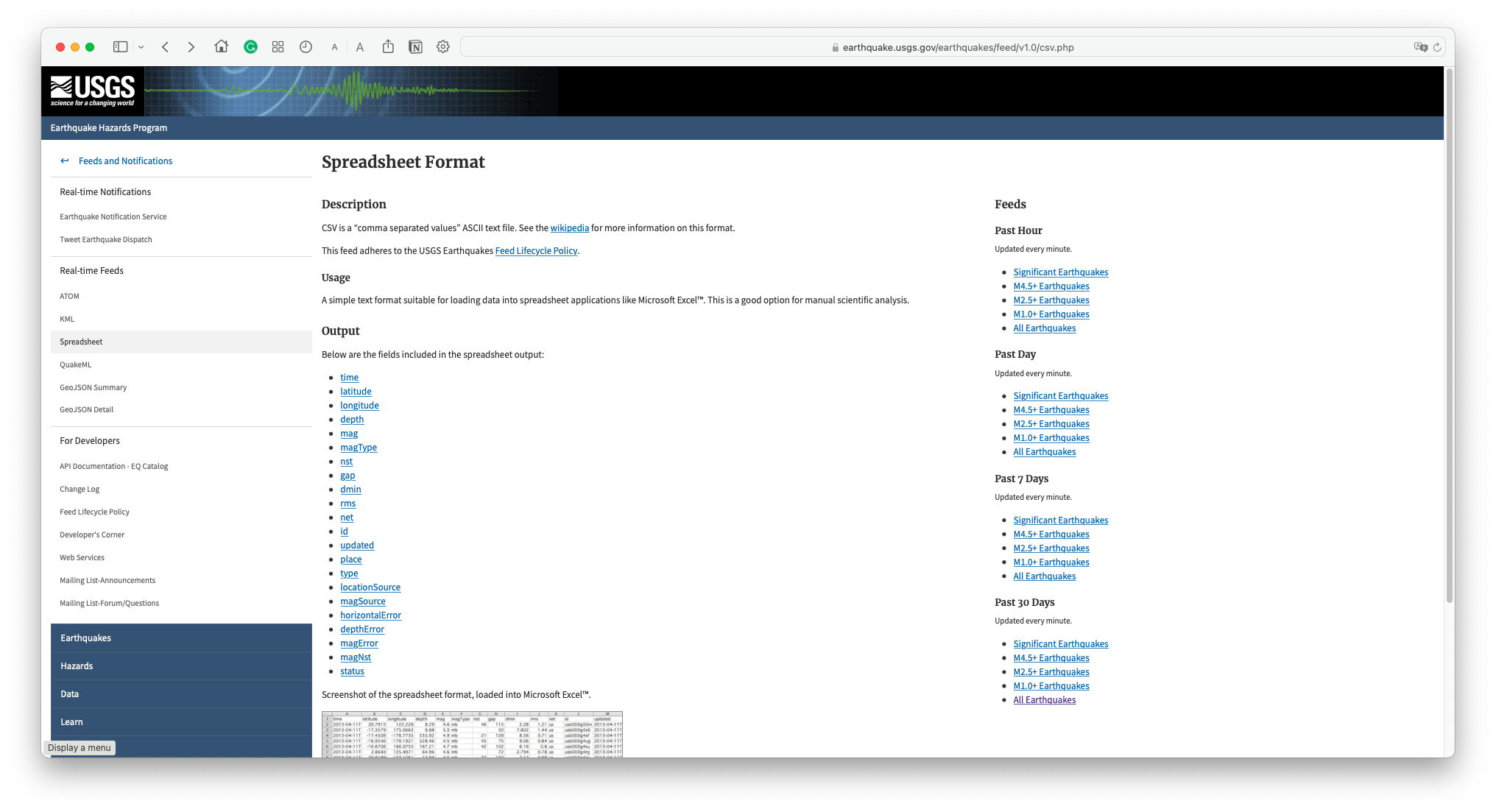
Alternatively, access the dataset used in this tutorial (retrieved on 11.1.2022) from here.
Open all-month.csv in Excel (or equivalent) to inspect the data and add an attribute. Start by turning text into columns.
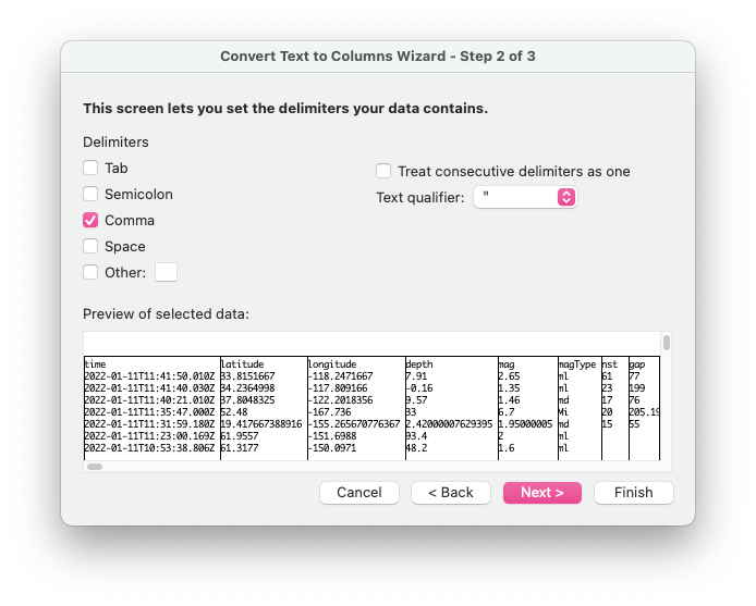
To do so, Select column A, then go to Data > Convert Text to Columns. In the wizard, select Delimited and click Next.
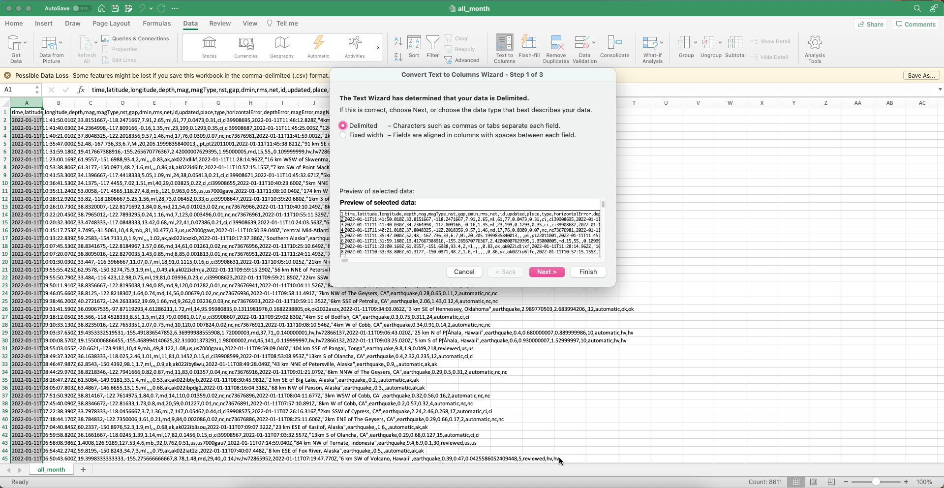
Then, choose Comma and click Next.
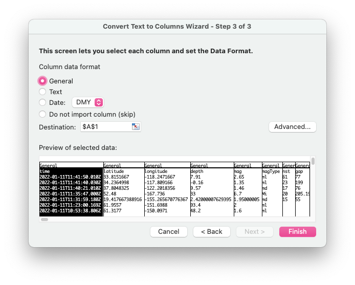
Finally, choose General and click Finish.
Notice the presence of two crucial attributes: latitude and longitude. These are the ones that will enable you to map the earthquakes.
Now, add a column called icon, and fill it with the value alert. You'll understand why in a few steps.
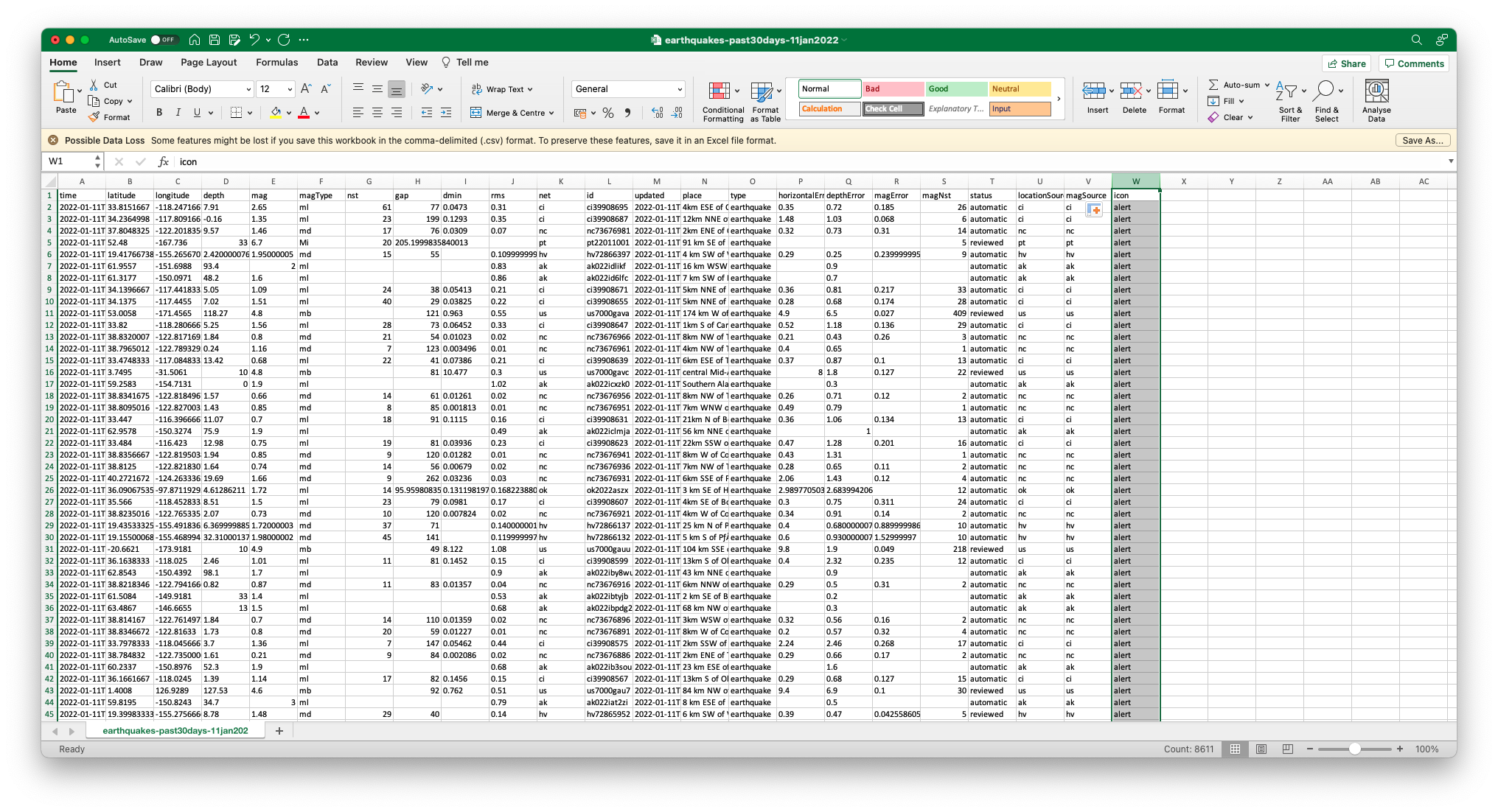
Go to File > Save As and give a more meaningful name to the file (something like earthquakes-past30days-[date]).
Close Excel.
3 Create a visualisation
Choose → Prepare → Create → Share
Open https://kepler.gl/ in your browser and click on GET STARTED.
A modal window opens for you to add data.
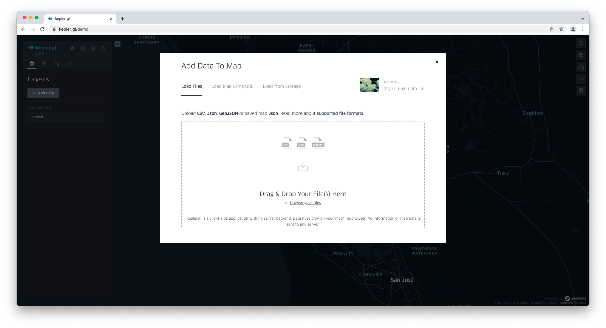
In the Load Files tab, click browse your files and locate the earthquakes-past30days-[date].csv file.
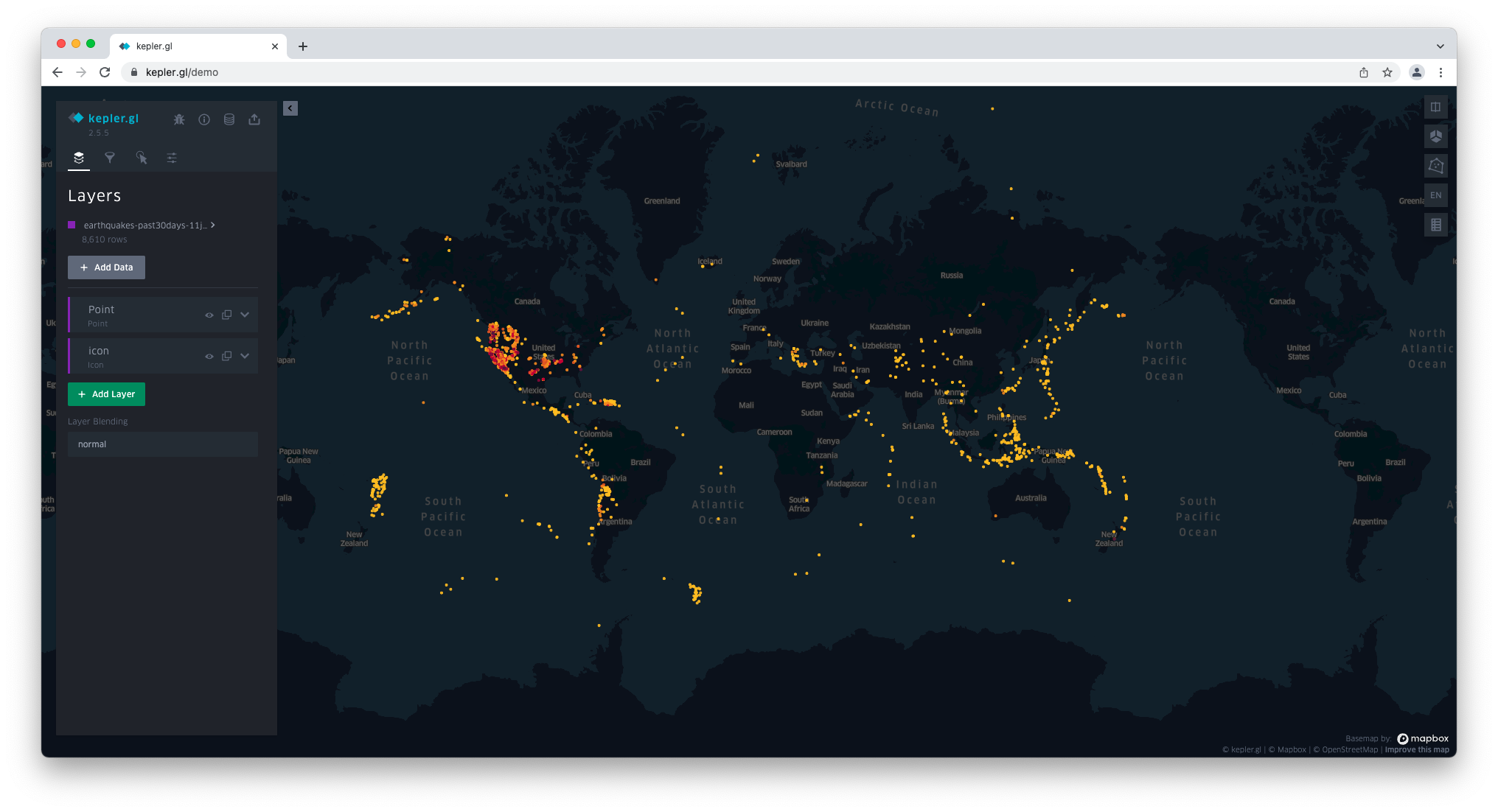
Once the dataset has been uploaded, it shows under Layers on the left-hand side panel.
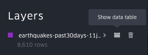
Hover over the dataset name and click on the first icon on the right to Show data table.
Inspect the data, focusing on the columns (attributes).
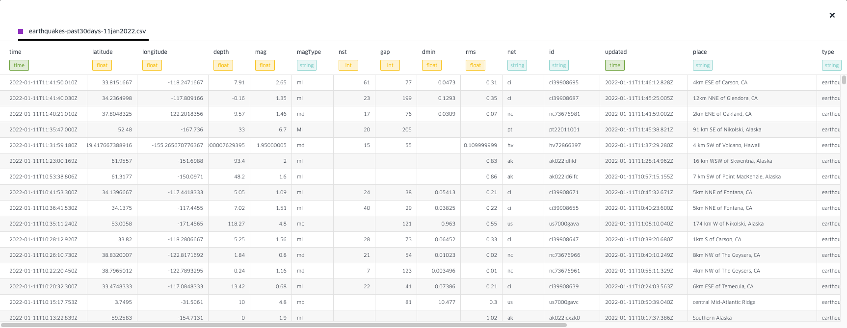
Close the data table.
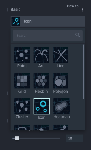
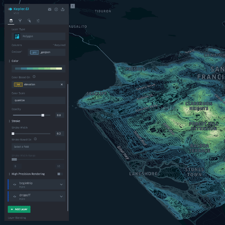
Layers
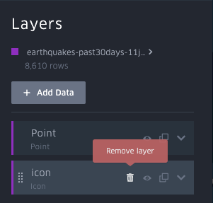
Notice the two layers created from the data table: point and icon.
Click the trash bin next to icon and remove the layer, for we don't need it.
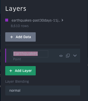
Rename the Point layer to Earthquakes by double-clicking on the name.
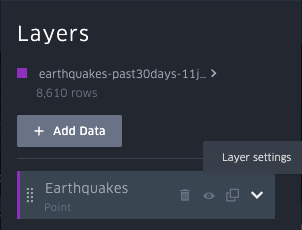
Click on Layer settings (the arrow pointing down).
Here, you'll configure how the layer is displayed on the map.
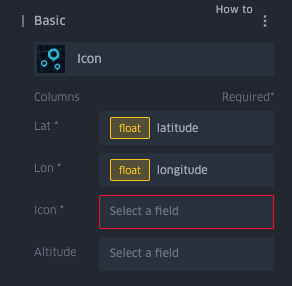
Under Basic, you can see the layer type has been defined as Point.
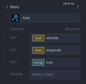
Notice how the Lat and Long fields (under Columns) are already set up to the corresponding fields (latitude and longitude).
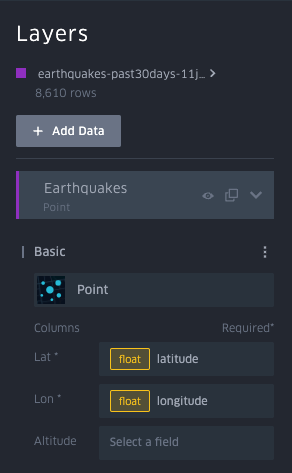
We want the data to show as icons on the map. Hence, click on Point and change to Icon.
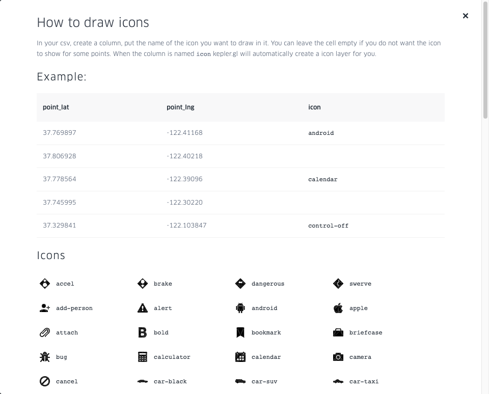
Now, icon is expecting the icon field from the dataset (remember the column we added to the CSV file earlier?).
If you click on How to, you'll discover a list of other icons supported by Kepler.gl.
Choose the icon field to finish setting up the Basic section.
Click on the name of the next section, Color, to expand all options.
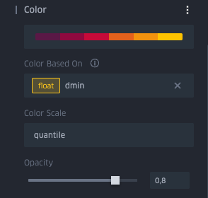
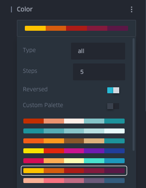
You're going to keep the default colour palette, but with a couple of modifications. First, click on the palette and decrease the steps to 5 (for a clearer distinction between hues). Then, activate Reversed.
Now set Color Based On to the magnitude field (mag).
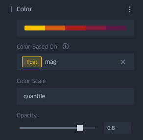
Hence, the darker colours will represent an earthquake of a higher magnitude.
The Color section is now set up.
Click on the top of Radius to expand the section.
Start by setting Radius Based On to the magnitude field (mag). Then, set the custom input to an interval between 10 and 100. The icons' size on the map, reflecting the earthquake's magnitude, will range between these two values.
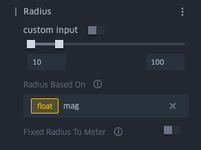
The radius section is now set up.
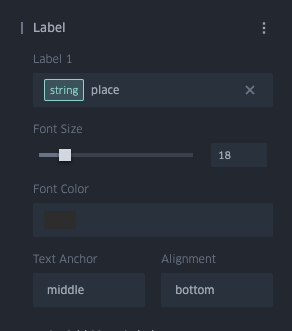
Click on Label to show all options.
Set Label 1 to place, Font Color to a dark grey, Text Anchor to middle, and Alignment to bottom. An informative label will complement the location of each earthquake for a better understanding of the events.
Now that we've fully customised the layer, it is time to set up a couple of filters on the data. The filters will be applied to two attributes, magnitude and time, to limit the earthquake events shown in the visualisation.
Filters
Click on the filter icon (the second one, after Layers).
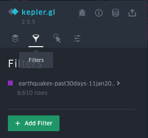
Under Filters, click on Add Filter.
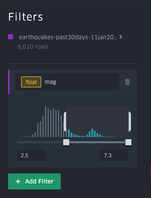
We want to filter the earthquakes data so that only those with a magnitude bigger than 4.5 show. In Select A Field, choose mag. Now enter 4.5 on the lower limit.
Add a second filter to enable playback of geo-temporal trends. To do so, in select a field, choose time.
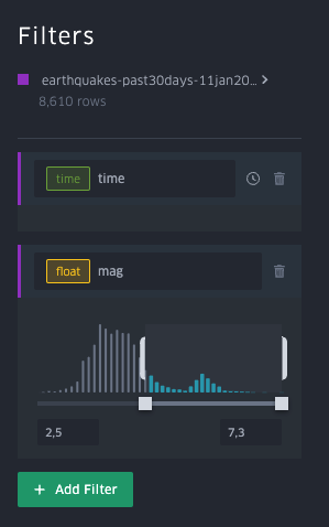
You have now added a temporal dimension to your data visualisation. Notice the time slider showing on the lower right corner.
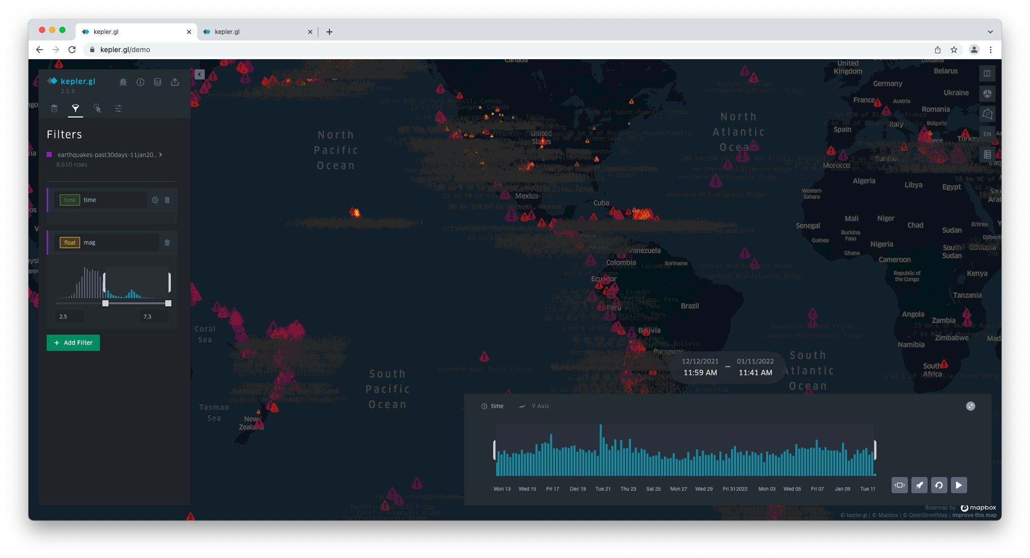
As you might have noticed, both the speed and quantity of points shown on the map are not easily followed. Start by moving the right bar toward the left so that the data displayed on the map corresponds to a smaller time interval at a time.
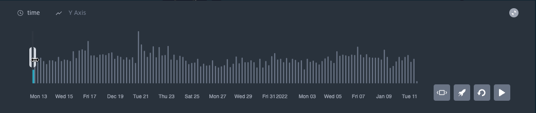
Then, click on the rocket icon on the lower right and enter 0,05 so that the animation plays slower.
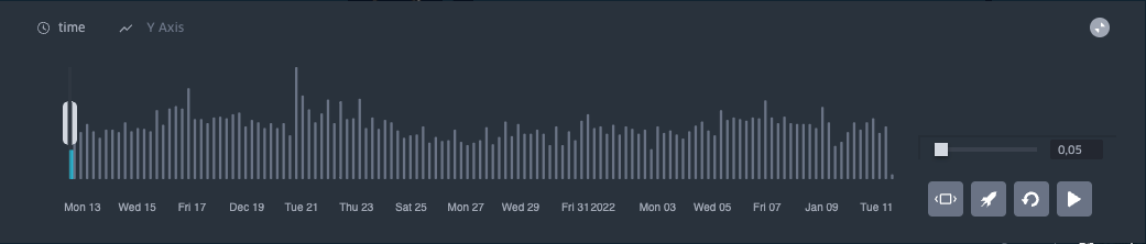
Now, click on y and change to depth. This will give the viewer additional information on the earthquakes more visually.
As you hit the play button, the map shows the earthquakes dynamically.
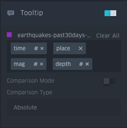
Interactions
Click on the third icon, Interactions. By default, the tooltips are active.
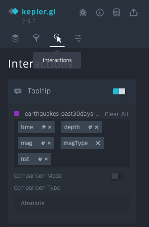
We will keep these tooltips as we want to provide further information on each event as the viewer hovers over the points on the map. However, we will choose a different configuration of attributes.
To do so, click on Clear All. Now click on Select a field and choose, in order: time, place, mag and depth.
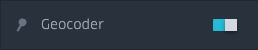
You can also activate the geocoder so that the viewer can enter a location on the top right corner and see earthquakes nearby.
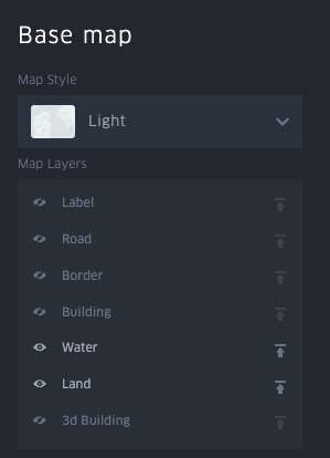
Basemap
Click on the Base map icon (fourth from the left). Under Map Style, change dark to light. The icons and labels now come to life.
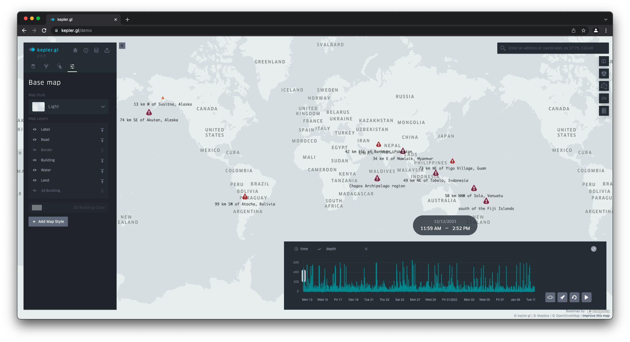
To remove noise from the basemap and strip the basemap down to the essentials, turn off all base map layers except for Water and Land.
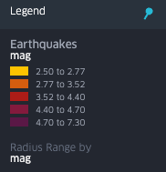
Finally, let's add a legend to the map. Go to the last icon on the right corner and click on Show legend.
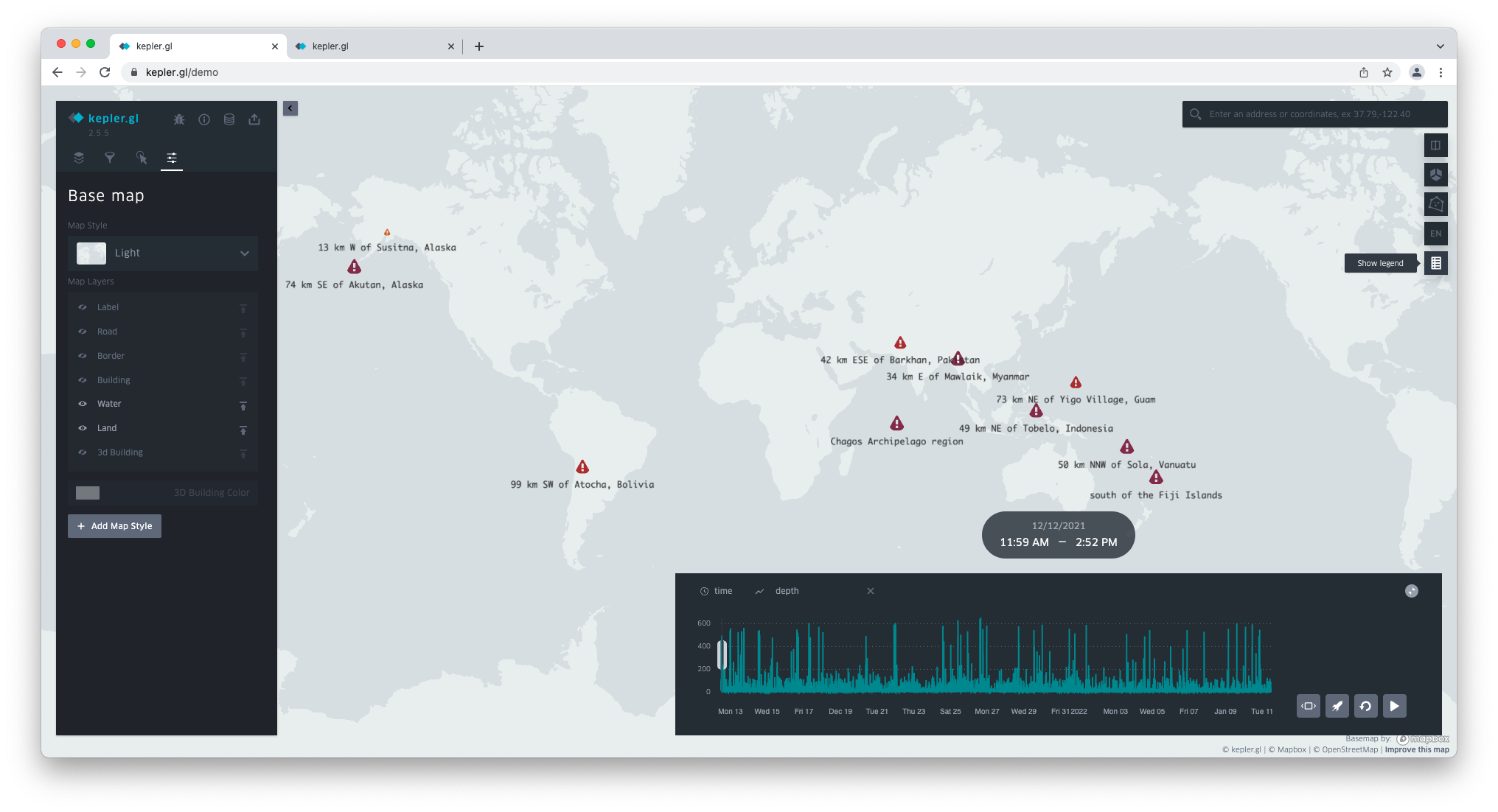
Click on the blue pin to lock the legend in the lower right corner.
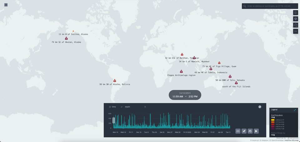
That's it; you're done building the visualisation! It should look something like this.
4 Share your work
Choose → Prepare → Create → Share
Save
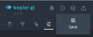
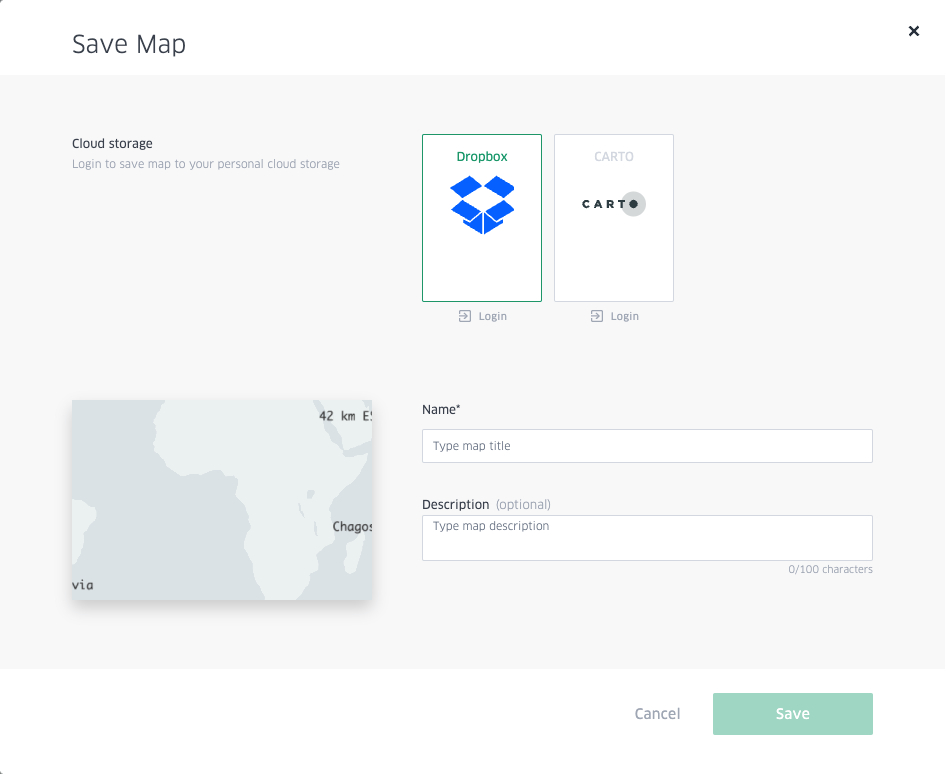
Kepler.gl gives you the option to save your map to cloud storage. To do so, you'll need a Dropbox or CARTO account. Here, we'll exemplify saving the map to Dropbox.
Click on the storage icon (third from the top) and then click Save.
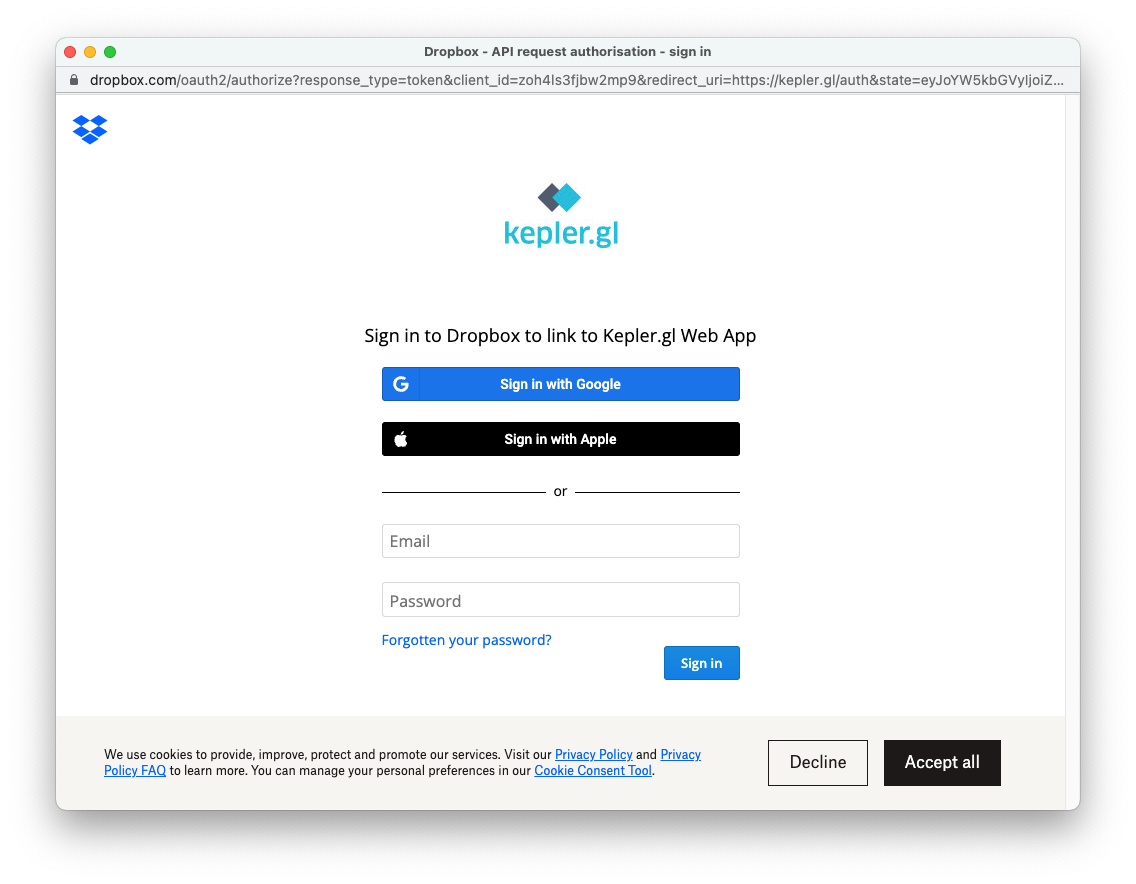
In the modal, select Dropbox > Login.
Login with your credentials. From now on, Kepler.gl will be linked to your Dropbox account.
Once you're signed in, you can enter the map's name and description. Then hit Save.
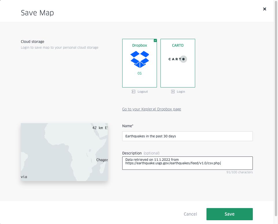
You'll find the map you saved in the Kepler.gl Web App folder in your Dropbox account.
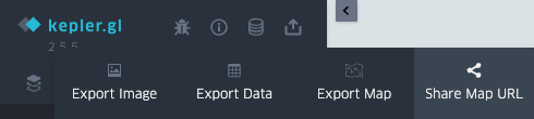
Share
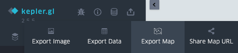
When you create a visualisation with Kepler.gl, you can choose to export the map as an image, export the data, export the map to HTML or JSON, and share a public URL (you'll need a Dropbox account for this too).
Here, we're going to exemplify exporting the map and share the map URL.
Export map
Click on the Share icon (the fourth option) and click Export Map.
The Export Map modal opens. Here, you're given two choices of format: HTML and JSON.
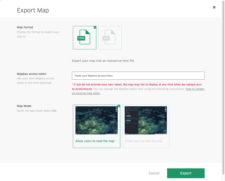
- Choose HTML if you want to embed the map in your website (with or without edit permissions). Click Export.
- Choose JSON if you're planning to come back to the map later and continue to work on it. Click Export.
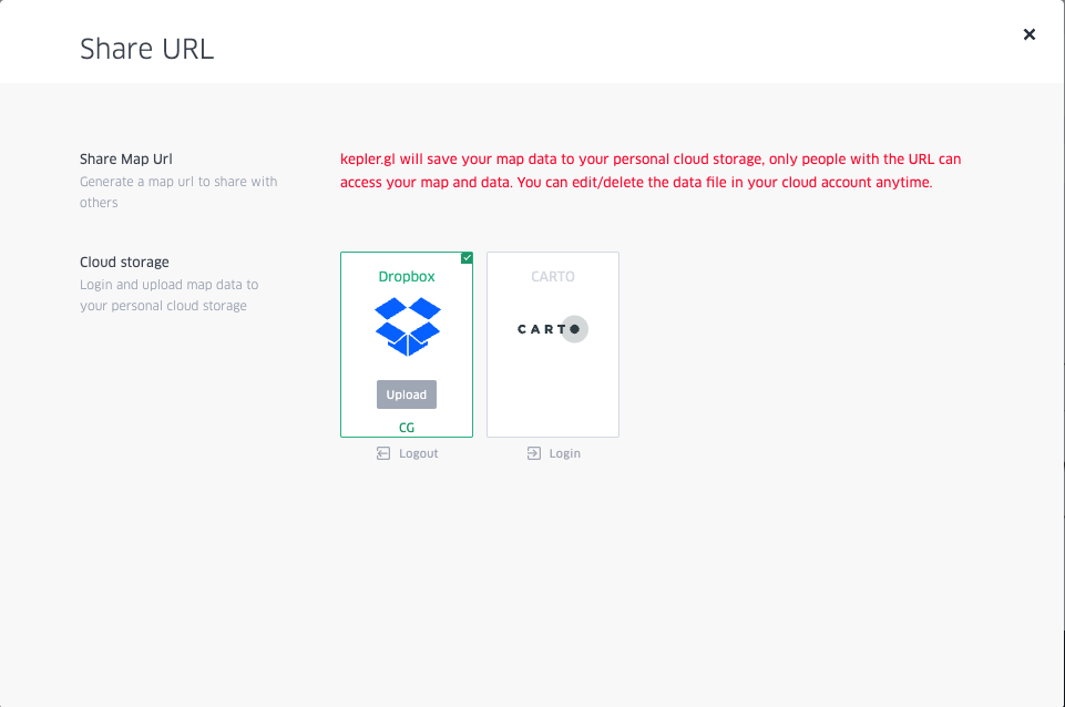
Share Map URL
Click on the Share icon again (the fourth option) and click on Share Map URL.
The Share URL modal opens. Click on Dropbox and add the map by clicking Upload.
A link to the map is produced and shown in Share URL.
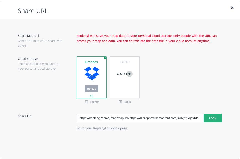
Copy the link and open it in incognito mode. There's your map - now share away!
Here's mine 👇


The Monthly with All That Geo
Want to learn how to use ArcGIS Online for spatial, data-driven storytelling? Sign up for The Monthly with All That Geo and I'll deliver a new example of an interactive web app straight to your inbox every month.
You'll get a behind-the-scenes look at how it was built—from the data collection process through the final app—so you can practice your own data visualisation skills and unlock your creativity as you go.
If you want to find inspiration to start a project that will make a difference in your study area or work, sign up for The Monthly with All That Geo!

Member discussion